Blue is the most preferred color when it comes to branding. Blue has the power to instill trust and belief. Hence, most brands prefer using shades of blue in their logo as well as the website. The blue color can brighten our mood, just like the view of the sky.
Like the sky changes colors from day to night, the color blue also has an extensive list of different shades and hues. We have curated a list of some of the commonly used shades of blue.
1. Sapphire blue (PANTONE 2745)
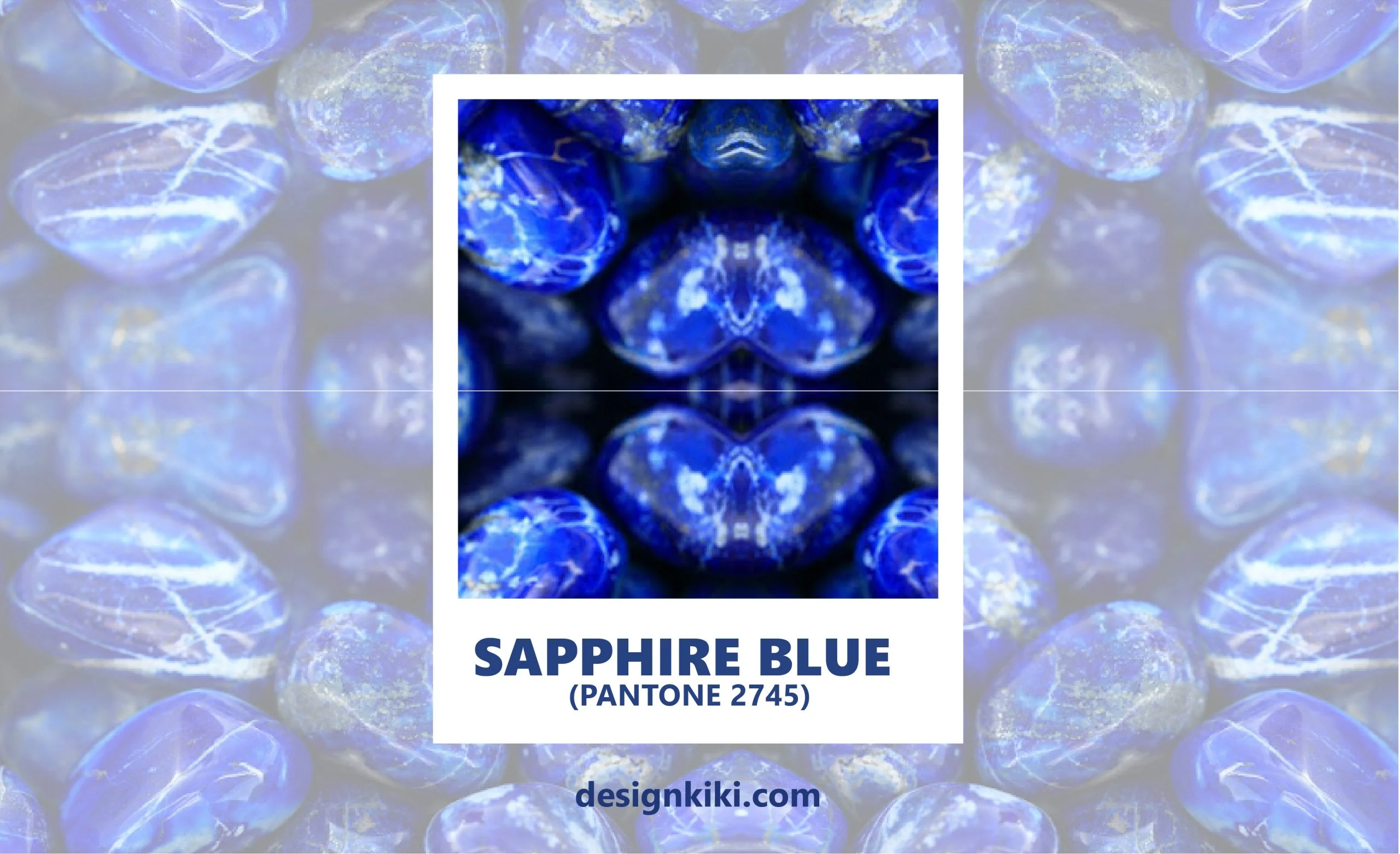
Sapphire blue is a majestic shade that has the capability of setting the mood right away. It can be used in the branding of logos and websites for luxury items. Sapphire blue can be used with colors like grey and lemon yellow to form an exquisite color palette.
2. Turquoise blue (PANTONE 313)
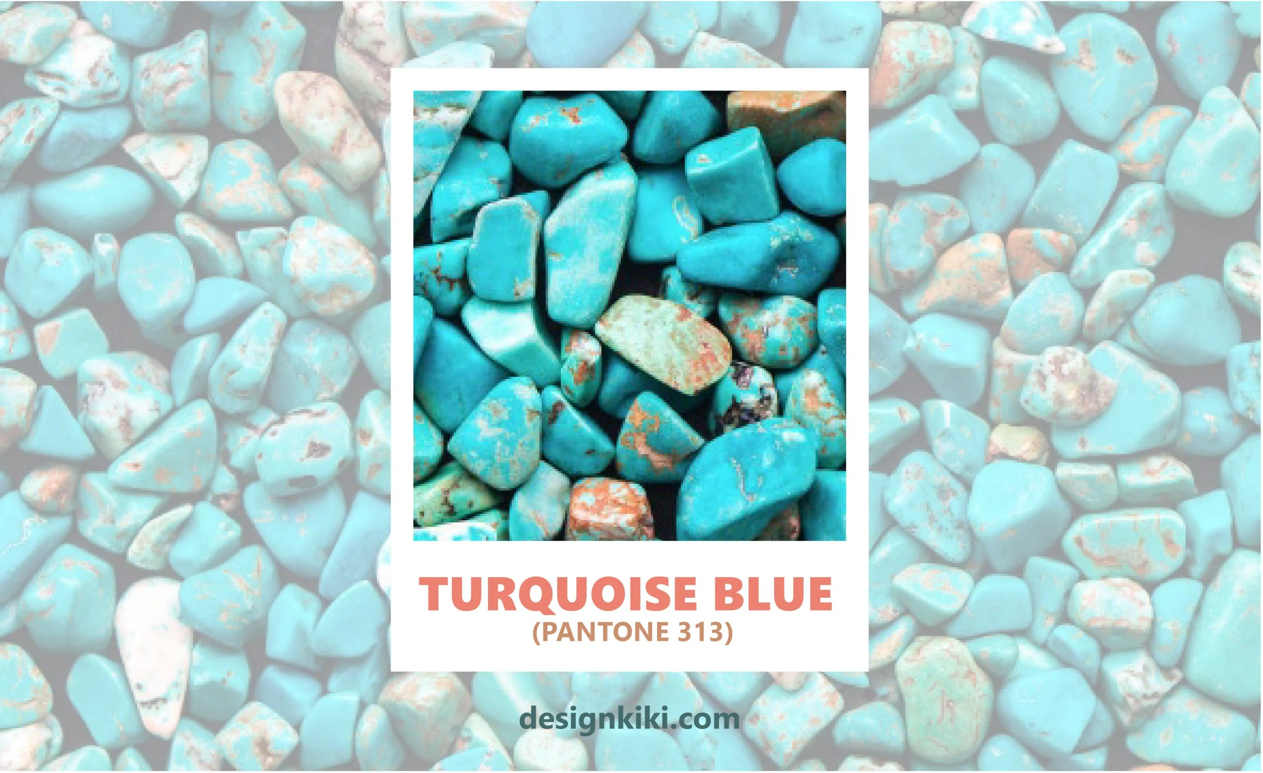
Turquoise blue is an alluring shade of blue. It can be used in the branding of vacation and recreational spots like resorts. Turquoise blue can be used along with colors like mint green and off-white to make a pacifying color palette.
3. Pool Blue (PANTONE 311)
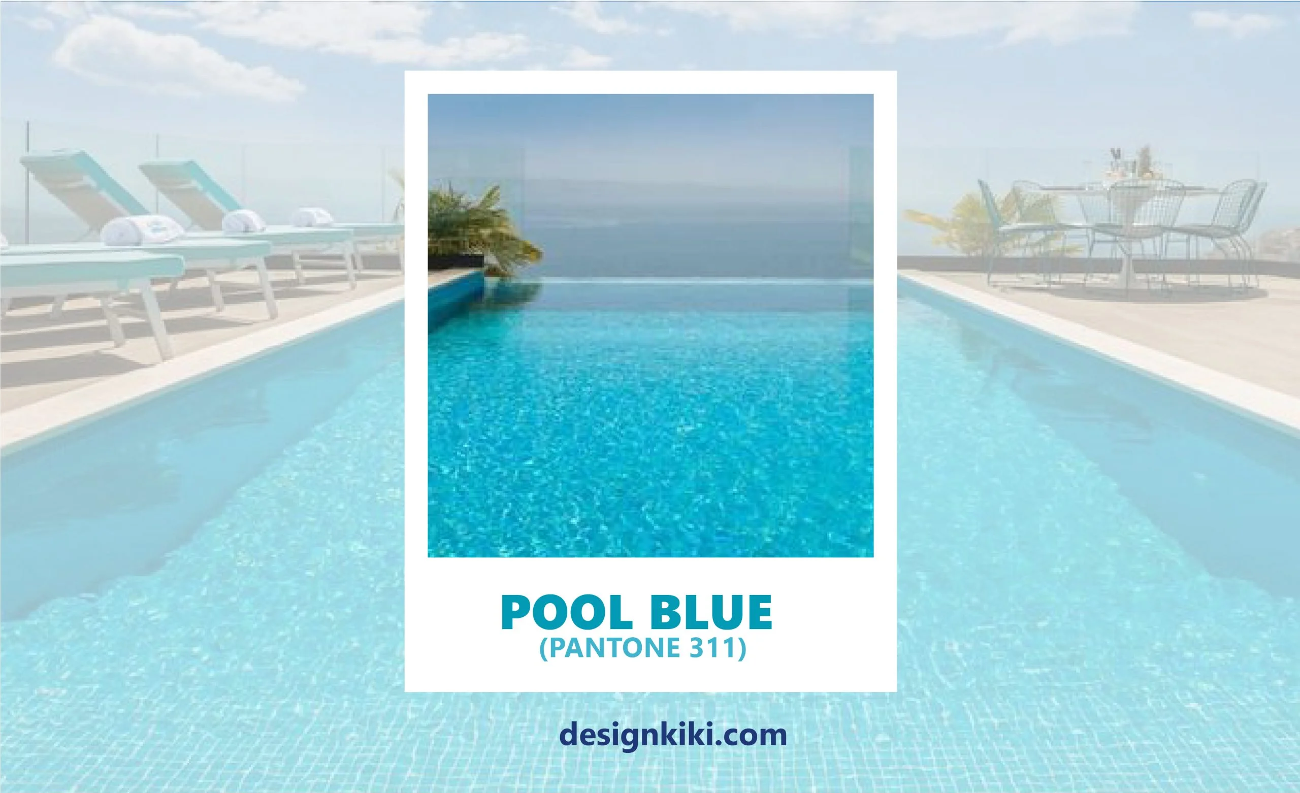
Pool blue is a sublime tone that induces a sense of appeasing tone. It can be used by brands to make customers feel relaxed and comfortable. Pool blue, smoked beige, and white form an exciting color palette.
4. Sky blue (PANTONE 2915)
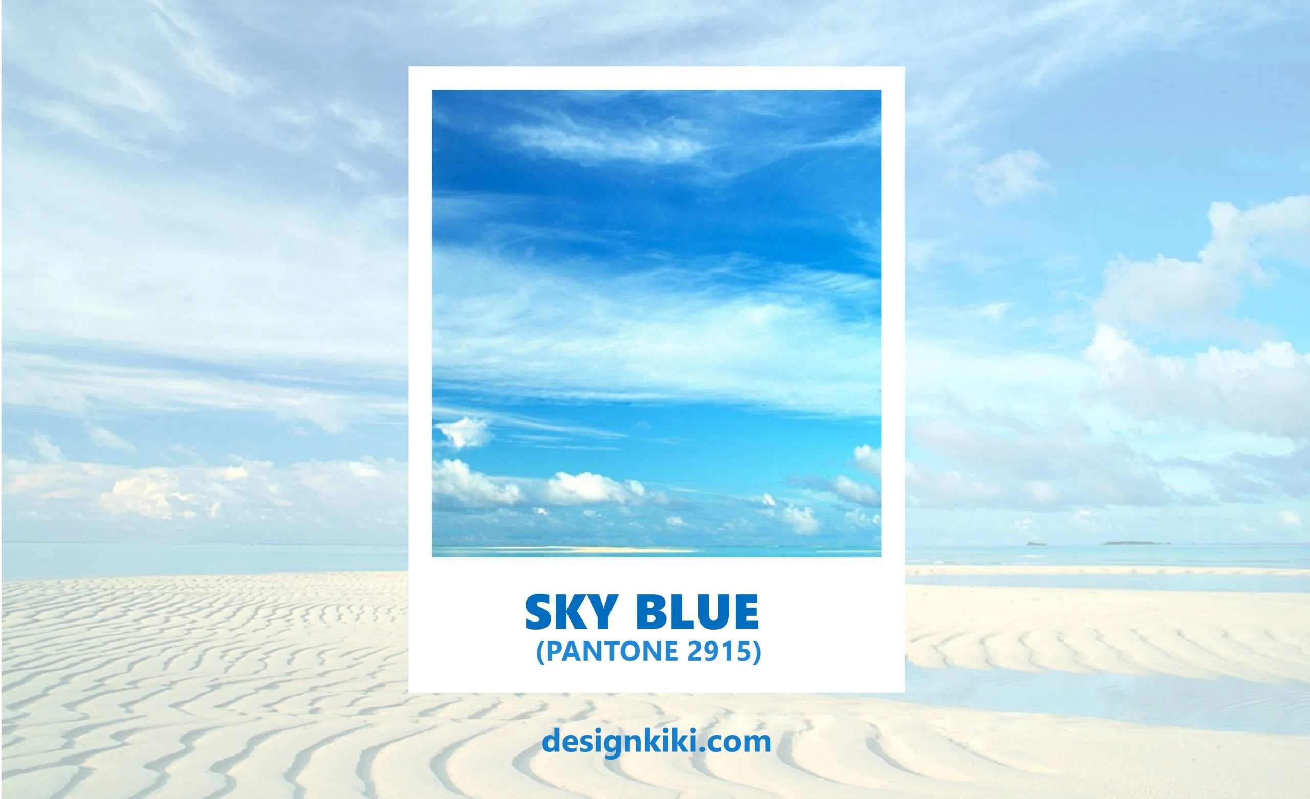
Sky blue is a placid and the most commonly used shade of blue. It can be used by companies to give customers a reassuring and uplifting experience. Sly blue can be used with colors like dusky pink and beige to form a charming color palette.
5. Nighttime blue (PANTONE 294)
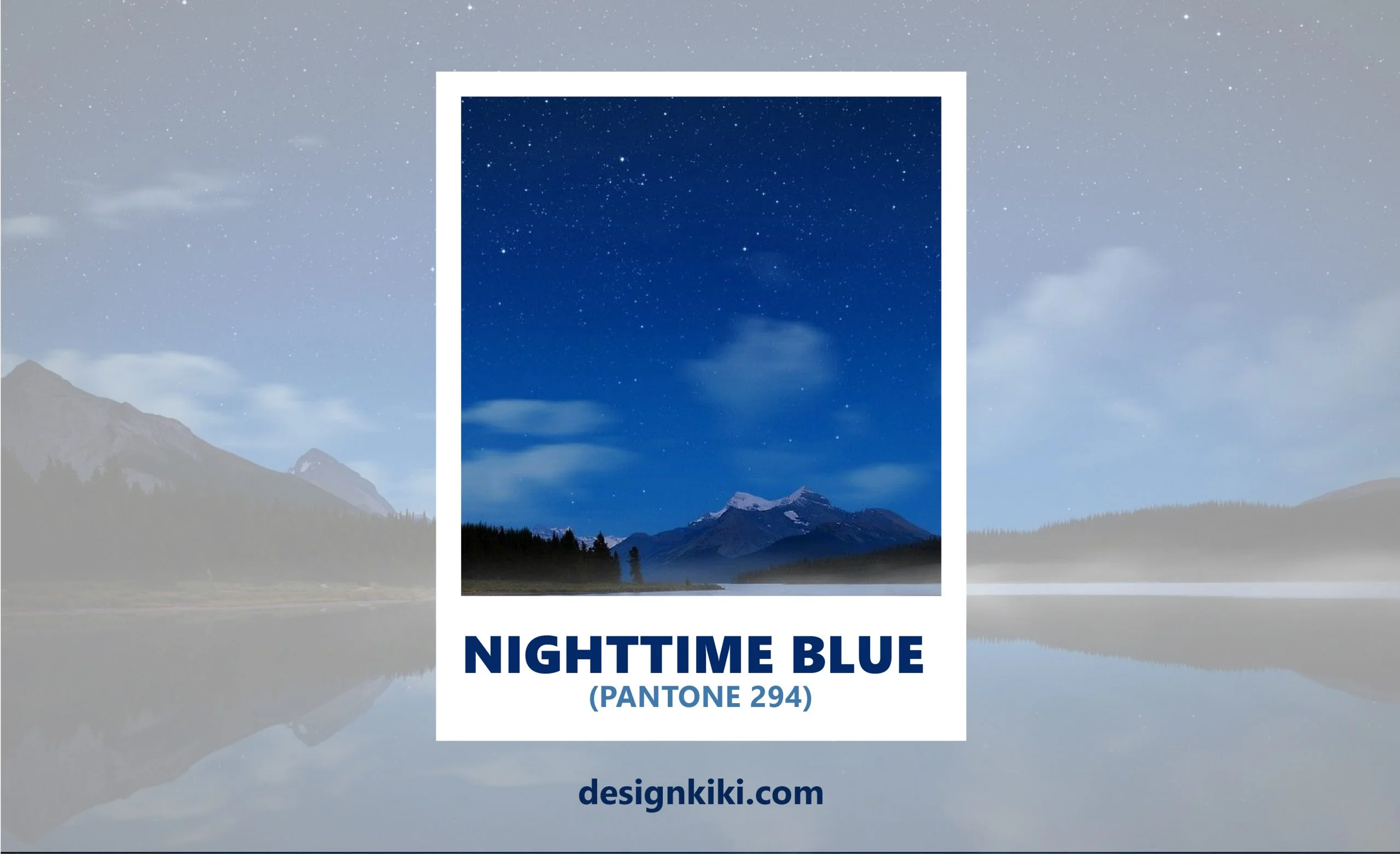
Nighttime blue is a deep shade of blue. It is as magnificent a color as the night sky. This color can be neutralized by using black and smoked grey in a color palette.
6. Teapot blue (PANTONE 284)
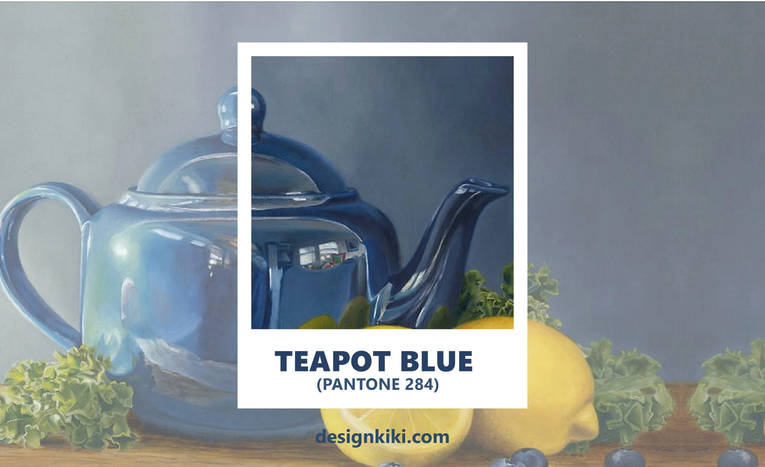
Teapot blue is an electrifying shade that catches the eyes very quickly. It can be used by companies in their billboards, flyers, and other advertising platforms to attract attention. Teapot blue, white, and sea green can be used together to form an amazing color palette.
7. Ocean Blue (PANTONE 300)
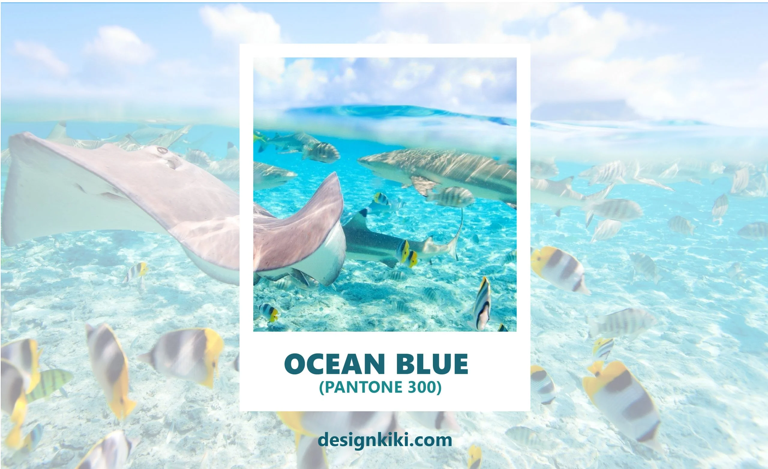
Ocean blue is a ravishing color that has the calming effect of the ocean. This color can be used by brands to bring tranquility to the customers. Ocean blue can be used along with colors like peach and sandstone.
8. Cornflower blue (PANTONE 312)
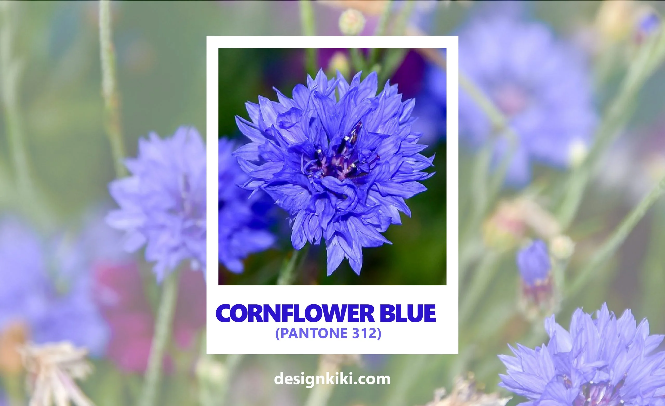
Cornflower blue is a divine color. It can be used on websites, especially for shopping and retail ones, because it induces trust and confidence in the customers. Cornflower blue can be used along with colors like lime green and bone white to form a beautiful color palette.
9. Bluebonnet Blue (PANTONE 2685)
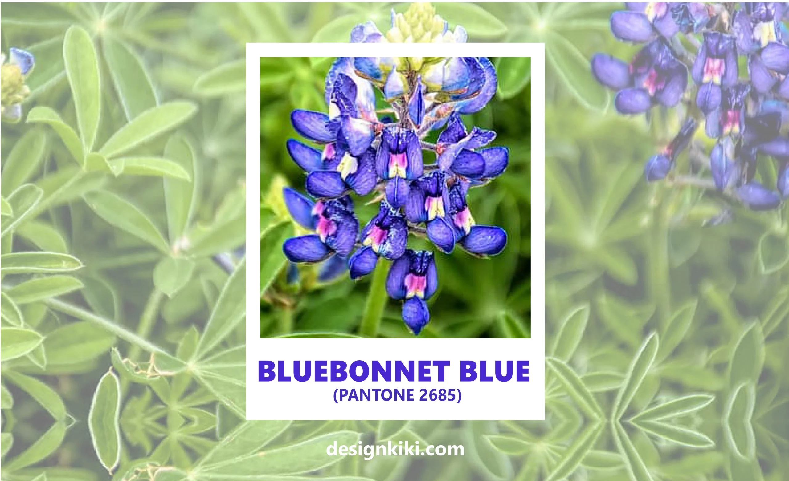
Bluebonnet blue is a shade that falls in between purple and blue. It is an enchanting color that can set a heavenly tone for any brand. Bluebonnet blue can be used with colors like lilac and off-white for branding purposes.
10. Classic blue (PANTONE 19-4052)
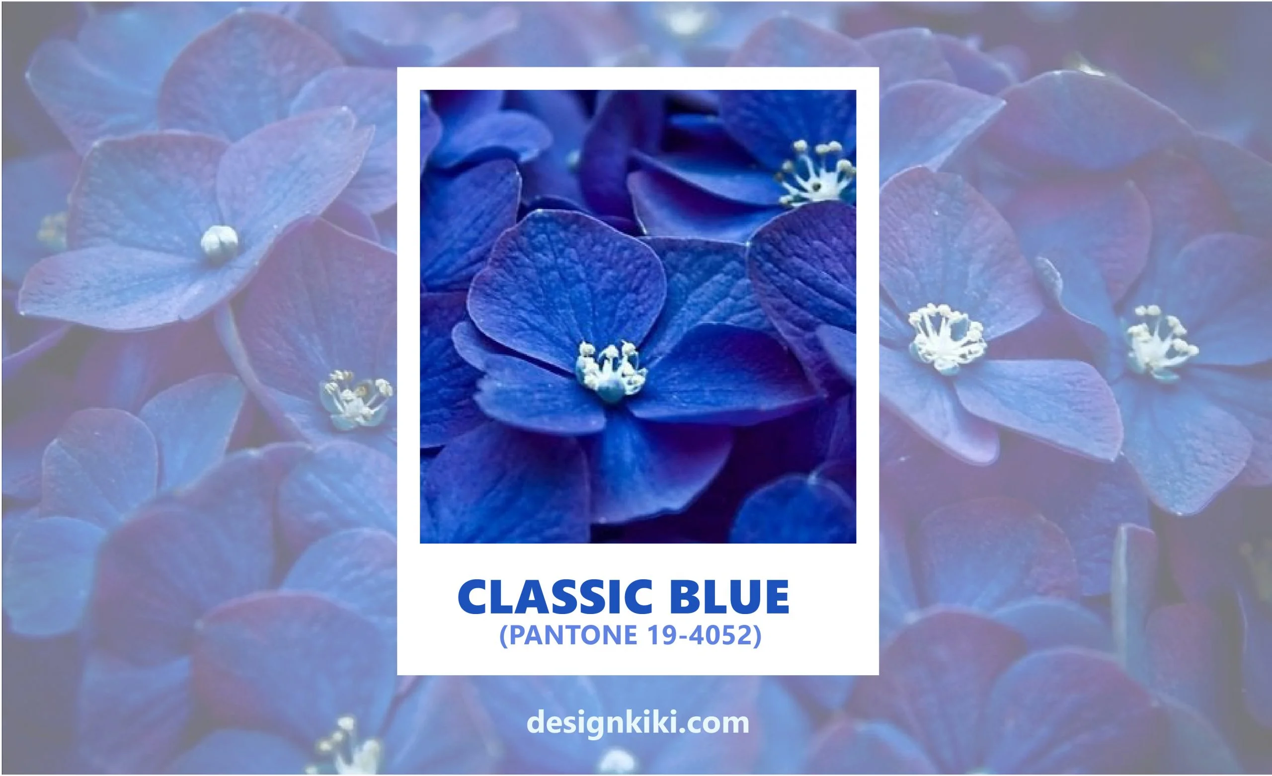
Classic blue was the Pantone color of the year for 2020. It signifies tranquility and peace. It is a poised color that signifies simplicity and elegance. Classic blue can be used by brands to instill trust in the company. It can be used with colors like cornhusk beige and monument grey to form a very soothing color palette.




Leave a Reply