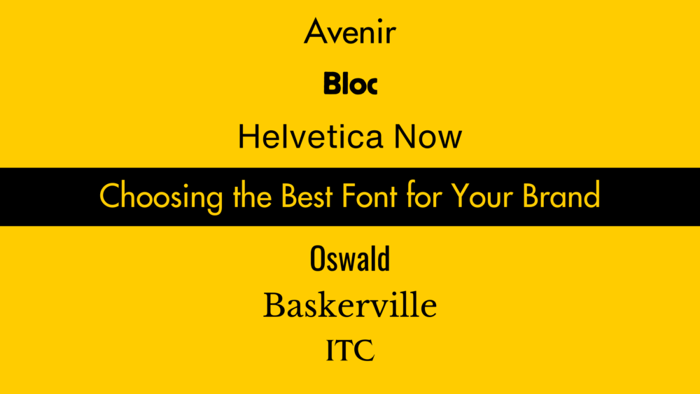
When it comes to branding, every detail matters. The color palette, logo design, and even the choice of fonts play a pivotal role in shaping the identity of your brand. But wait, what’s the best font for your brand? Is there a universal solution to this question? Well, it’s not as straightforward as it might appear. Fonts are more than just letters; they convey a message, set a tone, and establish a visual identity.
In this article, we’ll delve into the world of fonts and explore what makes a font the “best” for your brand. We won’t provide a one-word solution, but we will equip you with the knowledge and tools you need to make an informed decision about the font that aligns perfectly with your brand’s personality and goals.
So, let’s embark on this typographic journey as we uncover the secrets of selecting the best font for your brand. I’m your guide, and together, we’ll navigate through the fascinating realm of typography to help you make the right choice that will leave a lasting impression on your audience. Welcome to the world of fonts, and let’s begin!
Lesson One: Why Fonts Matter in Branding
In today’s digital age, fonts have become an integral part of branding, and their significance is greater than ever before. Brands, regardless of their size, now encompass a wide range of digital experiences that heavily involve text. From the text you see on your favorite Instagram posts to the labels on website navigation buttons and apps, fonts are everywhere. But choosing the right font goes beyond personal preference; it’s a strategic decision with significant implications.
Here’s why fonts matter in branding:
1. Consistency Across Platforms: When you pick a font for your brand, it needs to work seamlessly across various platforms, including different apps, operating systems, and web browsers. Not all fonts are universally supported, and using the wrong one can lead to inconsistent branding.
2. Licensing Costs: Many fonts come with licensing fees, meaning you have to pay to use them legally. These costs can add up, especially for large companies with extensive digital presence. This expense can be avoided by creating a custom font.
3. Brand Identity: Fonts play a crucial role in establishing and reinforcing your brand’s identity. They convey the tone, personality, and values of your brand to your audience. The right font can help you connect with your target market effectively.
4. Customization: To maintain a unique and distinguishable brand, some companies opt to create their custom fonts. This ensures that your font aligns perfectly with your brand’s visual identity and sets you apart from the competition.
5. Industry Trends: Branding is an ever-evolving field, and keeping up with trends is essential. Many notable brands, including CNN, Apple, Google, IBM, Coke, the BBC, Samsung, Warner Brothers, and YouTube, have recognized the importance of custom fonts in staying current and relevant.
In today’s branding landscape, bespoke fonts have become a standard element, allowing brands to craft a cohesive and memorable visual identity. So, as we dive deeper into the world of fonts and their role in branding, remember that the font you choose can significantly impact how your audience perceives your brand. The journey to discovering the best font for your brand continues, so stay tuned for more insights and tips on making the right choice.
Lesson Two: Lessons from Bespoke Fonts
When it comes to fonts, you don’t need to break the bank by commissioning your custom typeface, but there are valuable lessons to be learned from brands that have taken the plunge. Let’s explore two inspiring examples that illustrate the power of a well-chosen font.
1. Warner Brothers Sans: Preserving a Legacy

In 2019, Warner Brothers, the iconic film studio, underwent a massive rebranding effort that included the introduction of a bespoke font called “Warner Brothers Sans.” This font was not just a casual choice; it was meticulously crafted to pay homage to the brand’s rich history.
Inspired by the elongated letters in the studio’s renowned shield logo, the design agency Pentagram remastered these letters for the digital age. The result was a font where each letter echoed the brand’s legacy. For instance, the R and the P in Warner Brothers Sans resembled the B in the shield logo, and the W and the M mirrored the wedges in the shield’s W.
Every character in this bespoke font radiates the classic, cartoonish quality that Warner Brothers is known for. This example demonstrates that a well-thought-out font can not only reflect a brand’s history but also create a cohesive visual identity that resonates with its audience.
2. Airbnb’s Cereal: Embodying Playfulness and Flexibility
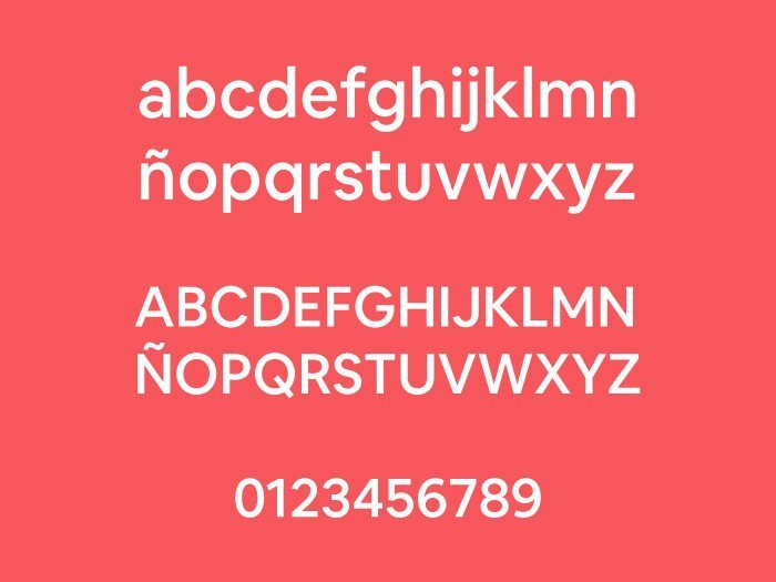
In 2018, Airbnb introduced its bespoke font named “Cereal.” The name alone is a nod to the company’s origins, as it’s closely tied to the idea of an air mattress bed and breakfast. But the creativity doesn’t stop there.
The letters in Cereal are designed to appear as if they are scattered and tilted, resembling letters floating in a bowl of milk. Each character exudes playfulness and friendliness, featuring rounded dots on lowercase i’s, periods, and other punctuation marks. Moreover, the font prioritizes legibility, with widened grooves in the lowercase n and r.
What sets Cereal apart is its adaptability. This bespoke font offers a wide range of weights, making it readable in small spaces and sizes, as well as on larger billboards.
These two examples, Warner Brothers Sans and Airbnb’s Cereal showcase how custom fonts can be purpose-built to align perfectly with a brand’s vision and goals. While existing fonts might offer a similar look, the investment of time and money in crafting these bespoke fonts has proven to be well worth it. These brands have demonstrated that a tailored font can be a powerful tool in conveying their unique identity and making a lasting impression on their audience.
As we continue our journey to discover the best font for your brand, keep these lessons in mind. Customization can be the key to setting your brand apart in a crowded market and ensuring your visual identity remains consistent and unforgettable. Stay tuned for more insights and guidance on finding the perfect font for your brand.
Lesson Three: How to Choose an Existing Font
Selecting an existing font for your brand or project is a crucial decision, and it requires careful consideration. Below, you’ll find some valuable guidance to assist you in making the correct decision:
1. Match the Character of Your Brand:
- Pay attention to the characteristics of fonts, such as roundness, crispness, grooves, dots, and sharp edges.
- Serif fonts, with their flicks and curves (like Addington CF and Abagnale Typeface), offer a classic and timeless feel.
- Sans-serif fonts (like Deutschlander and Prox typefaces) are sleek and modern, perfect for a clean and contemporary look.
- Consider pairing fonts for added versatility. For example, using a wide sans-serif for logos and a serif font for headings and body text.
2. Look for a Range of Weights and Styles:
- Ensure the font you choose offers various weights and styles, from thin to bold.
- Flexibility is crucial in today’s diverse digital landscape, where your text may appear on different screen sizes and in various contexts.
- Italic versions in all weights are essential for emphasizing words or titles and adding expressiveness to your text.
- Consider fonts with condensed and widened versions to adapt to different design needs.
3. Check for All Characters:
- Verify that the font includes both upper and lowercase characters, numbers, punctuation marks, and symbols you may need.
- Don’t assume all fonts come with these characters; it’s best to double-check.
4. Ensure Web Safety:
- Not all fonts are pre-installed on all devices, so it’s vital to choose a web-safe font.
- Check if the font is web-safe in the font library you’re using or refer to resources like HubSpot’s ultimate list of web-safe fonts.
- Avoid the disappointment of your chosen font being replaced by a generic one on users’ devices.
5. Prioritize Legibility and Accessibility:
- Ask yourself: Can people read the font easily?
- Fonts with features that improve legibility, such as well-defined grooves, curved cutouts, and clean strokes, are preferable.
- Consider diverse audiences, including those with poor vision or neurodivergent individuals.
- Test the font’s legibility by having someone read the text in various sizes, from large to small.
In the end, the “best font” isn’t a one-size-fits-all solution. It could be Helvetica, Gill Sans, Tahoma, or any of the hundreds of options available. Some fonts have stood the test of time because they strike a balance between style, functionality, and flexibility. Familiarity with standardized fonts can also contribute to their effectiveness. Remember that the font you choose plays a crucial role in conveying your brand’s identity and message, so take your time to explore and find the one that aligns best with your goals. Your font choice can leave a lasting impression on your audience and contribute to your brand’s success.
Lesson Four: What Is the Best Font for Your Brand?
In the quest for the best font, the answer lies in understanding what suits your unique needs and brand identity. Let’s summarize the key considerations:
1. Match Your Brand’s Character:
- Choose a font style that aligns with your brand’s personality. Consider factors like roundness, crispness, grooves, and sharpness.
- Serif fonts convey a classic and timeless feel, while sans-serif fonts offer a sleek and modern look.
- Decide on the overall style that best reflects your brand’s character.
2. Versatility in Weights and Styles:
- Ensure the selected font offers a range of weights and styles, from ultralight to extra black, italic, wide, and condensed.
- Remember that you may use this font for years and build a communication hierarchy around it, so versatility is key.
3. Comprehensive Character Set:
- Before committing to a font, verify that it includes all the characters and cases you need. Overlooking this detail could lead to complications down the line.
4. Web Safety Matters:
- Make certain that your chosen font is web-safe, meaning it can be viewed on various devices, operating systems, and web browsers without issues.
5. Legibility and Accessibility:
- Prioritize legibility to ensure your font can be easily read at any size, by people of all abilities, from small watch faces to large cinema screens.
In the end, the best font for you is the one that ticks all these boxes and meets the specific requirements of your brand or project. Remember that fonts are not just letters; they are powerful tools that convey your brand’s identity and message. Take the time to explore and find the font that resonates best with your audience and aligns perfectly with your brand’s goals. Your font choice can be a key factor in creating a lasting and memorable impression. So, armed with these insights, go forth and make your font selection wisely, and may your brand’s visual identity shine.
Conclusion: Finding Your Perfect Font
In the world of design and branding, choosing the right font is an artful endeavor. It’s about more than just picking letters; it’s about crafting an identity. Throughout our journey to discover the best font for your brand, we’ve learned that the ideal choice aligns with your brand’s character, offers versatility, includes a comprehensive character set, is web-safe, and prioritizes legibility and accessibility.
Ultimately, the best font is the one that encapsulates your brand’s essence and effectively communicates your message to your audience. It’s a font that will stand the test of time, from the tiniest digital screens to the grandest billboards. So, as you embark on your typographic adventure, armed with knowledge and insight, remember that your font choice is a vital element in leaving a lasting and positive impression on your audience. Choose wisely, and let your brand’s unique voice shine through every character.

Leave a Reply