Yellow is one of the jolliest and pep colors one can come across. It has been used by companies in their logos for ages. The yellow color can add radiance to any monotonous composition.
However, with the variety of shades and tones available, there is a lot of confusion about the application of these shades. But don’t worry because we have curated a list of the ten most popular shades of yellow along with a unique set of colors they complement.
Yellow Iris (PANTONE 11-0622)
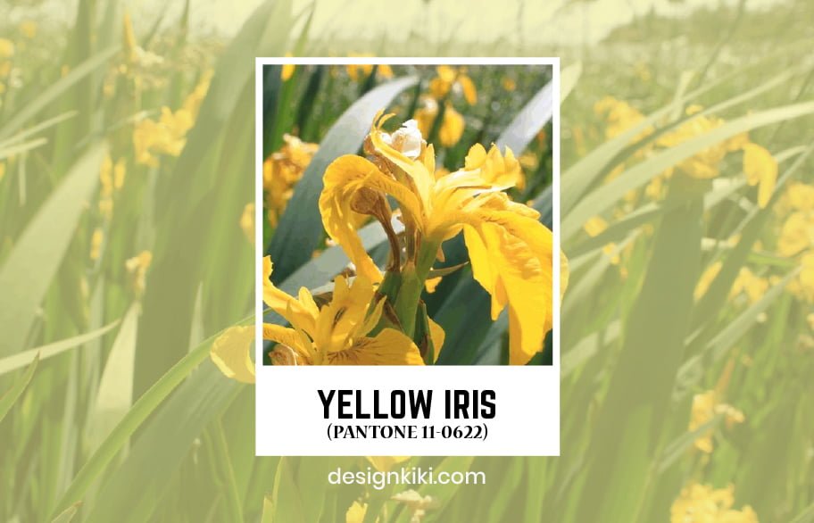
Yellow Iris is a cool and breezy color that can give any brand a summery look. This color can add a lively feel to your logo as well as your website. You can use yellow iris with colors like peach bud and gardenia to revitalize your brand.
Lemon Zest (PANTONE 13-0756)
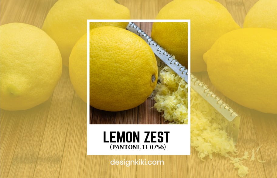
Lemon zest is a bright shade of yellow. It is an easy-going color that can be used by brands to spark up easiness. Lemon zest can be used with apple green and ochre to form a classy yet cheery color palette.
Solar Power (PANTONE 13-0759)
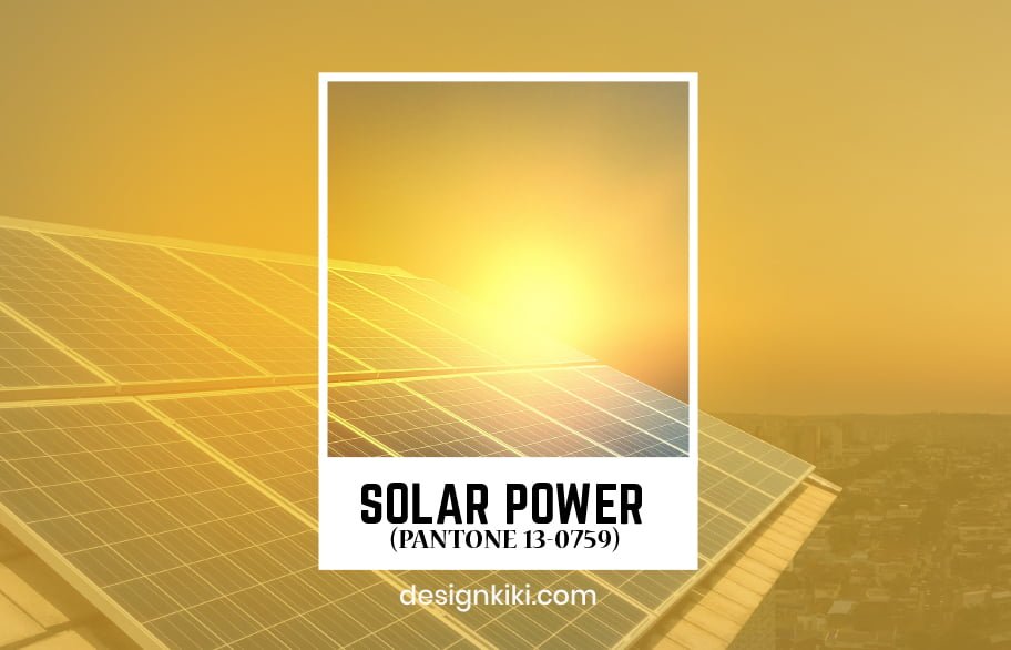
Solar power is a dazzling color that instantly brightens up any composition. It can be used by brands to catch the customers’ attention and spark enthusiasm within the employees. Solar power looks good with dusky shades of beige.
Empire Yellow (PANTONE 14-0756)
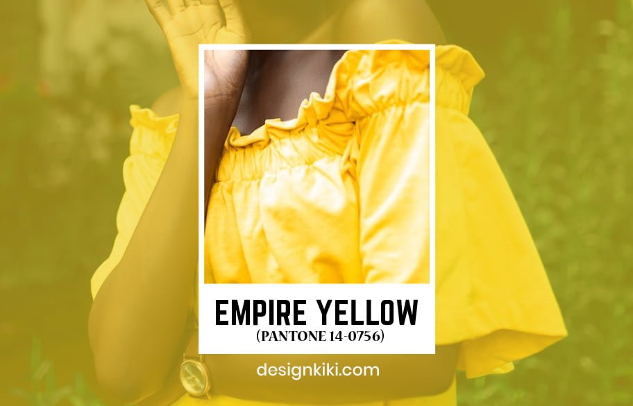
Empire yellow is a vivid color that can illuminate any design it is used in. It is often used by food brands to attract customers. Empire yellow can be used with light tones of sepia for branding purposes.
Yolk Yellow (PANTONE 14-0846)
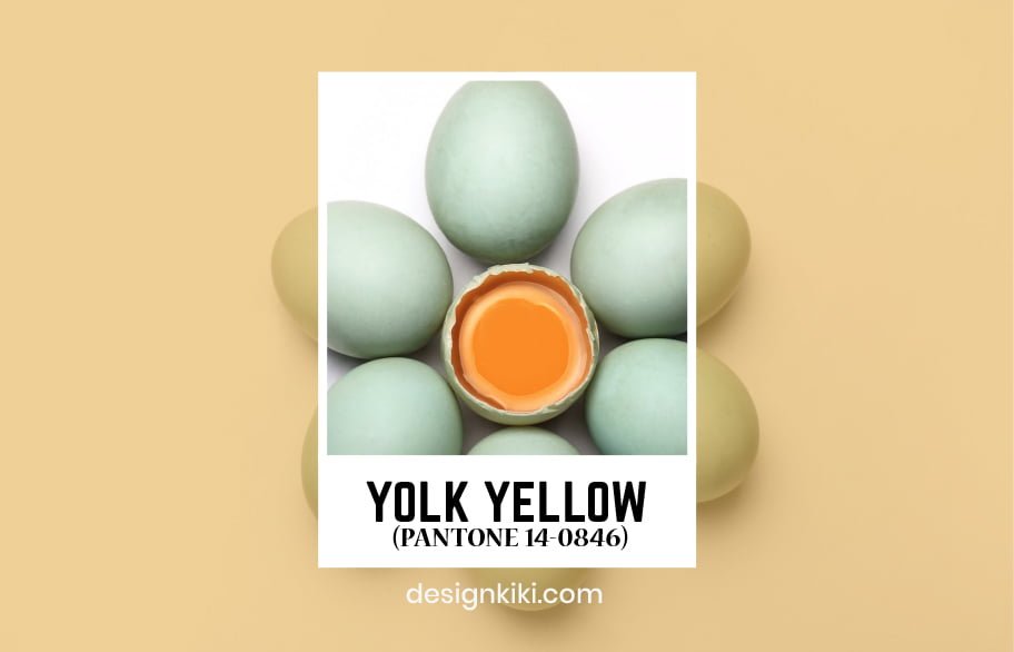
Yolk yellow is a vibrant color that adds radiance to a color palette. Snow White, sky blue, and yolk yellow can be used together for advertising purposes of a brand because the color palette is aesthetic and eye-catching.
Primrose Yellow (PANTONE 13-0755)
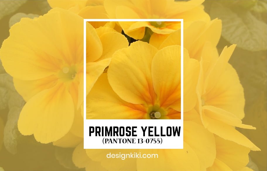
Primrose yellow is a lucid color that reminds people of fresh little primrose flowers. It can be used in the flyers, invites, websites, and other creatives of a brand. Pale dogwood pink, hazelnut, and primrose yellow form a refreshing color palette.
Cadmium Yellow (PANTONE 15-1054)
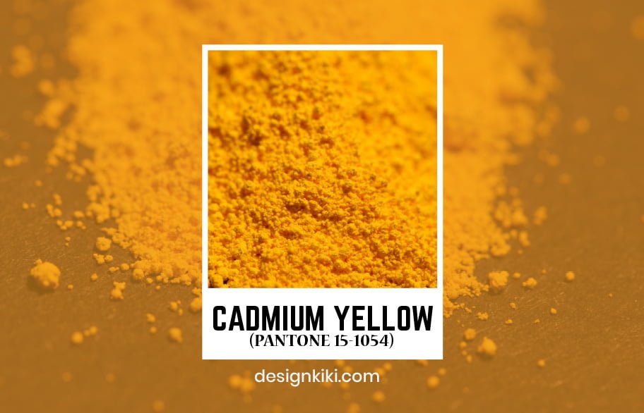
Cadmium yellow is a muted tone of yellow. It can be used in branding along with linen, peach, and beige. Cadmium yellow can add a friendly fashion to your brand.
Spruce Yellow (PANTONE 17-1040)
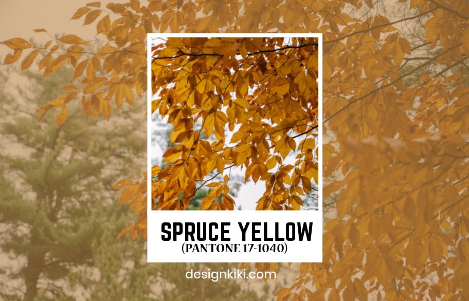
Spruce yellow is a color that can remind people of beaming spruce fields. It can be used along with colors like cherry red and golden lime green to form an appealing color palette for brands.
Vibrant Yellow (PANTONE 13-0858)
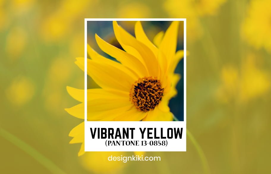
Vibrant yellow is a striking color that has been used by companies like restaurants and food chains. The vibrancy of this shade of yellow can be neutralized by colors like grey and off-white.
Safety Yellow (PANTONE 13-0630)
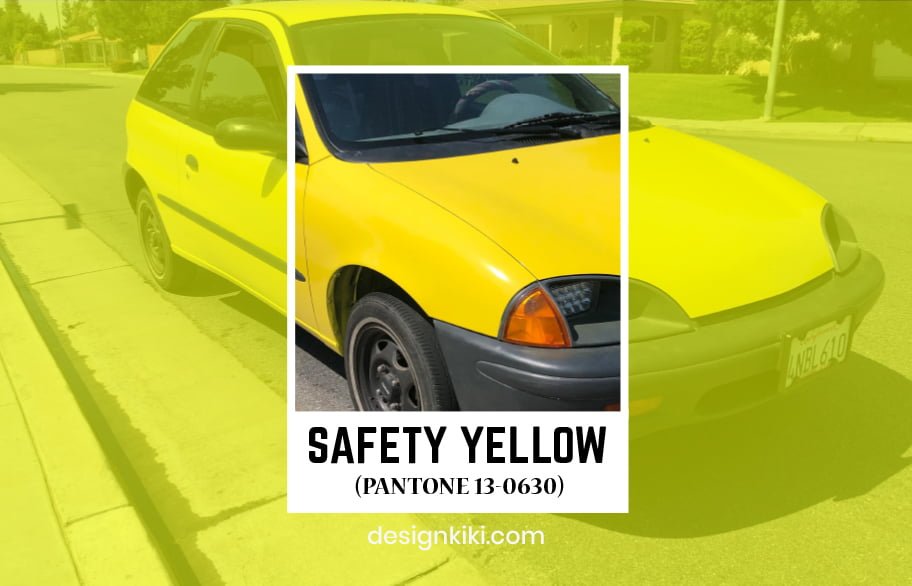
Safety yellow is a very fluorescent color. It can be used on websites to display important information. Safety yellow can be used with colors like diva pink and atomic blue to play down the brilliance of the color.



Have you ever considered writing an ebook or guest authoring on other blogs?
I have a blog based upon on the same information you discuss and would really like to have you share some stories/information. I know
my visitors would appreciate your work. If you are even remotely interested, feel free to shoot me an e mail.