
When it comes to designing graphics, one of the essential elements is color. How you combine colors can make a big difference in the impact of your design.
Colors have the ability to convey emotions, capture attention, and leave a lasting impression on the audience. However, selecting the right color combinations is not a simple task. It goes far beyond the color wheel and generic choices.
It’s essential to generate color combinations that work well. This can be achieved through three clever methods that go beyond basic color theory.
Method 1: Color Analogies
The first method involves generating color palettes based on analogies or associations with concepts, ideas, or other elements. This method is useful when you want to evoke specific emotions or convey a theme or symbolic meaning through color.
Let’s understand the method with an example to help you understand how it works.
What is Color Analogy?
Color analogies allow designers to tap into the emotional and psychological impact of different colors. Each color has its own personality, and understanding these associations can help you craft the perfect color palette for your project.
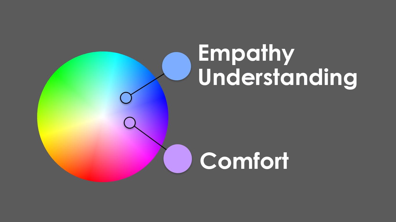
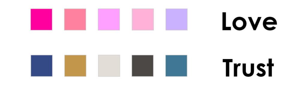
For example, colors like soothing blues and gentle pastels are often associated with comfort, understanding, and empathy. If you aim to create a design that conveys these emotions, these colors would be excellent choices.
How to Choose a Color Palette?
The power of this method lies in its flexibility. The colors you choose should align with the emotions and themes you want to evoke.
If your project is centered around mental health awareness, using soft, comforting blues as your base color can signify empathy and understanding. You can complement this with pastel shades, like light lavender or soft pink, to enhance feelings of comfort and compassion. Adding a touch of light green can represent growth and hope, which are powerful symbols in this context.
The result is a color palette that communicates a gentle, nurturing atmosphere, while also injecting a sense of hope and renewal.
How Does the Audience Matter When Choosing Color Combinations?
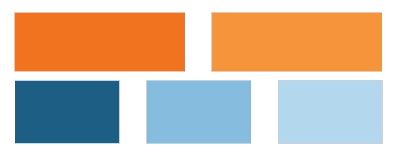
Designing for different age groups can require adjustments to your color palette. If your target audience is young teenagers, you might want to use brighter, bolder colors like orange to trigger a sense of action and change.
It’s essential to consider how emotions and color choices resonate with your audience.
Seeking Feedback and Ensuring Accessibility
One valuable tip is the importance of seeking feedback from colleagues, clients, or target audience members. Their perspectives can help you refine and enhance your color palette.
Additionally, it is important to always prioritize the accessibility of your design, particularly when it comes to digital platforms. Ensure that the text is easily readable and that your color choices follow accessibility standards.
Method 2: Branding and Sustainability
Branding is a crucial aspect of design, and the second method we’ll explore is tailored for branding and rebranding projects. The goal here is to align color choices with the brand’s values and principles, creating a visual identity that reflects the brand’s ethos.
Analyzing Your Brand or Niche
Before selecting colors, it is important to analyze the current color scheme of your brand or the predominant colors in your niche. Take a close look at your brand’s values and principles.
Suppose you are working on a sustainable fashion label. Do the existing colors reflect a commitment to sustainability and environmental friendliness?
Choosing Your Palette
When working on a sustainable fashion label, for instance, you might consider colors like natural greens, earthy browns, and calming blues, which resonate with eco-friendliness and eco-consciousness.
However, your choice doesn’t have to be conventional.
Standing Out from the Crowd
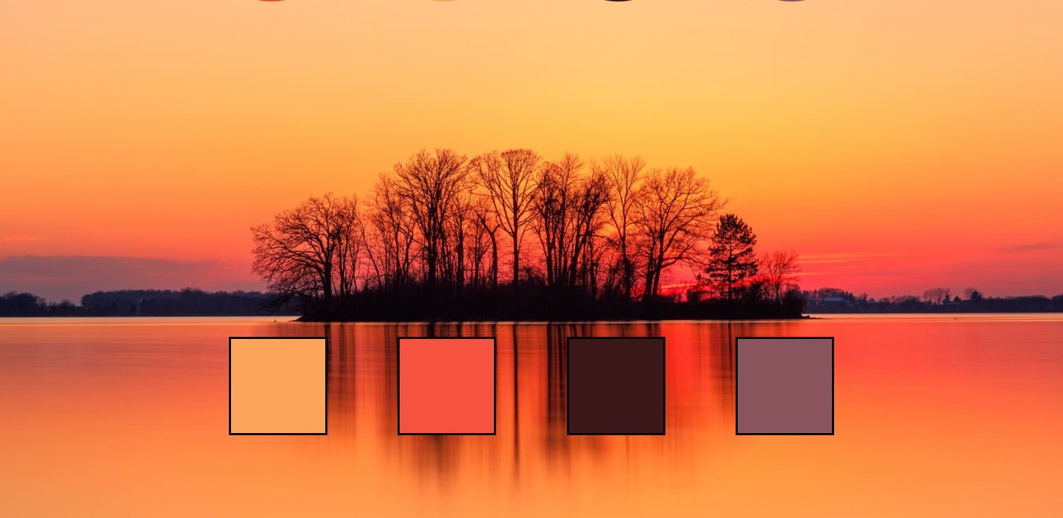
In highly saturated niches, you might want to stand out by choosing unconventional colors.
Instead of the expected earthy tones, you could opt for a vibrant sunset orange as your base color. This color symbolizes energy and change, reflecting your brand’s innovative and forward-thinking approach.
Gathering Feedback
As with the first method, gathering feedback is vital. It ensures that your adapted colors resonate with the intended audience and effectively convey the desired message.
Branding is a long-term commitment, so it’s crucial to make informed choices.
Method 3: Synesthesia-Inspired Color Selection
The third method is a bit different and creative. It involves an unconventional approach to associating color combinations with sensory experiences.
This method creates emotionally relatable and effective designs by drawing inspiration from music, nature, and more.
What is Synesthesia-Inspired Color Selection?
Synesthesia is a phenomenon where one sensory experience triggers another. In the context of design, it involves associating colors with sensory experiences and emotions.
This method is particularly creative and allows designers to create unique and emotionally resonant color palettes.
Applying Synesthesia to Jazz Music
Let’s consider an example involving a jazz music festival. To create materials for such an event, you want to tap into the emotions and sensations associated with jazz music.

Associating Colors with Music
Think about the colors that come to mind when you listen to jazz. Deep blues and cool purples might be associated with the peaceful and relaxed moments of the music, while vibrant reds or fiery oranges may evoke the excitement of a jazz solo.
Developing a Color Language
As a designer, you can create a unique “language” for your project by associating specific colors with different aspects of the music. This could be the smooth melodies represented by cool blues or the improvisational solos reflected in energetic reds.
Building Your Palette
Once you have your “language,” you can start building a color palette for your project. You may choose a base color and add complementary colors based on your associations.
For a jazz festival, you might use fiery reds and oranges as accent colors to represent the excitement and spontaneity of the music.
Documenting Your Associations
To make this method effective, it’s crucial to document your associations between sensory experiences and colors. This not only serves as a reference for your current project but also for future endeavors.
Exploring the Boundaries of Color Selection
Examining the above example hints at the creative potential of synesthesia-inspired color selection.
Designers can push the boundaries and experiment with different shades and tones to create harmonious palettes that connect visually with the emotions and unique experiences of their chosen niche.
Conclusion
The choice of colors is not random but rather a strategic decision that can make or break a project. Understanding the methods and principles discussed in the article provides designers with the tools to create visually striking and emotionally resonant color combinations.
Whether you are aiming to evoke specific emotions, align with brand values, or draw inspiration from sensory experiences, the art of color selection is a cornerstone of effective design.
With these methods in your toolkit, you can unlock the true power of color combinations in design and take your projects to new heights.
Remember, the art of color selection is a dynamic and creative process that can breathe life into your designs and captivate your audience.

Leave a Reply