
Color has always been one of my favorite subjects to talk about. As an artist, I believe that color is the greatest gift to humankind and the most emotive, perhaps. My fascination with color goes back to my childhood, I could never be thankful enough for the rainbow-colored balloons the bright yellow sunflowers, or even the 64 shades of beautiful crayons my dad would buy me. However, as I grew up to study art and design year after year, I realized that color is not as simple as it seems to the eye.
With colors, you can set a mood, attract attention, or make a statement. You can use color to energize or to cool down. By selecting the right color scheme, you can create an ambiance of elegance, warmth, or tranquility, or you can convey an image of whimsical youthfulness.
Color can be your most potent branding element if you learn to use it effectively. And that is why I have come to believe that color is a science, as complex as any and an understanding of it is a highly developed skill. And it is because of this very fascination with color, that I have seasoned for more than half of my life, that I choose to extensively and passionately write about it.
As I mentioned earlier, colors affect us in numerous ways, both mentally and physically. An intense red color has been shown to raise blood pressure, while a blue color has a calming effect. If we talk about design specifically, being able to use colors consciously and harmoniously can help you create spectacular results.
As designers, artists, and even businesses, we have a powerful ally in color. It can let us work towards several different goals. You can use it to strengthen or highlight an idea, to provoke an emotional response from the user or client, or to draw attention to a specific part of your design. This is, of course, in addition to making your design aesthetically pleasing to the eye.
But rather than going into the psychology of color and how it affects us again, I have chosen to go down a different road. Today I plan on dissecting the pillars or perhaps the foundation of the understanding of color- Color Theory.
The previous editions of this selection were quite a hit, so feel free to check them out, as well :
- HOW TO CHOOSE THE RIGHT COLOUR FOR BRANDING
- Understanding Color Psychology- How Color Affects Our Mind And Our Behavior
The color wheel
I’m sure we all know something about this term or have at least heard it here or there sometime in our lives. But let’s go into the depths of it. The color wheel or color circle is an essential tool for combining colors. The first circular color diagram was designed by Sir Isaac Newton in 1666.
The color wheel is designed so that virtually any colors you pick from it will look good together. Over the years, many variations of the basic design have been made, but the most common version is a wheel of 12 colors based on the RYB or the Primary Color model.
Traditionally, some color combinations are considered especially pleasing. These are called color harmonies or color chords, and they consist of two or more colors with a fixed relation in the color wheel.
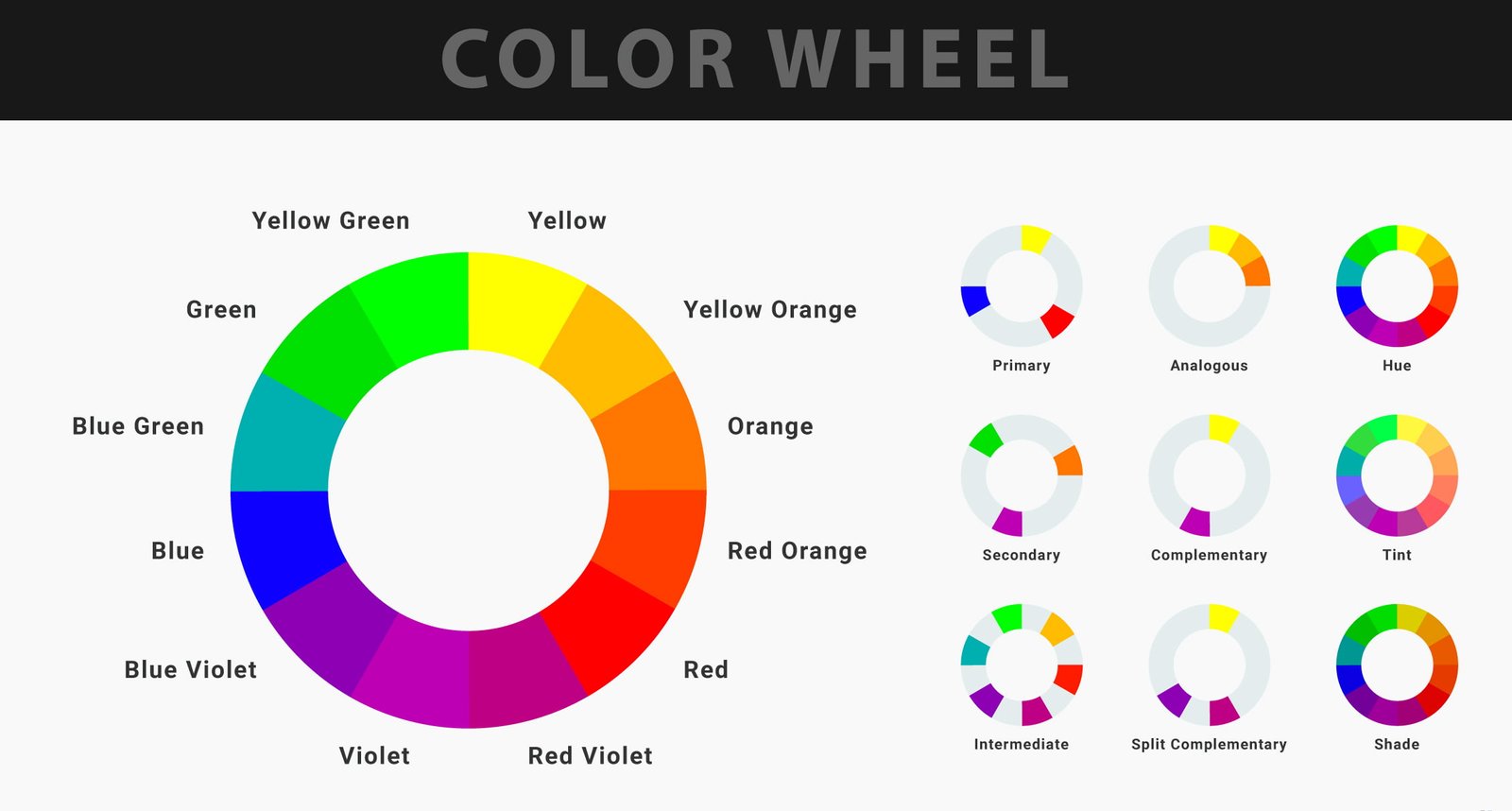
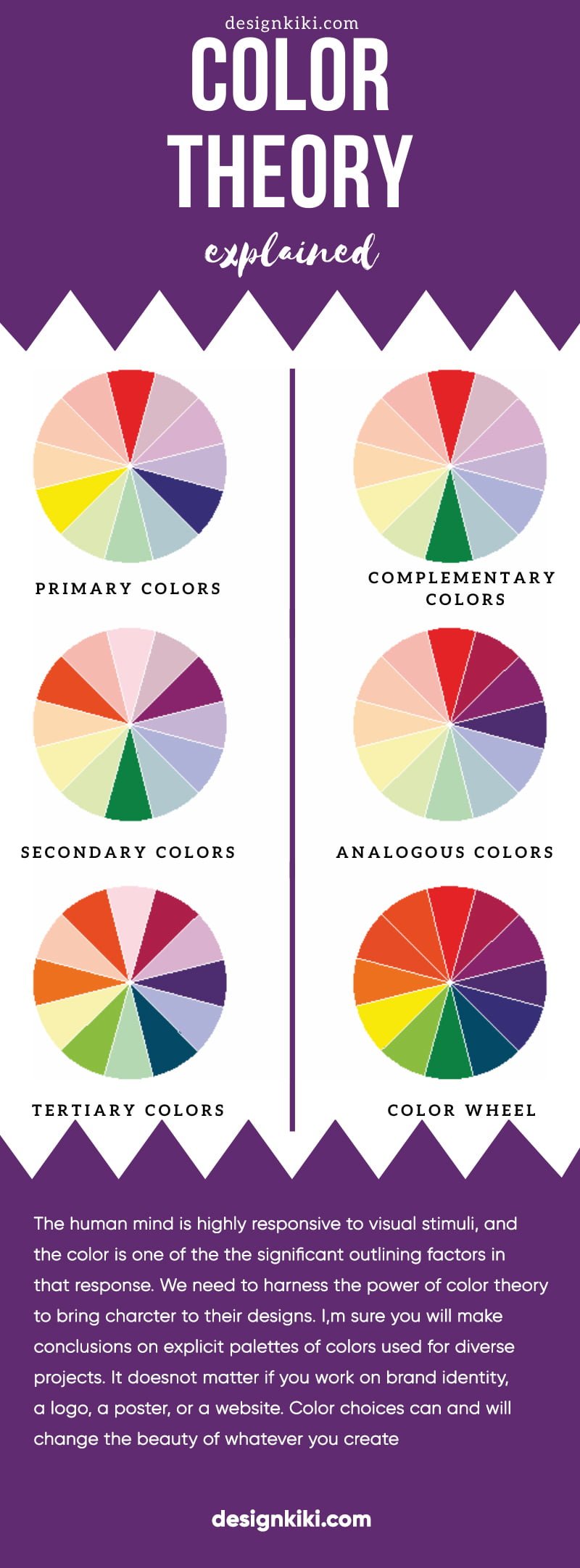
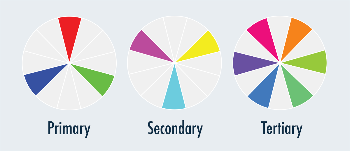
There are also some definitions or categories of colors based on the color wheel. Let’s start with a 3-part color wheel-
Primary Colors: Red, yellow and blue
In traditional color theory, which is used in paint and pigments, primary colors are the 3 pigment colors that cannot be formed by any combination of other colors. These three colors go on to become the basis of all other colors on the wheel. Merely stating, all different colors are derived from these 3 hues.
Secondary Colors: Green, orange and purple
These are the colors formed by mixing the primary colors.
Tertiary Colors: Yellow-orange, red-orange, red-purple, blue-purple, blue-green & yellow-green.
These are the colors formed by mixing a primary and a secondary color. That’s why the hue is a two-word name, such as blue-green, red-violet, and yellow-orange.
Let’s move on to some other categorizations of colors-
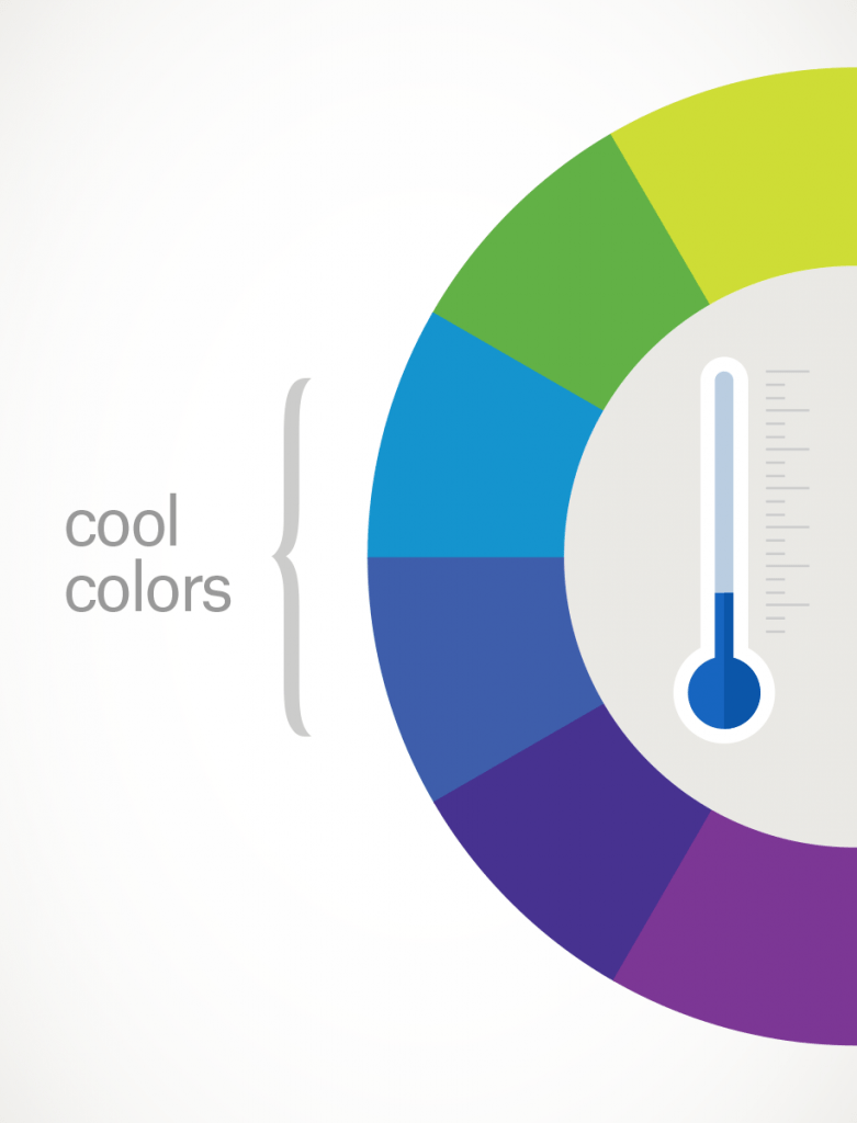
Warm and cool colors
in the study of color, the temperature is another vital consideration in the design. By distinguishing between warm, cool, and neutral colors, we possibly have the power to excite emotional responses in people. Warm colors are those with shades of yellow and red; cool colors have a blue, green, or purple tint; neutral colors include black, white, grey, beige, and sometimes brown. While these groupings hold in a general sense, emotional responses to colors can also be profoundly affected by gender, experiences, cultural associations, and other personal factors.
Speaking in terms of the feelings they evoke-
Warm colors are striking and energetic and tend to advance in space.
Cool colors give an impression of calm and create a soothing feeling.
Neutral colors are visually restful and do not distract.
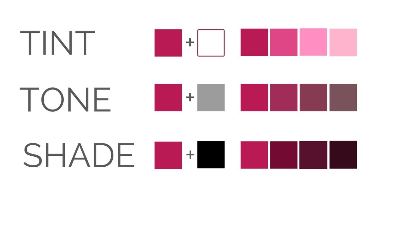
Shades, tones, and tints
This is where the confusion begins for most of us. If you think the terms shade, tone, and tint are synonyms of one another, you are wrong! Yes! These terms are often misused, although they express relatively simple color concepts. If a color is made lighter by adding white, the result is called a tint. If black is added, the darker version is called a shade. And if gray is added, the result is a different tone. For better understanding-
Tints – adding white to a pure hue
Shades – adding black to a pure hue
Tones – adding gray to a pure hue
I had mentioned this term earlier on this blog, but for your more solid understanding, I decided to describe it more readily. Harmony can be defined as a pleasing arrangement of parts, whether it be music, poetry, color, or even an ice cream sundae.
In visual experiences, harmony is pleasing to the eye. It engages the viewer, and it creates an inner sense of order, a discretion in the visual experience. When something is not harmonious, it’s either boring or chaotic. Let me try and put it another way- At one extreme is a visual experience that is so bland that the viewer is not engaged. The human brain will reject under-stimulating information. At the other height is a visual experience that is so overdone and exaggerated, so chaotic that the viewer can’t stand to look at it. The human brain rejects what it cannot organize, and what it cannot understand. The visual task requires that we present a logical structure. Color harmony delivers visual interest and a sense of order.
In summary, extreme unity leads to under-stimulation, and sheer complexity leads to over-stimulation. Harmony is a magnetic equilibrium.
Further, there are many schemes under color harmony, they are-
Analogous Colors-Analogous colors are any three colors that are side by side on a 12-part color wheel, such as yellow-green, yellow, and yellow-orange. Usually, these are chosen so that one of the three colors predominates. They usually match well and create serene and comfortable designs. Analogous color schemes are often found in nature and are harmonious and pleasing to the eye. Make sure you have enough contrast when choosing a similar color scheme. Choose one color to dominate, and a second to support. The third color is used along with black, white, or gray as an accent.
Complementary Colors– Complementary colors are any two colors that are directly opposite to each other on the color wheel, such as red and green and red-purple and yellow-green. These clashing colors create maximum contrast and maximum stability at the same time. The high contrast of complementary colors creates a vibrant look wherever they are used. However, this color scheme must be managed well, so it is not loud. These are tricky to use in large doses, but work well when you want something to stand out. Complementary colors are a poor choice for text.
Triadic Colors– A triadic color scheme incorporates colors that are evenly spaced around the color wheel. They form a triad or a triangle when you locate them on a color wheel. Triadic color schemes tend to be quite lively. To use a triadic harmony successfully, the colors should be carefully balanced – let one color dominate and use the two others for accent.
Split-complementary Colors– The split-complementary color scheme is a variation of the complementary color scheme. In addition to the base color, it uses the two colors adjacent to its complement. The split-complimentary color scheme is often the right choice for beginners because it is difficult to mess up.
Monochromatic colors- Monochromatic is a color scheme based on only one single color value. It uses different shades, tones, and tints of a hue, made by altering the saturation and brightness of the base color. Black, white, and grey colors are added and subtracted to create variants of the same hue.
Color and Design
The human mind is highly responsive to visual stimuli, and color is one of the significant outlining factors in that response. On both a conscious and subconscious level, colors carry meaning – not only in the natural world but also within the pretense of our culture. We need to harness the power of color theory to bring character to their designs. I’m sure you will make conclusions on explicit palettes of colors used for diverse projects. It does not matter if you work on brand identity, a logo, something for digital platforms, a poster, or a website. Color choices can and will change the beauty of whatever you create.
In the designers’ world, color is considered one of the most significant design elements. Many students struggle with following their real standing. They often underrate the power of color and stay utterly uninformed of how to use it. Every color, including black and white, has implications for design. You need to pick your colors carefully to enhance specific elements of the design and bring nuance to your message with the use of shade and tone this color scheme has the same sharp visual contrast as the complementary color scheme but has less tension.
For now, this is all I have to share about the ins and outs of color theory. If colors grab you as much as they do me, I have also written blogs on Color Psychology and Color in terms of branding. I’m sure you will like them. All things said and done, I hope that the colors of your life never fade away!

Leave a Reply