Your website is typically the client’s foremost interaction with you and your business. Creating a website is a serious job, and a poor one will affect your credibility. Do you see yourself associating with a company that has a poor website design? I think I’ve made my point. Using a generic template instead of building a tailored site is not an option if you want to be taken seriously.
We all know the importance of having a website, but do we know the crucial guidelines that we must follow while creating one? If you do not have a website and are planning to get one, you should know that several factors play a significant role in determining your website’s fate. And, here they are-
Clear Purpose
The point behind your website should be strong from the very first page. What are you offering? Are you selling a product or a service? Or are you marketing yourself and your proficiency? Whichever it is, this needs to be conveyed to your visitors. This will help the user engage with your website and attract the right kind of people. Do not forget about SEO. You do not want to go on without it.
Simplicity in Design

The design should always be as uncomplicated as possible while grasping interest. Complex designs typically lead to a bad user experience, which is not charming to potential clients. The use of font, colors, and text should be kept humble and harmonious throughout the website.
Yet, you don’t want the website to be generic either. Be careful of oversimplifying to the point of being bland and dull. There should be a right offset between an original and exciting design while staying modest and not going over the top with imagery and colors.
Easy to Navigate

The client must be able to locate whatever it is that they are looking for as promptly as possible. This is where UX design comes in. Visitors want efficiency and are not usually prepared to waste extra time steering through a finicky website. They will look elsewhere if it takes too long to find what they are looking for. For instance, finding your contact information should be easy; it should be right in front of the visitor’s eyes.
F-Shaped Reading Pattern
People tend to scan web pages in an F-shaped pattern. Visitors favor first reading in a horizontal movement for the initial lines and then browsing the page’s left side vertically. This means that the first lines of the pages will draw more attention from users, and notably, the first few words on the left.
You should use this information to benefit your website design. You should include your page’s most important messages in the first paragraphs to ensure they get attention. You can also use visible headlines and subheadings in bold and essential words that you wish users to pay more attention to in the first few lines.
Hierarchy

Systematizing the details of your site in order of importance is attributed to visual hierarchy. You may do this by size, color, contrast, style, or texture according to your preference. Your goal should be to set a focal point where the user’s attention will be drawn. Ensure that your viewers don’t miss out on the things you want them to see and remember.
Grid-based Layout
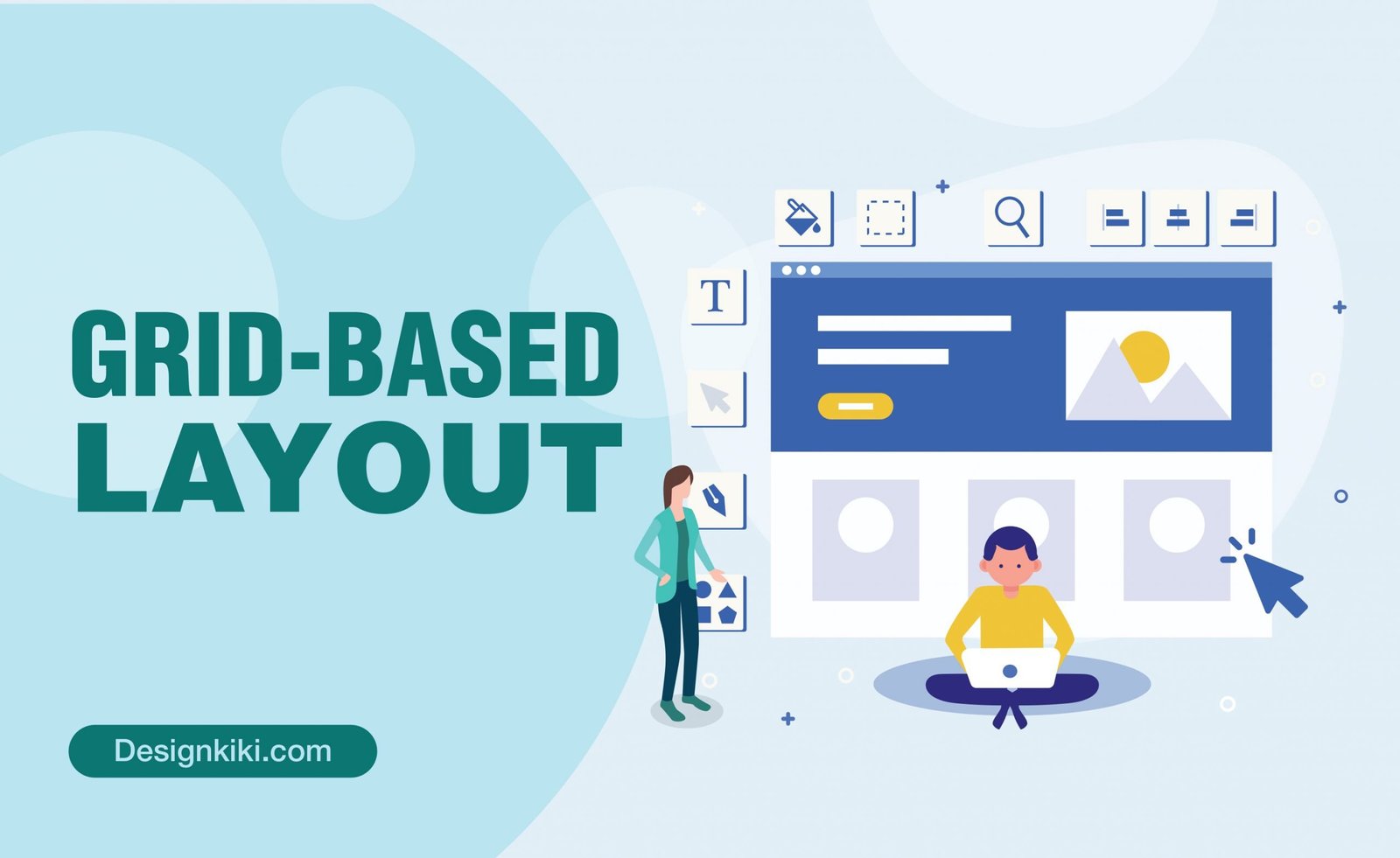
The grid-based layout is used to give the content of your website a good structure. This is done by using columns and segments that line up into a perfect grid. It will not only organize your data into a more simple form but also enhance visual hierarchy. This design type also helps the website seem clean and balanced, aesthetically pleasing, and easy to steer through.
High-Quality Images

I have expressed so much about the importance of high-quality custom images in my previous blog- “How and Why to Create Custom Images for Your Blog & Social Media.” You can go and check it out if you wish to read it in-depth.
To sum up, the pictures and illustrations used on your website should be simple but powerful. Any blurry or pixelated images can portray your brand as amateur and unprofessional. Your photos should fit with the content and your overall style and purpose.
Mobile-friendliness
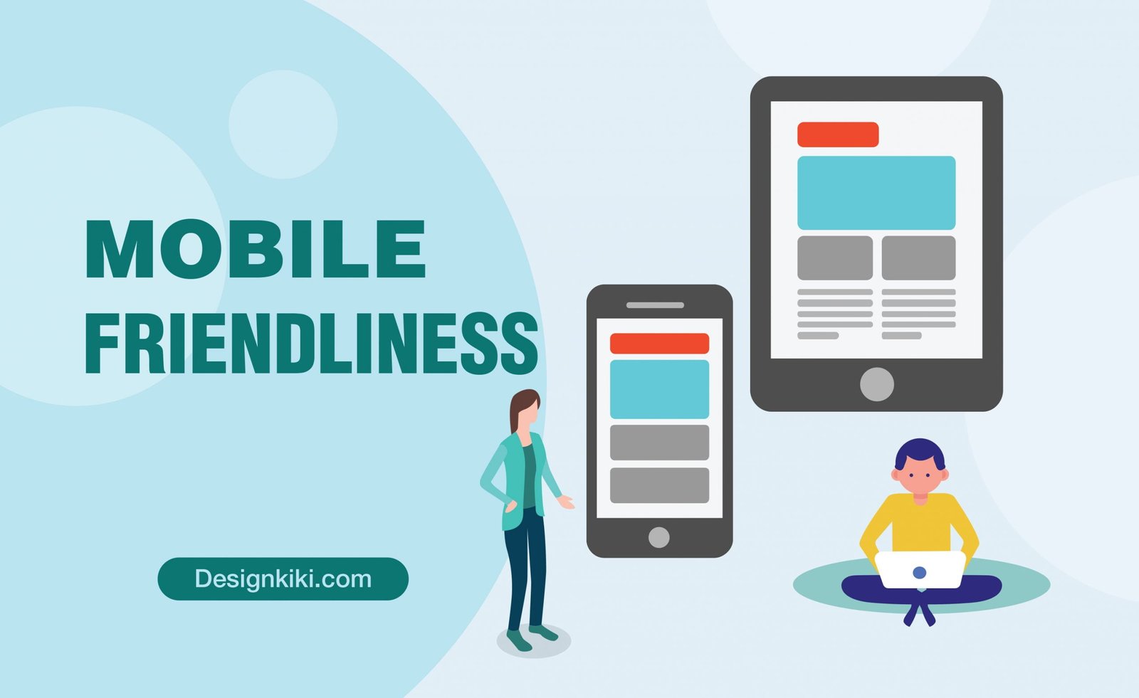
This is where hundreds of websites and new businesses go wrong. Developing a responsive website implies that its beauty will be consistent throughout devices other than a PC. Countless customers will be browsing your webpage on their mobile devices, and you do not want to give them a hard time. Therefore, you need to make sure the design works just as well on phones as on laptops.



Leave a Reply