
When it comes to design, color is my favorite subject to talk about. I can go on endlessly! I’ve spoken about choosing the right color for branding, color psychology, and color theory. While you might think I’ve covered it all, I believe that one can never learn enough about color. So today’s topic will be on Complimentary Colors.
“I prefer living in color,” said David Hockney, and I choose to live by his words. So, now and then, I dive into the world of colors and bring the best out of it.
When discussing colors, the term simple, I feel, comes nowhere in my mind. The complexity of it, however, is something only a few understand. If you are one of those few, you have a gift. If you aren’t, I’m always here to help you.
Today, you will get to know complementary colors like never before. We will go in-depth and look at some of the best logos that embrace complementary colors as no one else does. But before we do that, let’s first discuss the meaning of the term complementary colors.
What are the complementary colors?
When symmetrically opposite colors inside the color wheel are picked together, they are called complementary colors. Technically speaking, they form an angle of 180˚. To learn more about the color wheel, click here.
How to use complementary colors in a logo-
Violet and Yellow
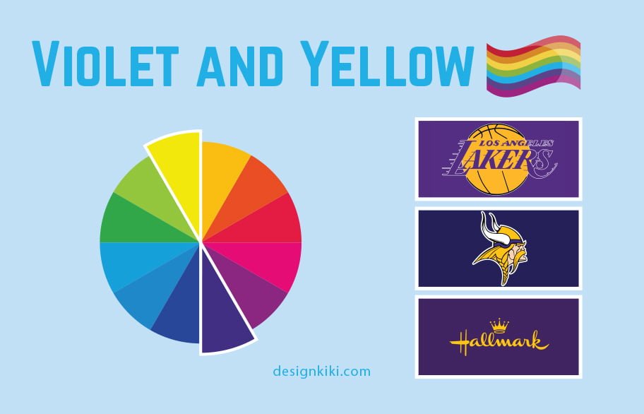
This combination is extraordinary. Violet is the color of luxury and royalty. It comes out of combining the energy of red and the stability of blue, bringing the best of both worlds. Darker shades and tones often represent majesty or lavishness, while softer lilac shades are pretty feminine and even nostalgic, appealing to people’s more sentimental side.
Yellow is a color that represents both joy and the sun. It represents positivity, liveliness, contentment, and friendship. On the other hand, yellow can direct jealousy, betrayal, disease, and caution or danger. It all depends on how and where you use it.
Some of the best examples of logos combining yellow and violet are those of the Lakers, Hallmark, and the Minnesota Vikings.
Red and Green
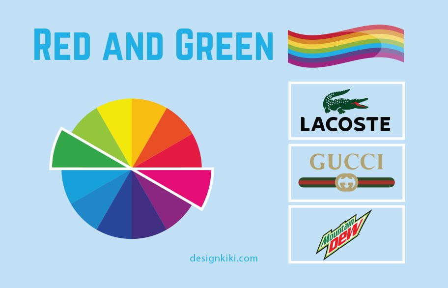
Red is a dynamic color. It symbolizes energy and passion, as well as aggression and anger. So many associate it with love and romance, hence the overload of red on Valentine’s Day.
Green is the color of mother nature and the environment that merges the power of blue and yellow. It also translates freshness and growth. For some, it is also a symbol of money. While others think it brings peace and health.
The combination of red and green brings cheer and merriment because of its close association with Christmas. These two bring out the best in each other and go unnoticed when used together.
The logos of Lactose, Gucci, and Mountain Dew all wear red and green.
Blue and Orange
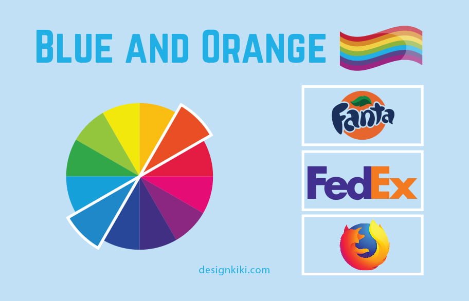
The merger of the passion of red and the optimism of yellow, and orange transfers to motion and energy. Orange is every so often considered the color of novelty and modern thinking. It also transmits
inferences of youth, fun, approachability, and creativity.
The color blue suggests competence, serious-mindedness, honor, earnestness, and calmness. Hospitals and airlines often use blue since it symbolizes trust, wisdom, faithfulness, and strength.
The harmonizing combination of blue and orange is used more often than the two combinations mentioned above. You will generally see orange with blue to emphasize its energetic appearance. Fanta, Firefox, and FedEx are possibly the best examples of logos that feature blue and orange.
Choose the combination that suits you best.
Now that you know all about them, you can freely choose complementary colors when designing your logo. When complementary colors are used together, they give each other and, overall, the logo more strength. So, which do you like best? Tell us in the comment section below.

Leave a Reply