
Have you ever looked so hard into a logo that you started seeing things? Well, you are seeing what it is trying to tell you. It’s the hidden meaning in logos or objects besides the subject of the logo. It is done by creatively using negative or empty space while designing a business logo.
Negative space logos have been all over the place this year and made to the hottest logo trends of 2023. They not only make logos cleverer but also memorable because of the same cleverness. If you are a designer, an entrepreneur, or a small business planning to create an identity for yourself or your client, please take some time to learn about this fantastic theory that we have for you today.
WHAT IS NEGATIVE SPACE?
More than often, we try and avoid emptiness, nothingness, and silence. We forget that this very nothingness is the best contrast to anything that we try to create. It is only the deficiency of color that tells us how important it is, and it is the absence of sound sometimes that makes it valuable.
So, what exactly is negative space? In simple words, negative space, or as it is often called white space, is the area of a design arrangement that is left empty. It could be around the subject of the composition or between two or more elements of the subject. More explicitly, it is the latent area created by an active ingredient.
WHY USE NEGATIVE SPACE IN LOGOS?
I am about to tell you that your logo has nothing to do with the design or look sometimes but has everything to do with how it will be perceived. Yes! The significance of a logo does not come out by its looks, but by how it is interpreted. In the discipline of psychology, Gestalt theory strives to make sense of how our brains process visual stimuli or extract meaning out of outward anarchy and confusion.
The foundation of Gestalt psychology is that when we look at an assortment of objects, we process the whole form that it creates before we see the individual parts of which it is composed.
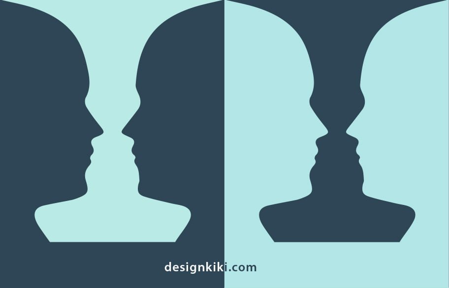
In the case of the image above, what do you see? Is it the two faces or a vase that you notice first? The brain detects the first or the latter and tries as vigorously as you can, your mind is hardwired to perceive the figure as either two faces or a vase. You must see either one or the other at any single flash, but not both at once.
Negative space can be used to create keen-witted visual extenders or optical illusions in logos. The logo will bring an element of surprise to the table, but the fact that your viewer had to focus on spotting the hidden pun will make it memorable in a way that typical logos cannot.
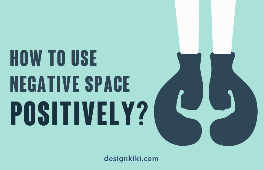
HOW TO USE NEGATIVE SPACE POSITIVELY?
The use of negative space comprises artistic groupings of shapes, positions, shadows, and colors to highlight a connection between your brand’s central elements. Typical cases of negative space in logos involve hidden metaphors, double meanings, or clever use of overlapped elements.
The negative space is magical-create it, don’t just fill it up.
-Timothy Samara
If you are new to the concept of negative space, we would suggest that you start with the basics. We understand that the whole process can sometimes be mind-rattling, so we have listed three of the simplest ways to uniquely yet generously use negative space in your logos with some well-known logos as examples.
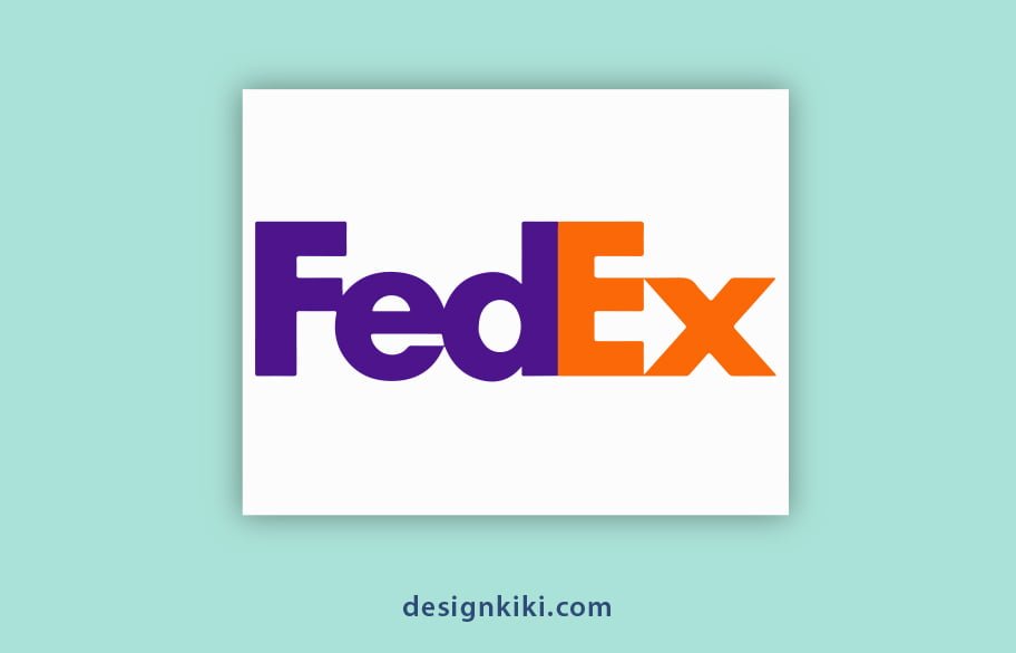
Push the letters closer- Have you observed the hidden image in the FedEx logo? The carriage company’s logo is perhaps one of the best-known in the world of hidden image logos. Those of us who are unaware, take a look between the “E” and the “X,” where the negative space creates an immaculate arrow. In an interview with Fast Company, the logo’s designer, Lindon Leader, said, “The arrow could connote forward direction, speed, and precision. If it remained hidden, there might be an element of surprise, that aha moment.” The design went on to win over 40 awards and was also ranked as one of the eight best logos in the last 35 years by Rolling Stone magazine.
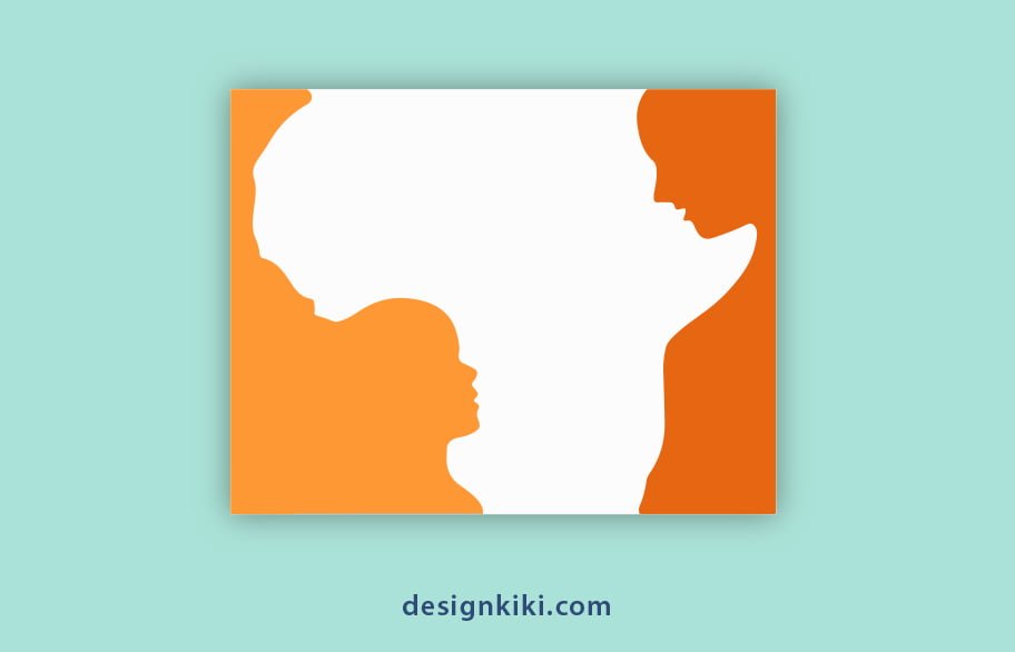
Push the objects further away-Look at this logo carefully. What do you see? The Hope for African Children Initiative is a pan-African struggle to help kids who have been orphaned by AIDS or who have parents sick or dying of AIDS and associated ailments. The golden yellow and orange logo distinctively uses the negative space between two objects placed further apart. Their logo displays at first glimpse of the African continent in the negative area, but what shapes it? The outline of an adult and child, who the Initiative is trying to help bring together.
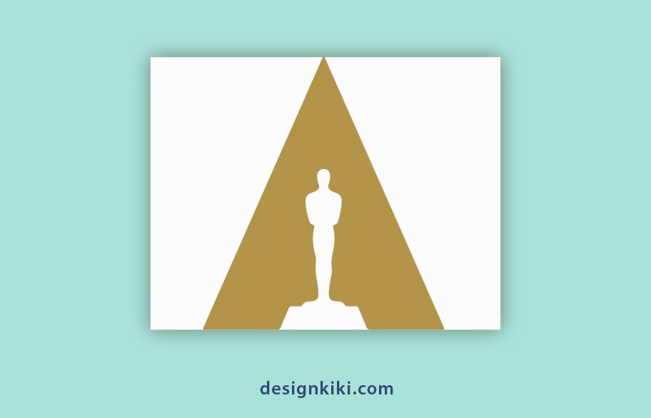
Place the spaces on top of one another- If you mindfully look at the Academy Awards, aka. the Oscars’ new logo. The Oscars are one to watch out for. In the new logo, the Oscar statuette is spotlighted from above, and the spotlight strategically forms the letter ‘A’ which stands for ‘The Academy.’ The best part is that the fresh design takes a poised approach without using any words stressing that most people will immediately identify what the new design denotes. An ingenious touch comes in the form of the ‘A’ shape where the Oscar statuette is illuminated. This is a classic example of overlapping the negative space onto the positive one.
CONCLUSION
We now know that negative space is about spinning ’empty’ spaces into a moving part of the association and showing how treasured it can be in communicating messages with more than one element. There are tons of ways to use negative space in your logo. These are but the easiest of them all. Play around with different symbols, letters, and forms, and think of concepts for logos that reflect your brand. Whatever you do, remember to keep your use of negative space subtle yet effective, and you’ll succeed in getting your target audience’s attention.
To help you out even further, we have placed a lot of material on our online logo-making tool. Make sure you try them out. We would also love to know your thoughts about the use of this concept. Please feel free to use our comment section to tell us how you used it and your favorite methods of employing a creative way of using negative space in logos.


Hi, I discovered this blog very helpful I am happy to understand that people have such great community. I also have passion of drawing, sketching and painting. You may also share my artwork in your blog here you will see my art work too in the link. Thanks so much please lets support eachother.
Great tremendous issues here. I am very glad to look your article. Thank you a lot and i am having a look ahead to touch you. Will you please drop me a e-mail?