
It is not easy to survive in a world ruled by graphics and visuals. In the contemporary world, appearances are what sell. In such a condition, a layman often finds himself graphically challenged when it comes to marketing online to attract a larger audience. To rescue you from such a dilemma and help you rise above the communication barrier, we have curated a glossary of commonly used graphic design terms to help you understand and speak design fluently.
1. Golden Ratio
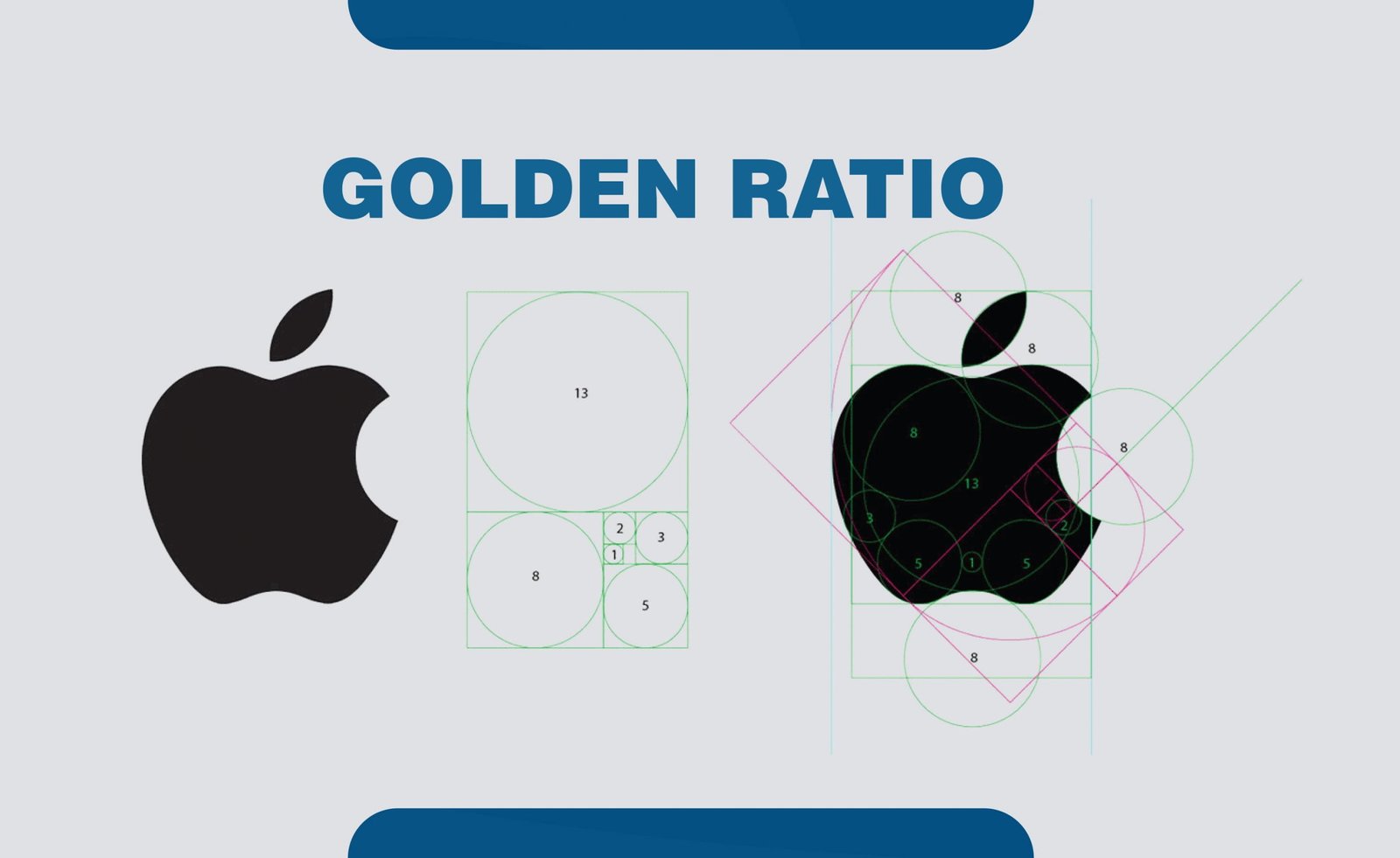
The golden ratio is a mathematical ratio found in nature, which defines the perfect symmetric relationship between two proportions as an element. Derived from the Fibonacci sequence, the Golden Ratio is approximately equal to 1:1.61. designers all over the world have been using this ratio to create visually pleasing designs.
2. Font / Typeface
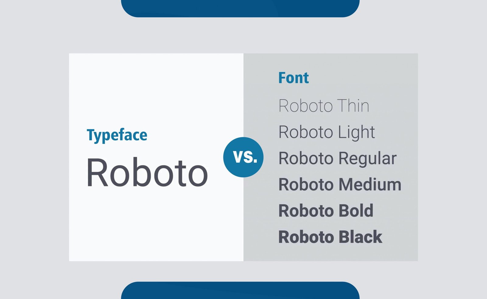
A typeface is a collection of alphabets that belong to the same set. They have similar features, like being serif or sans serif. Let’s, for instance, consider Helvetica. Now, Helvetica Bold is a typeface, and so are Helvetica Light and Helvetica Bold. But together, the family of all the different typefaces of Helvetica is called a font. Therefore, we can say that font is a bigger concept than typeface.
3. Serif
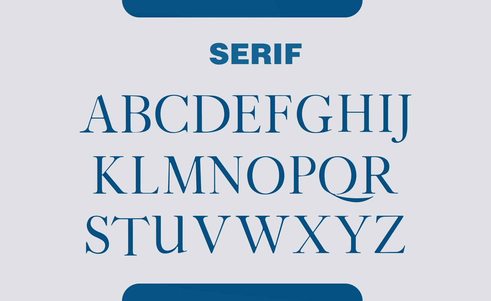
The small stubble-like strokes at the end of the alphabet is called a serif. Some of the most famous fonts are Times New Roman, Garamont, and Baskerville. Serif fonts are the oldest kinds of fonts.
4. Sans Serif
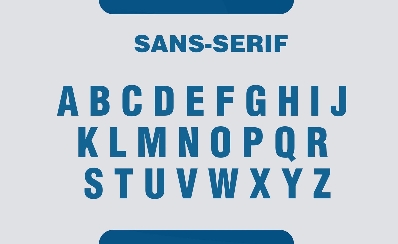
Fonts without the end stokes on their alphabets are called sans serif fonts. Some commonly used sans serif fonts are Futura, Roboto, and Helvetica Neue. Sans serif fonts are more modern and simplistic as compared to their serif mates.
5. Visual hierarchy

Visual hierarchy is the principle of arranging elements in a composition. It defines the movement of the eyes in a particular design. The elements are placed according to the order of importance strategically to make the user understand the information easily. This is one of the most commonly used graphic design terms.
6. Negative Space
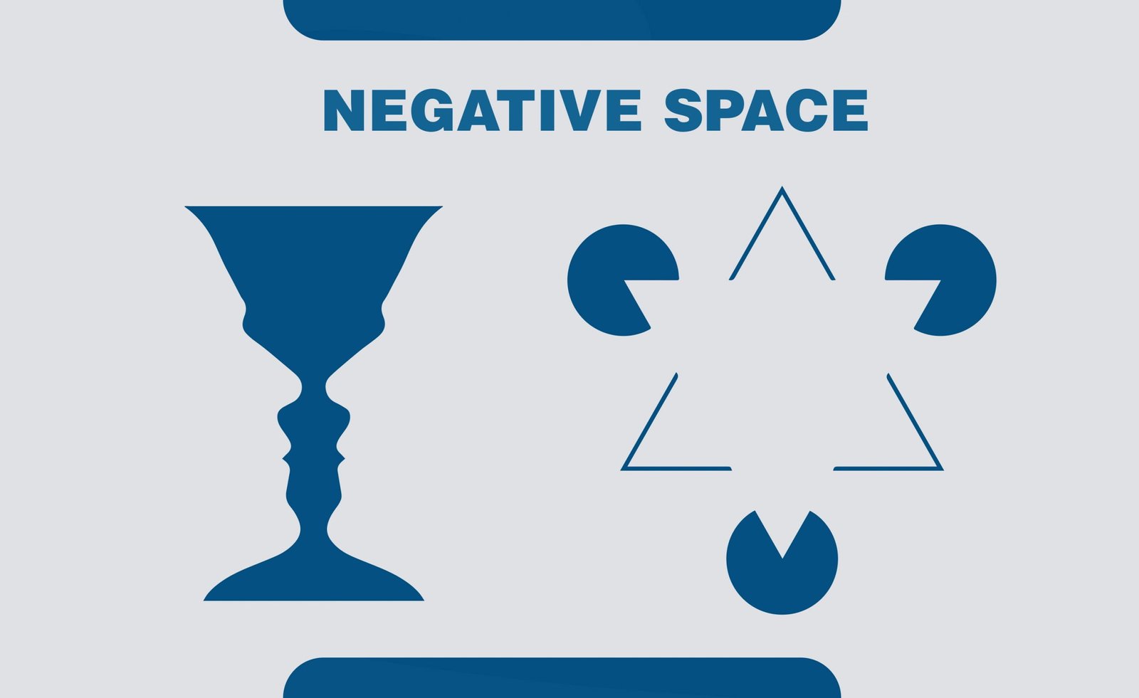
It is the space around elements in a design. It is a very important element of design as it helps create a balanced design. It plays a huge role in defining visual hierarchy.
7. Layout

Layout refers to the arrangement of visual elements on a page. The attributes that influence a layout are screen size, spacing, size of content, etc.
8. Grid

In graphic design, a grid is a structure made up of equal spaces, and horizontal and vertical lines that govern how the elements in a design are placed. It helps in the formation of a layout of a page.
9. Logomark
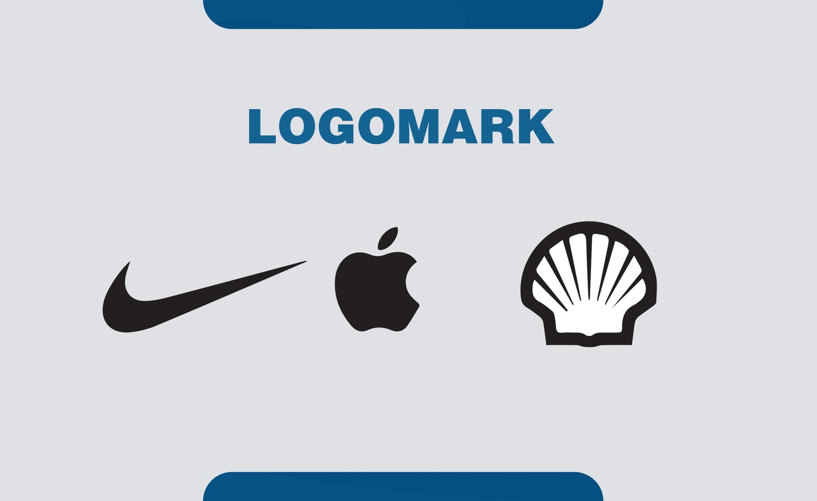
A logo mark is a symbol or pictorial part of a logo that doesn’t contain the company’s name. It is the visual identity of a brand.
10. RGB
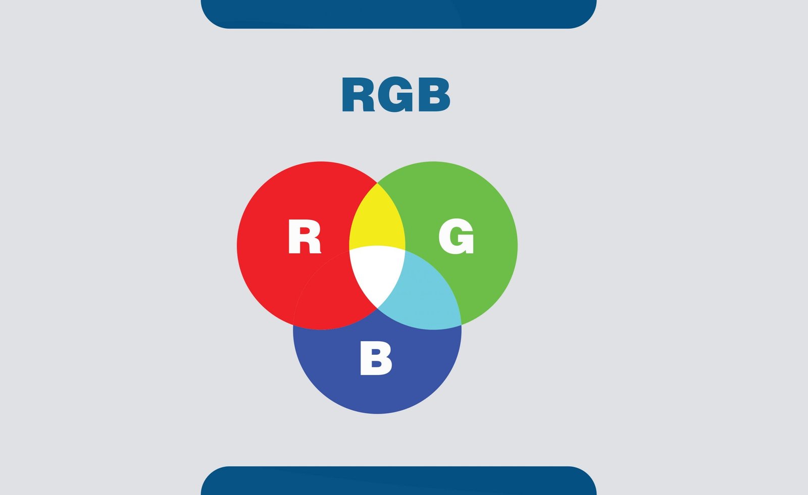
RGB is a color profile on a computer that is based on the hues of red, green, and blue. This color profile is used to create a design that is meant to be digitally displayed only.
11. CMYK
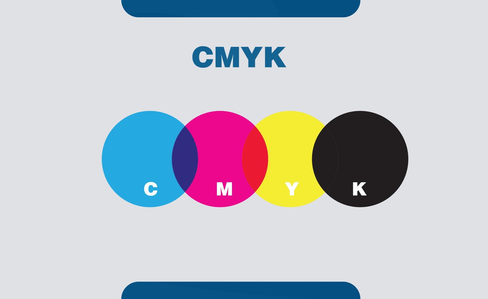
CMYK color profile uses four basic colors, namely cyan, magenta, yellow, and black, to create graphics on the screen. This profile is generally used to create graphics for print.
12. Monochrome
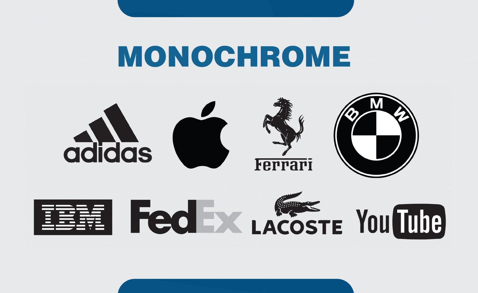
Monochrome refers to a visual. The elements are made using different tones from the same angle on the colors wheel. People generally use the term black and white and monochrome interchangeably. But, in reality, black and white is only an example of monochrome.
13. Pantone
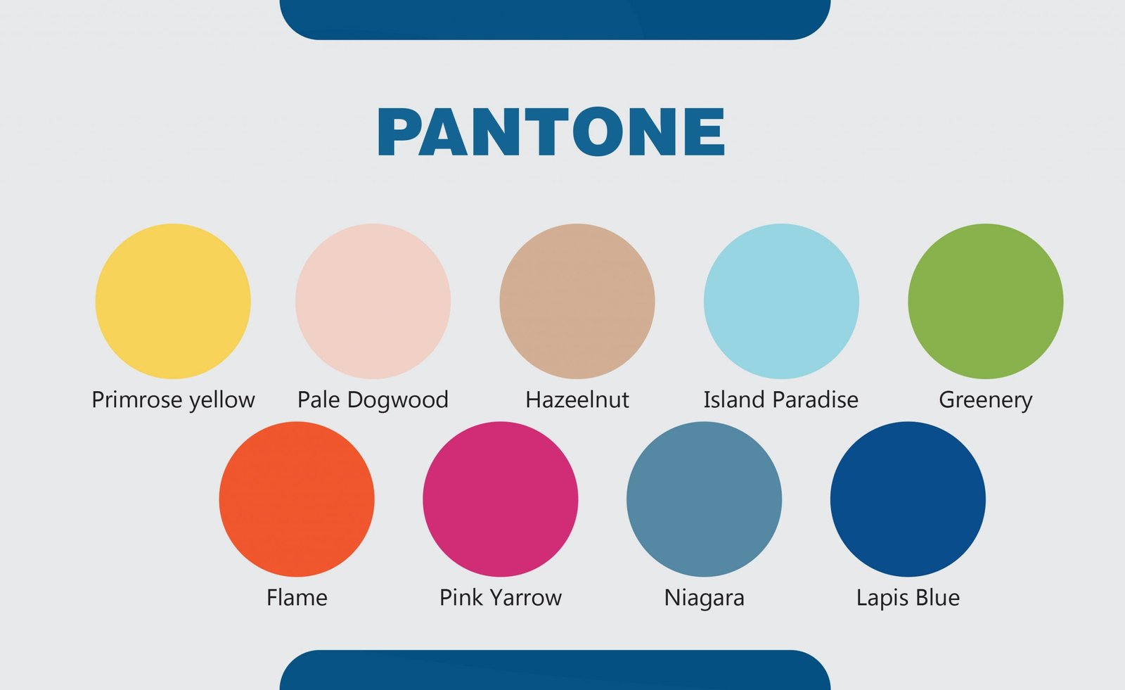
Pantone is a language of colors that is universally used to make color-related decisions by designers and manufacturers. Since its advent in 1963, the Pantone color system has consistently produced a numbering system to match colors.
14. Gradient
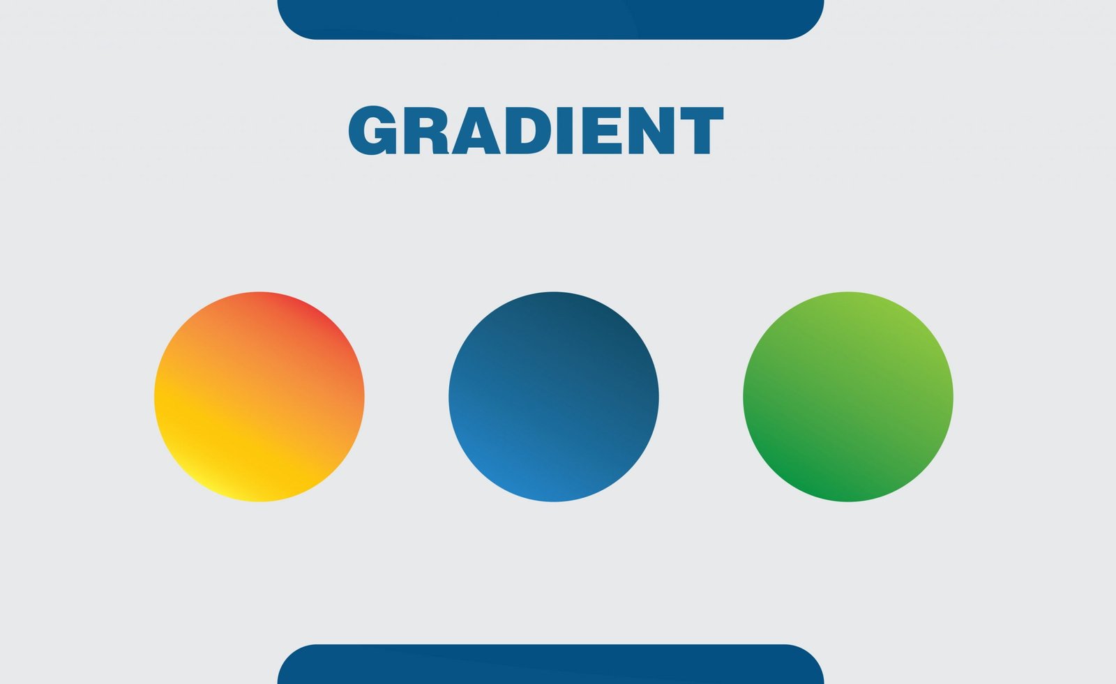
In graphics language, a gradient is a range of position-dependent colors usually used to fill a region. Gradients are used to produce smooth color transitions.
15. Opacity
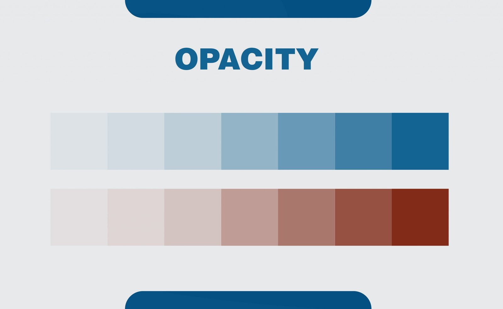
Opacity is the measurement of the opaqueness of an object. The more transparency, the lower, is the opacity.
16. Tint
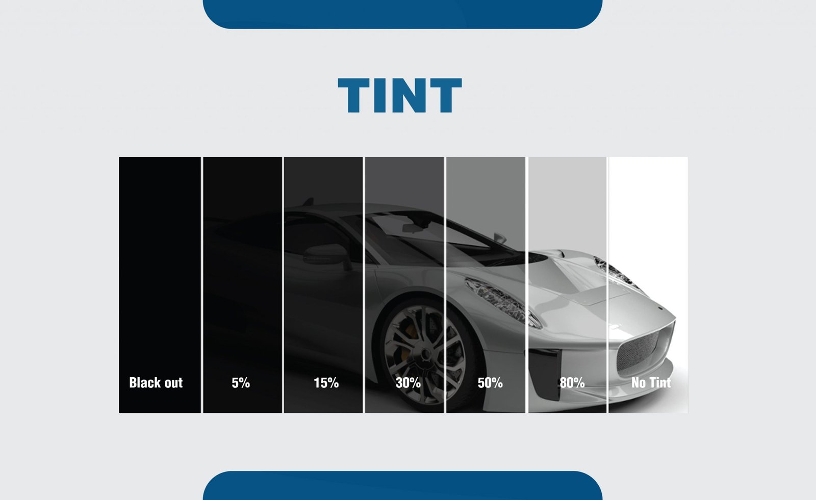
A tint is a mixture of a color with white, which reduces the darkness of the color. It brightens and lightens a color.
17. Shade
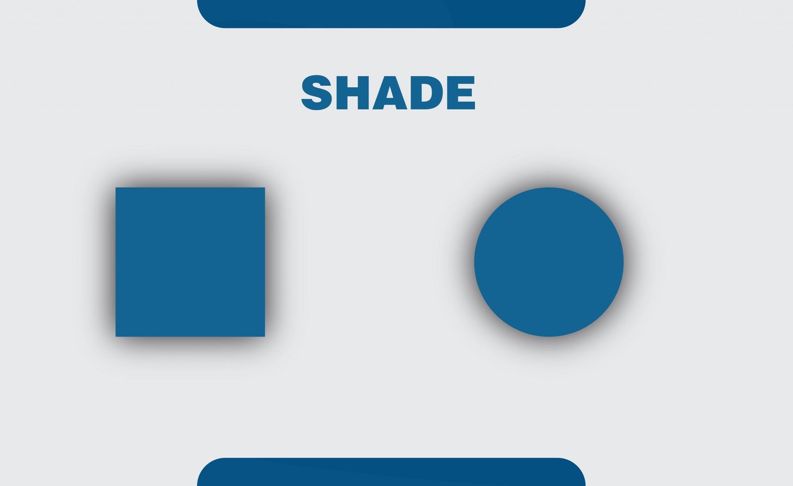
The shade is the opposite of the tint. Mixing a color with black brings out a different shade of the color. It is used to increase the darkness of a color.
18. Tone
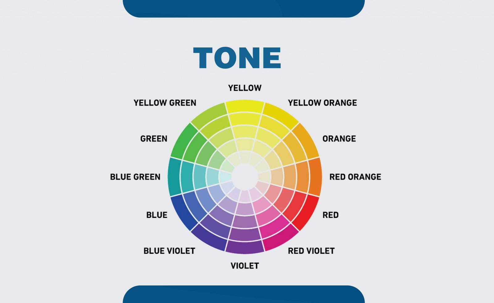
The tone is a mixture of neutral grey with any color. It reduces the intensity or brilliance of a color.
19. Saturation
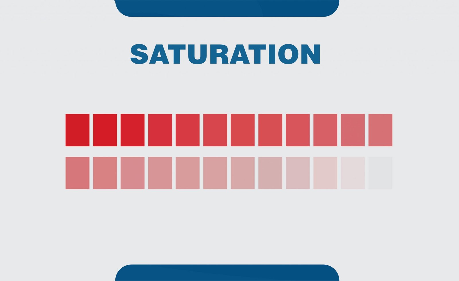
In graphics, color saturation is used to describe the intensity of a color in the image. The more the saturation of an image, the brighter the colors in the image.
20. Knolling
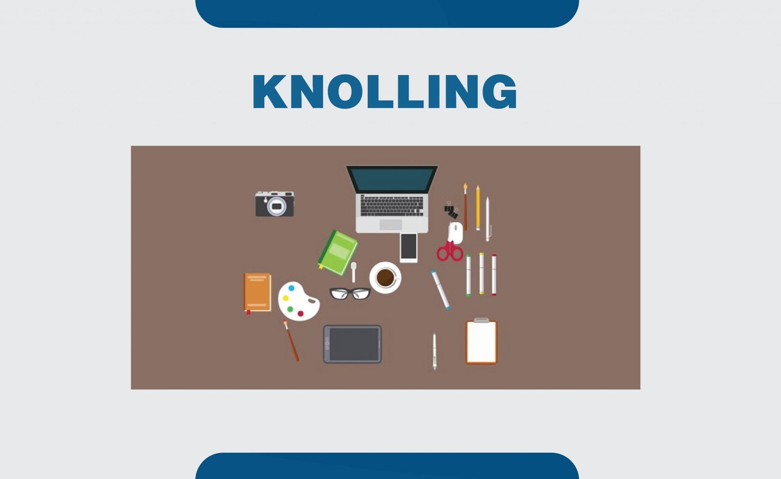
Knolling is the act of arranging different objects so that they are at 90-degree angles from each other, and then photographing them from above. This technique creates a very symmetrical look that feels pleasing to the eye. Images that feature knolling tend to be set against a contrasting solid background.
21. Pixels
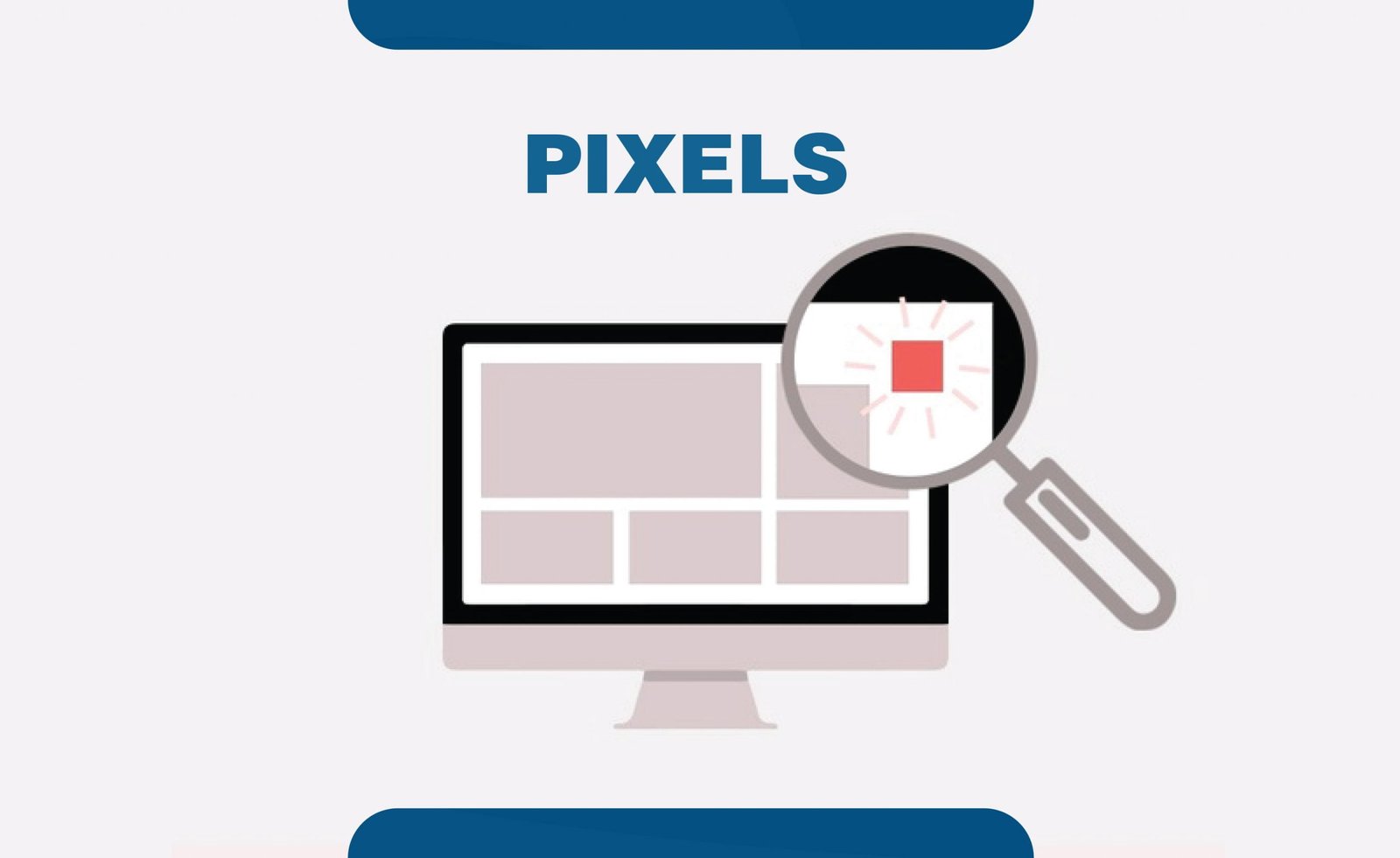
A pixel is the smallest unit of digital image or graphics. Many pixels are combined to make an image or a design on the digital screen. It is represented by a dot on a computer screen created using geometric coordinates. As one of the important graphic design terms, it gets thrown around in everyday life generously.
22. Raster
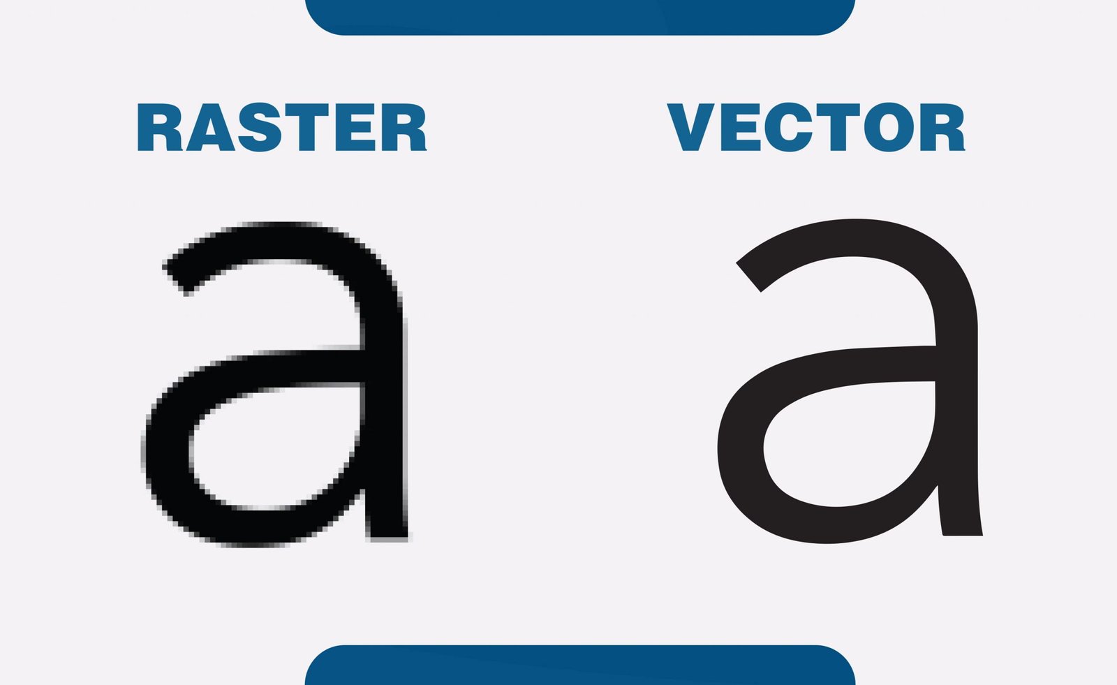
Raster graphics is a file format that is defined by pixels. It uses a dot-matrix system data structure that represents a rectangular grid of pixels. The higher the pixels, the better the resolution in a raster image.
23. Vector
Vector graphics are composed of true geometric primitives; they are best used to represent more structured images, like line art graphics with flat, uniform colors. They are much more versatile, flexible, and easy to use. The most obvious advantage of vector images over raster graphics is that vector images are quickly and correctly scalable.
24. .png

PNG file format is a compression file format that is commonly used on the Web. PNG is the right choice for storing line drawings, text, and iconic graphics in small file sizes.
25. .jpg
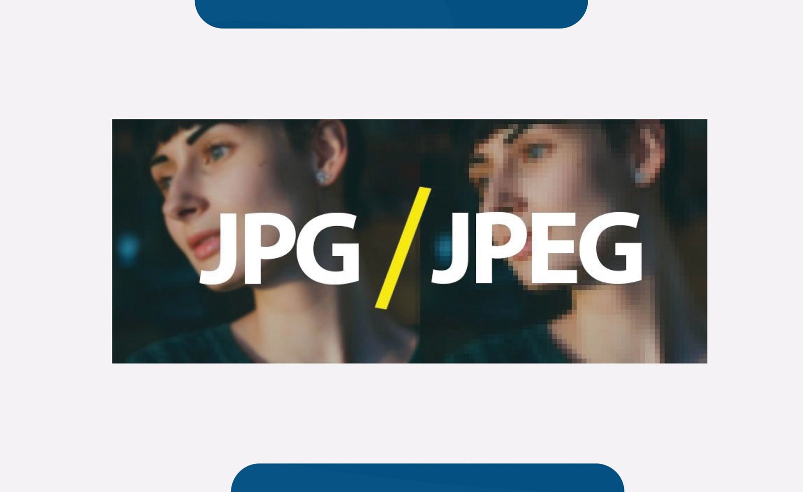
JPG or JPEG format is also a compression file format commonly used on the Web. The difference between .jpg and .png is that the former is used for photographs and realistic images. The latter is used for graphics.
I’ve covered everything off the top of my head. If you have any doubts or questions about the above or other graphic design terms please leave them in the comment section below and I will make sure to answer them for you.

Wonderful beat ! I would like to apprentice while you amend your web site, how can i subscribe a blog site?
The account helped me a acceptable deal. I had been a little bit acquainted of
this your broadcast offered bright clear idea
I am sure this paragraph has touched all the internet visitors, its really really nice article on building up
new web site.
I like the helpful information you provide in your articles.
I’ll bookmark your weblog and check again here frequently.
I am quite sure I’ll learn many new stuff right here! Best of luck for the next!