
Great graphic design is not only the means to brand-building, but it is also, at the same time, proof of your skill and talent. There are no hard and fast rules in graphic design principles, never the less it’s important to understand its basics before embarking on projects that need you at your best (all of them do). You get only one break to make a strong first impression on new clients in the real world. So, you have to infuse your creativity with some fundamental principles. Let’s discuss the eight basic design principles that will help you create stunning graphics.
01. Balance
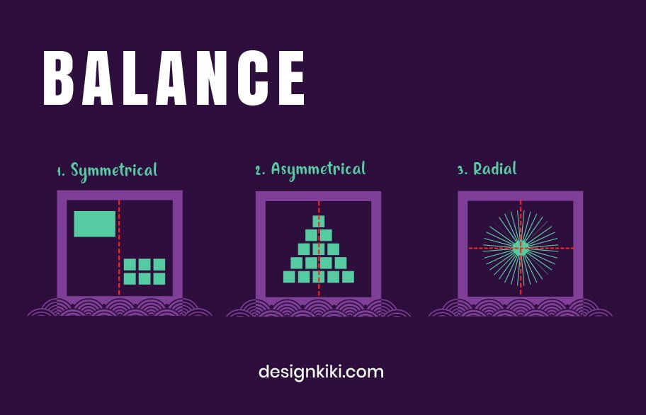
Balance, the first of eight design principles, is the visual weight distribution of graphic elements in a design layout. It brings structure and stability to a design. To know it better, consider that there’s visual weight behind each element in your design. Shapes, text boxes, and images are the factors that form your design, so it’s necessary to be familiar with the visual weight each of those elements holds.
Momentarily, this doesn’t suggest that the elements always require being scattered evenly or being of uniform size and height. Putting it in simple words, balance is either symmetrical or asymmetrical. Symmetrical balance is when the weight of elements is evenly divided on either side of the design using an imaginary symmetry line. In contrast, asymmetrical balance uses scale, contrast, and color to achieve the flow in design.
02. Proximity
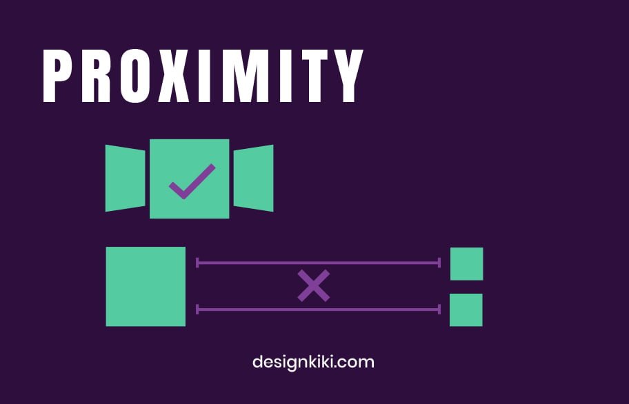
Proximity helps in constructing a bridge between similar or related design elements. These elements need not be assembled closely but should be visually connected by font, color, negative space, size, etc.
03. Alignment
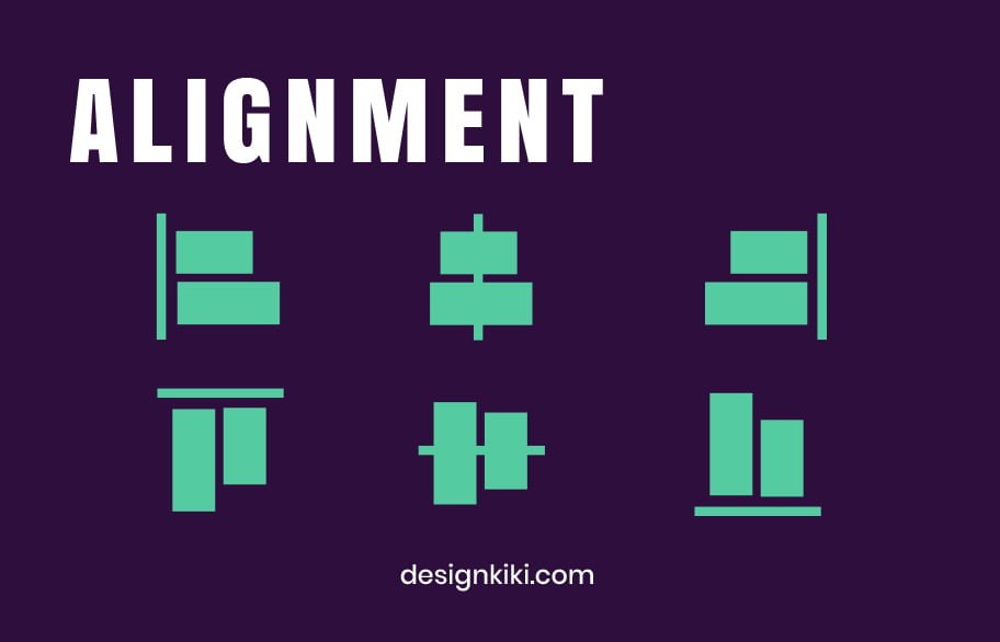
Alignment plays a crucial role in making a seamless visual connection among all the design elements. It gives a neat appearance to shapes, images, and blocks of text by eliminating constituents placed haphazardly.
04. Visual Hierarchy
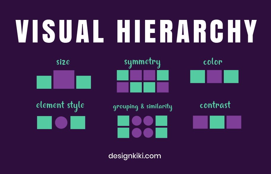
In the simplest form, hierarchy is formed when extra visual weight is carried by the design’s most crucial element. There are so many different ways to achieve it — using larger or bolder fonts to draw focus on the essential text, placing the critical component higher than the others, or adding stress to larger, more embellished, and more colorful visuals than those less relevant.
05. Repetition
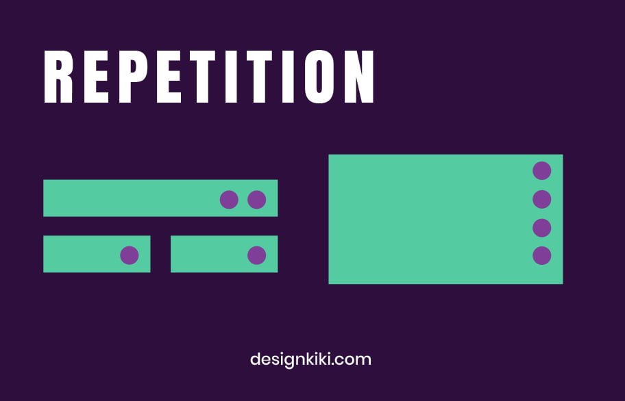
Repetition is an important design element, particularly when it comes to branding. It creates a rhythmic progression and braces the overall design by tying together the elements harmoniously, making the design or brand instantly attractive to the audience.
06. Contrast

Contrast takes place when there is a clear distinction between the two or more design elements. The most common types of contrast are bright vs. dull, contemporary vs. old-fashioned, dark vs. light, large vs. small, etc. Contrast guides a viewer’s attention and helps make a design exciting and eye-catching.
07. Colour
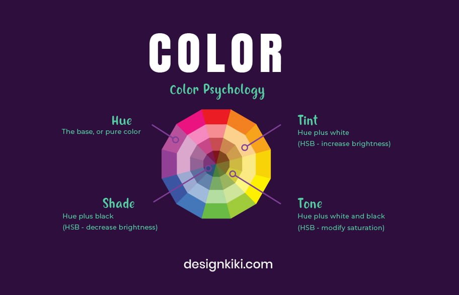
What is the easiest way to set the overall mood of a design? The answer, my friend, is color. The pallet you pick represents your brand in its totality, so be vigilant with the colors you choose. As a graphic designer, it’s always helpful to have a basic knowledge of color theory and psychology. Want to know about the trendiest color palettes? Click here.
08. Negative Space
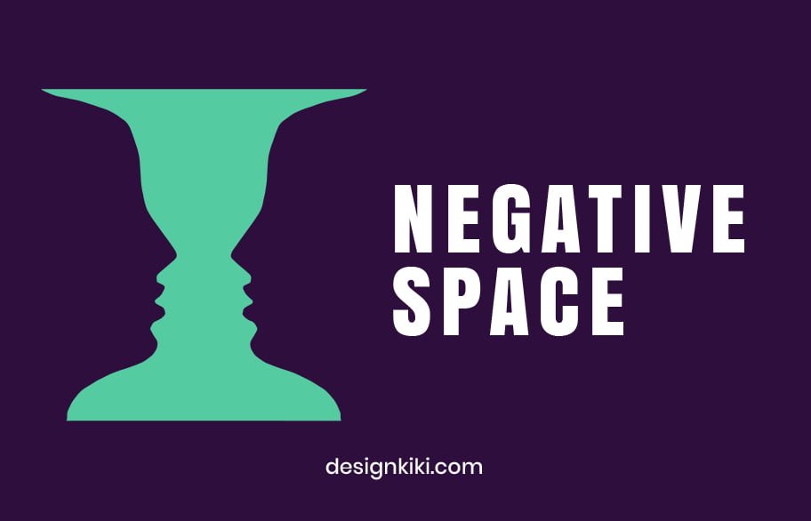
We’ve discussed almost all the essential details, but what about the space that is left blank? Negative space, which in simple words means the empty area between or around the forms and elements of design, when used creatively, can help create hidden meanings and draw the viewer’s eyes to important components of your composition. To read more about negative space, click here.
Over to You
Once you’re a proficient graphic designer who comprehends the nitty-gritty of design, it’s time to bend and even break some of those rules. Remember, everything that you’re trying to communicate should not be bargained. You must frequently color outside the lines to pull away from a mediocracy or a flat design structure, but beginners must first try to fine-tune as much as possible with the above principles.

Heya are using WordPress for your blog platform? I’m new to the blog world but I’m trying to get started and set up my own. Do you require any coding expertise to make your own blog? Any help would be really appreciated!
Yes! We do use WordPress. And no, you can easily manage without coding.