What will your logo look like when using it for a social media display picture? How about a print on tee shirts? Will it be legible on promotional items like pens or coffee mugs? How resourceful is your logo? Can it adapt to different situations according to space and time? If your answer to the last question is yes, well done! If not, you need to do something about it right away.
Logo versatility becomes more and more as your business expands and your logo is seen in more places, starting from websites and billboards to social media and business cards. All of these places will have their constraints for how they will require your logo. Some will provide you with a compact square area, while others will give you abundant space for your logo. But whatever situations you meet with, you must be prepared!
However, you don’t need a vast band of logo variations to pull from. Long-term stability in brand building is achieved by agreeing to a few varieties early on, that have the key compatible characteristics. A decent designer will provide more than one logo design option for you to use in different circumstances.
Which logo variations do I need?
Following is my list of all the different types of logos you might need while building your brand identity. You might not need all of the following depending on your existing logo’s dimensions and scope, and some alternatives may even coincide with your primary logo. To make it easy for you to understand, I have also put examples of logo variations in place.
Primary Logo
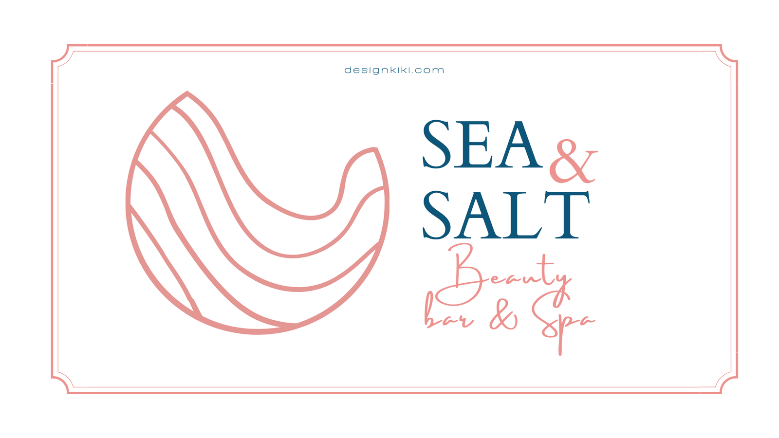
Your prime logo design is your ideal arrangement. When space allows, this is your go-to logo variation, and you’ll use it the most often. The primary logo is the face of your brand. This one should typically embrace both a wordmark and a symbol or an icon, and you could even include a tagline too. You’ll use your primary logo most often, to present to unfamiliar clients and welcome frequent customers to your company.
Sub-mark
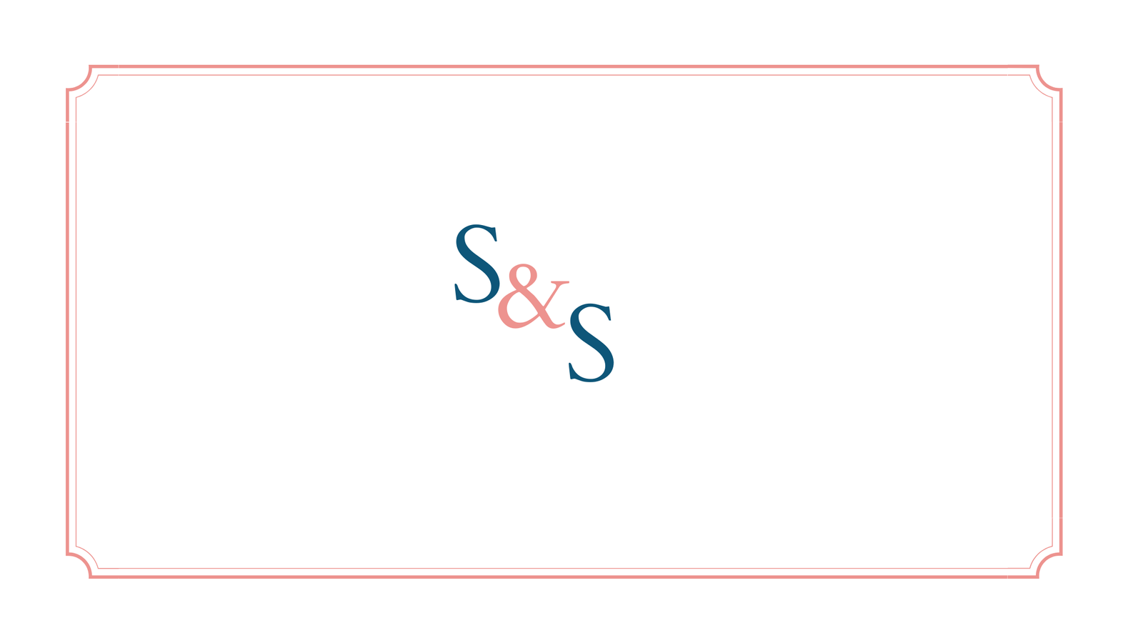
This option is an abridged version of your logo that still contains some elements of your original logo. The small form makes it perfect for places where an entirely written logo wouldn’t look very sound. It’s handy to have such an alternative logo, usually, subtly rework in some way to the principal logo. It helps to keep things clean and fresh by using your visual branding fundamentals in an unlike but consistent way.
Stacked Logo
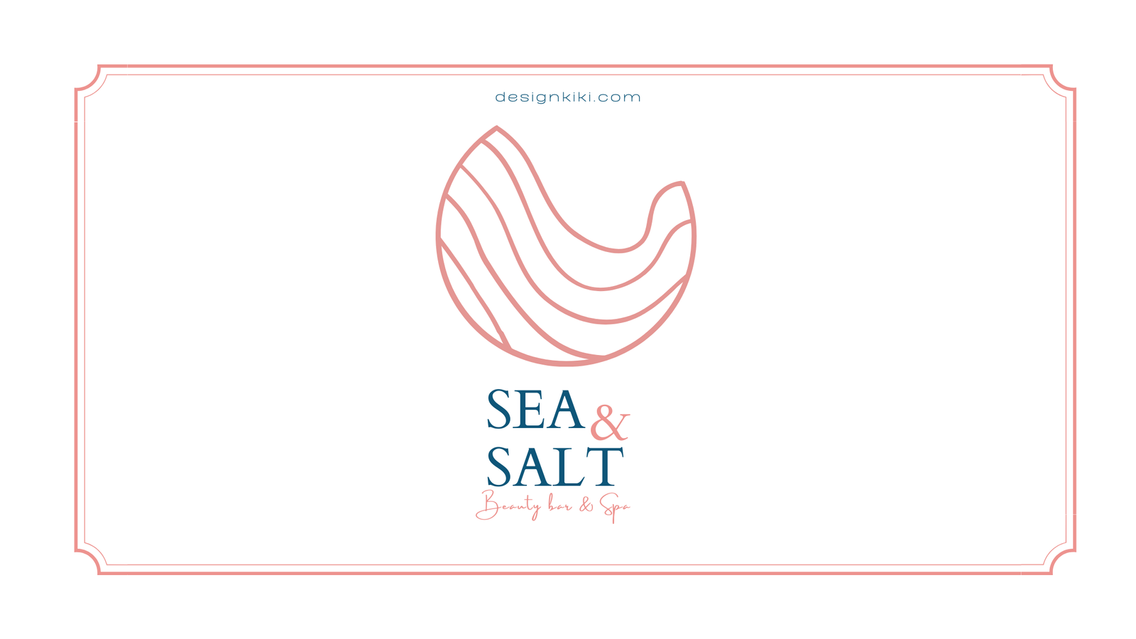
This alternative doesn’t need to be a perfect square, consider spaces that only offer a vertical place for logos. Social media icons, your website favicon, and some other promotion sites often have proportions as such. Having a more compact logo variation can be helpful for printed material too, where you have to work within strict sizing and layouts.
Horizontal Logo
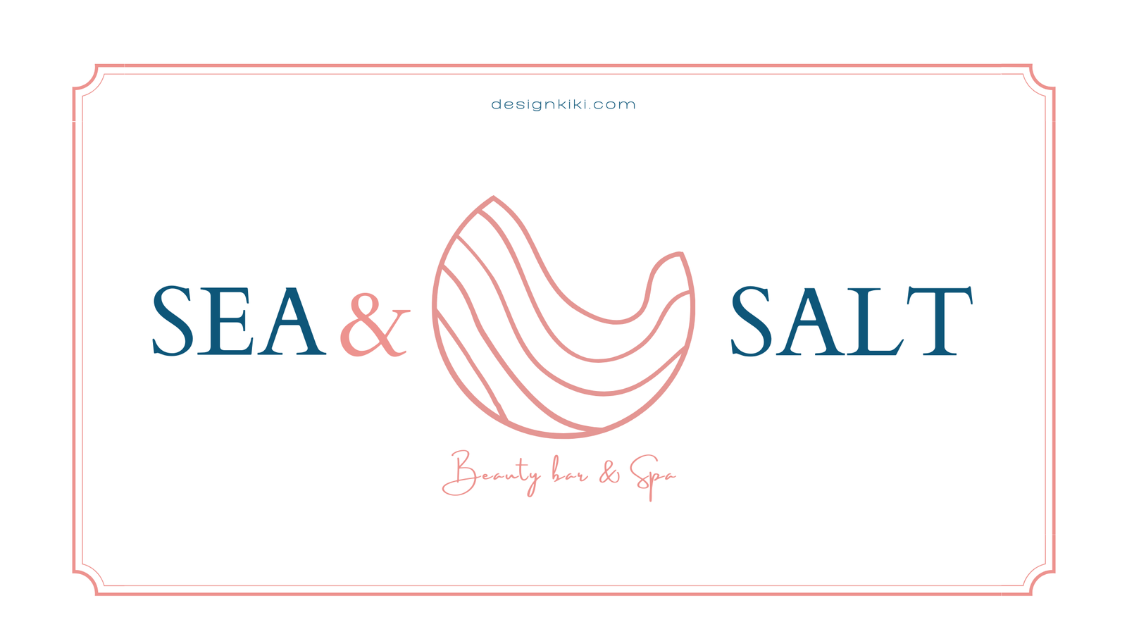
Oftentimes, logos may already have a horizontal arrangement, but if not, you’ll need a broader design to work where space requires so. Think letterheads, Facebook, and Etsy cover pictures. An ideal shape for this variant of your logo is a horizontal rectangular frame. That doesn’t imply that the definite form of the logo requires to be a rectangle, but its imaginary parameter should be a wide rectangle. A horizontal logo can be cast off on your website, company invoices stationery material, or online and in print where the stacked or vertical logo doesn’t fit properly.
Icon
Sometimes even the alternative logo is too large to be appropriate or doesn’t have a perfect arrangement. You don’t want your logo elements to look overcrowded. As an alternative to imposing your logo into that cramped space, your designer ought to give you an apt variation, so your logo adapts to space!
Social media icons are often small and round, so the primary logo might not fit into space. This is where I would suggest an icon. An icon is critical for your company in more situations than you can imagine. There are so many circumstances where you would want to apply branding, but don’t have a lot of free space. You can genuinely have fun with icons while packaging and designing your website.
Wordmark
You will often stumble into situations when you don’t have sufficient space to use your primary logo, but merely an icon won’t do, your wordmark will come to your rescue. It includes only your company name and sometimes even your tagline. It’s a hands-on way of keeping your brand identity sturdy and recognizable.
Black & White logo
Apart from all the above logos, you will need a black-and-white version of all of them or the ones you use more frequently. You never know where they might come in handy.
Logo Variations Make Your Brand Multidimensional
As you’ve seen through the examples above, there is an intention behind all of the variations. Each of them has a space in which they work best. They make you and your brand look proficient in every condition. Your logo variations make up a toolkit, and you can use the logos in this toolkit for print, web, stationery, packaging, and everything else that you can think of.
So, which of these do you have or don’t? Let us know in the comment section below.


Valuable information. Lucky me I found your website by accident, and I’m shocked why this accident didn’t happened earlier! I bookmarked it.