
Winter colors are a mix of icy blues and calming tones, which help provide warmth on chilly days. It is a great time to start afresh with a new color palette to set a new tune for your brand. It will not only give a fresh start to the brand but will also help to get a fresh perspective and conquer new customers.
So without ado, let’s discuss the most trending winter colors and what feel they provide to your brand.
Sandstone (PANTONE 16-1328)
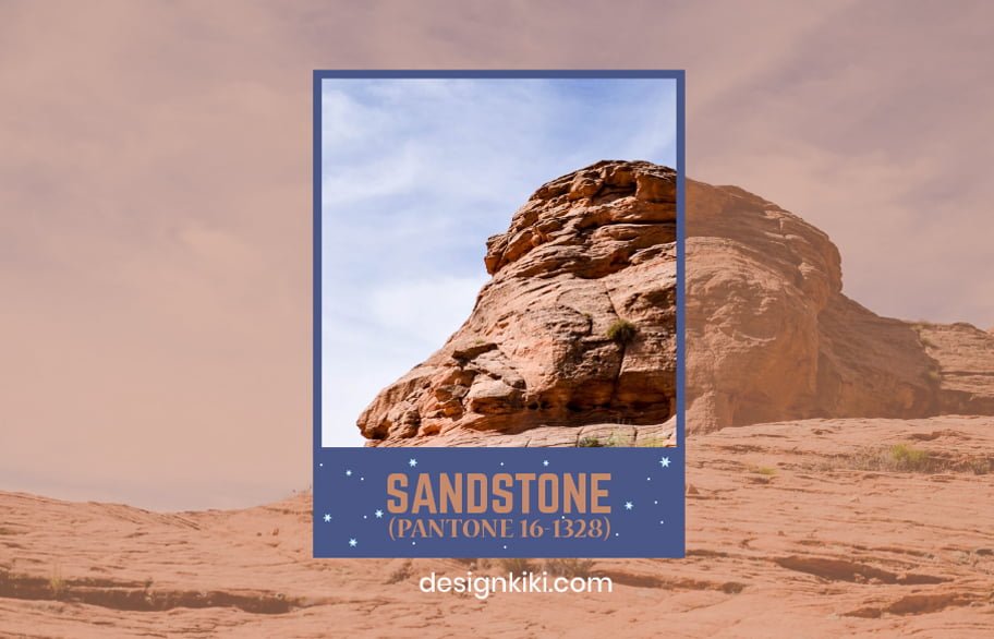
Sandstone is a warm and cozy color that reminds me of the rich teak wood. It provides a sense of richness to the brand and can be used in the logo, website, and packaging. This color will give your customers a sense of luxury. It can be combined with colors like off-white, chocolate brown, and mint green to form a beautiful color palette.
Aqua haze (PANTONE 15-5209)
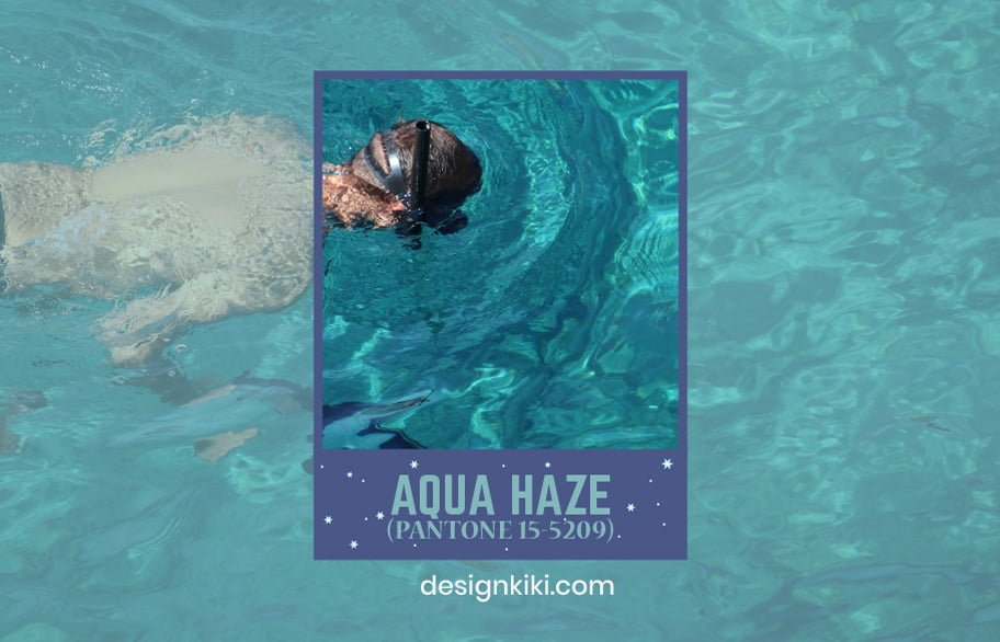
Aqua haze is one of the winter colors that represents calmness and tranquility. It makes people trust the brand and makes it easier for the brand to expand its markets because it is reminiscent of the calm ripples of water. This color is not only useful to attract customers but also to get investors interested in your brand. Aqua haze can be combined with grey, light lemony yellow, and military green to make a great color palette.
Elderberry (PANTONE 17-1605)

Elderberry is a soothing color that has the power to make everyone feel reassured and comfortable. It is a welcoming color and can help the brand to attract customers. It can be combined with shades like melon orange, peony pink, and smoked beige to create a fantastic color palette.
Blanc de Blanc (PANTONE 11-4800)
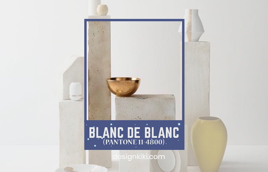
Blanc de Blanc is a shade of white that reminds me of fresh linens. It spreads refreshing energy and makes the customers of a brand feel nostalgic as it reminds them of home. Blanc de Blanc can be intermingled with other winter colors like powder blue, mint green, and rusty red to make a very appealing color palette.
Pale gold (PANTONE 15-0927)
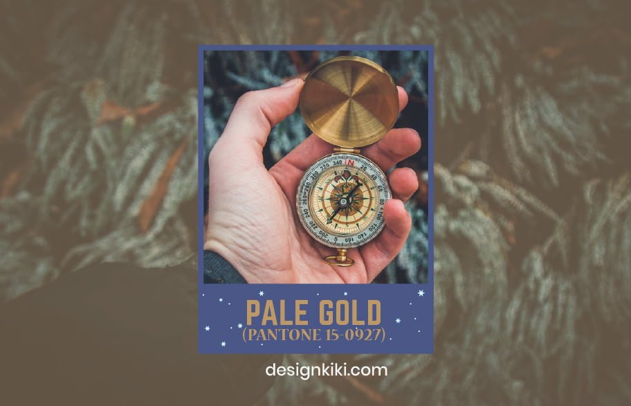
Pale gold is reminiscent of warm vanilla and is just the cherry on top with the tremendous Christmassy feeling. Pale gold has a perfect tint of richness mixed with a muted delicacy that appeals to the people. This color will not only raise a festive feel but also have a welcoming effect. Pale gold winter colors can be mixed and matched with pale blush, lavender, and beige for a perfect color palette.
Classic Blue (PANTONE 19-4052)
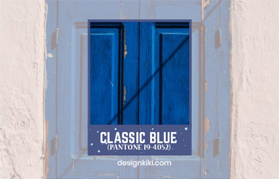
Classic Blue lays out a strong foundation for brands and helps the customers connect with the company. It was also the Pantone color of 2020 because it is one of the universally accepted winter colors that instills reassuring confidence. This is why it is the best choice of color this winter. Classic blue can be paired with almond beige, dusky pink, and icy blue to form the best color palette.
Rose Tan (PANTONE 16-1511)
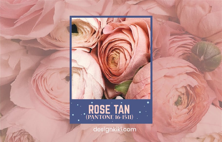
Rose tan is a beautiful nude subtle pink tone. It looks delicate yet elegant look about it. It represents the silkiness of a flower with a hint of subtlety, which gives it class. Using rose tan in the branding would bring a sense of softness to the company, helping the people feel at home with the brand. Rose tan complements colors like tan, cream, and wine red.
Serenity (PANTONE 15-3919)

Serenity is another shade of blue that has a certain balmy and stress-free aura to it. As the name suggests, it represents peace and oneness to nature. It reminds people of the little currents of the ocean and its calming sound. It will be a perfect match for an eco-friendly brand. It can be paired with colors like lilac grey, peachy pick, and pirate black to set the ideal tone.
Arctic ice (PANTONE 13-4110)

Arctic ice is a muted tone of lavender mixed with a neutral tone of grey. It is a light shade that tones down the over-the-top effect of other colors. Like the other winter colors, Arctic ice is a versatile color that can be used to form various color palettes because of its dual tone-ness. It can be combined with colors like coral, honey, and deep-sea blue.
Olive gray (PANTONE 16-1110)
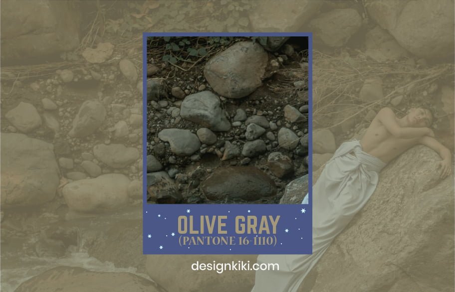
Olive grey is a muted neutralizing color. It represents solemnity and responsibility. Using olive-grey in the branding would make your customers trust you and encourage them to return to you again and again. It can be paired with winter colors like mauve, smokey blue, and even lime green to form a pleasant color palette.
Colors play a huge part in attracting customers, especially when the world is moving to a new virtual era. Visuals are what attract the customers the most. This is why it is essential to understand the symbolism of what color represents and how it affects people’s psychology when viewing the colors before making big decisions.

Leave a Reply