
White color is often thought of as being colorless. But it is a versatile color. It has different shades, tints, and hues, which make it so multifaceted. Additionally, it is one of the most used colors in the branding of successful brands. It is a color that can add an accent to your color palette sometimes and act as the hero of others.
We are starting a new segment to educate our fellow designers and creatives about colors and how and when to use them. In it, we will try to cover all major colors that we use day-to-day in the world of art and design.
So, to give you an insight into the world of white, we have curated a list of its different shades, its Pantone color code, and what it represents.
Lily White (PANTONE 11-4301)

This shade reminds you of fresh lilies and the distinctive aroma lilies possess, their specialty, and significance. Using lily-white in your brand will move your employees to bring a fresh new perspective. It can be combined with yellow, pink, and maroon to form a very soothing color palette and can be used in your website as well as in the logo.
Antique White (PANTONE 11-0105)
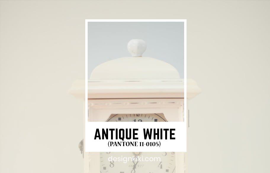
This shade will help instill a sense of trust in the brand. It appeals to the customers through the feeling of nostalgia. This shade can be used by brands while aiming at giving out vintage classic vibes. It can be used with colors like rust red, avocado green, and earth nude to form a beautiful antique-inspired color palette.
Bone White (PANTONE 12-0105)
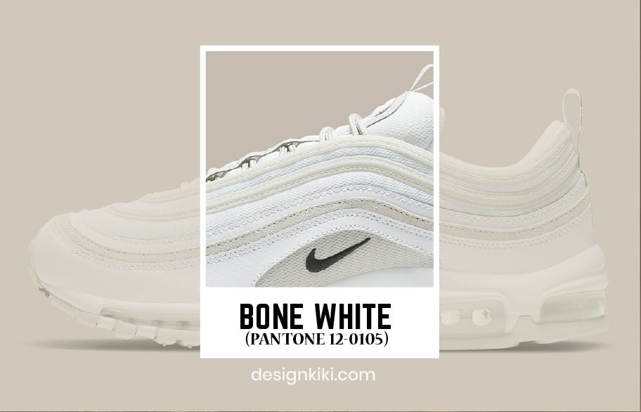
Bone white is a classic evergreen shade of white. It represents luxury and refinement. Using this shade in your brand will give customers a feeling of exclusivity and rich taste. It can be used with colors like peach dust, mauve, and cocoa cream to form an elegant color palette.
Winter White (PANTONE 11-0507)
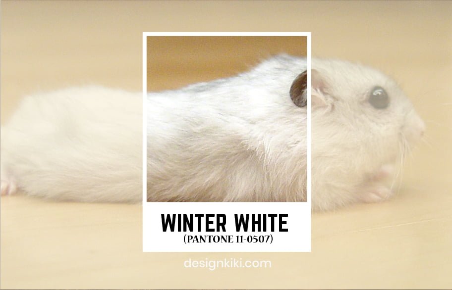
Winter white reminds people of beautiful snow-covered pine trees. It represents the joy of new beginnings. It can be used along with warm colors like vanilla cream, winter wheat, and tile red.
Star White (PANTONE 11-4202)

This is a spiritual shade of white that represents the cosmos. It is a soulful color that can be used by brands to neutralize their color palette. It can be used along with colors like powder blue, sapphire blue, and smoke grey.
White Asparagus (PANTONE 12-0104)
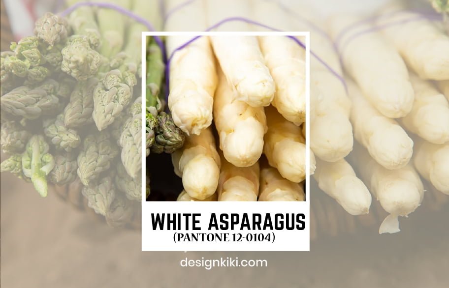
Here is a very calming shade of white. It has an earthy tone and is very peaceful to look at. It can make users of a brand feel secure and have a very peaceful experience. It can be used with colors like cheddar brown, rosewood red, and olive green to relish the color palette.
Bright White (PANTONE 11-0601)

Bright white is the purest shade of white and is a reminiscence of fresh linens. It is a very exhilarating color and refreshes the mind of the onlooker. It can be combined with colors like lilac, cloud grey, and lemon yellow to make an energizing color palette.
White Alyssum (PANTONE 11-1001)

This is a very cheerful shade. It reminds people of the beautiful alyssum flowers and fills their hearts with happiness. It can be combined with different colors like lilac, lavender, and peach to make an exuberant color palette.
Meadow Mist (PANTONE 12-0106)
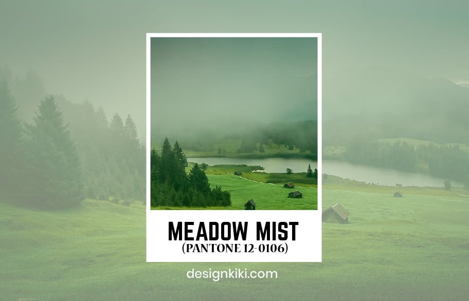
Meadow Mist is a subtle shade of white with a hint of green. It is a very fuzzy color. It can be used along with misty mauve, taupe, and amber color to make a heart-melting color palette.
Coconut Milk (PANTONE 11-0608)
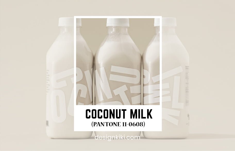
Coconut milk gives off a very beachy vibe. It is a very relaxing color and pacifies the mood of the customers. Coconut milk can be used with colors like cocoa brown and mint green and alleviating palette.
You can now incorporate these colors into your design projects and see how they bring out the best in your artwork. To help you further we have created a unique tool to help you create the best color pallets.

Leave a Reply