
The human mind is highly responsive to visual stimuli, and color is one of the significant outlining factors in that response. On both, a conscious and subconscious level, colors carry meaning – not only in the natural world but also within the pretense of our culture. So choosing the right color for branding becomes crucial for any establishment, be it big or small.
Designers need to harness the power of color psychology to bring character to their designs. The symbolism of colors is one of the most exciting aspects of visual communication. As a designer, you will make conclusions on explicit palettes of colors used for diverse projects. It does not matter if you work on brand identity, a logo, a poster, or a website.
Is there a right or wrong color for branding?
Color choices can and will change the meaning of whatever you create. In the designers’ world, color is considered one of the most significant design elements. Many students struggle with understanding their real standing. They often underrate the power of color and stay utterly uninformed of how to use it. Color changes the perception of design and must be used willfully. Every color, including black and white, has implications for design. As a designer, you need to pick your colors carefully to enhance specific elements of the design and bring nuance to your message with the use of shade and tone.
Here is a detailed study of different colors, what they mean, and how they must be used so that you can choose the right color for branding your business and products.
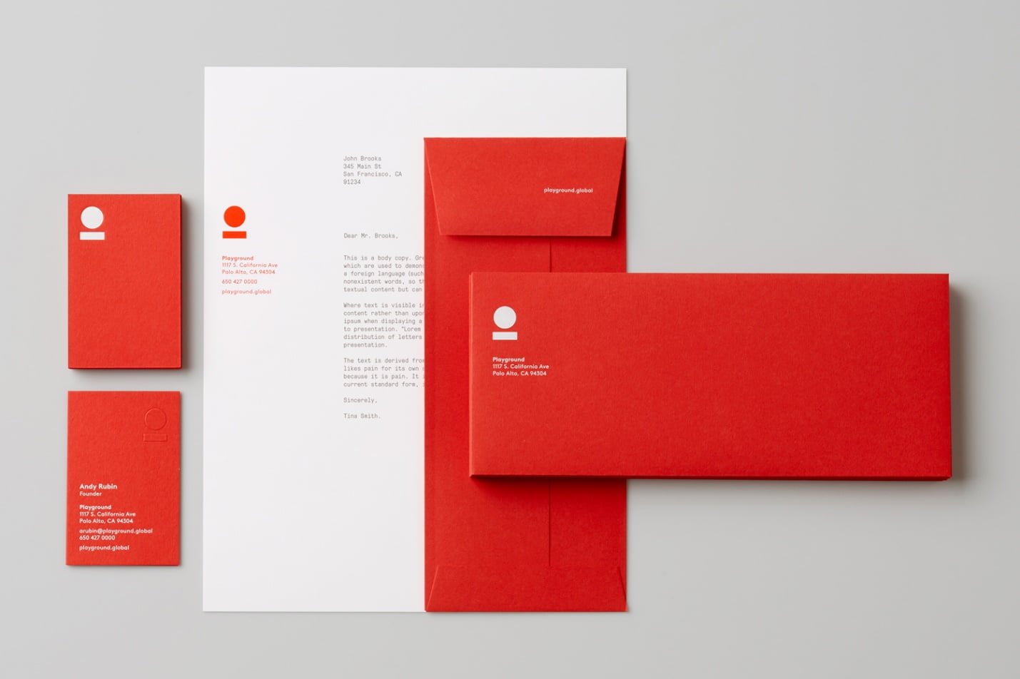
RED
Red implies passion, energy, danger or aggression, warmth, and heat. It has also been found to stimulate appetite, which explains why it is used in so many restaurants and food product logos. Choosing red for your logo can make it feel more dynamic. Red is the color of fire and blood. It is associated with excitement, vigor, desire, and sexuality. It can symbolize longing, power, speed, and strength.
Is red the perfect color for branding your products and services?
On the other hand, it stands for aggression, anger, violence, and war. Many of us consider red as a color of love, but in fact, it is more related to the excitement of falling in love and awakening passion for the other person. Red is also a color of Christmas, bringing joy, warmth, and safety. Moreover, it is widely used in flags and signs as it is associated with pride. Red is intense, and it steals attention from other colors. It provokes emotions and calls to action or becomes a warning. Remember that red will most likely bring pieces of text or images to the foreground. Because red has such powerful meanings, it is perhaps best used with discretion. But, if other brands are avoiding red, it may be a great way to stand out from the crowd.
BLUE
Blue is one of the most widely used colors in corporate logos. It implies professionalism, serious-mindedness, integrity, sincerity, and calmness. Blue is also allied with authority and success, and for this reason, it is popular with both financial institutions and government bodies. Blue is a cooling and soothing primary color that stands for intelligence, openness, spirituality, and creativity. Blue is famous among significant concerns, hospitals, and airlines since it symbolizes wisdom, trust, loyalty, and strength. It is relaxing and averts chaos. Using blue will help you to promote products related to hygiene, air and sky, water and sea, and consciousness development. Stereotypically, blue is considered a masculine color, so many male toddlers will wear blueish clothing and play with blue toys. Remember that food should not be advertised with the use of blue since it lowers the appetite.
On the other hand, blue can make a huge impact when combined with warm colors like red and yellow. Blue is the most universally preferred color, perhaps for its very versatile qualities. It is a favorite color for companies that wish to convey reliability, trustworthiness, and communication. Some big names associated with the blue color are Facebook, Twitter, and Samsung It is also appreciated for it’s calming and harmonious qualities being associated with the sea and sky. However, being associated with the emotional feeling of being ‘blue’ is also used to express sadness or depression. Blue runs the gamut from corporate and dependable, to calming and tranquil, to feeling down in the dumps. So, choose your shade wisely. Or even avoid it altogether if it’s a popular color in your market segment. It is totally on you to make blue the right or wrong color for branding.

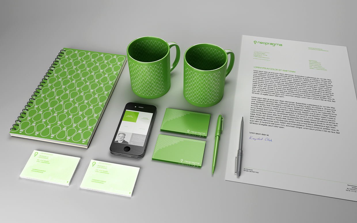
GREEN
Green is commonly used when a company wishes to accentuate its natural and ethical credentials, especially with such products as organic and vegetarian foods. Other meanings credited to it include growth and freshness, and it’s popular with financial products too. In general, green is the color of nature and the environment that combines the power of blue and yellow. It is associated with growth, health, renewal, youth, harmony, freshness, and fertility. On the other hand, it can symbolize safety metaphorically and physically. For some people, it is strongly associated with money.
Is green the perfect color for branding your products and services?
Green is the most restful color for our eyes. It is widely used to advertise healthy foods, drugs, medical services, and environmental organizations all over the world. Dark green products may seem more traditional and classic, while light green goods are seen as trendier and more modern. Green has two widespread meanings that are quite ambiguous; one being nature and the environment, and the other being finance and wealth. When it comes to nature, green represents plant life and growth and is consequently used to convey being ‘green’ in the environmental, sustainable, organic, and natural sense of the word. And of course, green is, as the saying goes, ‘the color of money’ and therefore associated with wealth and stability. Pick your shade of green carefully as brighter, lighter greens indicate growth, vitality, and renewal; while darker, richer greens represent prestige, wealth, and abundance.
YELLOW
Yellow is a color associated with the sun. It symbolizes optimism, energy, joy, happiness, and friendship. It might also stand for intellect. On the contrary, yellow can indicate jealousy, betrayal, illness, and danger. It is strongly associated with food, often evoking cheerful feelings. When long-lasting advertising goods, yellow is not the best choice; it is a subtle and spontaneous color. Men often consider it as “childish,” so many products such as cars, watches, or smartphones should not be advertised with yellow. Too much yellow in a design can be truly overwhelming. At the same time, yellow, in combination with black, will create high contrast and indicate possible danger. Being the color of sunshine, yellow puts a smile on the face.
Is yellow the perfect color for branding your products and services?
It is the most visible color from a distance, which is why it’s used for street signs and communicates cheerfulness, friendliness, joy, and energy. It can also be associated with mental clarity and brainpower. However, yellow is also a cautionary color used in life vests, cordoning police tape, and hazardous areas. Yellow requires cautious use as it has some negative connotations, including its signifying cowardice and its use in warning signs. However, it is sunny, warm, and friendly, and it is another color that is believed to stimulate the appetite. Some shades of yellow can look cheap—although this may suit your brand image. So yellow is an excellent example of when to research consumer reaction to color appropriateness and make sure it is the right color for your product. Make sure to use sound design if you want to avoid any feeling of cheapness.

BLACK
Black is a color with a split personality. On the one hand, it implies power and cleverness, but on the other hand, it is associated with evil and death. More commonly, most logos will need a black and white version for use in media in which color is not available – and there is currently a trend for bold monochrome logos and wordmarks. While color is more likely to increase brand recognition, there’s no reason black—when used appropriately—can’t be just as distinctive, memorable, and communicative of a brand’s attributes. Black is to be taken seriously. It represents power, luxury, sophistication, and exclusivity on the one hand, and death, evil, and mystery on the other. From formality to mourning to power, black is bold, classic, and not to be fooled with. Contrast a bright color against black; use gold foil for a touch of luxe, or combine it with white for a bold and simple statement. Think about texture and how matte or glossy black might change the message of your brand.
WHITE
White represents simplicity, purity, innocence, and perfection. If you had to identify one brand that has used white to convey its brand message to the end, it would have to be Apple – white represents the effortlessness and ease of the products in both their form and function. White also comes with a starkness or bareness about it, which is often used by designers to convey a minimalist aesthetic and clean, modern quality. It is difficult to inject personality into your brand when using white, so make sure your brand personality is about simplicity, purity, and transparency. White is generally associated with purity, cleanliness, simplicity, and innocence. In practical terms, a white logo will always need to stand in a colored field to make it show up on a white background. Many companies will choose to have a distorted version and a white version of their logos; for example, the Coca-Cola wordmark appears in white on its red tins and brown bottles but is used in red when needed on a white background.
ORANGE
Blending the warmth of red and the optimism of yellow, orange communicates activity and energy. Moreover, it is associated with great enthusiasm, encouragement, determination, and stimulation. It is a color of creativity.
Is orange the perfect color for branding your products and services?
Orange is often seen as the color of innovation and modern thinking. It also carries implications of youth, fun, affordability, and approachability. Orange gives an intense sensation of heat, but it does not have the aggressiveness of red. It stimulates appetite and is widely used in the healthy foods industry. Orange can be highly effective in promoting toys as well. Orange is not for everyone and can, therefore, tap into associations of youthfulness, creativity, and adventure. Because orange is associated with fun and vibrancy is well suited to youthful, energetic brands and is best avoided for luxury, traditional, or serious brands.

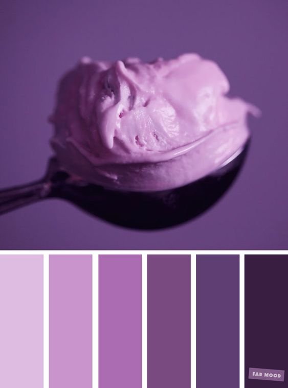
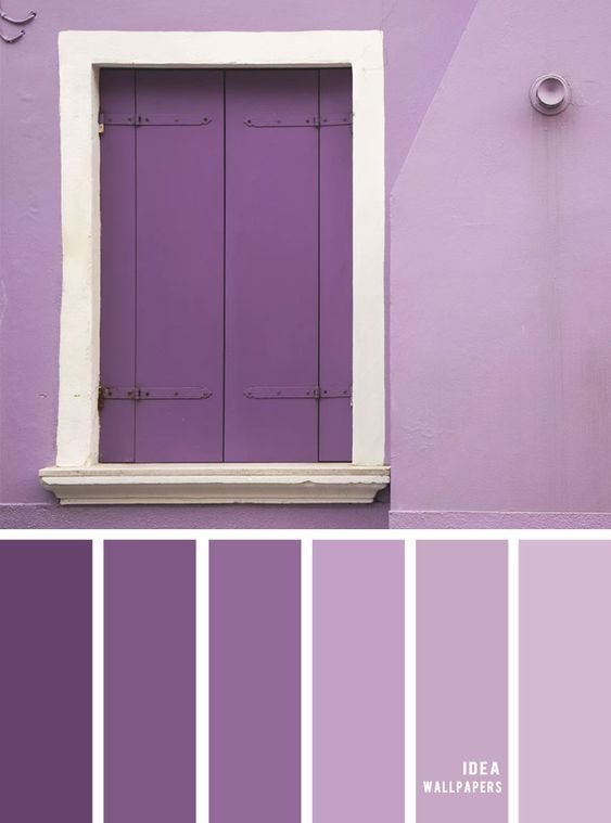
PURPLE
So, what do you think makes or breaks purple as the right color for branding? Purple speaks to us of royalty and luxury. It has long been associated with the church, implying wisdom and pride, and throughout antiquity, it has been the color of wealth and riches. Purple has the stability of blue and the energy of red, two primary colors. It symbolizes both wisdom and enlightenment, and it is a reliable indicator of imagination. Children prefer purple over other colors, although it is considered a bit artificial. It is pretty rare in nature. Purple will be the right choice when promoting feminine products, goods associated with rest, and sleep, or toys for kids. Purple is magical and unique, so it is recommended not to overuse it. Purple is a deep arousal color. It is traditionally associated with majesty or nobility, as well as having a spiritual or mysterious quality. Darker shades often represent extravagance or lavishness while lighter lavender shades are quite feminine, sentimental, and even nostalgic. Purple is best used for targeting a female audience, while women list purple as a top-tier color, it doesn’t even rank for men. Overall, purple is not a standard color for branding.
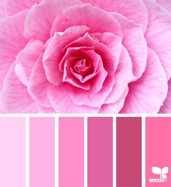
PINK
Pink has long been associated with females and is often viewed as being ‘girly.’ However, like all colors, pink is quite diverse, and the level of intensity can impact its meaning. Pink can be fun and flirty, but its feminine associations mean it is often avoided for products not specifically targeted at women. Pale pink, often marketed as the official color of little girls, represents sweetness while dusty pink can be more sentimental and light pink more romantic. At the other end of the scale, hot pink indicates youthfulness, energy, fun, and excitement. Soft pink is now often referred to as ‘millennial pink,’ for the generation’s fondness for the blush tone. Soft pink interiors, graphics, and more are particularly popular with the millennial generation. Identify the mood and feeling you want to muster and choose your pink accordingly. Don’t shy away from using pink for genderless brands.
Now that you have read so much about each of the above-mentioned colors, which do you think is the right color for branding in your case? Do tell us in the comment section below. If you now wish to create a color palette for branding, do not forget to check out our latest tool, Colordoo which will help you generate the same effortlessly.

Great goods from you, man. I have understand your stuff previous to and
you’re just extremely wonderful. I actually like what you’ve acquired
here, really like what you’re saying and the way in which
you say it. You make it enjoyable and you still care for
to keep it sensible. I cant wait to read far more from you.
This is really a tremendous web site.
Every weekend i used to pay a quick visit this web
site, because i want enjoyment, for the reason that this this site conations in fact nice funny information too.
Hi there all, here every person is sharing these know-how, therefore it’s nice to read this webpage, and I used to pay a quick visit this blog everyday.|
Hi, I do believe this is an excellent website. I stumbledupon it 😉 I am going to come back yet again since I book-marked it. Money and freedom is the best way to change, may you be rich and continue to guide others.|
I do believe all the ideas you have introduced on your post. They are really convincing and will definitely work. Still, the posts are too quick for beginners. May you please extend them a bit from subsequent time? Thanks for the post.|
These are genuinely fantastic ideas in about blogging. You have touched some fastidious things here. Any way keep up wrinting.|
Heya just wanted to give you a brief heads up and let you know a few of the pictures aren’t loading properly. I’m not sure why but I think its a linking issue. I’ve tried it in two different web browsers and both show the same outcome.|
When I originally commented I clicked the “Notify me when new comments are added” checkbox and now each time a
comment is added I get four e-mails with the
same comment. Is there any way you can remove people from that service?
Many thanks!
Thanks for finally talking about > HOW TO CHOOSE THE RIGHT COLOR FOR BRANDING
– Designkiki < Loved it!
Admiring the persistence you put into your website and in depth information you offer. It’s nice to come across a blog every once in a while that isn’t the same old rehashed information. Excellent read! I’ve bookmarked your site and I’m adding your RSS feeds to my Google account.|