Pastel color palettes are unquestionably “in” again. Pastel color palettes are popping up universally—they’re not just for confectioners and greeting cards anymore. Graphic designers may want to pause and give the season’s designated color scheme a second look for their next branding project and logo design.
What Makes a Good Pastel?
Pastel colors are defined as hues with low to medium saturation and high value. These are softer, muted tints, i.e., they are derived after mixing a large amount of white with the colors.
If you are a designer, you already know that color not only makes your design look good or bad but also sets a mood and arouses feelings and emotions in the audience. Read more about the effect of color on your audience here.
Pastels can do two things to your design- make them look washed out or create a sense of calmness and ease. The later kinds of pastels are more romantic and dreamy. They go with almost everything, from spas and coffee shops to boutiques and whatnot.
Tips for Designing in Pastels
Here are some tips to get you started with your pastel projects-
1. Pause for a moment and think.
Don’t just use pastels because they look aesthetically pleasing; instead, use them to bring out the message you are trying to send out. So before filling in your design, it’s imperative to think about what you want to say to your audience and possible clients. Once you have this down, you’ll be ready to start playing with your logo designs and branding projects.
2. Play with contrast and brightness.
The next important thing is experimenting with each color’s brightness in the design and seeing which aspects you can highlight.
Contrast is the key here, so if you have multiple colors in your graphic, try to up the brightness of one color while dimming down the others as needed. The trial and error method must work here. Don’t stop until you’ve found the color combination that works best for your brand.
3. Always keep your designs professional.
It would be wrong to think that pastel logos always give off a cute and darling vibe. Pastel colors are there for one and all, including gyms, law firms, media houses, film studios – anyone who wants to create something unique.
For a more sophisticated and professional appeal, try using just one or two pastel colors in your design while keeping the others on the sharper side.
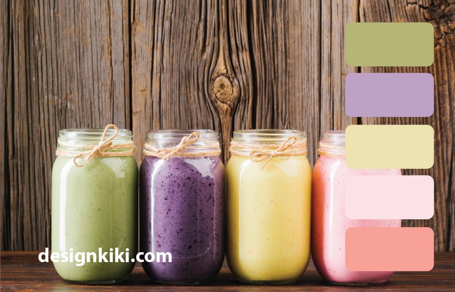
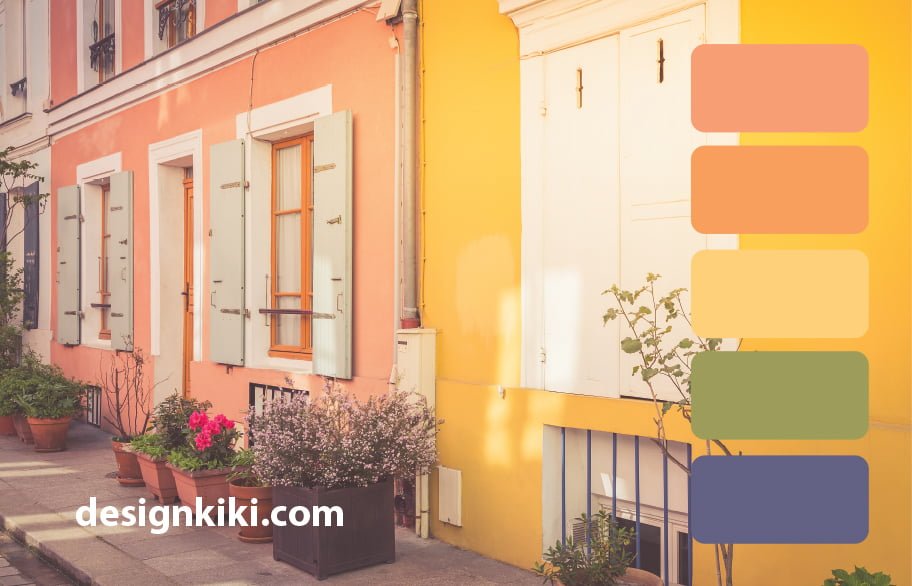
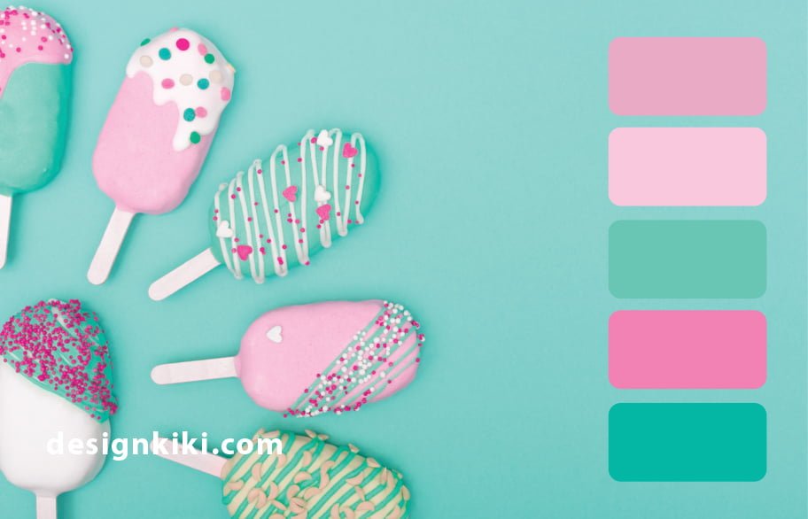
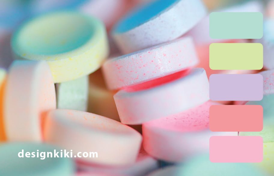
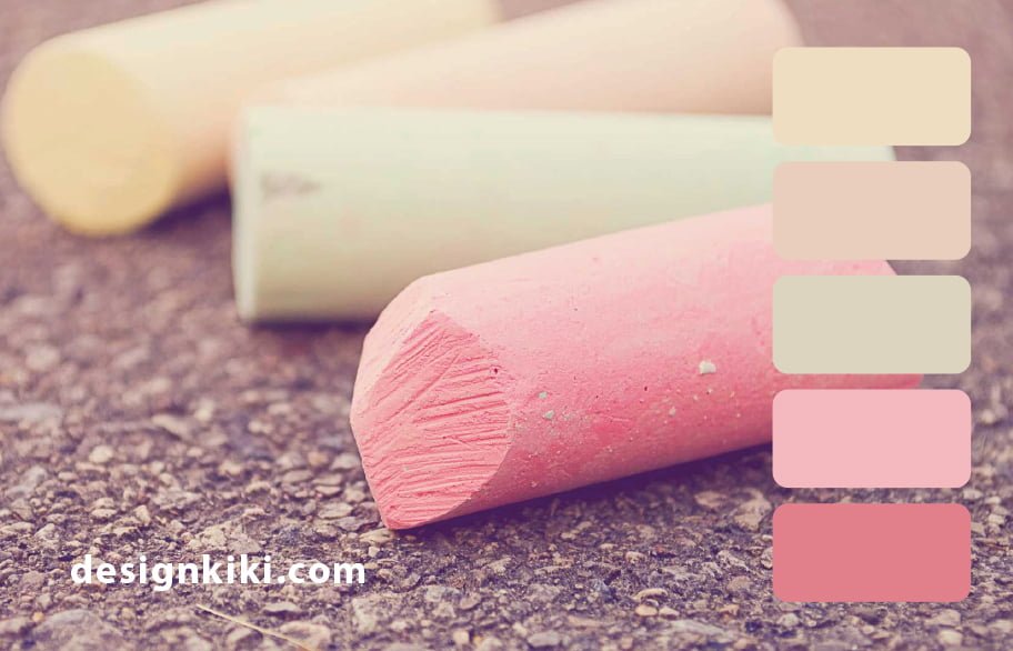
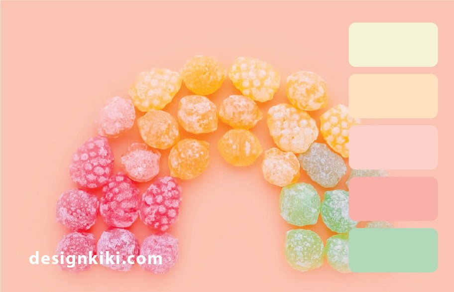
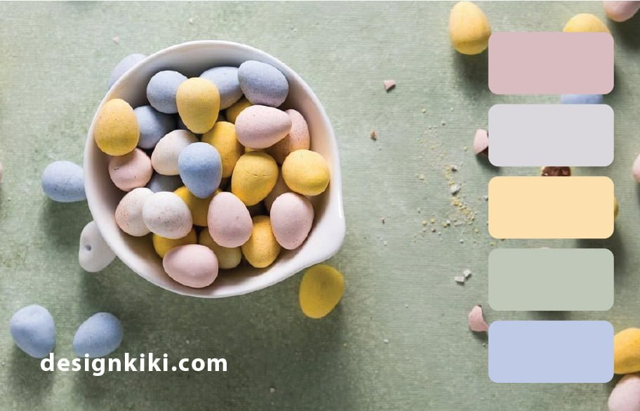
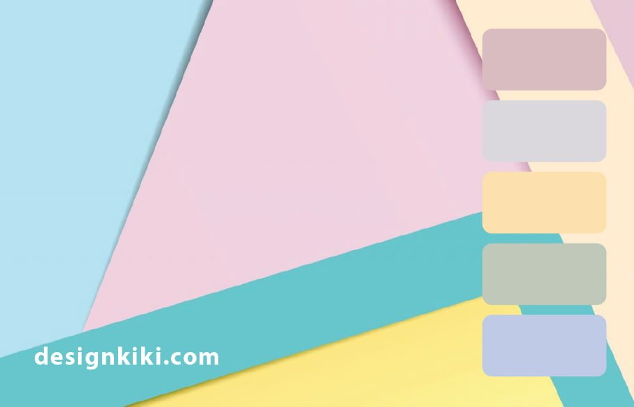
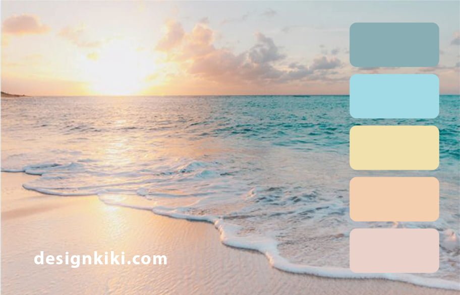
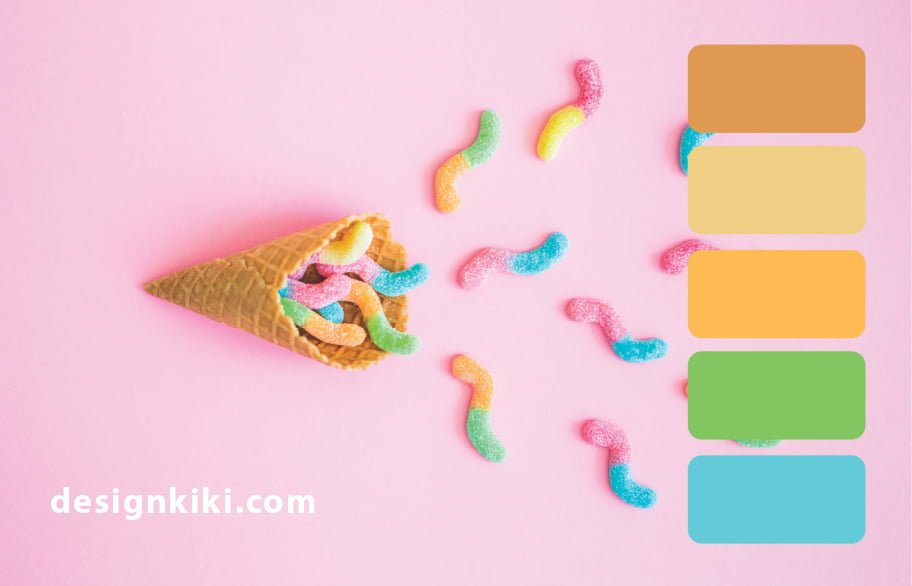
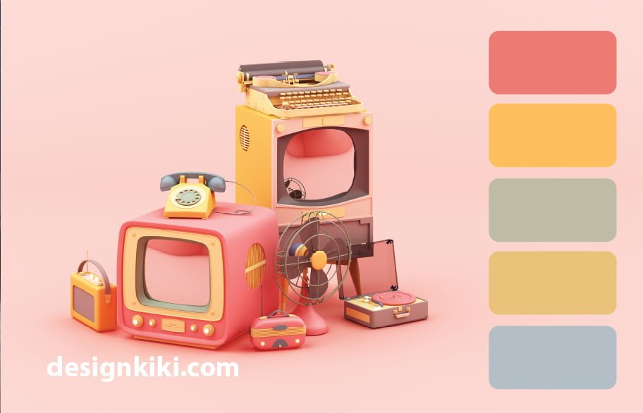
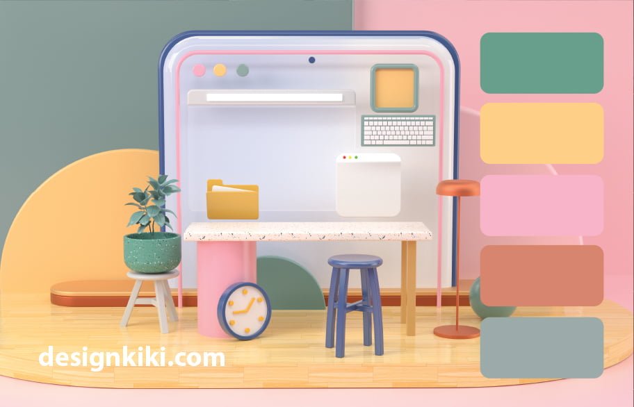
Here are 20 pastel color palettes to get you started-










Right here are actually seven wellness perks of CBD oil that are actually supported by clinical proof. Marijuana has been used to address discomfort as long ago as 2900 B.C. (). Even more lately, experts have uncovered that certain parts of cannabis, including CBD, are in charge of its pain-relieving results. The individual body consists of a customized system phoned the endocannabinoid device (ECS), which is involved in controling a variety of functionalities including sleeping, cravings, discomfort and also body immune system reaction (). The physical body creates endocannabinoids, which are actually neurotransmitters that tie to cannabinoid receptors in your peripheral nervous system.
dragonfly review
Whats up very nice website!! Man .. Excellent .. Amazing .. I’ll bookmark your blog and take the feeds alsoKI am happy to seek out so many useful info right here in the put up, we’d like work out more techniques on this regard, thanks for sharing. . . . . .