As easy as it looks, designing a logo is a task. But none that cannot be mastered. When trying to establish an identity for your business, logos are the first things that cross our minds. It serves as the visual identity of your brand. All the significant tycoons around the world have realized the importance of these visual tools and used them for their aid.
Logo design is a simple process with long-term implications. Logos are not something that can be changed frequently once launched. They are the relation of a customer to the brand. Changing a logo isn’t just a costly affair, but it also risks the relationship of a brand with its customers. Therefore it is very crucial to avoid making mistakes in logo design. But do not worry because we are here to lift some of that weight off your shoulders by helping you dodge the most common yet overlooked mistakes incurred while designing a logo. Here are five vicious mistakes you should be aware of.
Typographical mistakes: Font it right!
As a wise man once said, “You are just one font away from a marvel or a disaster.” Typography is an integral part of logo design. It was either enhance your logo or degrade it. However, no rule of thumb applies when you choose the perfect font. Experimentation is the key! Keep trying different fonts to check what suits your design best. The critical points to consider while choosing a font for your logo are the clarity of the font in various sizes, and the spacing between the characters.
If you have to choose more than one font, make sure that all the fonts look good together. Usually, serif fonts blend well with non-serif fonts. Nevertheless, using a lesser number of fonts is always better than overcrowding the design with a lot of fonts.
Complex designs: Simplicity is the key to authenticity!
Consider the logo of brands like Nike, Adidas, McDonald’s, Apple, Google, Pepsi, and Facebook. Apart from being the logos of the most famous companies, they have one thing in common. Simplicity. In a world already full of complexities, simplicity, and minimalism is the need of the hour. When it comes to logo designs, less is always more. Not only will it help you save on printing costs, but it will also make your logo more memorable.
Having said this, it is also essential for the logo to have a deeper meaning than what meets the eye. It will make your logo more impressionable to the audience for the long term. It will attach an emotional value to the already visually appealing graphic. Take the example of the logo of Amazon. The arrow from the letter A to Z in Amazon symbolizes the wide range and availability of products Amazon offers, hence visually communicating the USP of the company.
Improper size: Yes, size matters.
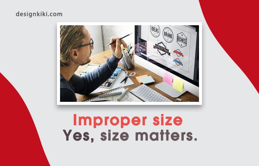
Logos are printed on and displayed across objects of varying sizes, starting from the handle of a toothbrush to huge roadside hoardings. Hence, it is only sane to design a logo that can be scaled to different sizes. Therefore, logos should be designed in vector-based software so that their adaptability is not compromised.
Further what we can remember here is that the clarity of the logo shouldn’t be affected when it is scaled down. If you don’t want this to happen, you should always try to choose simple geometrical shapes in the design.
Lack of research: Keep up with the trends.
Research is an imperative part of designing a logo. It is vital to know what’s trending in the market. You should look for companies’ logos as yours in the industry; no matter how big or small a company is, it is your potential competitor if, in the same industry. This will not only help you establish relevance but also make sure that your logo doesn’t resemble the logos of these companies. Henceforth helping you create your own unique identity.
But always keep in mind that your goal is only to take inspiration from these logos. Researching would help you find out what works best for the audience without going through the trial and error process. However, eventually, you have to create something that defines you and your brand.
Incompetent color scheme: Colour it out!
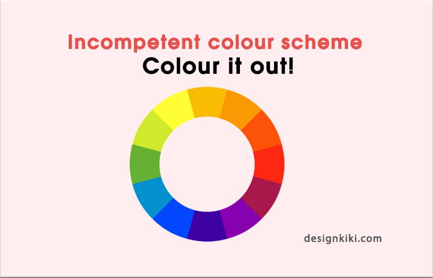
Color malfunctions are one of the most common errors when it comes to designing. The important here is to remember that logos are used on a lot of different platforms like window displays, newspapers, clothes, banners, digital media, and even embroidery sometimes.
Also, one should keep in mind that tones and hues of colors change when subjected to different platforms. Hence, it’s always better to test it out before deciding on anything.
While adding a little color is important, you should also make sure that the logo works in black and white, just in case. The right color scheme is the way to the audience’s heart. While it is comparatively easier to go with only one color, many famous logos also use a combination of two or more colors. The only catch is that the colors should complement each other. Subtle is the new charming. So do not go with too bold or bright colors.




Leave a Reply