
Logo designing is a task. There is always so much tension about what is right and what isn’t. To relieve you of this dilemma, we are here with the seven commonly made mistakes in the field of logo design and how to get past them.
Too much abstraction
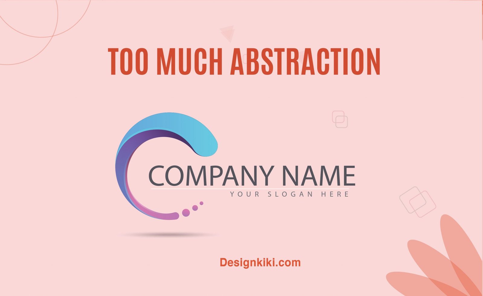
Usually, people just glance at a logo. They don’t watch it to analyze it. The attention span of people in the contemporary world is shorter than the blink of an eye! First impressions matter a lot. Don’t assume that your viewers will always fill in the blanks.
To capture attention, the message has to be received instantly, at a glance. To achieve this, your message has to be very clear, something that the masses can understand. If someone looks at your logo and is left with a feeling of confusion or is struggling to put the pieces together, you haven’t done your job. This is why it is generally not advisable to use too much abstraction for your logo. You should only try an abstract concept if you have a company related to the artistic field.
Picking out the wrong fonts
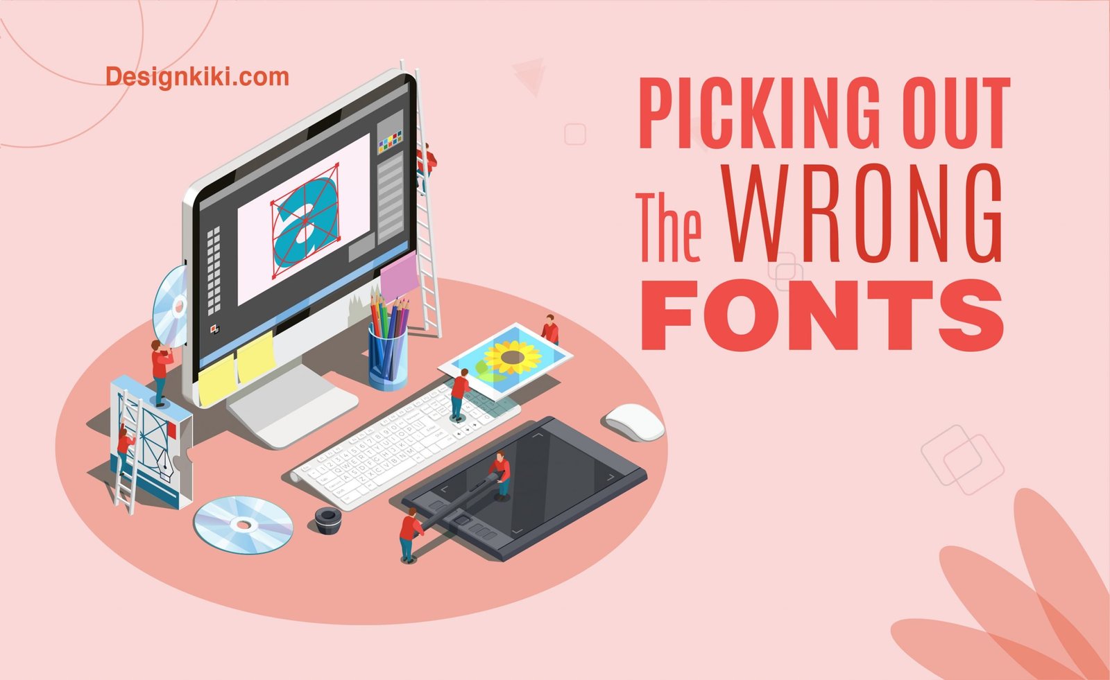
Font choices are very important for achieving visual harmony in a design. The typography you use can either completely ruin a design or enhance it. Believe it or not, fonts are an essential part of the design language.
There are theme-based fonts as well; for example, if you want to give your design a vintage feel, you can always opt for Aviator, Bayshore, and Rumble Brave. If you’re going to keep your design minimalistic yet edgy, always use sans serif fonts like Futura and Open Source. Lastly, no matter what your design looks like, if confused, go with Roboto. Click here to learn more about the topic.
Picking out the wrong colors
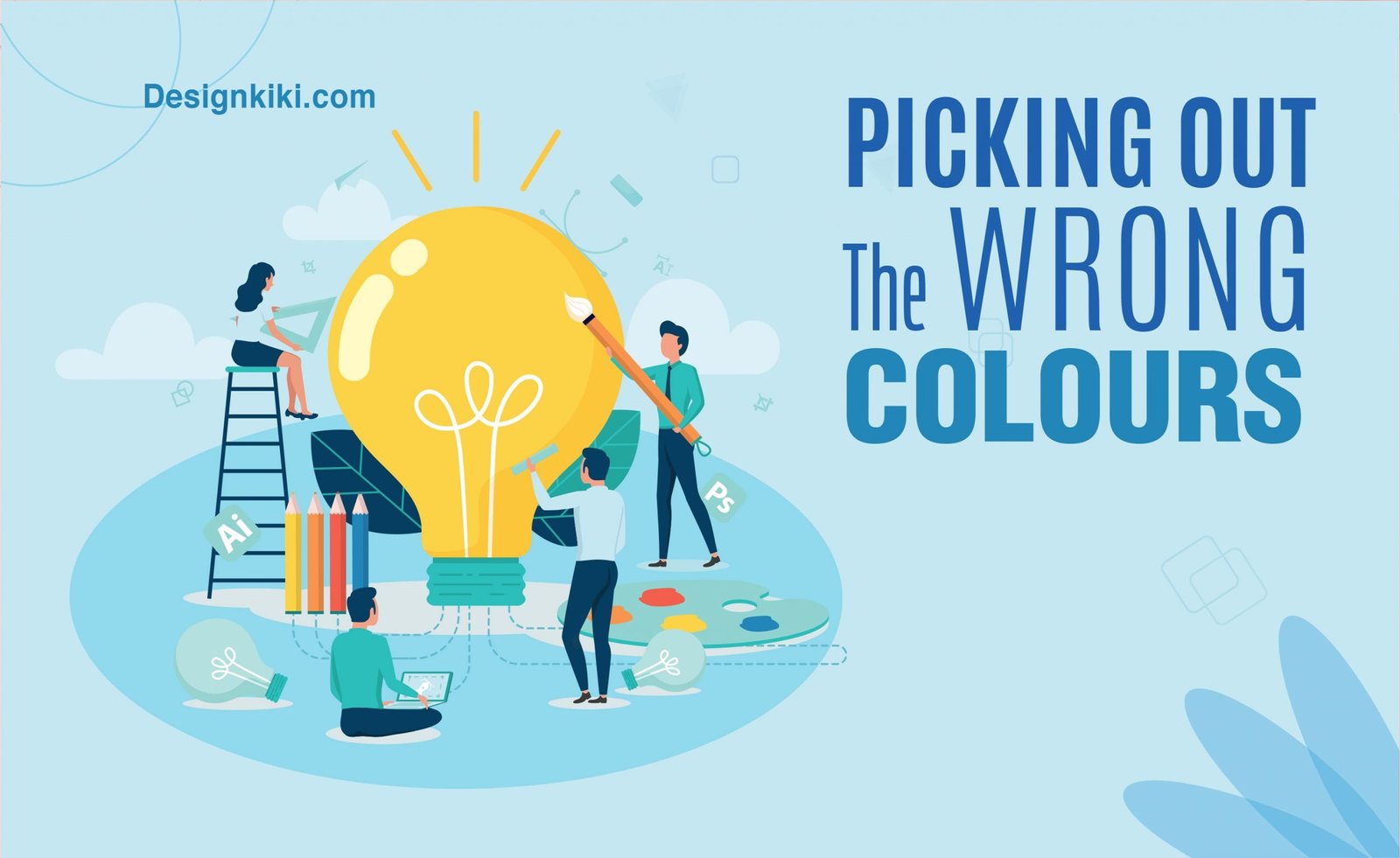
Colors are the most critical element in a logo. Since logos are usually printed in a small size, what makes them stand out is the color combination used. It is always advisable to use 3 or fewer colors in logo design. Always remember that colors appeal to the emotions of people; hence use them wisely. To understand more about colors and psychology, click here.
File size
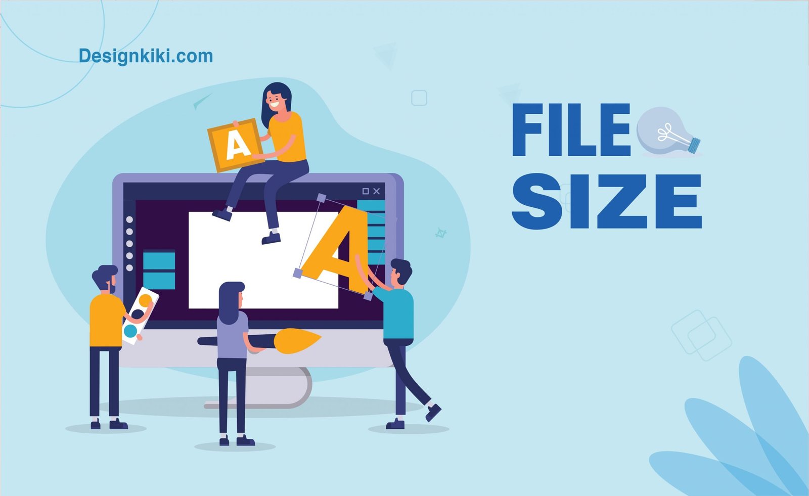
You should never use raster images in logo design. Logos should always be created on vector-based software like Adobe Illustrator. This ensures that the logo doesn’t get pixelated when scaled up or down. A pixelated logo gives an impression of mistrust and irresponsibility. This may affect your business in the long run.
Trying too hard to communicate
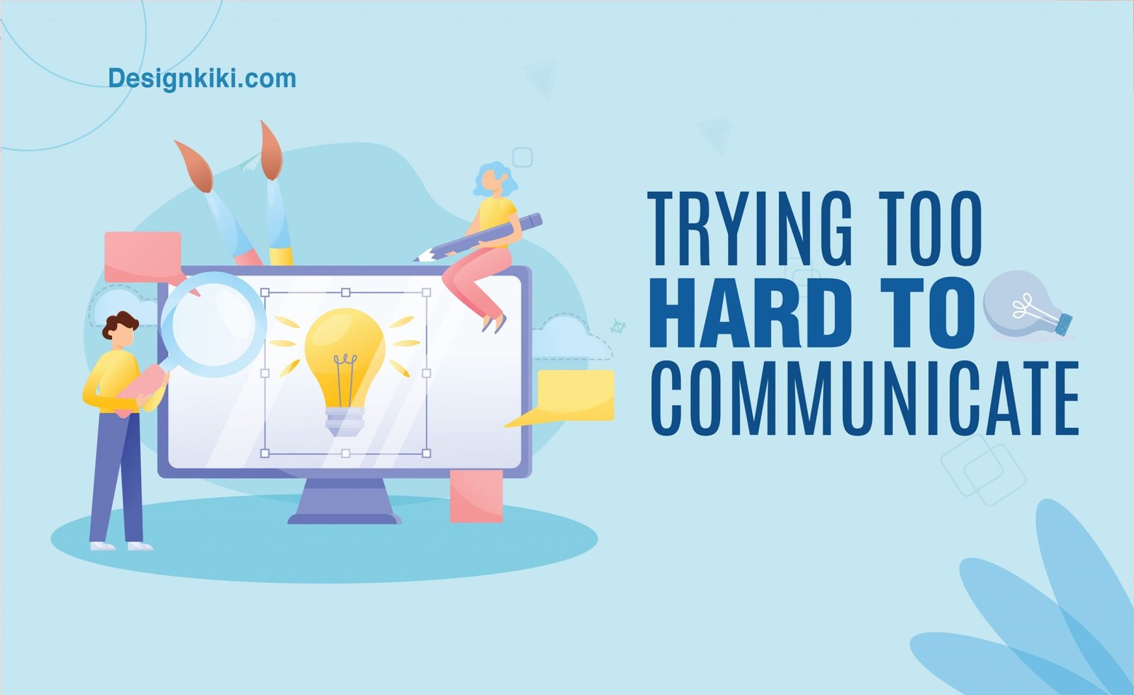
The message conveyed by a logo should be crisp and concise. The second important thing is to not try and give out too many messages at the same time. That might just confuse the audience and repel them. Remember that a person will only find the logo interesting if he gets the message. The simpler the logo, the better.
Using your inspirations
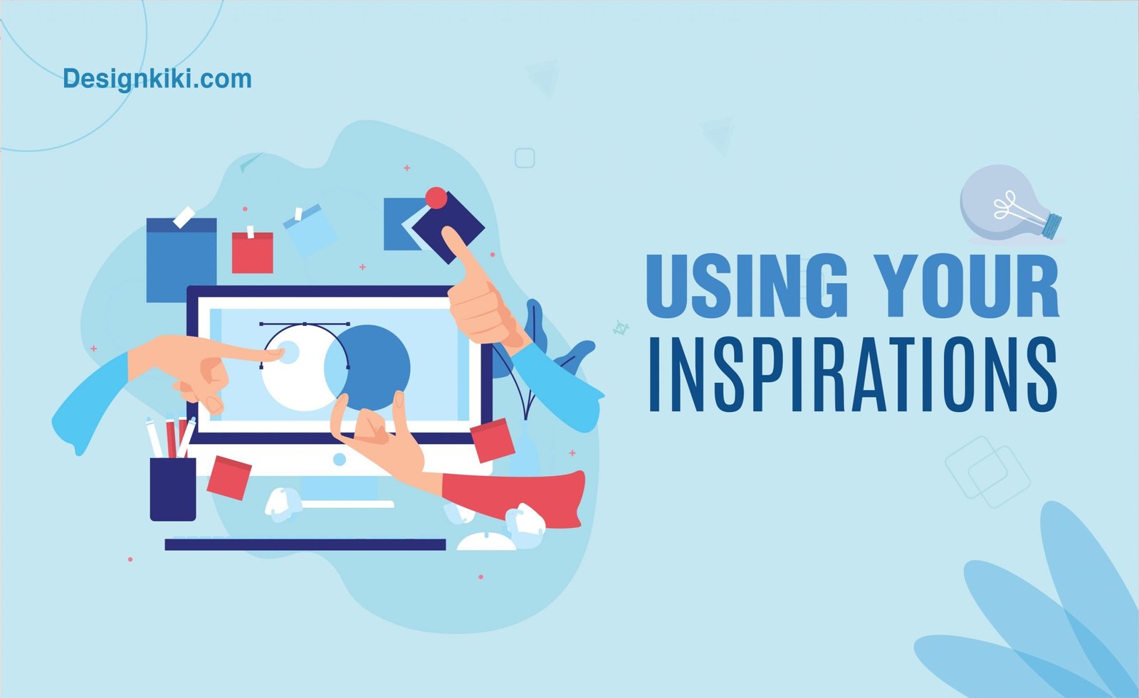
It is always good to have inspirations to refer to when designing a logo. But with that being said, remember that you shouldn’t use the inspirations literally. That just becomes a case of plagiarism and is a severe offense. Using someone’s idea is bound to have dire consequences sooner or later. Hence it is always better to be on the safe side. Moreover, being caught up in such a situation can always earn the company a bad reputation and will never go well with earning the customers’ trust.
Sometimes you may have had the same ideas that somebody else had coincidentally. To prevent such a situation, you should conduct thorough research before and after completing the design process.
Not thinking about the target audience
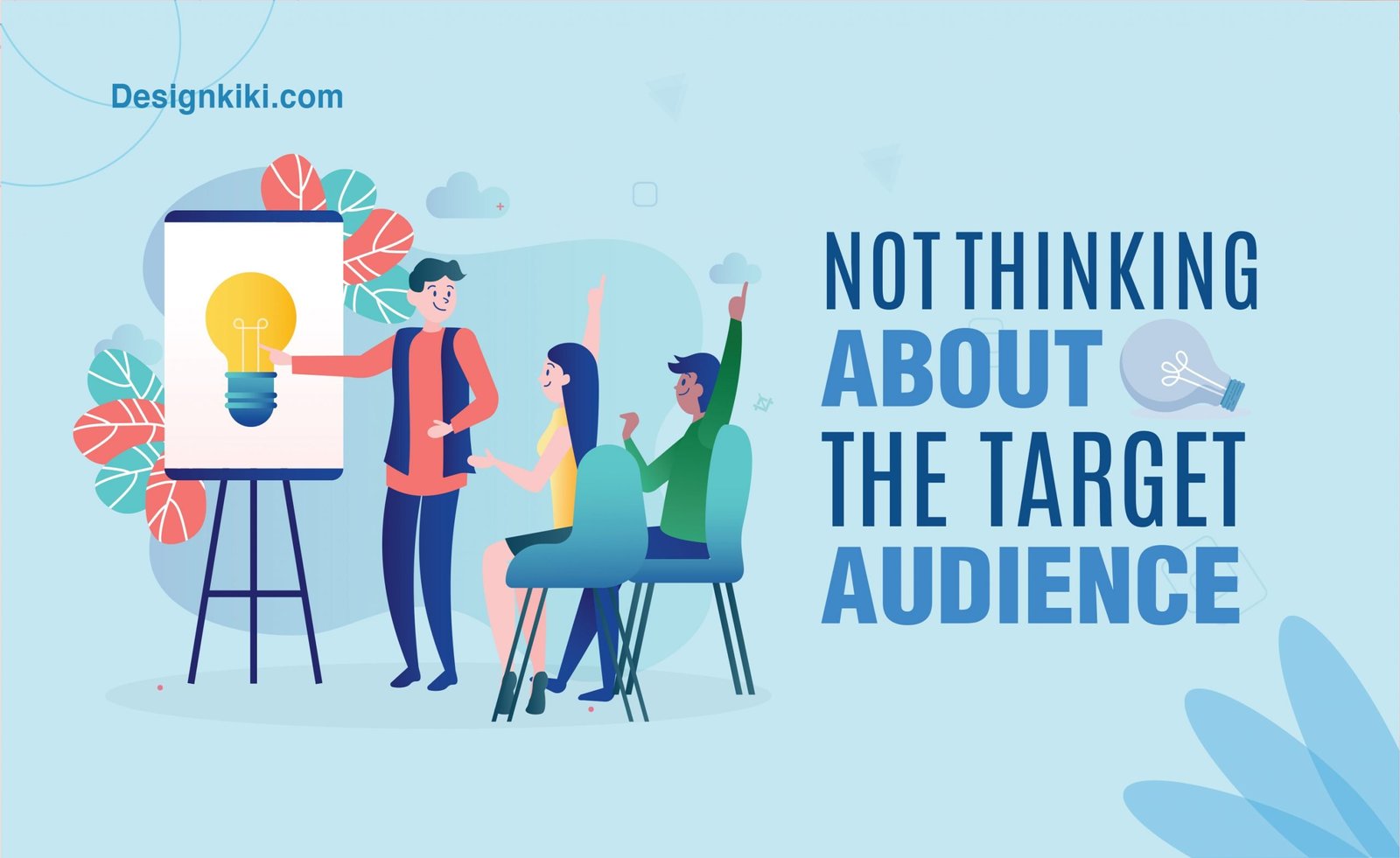
Thinking about who your target audience might be before designing a logo is very crucial. At the end of the day, the logo has to be relatable to a company’s customers.
Let’s study the logo of Hamleys, one of the big giants of the top-making industry. If you notice carefully, the font used in the logo looks just like a child’s handwriting. Also, they’ve used the color red in the logo, which appeals to young children. All the elements used in the logo make children more attracted to the company. The great success of the company is evidence of how much kids love the brand.
Logo designing can be a very tedious task. But always remember that the perfect logo is just a mistake away. So never give up trying.


I?¦ve recently started a website, the information you provide on this site has helped me greatly. Thank you for all of your time & work.