Designkiki Designkiki
  • Branding & Design
  • Kickstart Your Business
  • Logo Design
  • More
    • Tips and Tricks
    • AI
    • Infographics
    • Social Interest
  • Free GoodsNew
  • Branding & Design
  • Kickstart Your Business
  • Logo Design
  • More
    • Tips and Tricks
    • AI
    • Infographics
    • Social Interest
  • Free Goods
Logo Design

Five Big Brands With Bad Logos-do’s and Don’ts

nalini jamarNovember 7, 20201 Comment
Five Big Brands With Bad Logos-do’s and Don’ts

It does not take a lot to design bad logos, but it also does not take a whole lot to create a good one. Just a few key points can transform an average logo into a great one. So here are a few cautionary tales of some big brands with bad logos. Get ready with a pen and take notes of the mistakes these brands made and what we can learn from them.  

1. London Olympics 2012

bad logos

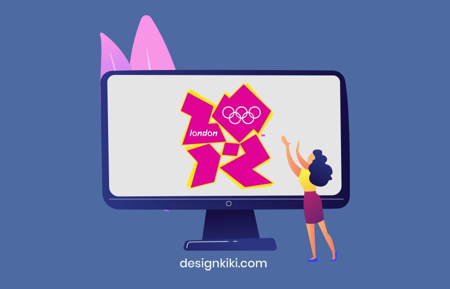
There was so much that wasn’t right about this logo-The weird graffiti-like font and just the appearance. This logo in no shape or form represented London as a city. The designers were embarrassed when the logo first debuted.

Moral of the story: Clumsy and casual isn’t for everyone. Know what your business represents, and make sure that your logo conveys it. Clarity is the foundation for a good logo.

2. Gap (2010)

bad logos- Gap

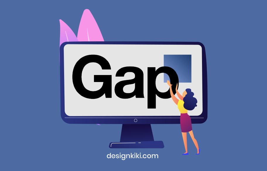
Who can forget this design blunder? When Gap redesigned its well-loved and immensely popular logo, it led to an outrage. The $4 billion brand image now looked like MS Word clip art. The Helvetica-like font was all the trend in the 2010s, so every brand assumed the Helvetica=successful logo.

Moral of the story: Don’t try to fix something that’s not broken.

3. eBay

Bad logos Evay

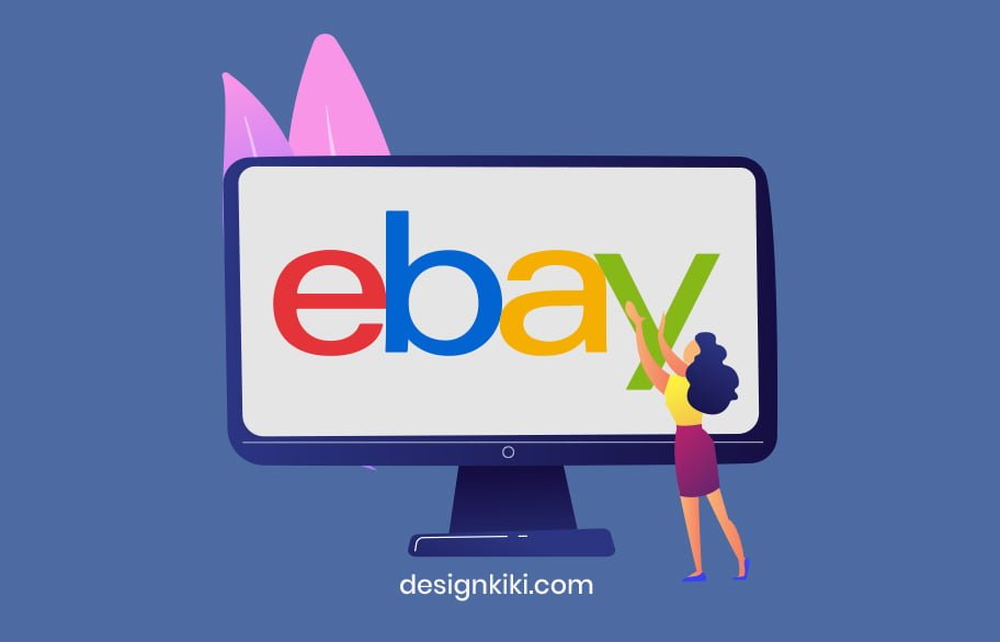
When eBay rebranded, the design community was not very sure about it. The retail giant assumed that removing all spacing between the letters and the Helvetica font would give the brand a more modern look. We feel that the disoriented placement of letters and the older font before rebranding was more memorable.

Moral of the story: Stand out of the crowd. Do things differently. There will be nothing memorable about your logo if it has the same font as five other big companies. Originality is the key.

4. NYC Taxi

NYC Taxi- Bad logos

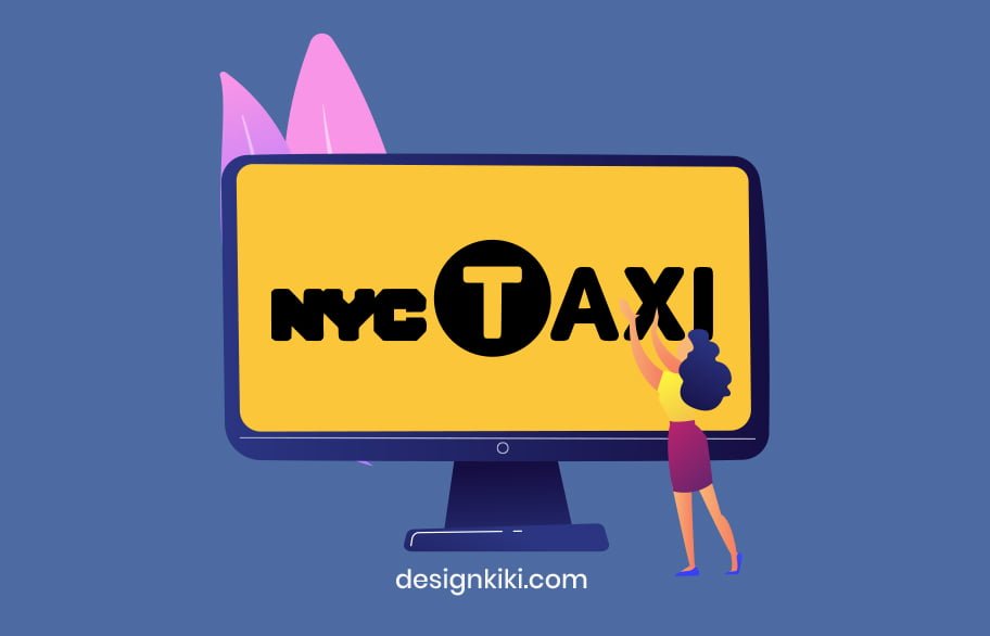
New York City is considered a hotspot for all things art and design. The taxi service in New York is its character that has been glorified in many romantic comedies. But this logo…is just so dull and unimpressionable. We have so many questions! Out of all the fonts that exist, somehow, the designers chose these two bad fonts to make one awful logo.  

Moral of the story: Your logo must be stimulating to the observer’s mind. It’s not doing what it’s supposed to if people forget about it in five seconds.

5.  Aol

Aol logo

Previously known as AOL, this logo was not received well by the design community. Firstly, the elephant in the room, the font! Helvetica. It’s the same story as eBay and Gap. It’s just a lazy cop-out. The logo is too simple and defeats the whole purpose of rebranding to a more contemporary vibe.

Moral of the story: Sometimes less isn’t more. It can translate to basic and unimpressionable. The execution of an idea must be appropriate.
Facebook Twitter Pin Linkedin
  • bad logo designs
  • bad logs
  • designkiki
  • designkikilogomaker
  • freelance
  • logo
  • logotool
  • makeronlinelogo
  • online logo maker
  • onlinelogomaker
  • onlinelogomakertool
  • portfolio
  • small business
  • startups
  • typography
  • work from home
  • worst logo designs
Vintage Logos-is Retro Limited to Fashion Only? Previous post
8 Most Iconic Mascot Logos Next post

Related Articles

Step-by-Step Guide to Creating a Custom Logo in Illustrator
Branding & DesignLogo Design

Step-by-Step Guide to Creating a Custom Logo in Illustrator

Ayush MidhaDecember 8, 2023
AIBranding & DesignLogo Design

Looka: AI-Powered Platform for Your Brand

Gaurav SinghOctober 31, 2023
Branding & DesignLogo Design

20+ Coffee Shop Logo Ideas That Can Inspire You

Gaurav SinghOctober 21, 2023
7 Branding and Logo Design Tips for Your Coffee Shop
Branding & DesignLogo Design

7 Branding and Logo Design Tips for Your Coffee Shop

nalini jamarJanuary 7, 2021

One Comment

  1. Ramon Bourns November 12, 2020 at 4:27 am Reply

    I like this weblog very much, Its a really nice spot to read and obtain info .

Leave a Reply Cancel reply

Your email address will not be published. Required fields are marked *

Recent Posts

  • Branding & Design

    Mostbet: Mobil Uygulama Ile Kazanin

    October 17, 2024
  • Branding & Design

    Fairgo Casino It’s Your Gateway to Online Gaming with Exclusive Promotions

    September 28, 2024
  • Branding & Design

    Mostbet: Yarisma ve turnirlere qosulmaq

    June 19, 2024
Branding & Design

Crafting Your Coffee Shop Brand Identity: Strategies for Standing Out in a Saturated Market

Ayush MidhaNovember 25, 2023
Branding & Design

15 Graphic Design Trends For 2024 (And How To Use Them)

Gaurav SinghNovember 24, 2023
Branding & Design

The 3 Pillars of Brand Positioning

Ayush MidhaNovember 17, 2023
AI2
Branding & Design46
Free Goods1

Helpdesk

  • About Us
  • Privacy Policy
  • Disclaimer
  • Contact Us

Recent Posts

  • Branding & Design

    Mostbet mobi – her zaman ve her yerde merc imkani

    October 29, 2024
  • Branding & Design

    Mostbet: Mobil Uygulama Ile Kazanin

    October 17, 2024

Categories

  • AI 2
  • Branding & Design 46
  • Free Goods 1
  • Infographics 3
  • Kickstart Your Business 24
  • Logo Design 32
  • Social Interest 2
  • Tips and Tricks 2
© Copyright 2023 DesignKIKI. All Rights Reserved Powered by DesignKIKI
Facebook Twitter Pin Linkedin