It does not take a lot to design bad logos, but it also does not take a whole lot to create a good one. Just a few key points can transform an average logo into a great one. So here are a few cautionary tales of some big brands with bad logos. Get ready with a pen and take notes of the mistakes these brands made and what we can learn from them.
1. London Olympics 2012
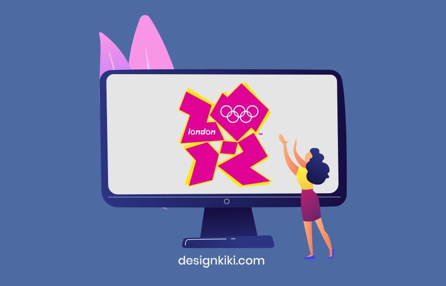
There was so much that wasn’t right about this logo-The weird graffiti-like font and just the appearance. This logo in no shape or form represented London as a city. The designers were embarrassed when the logo first debuted.
Moral of the story: Clumsy and casual isn’t for everyone. Know what your business represents, and make sure that your logo conveys it. Clarity is the foundation for a good logo.
2. Gap (2010)
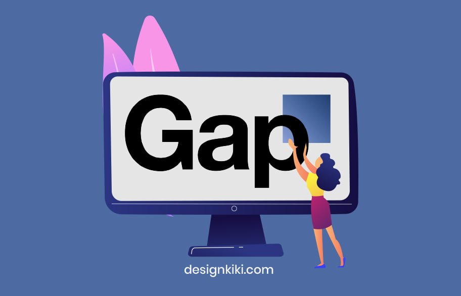
Who can forget this design blunder? When Gap redesigned its well-loved and immensely popular logo, it led to an outrage. The $4 billion brand image now looked like MS Word clip art. The Helvetica-like font was all the trend in the 2010s, so every brand assumed the Helvetica=successful logo.
Moral of the story: Don’t try to fix something that’s not broken.
3. eBay
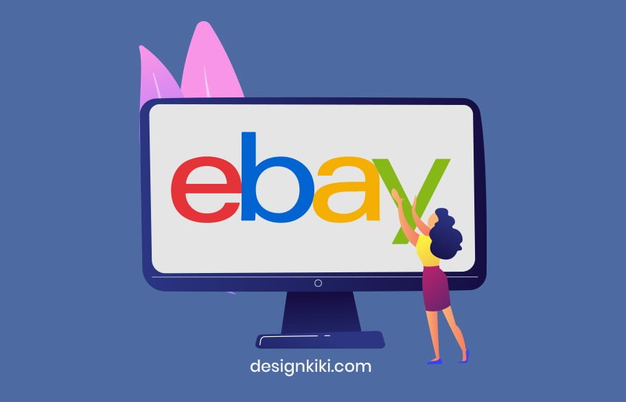
When eBay rebranded, the design community was not very sure about it. The retail giant assumed that removing all spacing between the letters and the Helvetica font would give the brand a more modern look. We feel that the disoriented placement of letters and the older font before rebranding was more memorable.
Moral of the story: Stand out of the crowd. Do things differently. There will be nothing memorable about your logo if it has the same font as five other big companies. Originality is the key.
4. NYC Taxi
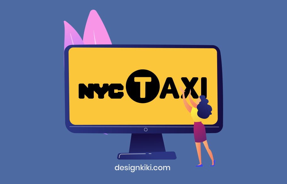
New York City is considered a hotspot for all things art and design. The taxi service in New York is its character that has been glorified in many romantic comedies. But this logo…is just so dull and unimpressionable. We have so many questions! Out of all the fonts that exist, somehow, the designers chose these two bad fonts to make one awful logo.
Moral of the story: Your logo must be stimulating to the observer’s mind. It’s not doing what it’s supposed to if people forget about it in five seconds.
5. Aol

Previously known as AOL, this logo was not received well by the design community. Firstly, the elephant in the room, the font! Helvetica. It’s the same story as eBay and Gap. It’s just a lazy cop-out. The logo is too simple and defeats the whole purpose of rebranding to a more contemporary vibe.




I like this weblog very much, Its a really nice spot to read and obtain info .