Logo designing is a purpose-driven process and requires one to put all their energy into it. It is so much more than just an abstract piece of design. A logo (timeless logo) is a visual identity that sometimes becomes more identifiable than the brand name. This is precisely why I said that you should put everything in your capacity into the design process, including your creative thoughts, artistic thinking, and efficient planning.
That said, everyone looking to get a logo design shoots for something original and, at the same time, durable. Durable in the sense that it will stick around for a couple of decades before it needs a touch-up. However, not many will achieve this, and will get stuck in a rut! But what makes a timeless logo? How do we know if it is timeless or not?
Here’s how! Following is a list of the five characteristics that every timeless brand icon will have if your logo falls under each one of them, congratulations! You’ve got yourself a timeless logo. If not, you will at least know where to make those corrections.
Simplicity
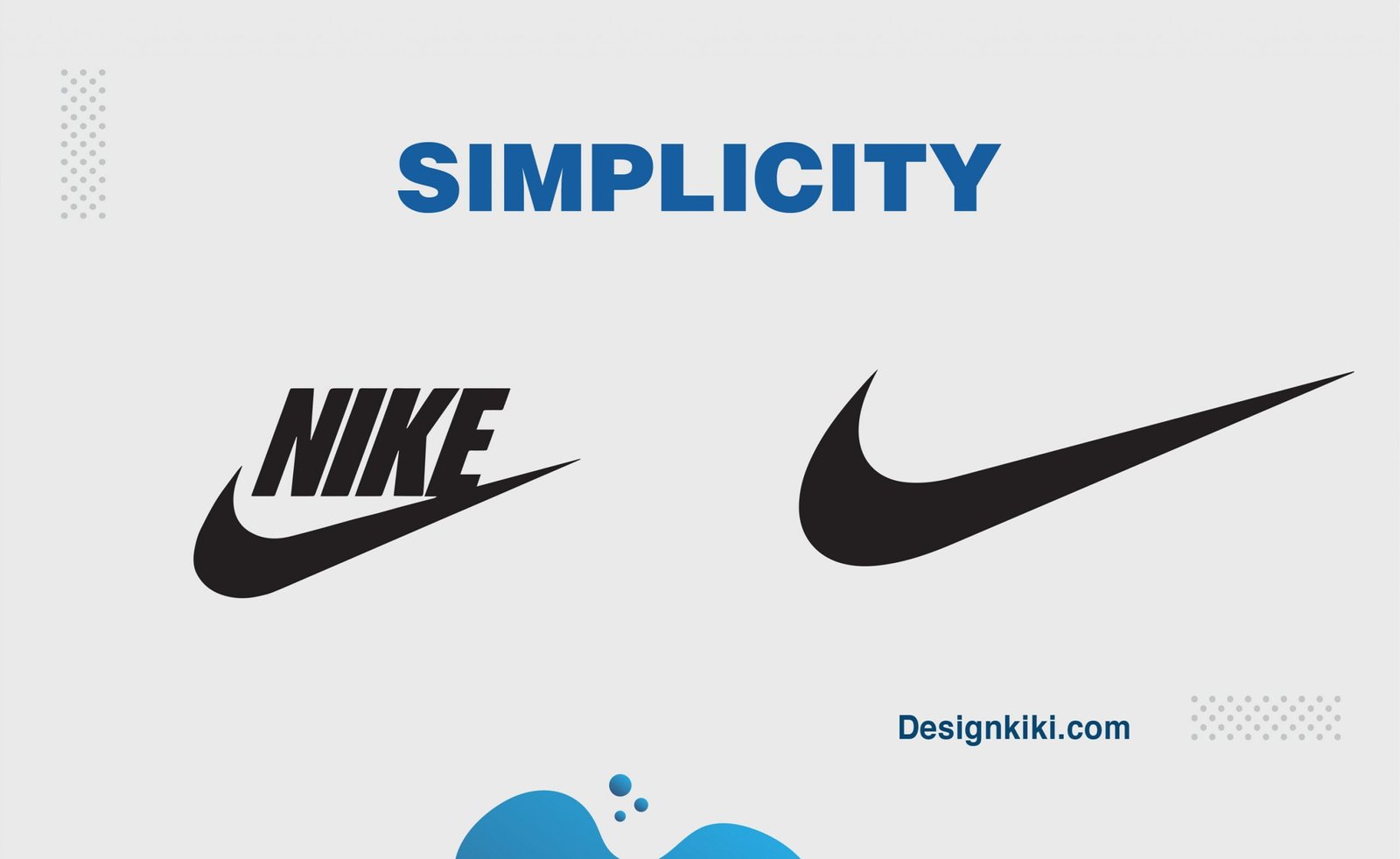
While brainstorming, you are bound to come up with many silly ideas, but you do not want to include them all in your logo. Focus on some minimal yet substantial premises. One will always be better than the others. Look for the one idea that is on the same page as your brand. Keep the logo clean and simple. The more complicated it gets, the faster it will date. So, it’s best to keep it simple. This will draw emphasis, power, and a recognizable image that can be easily identified as your brand grows and prospers.
Limited use of color
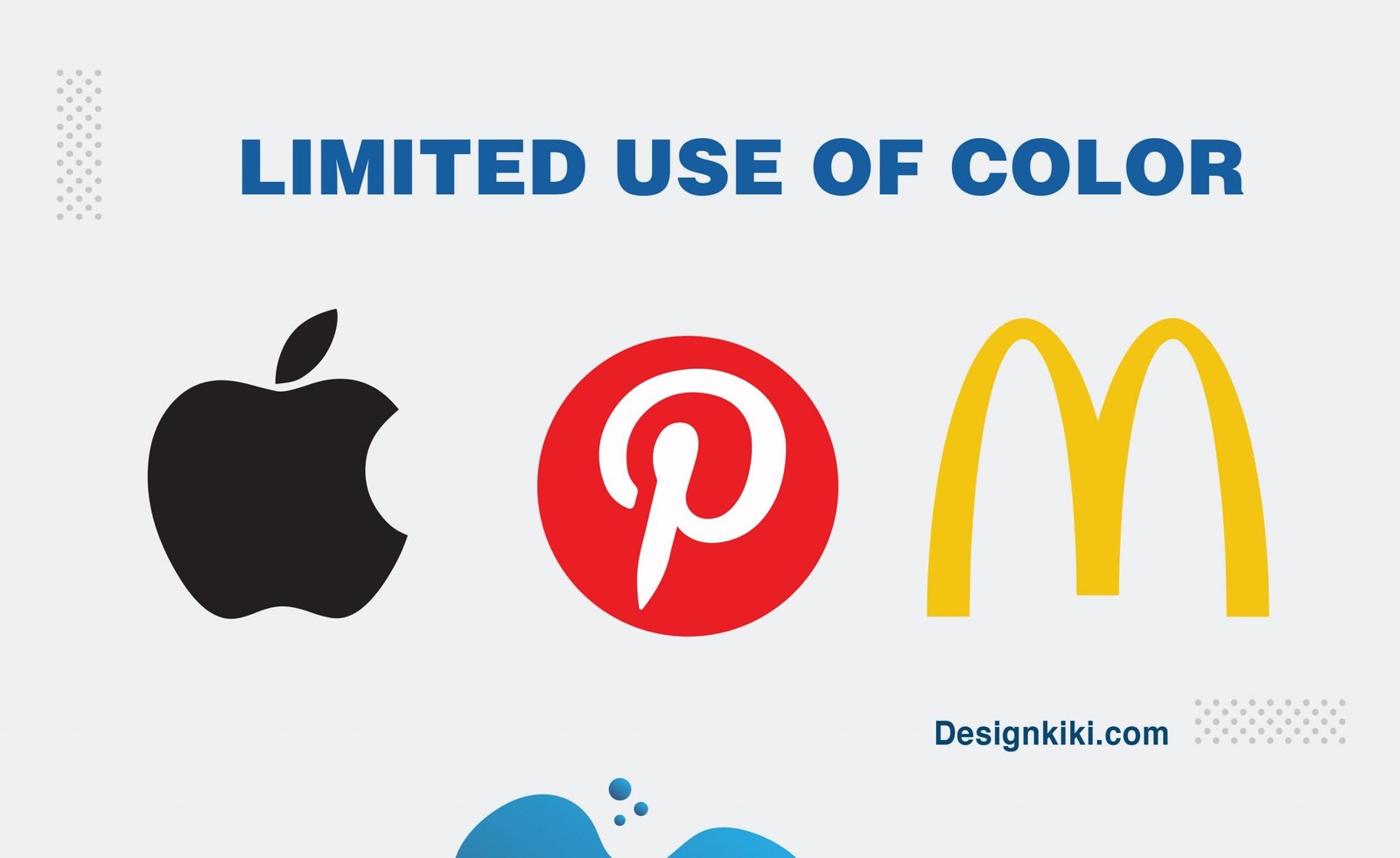
When designing your logo, it is usually best practice to stick by a small color palette of one main color, possibly a minor secondary color, and then one neutral color. Why? So that your audience does not get distracted by the mumble-jumble of colors.
When selecting a core color, delve into all the different tones and shades of the colors you like. If you end up choosing a bright color, you might want to go for a slightly muted version of it; this will always give a more sophisticated touch to the brand while making it timeless. Color can be personal, but you can have your cake and eat it with a little expert attention. To learn more about how to choose the right color for your brand, click here.
Relevance
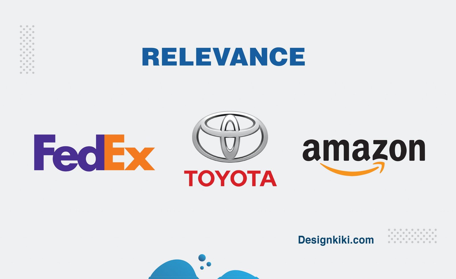
The best logo design will always be singular in its messaging. When I say singular, it means that it will correspond to a particular industry and a given range of products and services. The message should be relevant and must be significant to your audience. This may seem obvious, but it’s worth emphasizing because it is indispensable to your brand image.
Relevance also means that your logo should be allied with your business interests, rather than your perception. Avoid redundant elements that may be visually attractive, but don’t provision your message.
Versatility
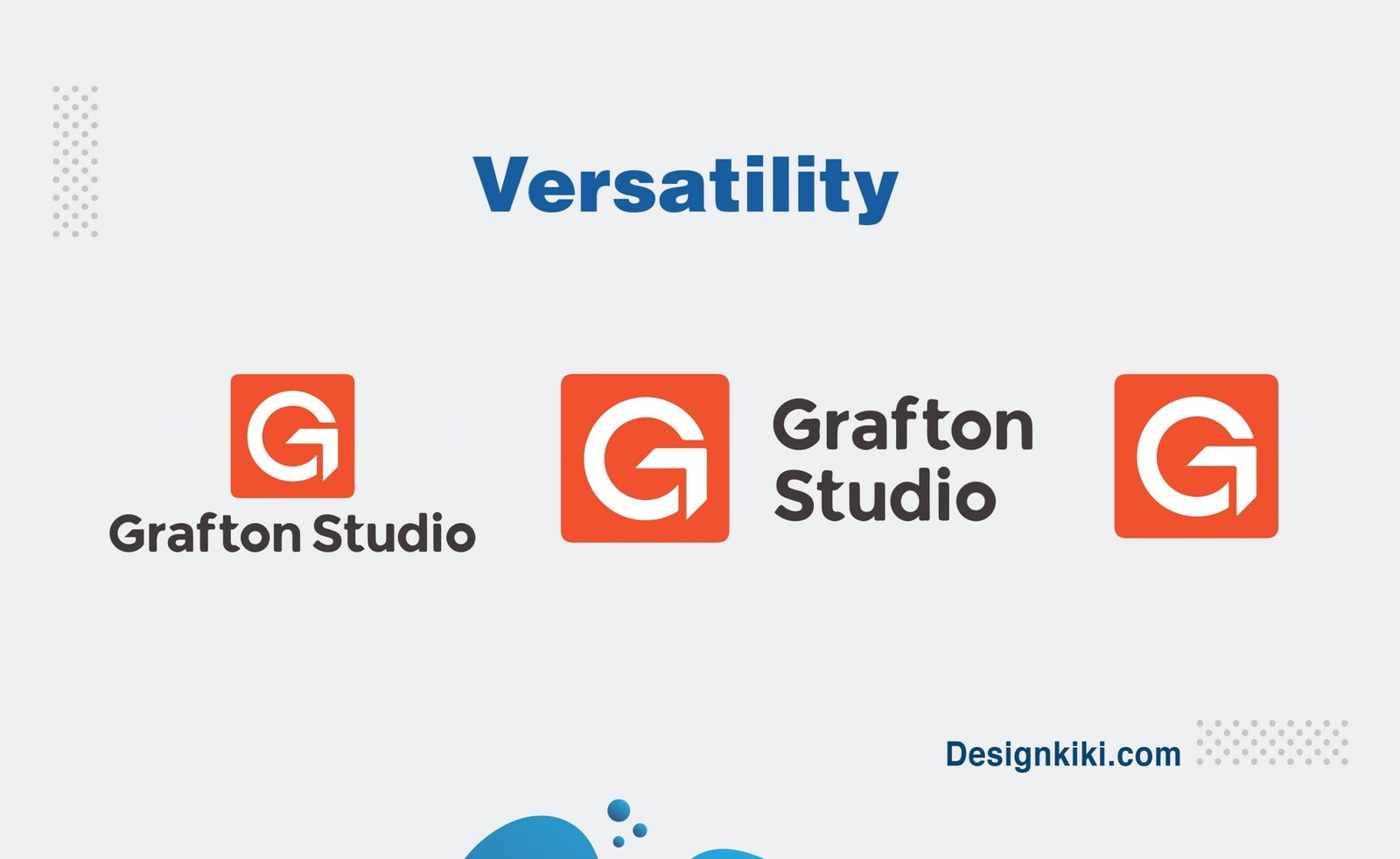
Whatever size your logo is, it will not always fit into all the places that you might need to put your logo on. Icons and fonts should be balanced so that they are legible at any size and in various settings. Will your logo still be clear and convincing if it appears in a single color or a black background instead of a white? The best designers reflect on these aspects and strategies accordingly. A professional designer will also supply you with a style guide with logo variations, which delivers the best way of using your logo in a given situation.
Artistry
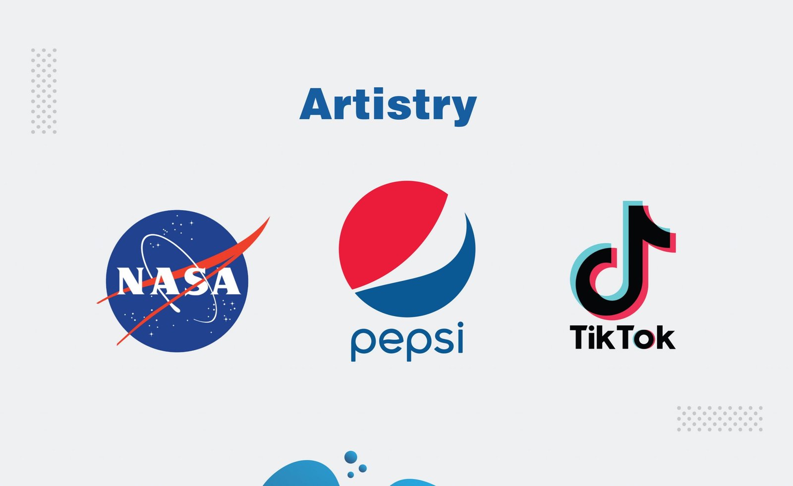
In the end, a great logo is like a piece of art. Like the best of art, it can immediately arouse pleasure, joy, expectation, or tranquillity. It combines font, color, layout, and graphic elements into a union that can display in a single glimpse the zeal and passion behind your business. It takes real creative instincts to assemble these elements for maximum impact and influence. This is the most demanding criteria to justify for most, but a little extra thought can always come in handy.

An impressive share! I’ve just forwarded this onto a coworker who has been doing a little research on this. And he actually bought me lunch simply because I stumbled upon it for him… lol. So let me reword this…. Thanks for the meal!! But yeah, thanx for spending time to talk about this subject here on your blog.
web site
Greate post. Keep posting such kind of information on your blog. Im really impressed by your blog.
Hi there, You have performed a great job. I’ll definitely digg it and in my view recommend to my friends. I am sure they’ll be benefited from this site.
I loved as much as you will receive carried out right here. The sketch is tasteful, your authored subject matter stylish. nonetheless, you command get bought an impatience over that you wish be delivering the following. unwell unquestionably come more formerly again as exactly the same nearly a lot often inside case you shield this increase.
You really make it seem so easy with your presentation but I find this matter to be actually something which I think I would never understand. It seems too complex and very broad for me. I’m looking forward for your next post, I’ll try to get the hang of it!
I do believe all of the ideas you have offered on your post. They are really convincing and will definitely work. Nonetheless, the posts are too short for starters. May just you please lengthen them a bit from subsequent time? Thank you for the post.
Aw, this was an incredibly good post. Taking the time and actual effort to create a superb article… but what can I say… I procrastinate a lot and don’t seem to get anything done.
Wow that was unusual. I just wrote an very long comment but after I clicked submit my comment didn’t appear. Grrrr… well I’m not writing all that over again. Regardless, just wanted to say wonderful blog!
I got this web page from my pal who told me concerning this web page and at the moment this time I am browsing this website and reading very informative posts at this time.
It’s really a nice and helpful piece of info. I’m happy that you just shared this helpful information with us. Please stay us informed like this. Thank you for sharing.
When I initially commented I appear to have clicked the -Notify me when new comments are added- checkbox and from now on whenever a comment is added I recieve four emails with the same comment. Is there an easy method you can remove me from that service? Many thanks!