Logo designing is a purpose-driven process and requires one to put all their energy into it. It is so much more than just an abstract piece of design. A logo (timeless logo) is a visual identity that sometimes becomes more identifiable than the brand name. This is precisely why I said that you should put everything in your capacity into the design process, including your creative thoughts, artistic thinking, and efficient planning.
That said, everyone looking to get a logo design shoots for something original and, at the same time, durable. Durable in the sense that it will stick around for a couple of decades before it needs a touch-up. However, not many will achieve this, and will get stuck in a rut! But what makes a timeless logo? How do we know if it is timeless or not?
Here’s how! Following is a list of the five characteristics that every timeless brand icon will have if your logo falls under each one of them, congratulations! You’ve got yourself a timeless logo. If not, you will at least know where to make those corrections.
Simplicity
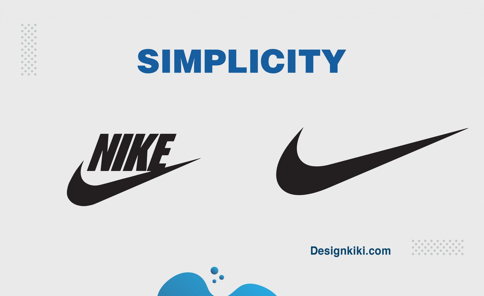
While brainstorming, you are bound to come up with many silly ideas, but you do not want to include them all in your logo. Focus on some minimal yet substantial premises. One will always be better than the others. Look for the one idea that is on the same page as your brand. Keep the logo clean and simple. The more complicated it gets, the faster it will date. So, it’s best to keep it simple. This will draw emphasis, power, and a recognizable image that can be easily identified as your brand grows and prospers.
Limited use of color
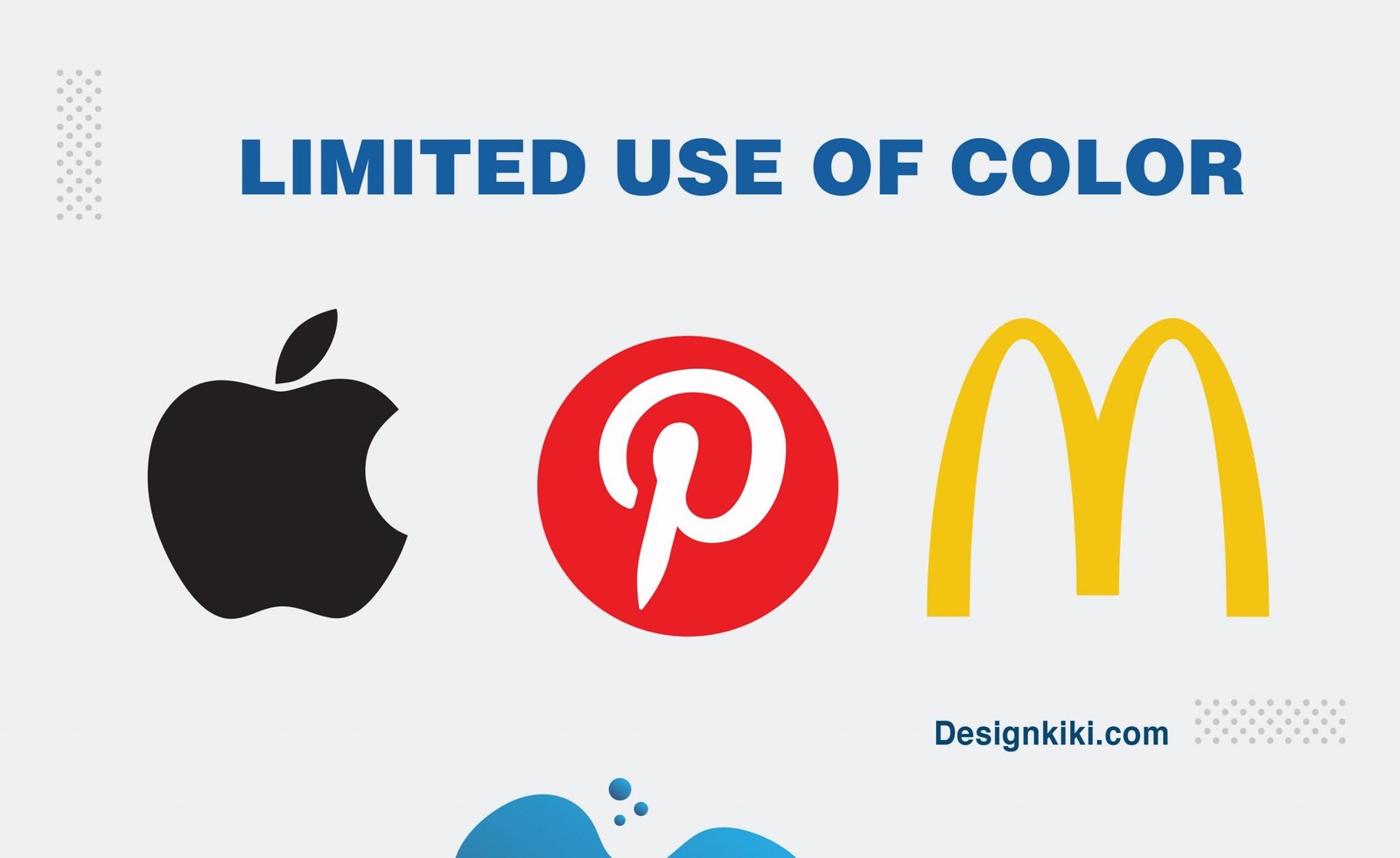
When designing your logo, it is usually best practice to stick by a small color palette of one main color, possibly a minor secondary color, and then one neutral color. Why? So that your audience does not get distracted by the mumble-jumble of colors.
When selecting a core color, delve into all the different tones and shades of the colors you like. If you end up choosing a bright color, you might want to go for a slightly muted version of it; this will always give a more sophisticated touch to the brand while making it timeless. Color can be personal, but you can have your cake and eat it with a little expert attention. To learn more about how to choose the right color for your brand, click here.
Relevance
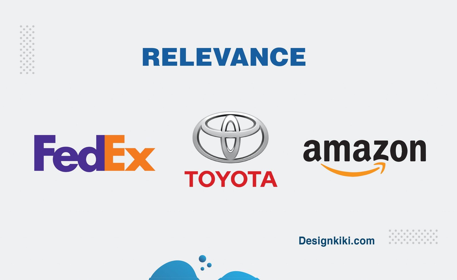
The best logo design will always be singular in its messaging. When I say singular, it means that it will correspond to a particular industry and a given range of products and services. The message should be relevant and must be significant to your audience. This may seem obvious, but it’s worth emphasizing because it is indispensable to your brand image.
Relevance also means that your logo should be allied with your business interests, rather than your perception. Avoid redundant elements that may be visually attractive, but don’t provision your message.
Versatility
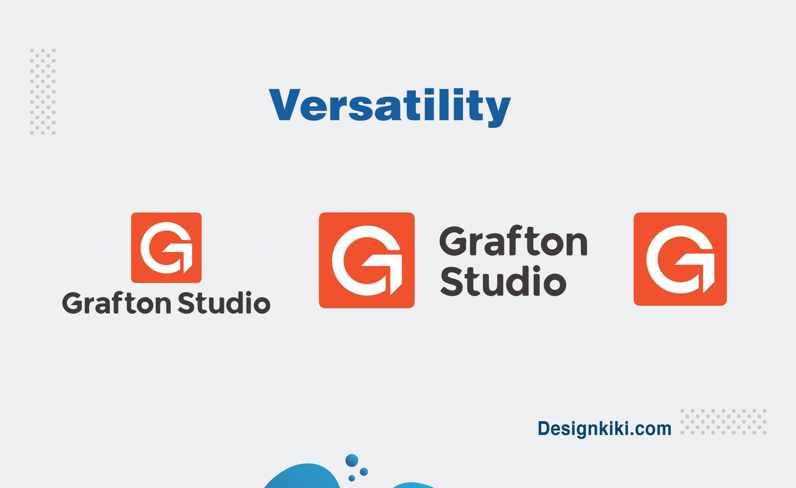
Whatever size your logo is, it will not always fit into all the places that you might need to put your logo on. Icons and fonts should be balanced so that they are legible at any size and in various settings. Will your logo still be clear and convincing if it appears in a single color or a black background instead of a white? The best designers reflect on these aspects and strategies accordingly. A professional designer will also supply you with a style guide with logo variations, which delivers the best way of using your logo in a given situation.
Artistry
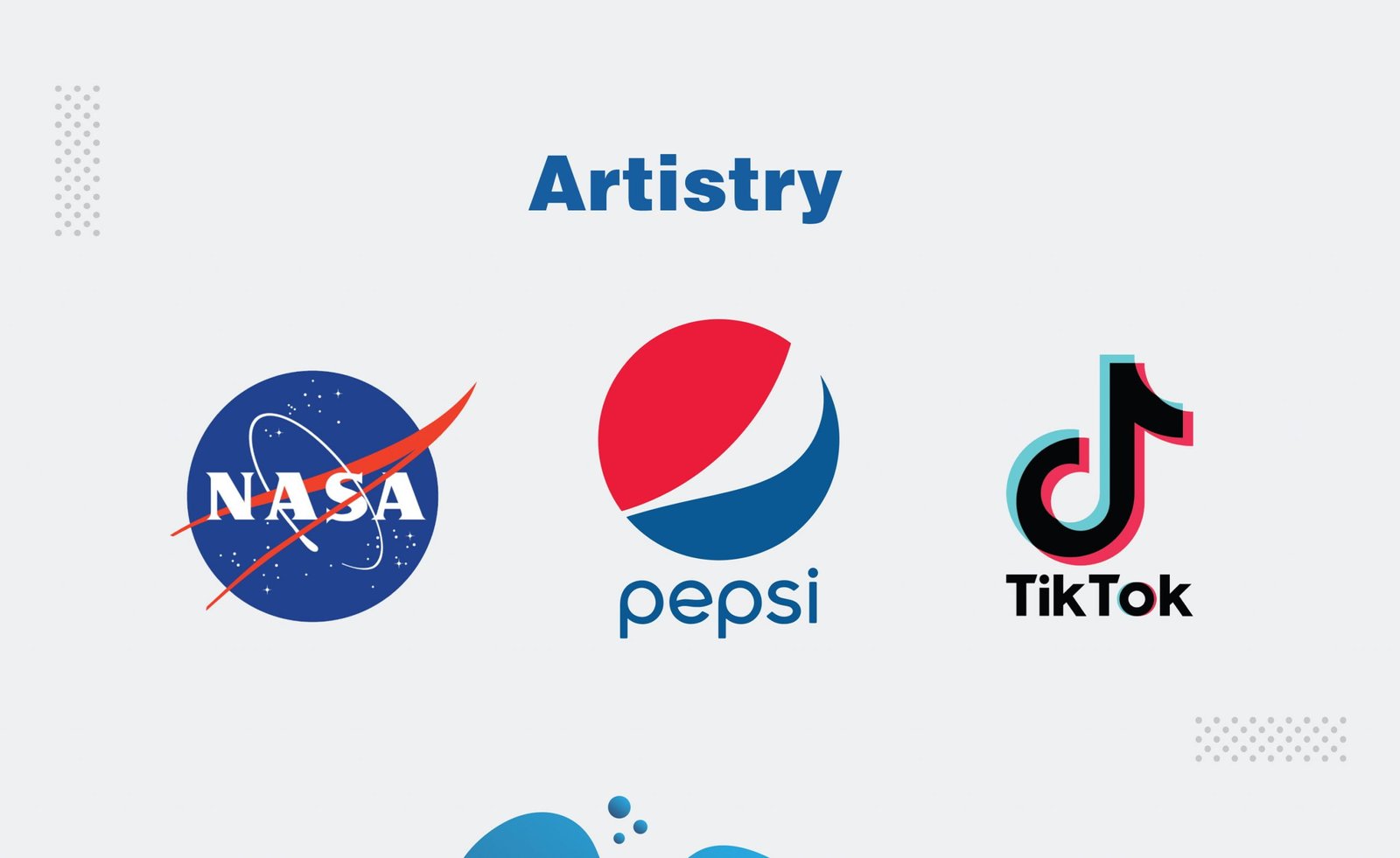
In the end, a great logo is like a piece of art. Like the best of art, it can immediately arouse pleasure, joy, expectation, or tranquillity. It combines font, color, layout, and graphic elements into a union that can display in a single glimpse the zeal and passion behind your business. It takes real creative instincts to assemble these elements for maximum impact and influence. This is the most demanding criteria to justify for most, but a little extra thought can always come in handy.

Hello! I could have sworn I’ve been to this website before but after browsing through some of the post I realized it’s new to me. Nonetheless, I’m definitely happy I found it and I’ll be book-marking and checking back often!
Simply desire to say your article is as surprising. The clearness in your post is simply cool and i can assume you’re an expert on this subject. Fine with your permission let me to grab your feed to keep up to date with forthcoming post. Thanks a million and please carry on the enjoyable work.
of course like your website however you have to take a look at the spelling on several of your posts. Many of them are rife with spelling issues and I in finding it very bothersome to tell the reality however I will certainly come back again.
Thanks in support of sharing such a fastidious idea, post is fastidious, thats why i have read it completely
Hmm is anyone else having problems with the images on this blog loading? I’m trying to find out if its a problem on my end or if it’s the blog. Any suggestions would be greatly appreciated.
I loved as much as you’ll receive carried out right here. The sketch is tasteful, your authored subject matter stylish. nonetheless, you command get bought an shakiness over that you wish be delivering the following. unwell unquestionably come more formerly again as exactly the same nearly very often inside case you shield this increase.
I think this is among the most significant info for me. And i am glad reading your article. But should remark on some general things, The website style is ideal, the articles is really great : D. Good job, cheers
I like the valuable information you provide in your articles. I will bookmark your weblog and check again here regularly. I’m quite sure I’ll learn a lot of new stuff right here! Good luck for the next!
Hi there, just became aware of your blog through Google, and found that it’s truly informative. I’m gonna watch out for brussels. I will be grateful if you continue this in future. Many people will be benefited from your writing. Cheers!
I love your blog.. very nice colors & theme. Did you design this website yourself or did you hire someone to do it for you? Plz answer back as I’m looking to design my own blog and would like to know where u got this from. appreciate it