Why do we have business cards?

Despite all the technological advancements of the 21st century, business cards are still an essential element of the corporate world. No amount of automation can replace the kind of personal touch that handing a business card has. Most company officials keep some cards in their pockets and hand out the cards when shaking hands with potential clients.
Business cards are your marketing friends who help spread the word about your business. They are an important part of the process of branding, just like creating a logo. To learn more about branding, click here. According to statistics, about 70% get form first impressions by looking at a business card. So without further ado, let’s take a plunge into the basics first.
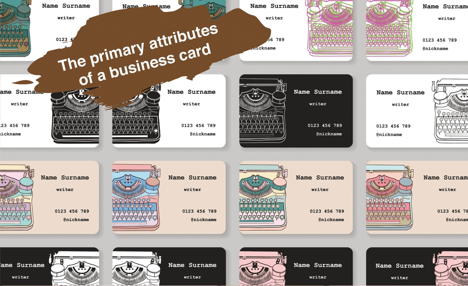
The primary attributes of a business card
Cost efficiency
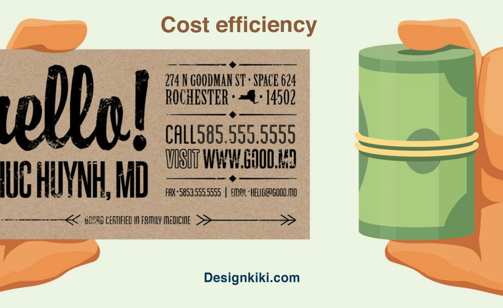
Business cards are usually produced in thousands. Therefore, it is crucial to keep in mind the economic factor when designing one. Although economies of scale do reduce the cost per piece, it is still advisable to try and keep the price per piece to a minimum.
Portability
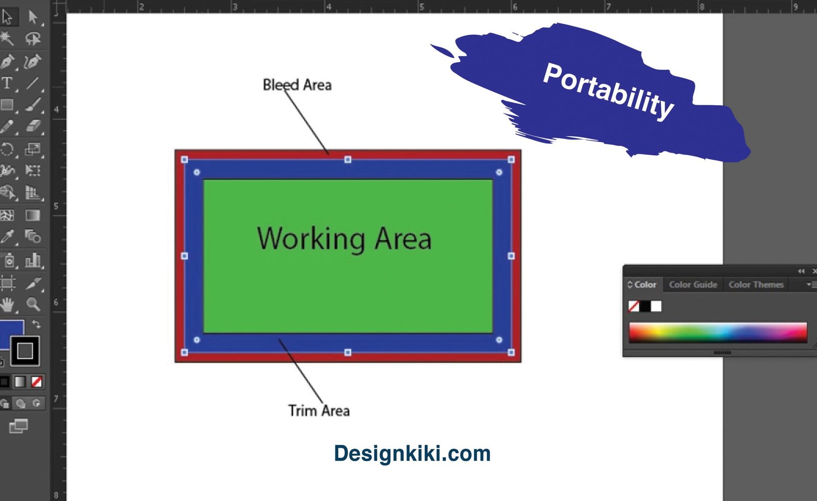
Business cards are always small in size and can be easily carried in a wallet or a purse. The intention is to make it easy to be carried around by the client or potential customer as well as the distributor. However, business cards are also found in the form of paperweights and pen stands. These forms of business cards do not fulfill the purpose because they are neither cost-efficient nor portable. The standard size of a traditional business card is 3.5*2 inches.
Communication
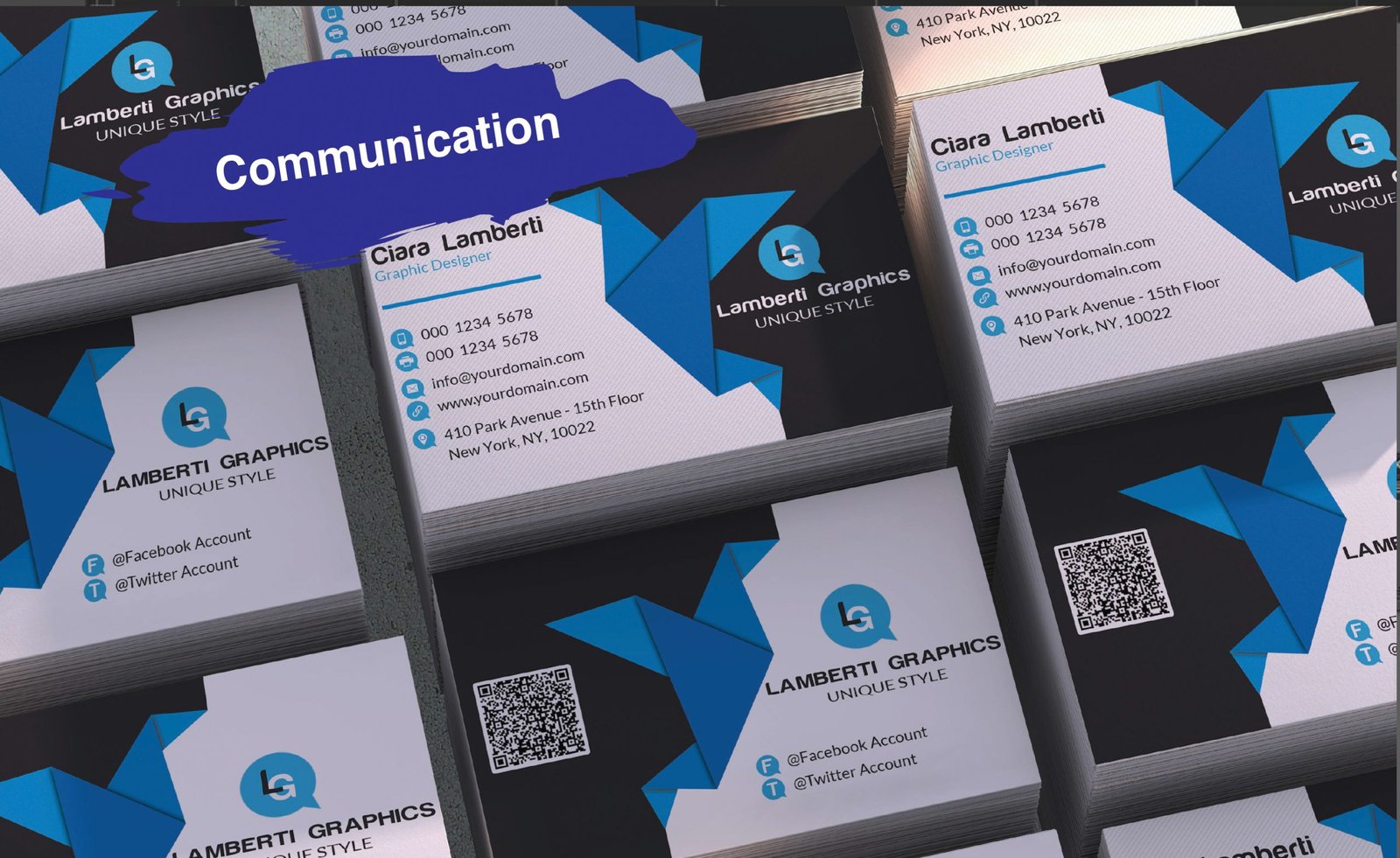
The key feature of a business card is to communicate key information to a potential customer. This includes the name of the person, his/her designation, basic contact details like phone number and email address, the business address, the name of the website (if any), and the logo. Nowadays, people also generate QR codes and print them on business cards to convey important information interestingly.
How to design the perfect business card for you?
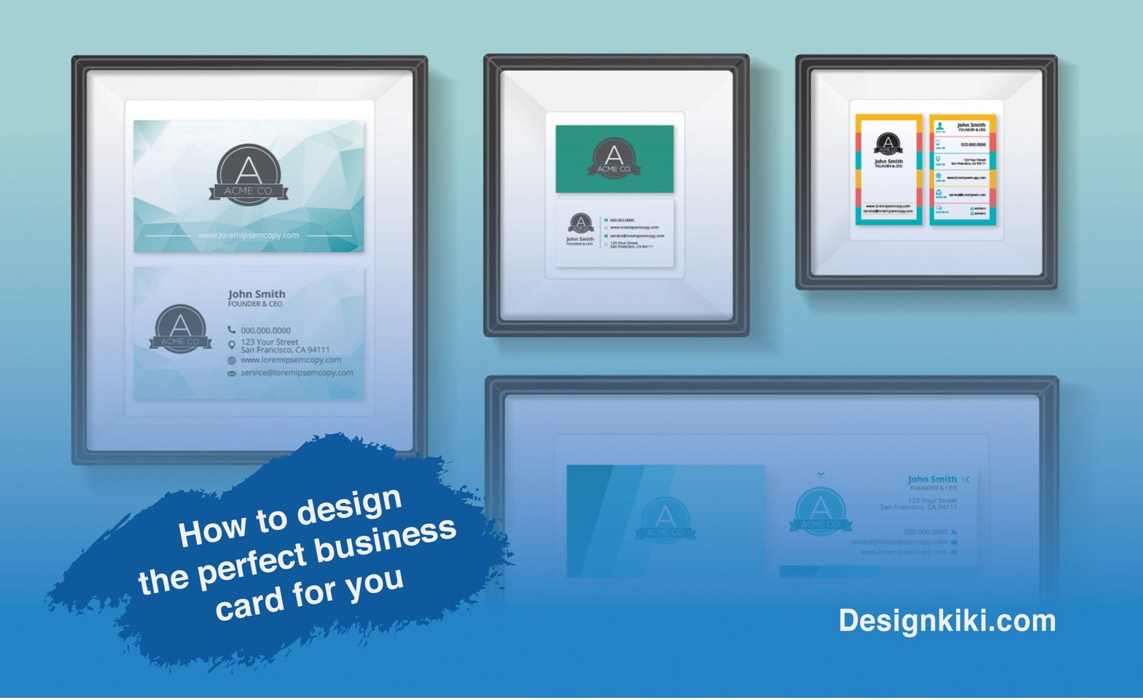
Paper

What is the first thing that you notice when you hold a business card? Yes. The paper on which it’s printed! They say, “The first impression is the last impression.” So if you need to impress your potential customer, you need to give him a feel of what it would be like to do business with you.
Paper quality
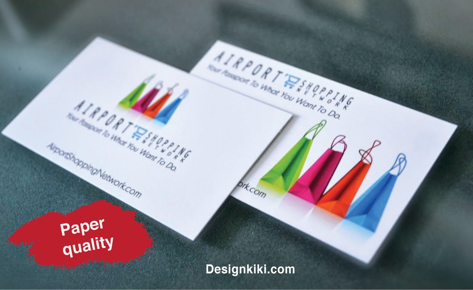
There are so many choices available when you choose the paper quality. You can go crazy in gloss and lamination, keep it sophisticated using a matt finish, or give the customer a royal feel by using textured paper. The three P’s that you need to keep in mind while choosing the paper’s quality for the business card are – Price of production, Profession field, and Printing effects.
It is always smart to go with paper with at least more than 200 gsm; otherwise, your business card would be flimsy and easily foldable. Hence the quality of the paper matters. If you are in a creative profession, it is better to choose a textured paper that gives a more artistic feel. For trading or manufacturing-related fields, it is better to go with lined paper with a matte or glossy finish.
Paper colour
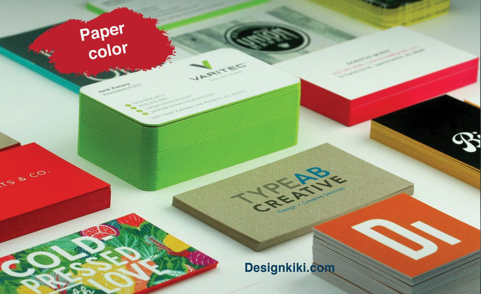
Although white is the most commonly used color for business cards, you can also consider using subtle colors like beige, cream, or grey. It might seem like a pathetic decision to deal with, but the business card’s base color can change the entire look and feel of it. One thing to remember here is never to use a background color for the card instead of using naturally colored paper for printing.
Layout
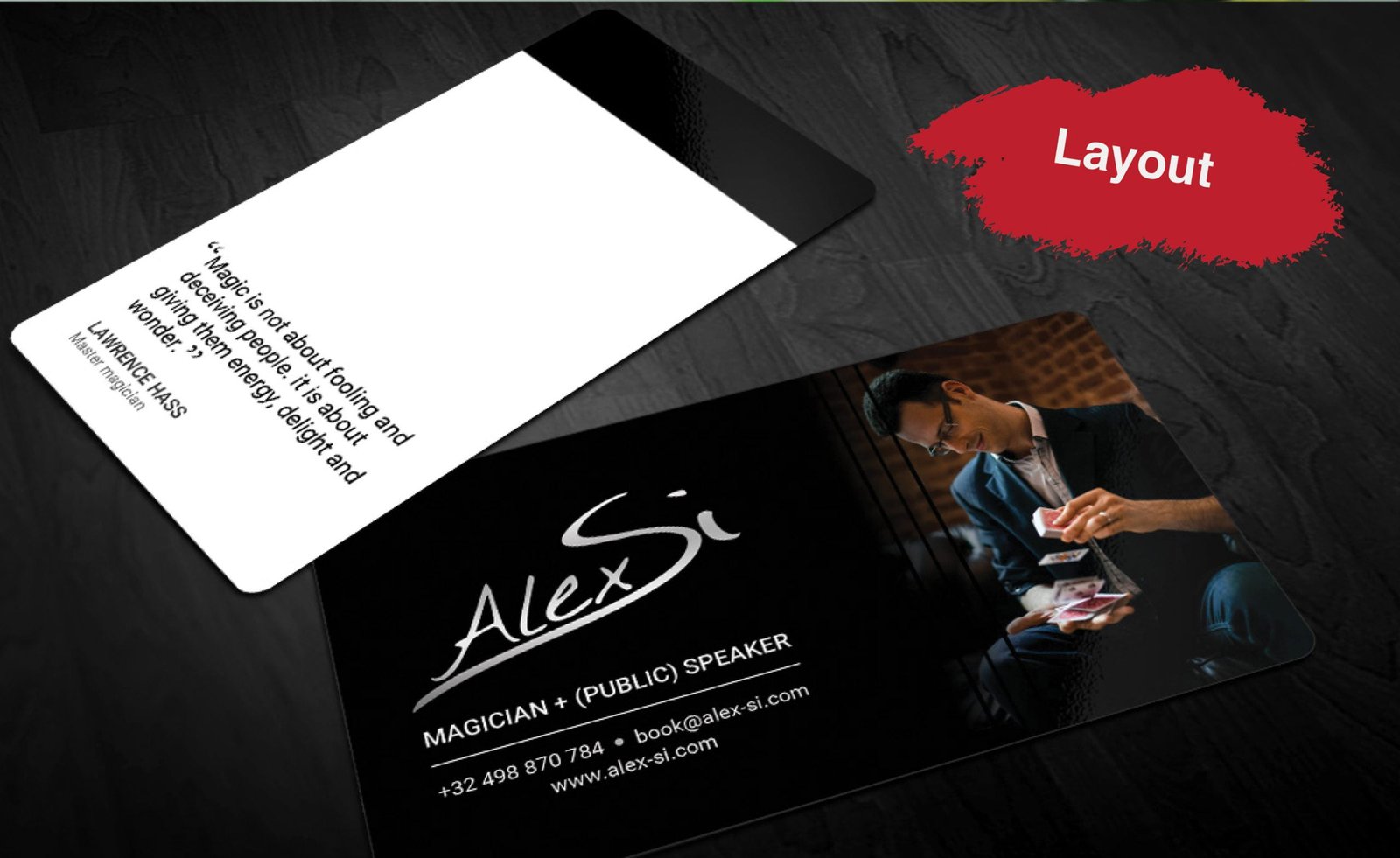
The layout of the business card is the most important part. The rule of thumb here is to keep it as minimal and straightforward as possible. Since a business card is a very small piece of paper, cluttering it with unnecessary graphics may overshadow its purpose. The design should be kept clean with a lot of negative space around the text to make the important information stand out. The logo design should always be placed strategically in the layout of the card.
Shape
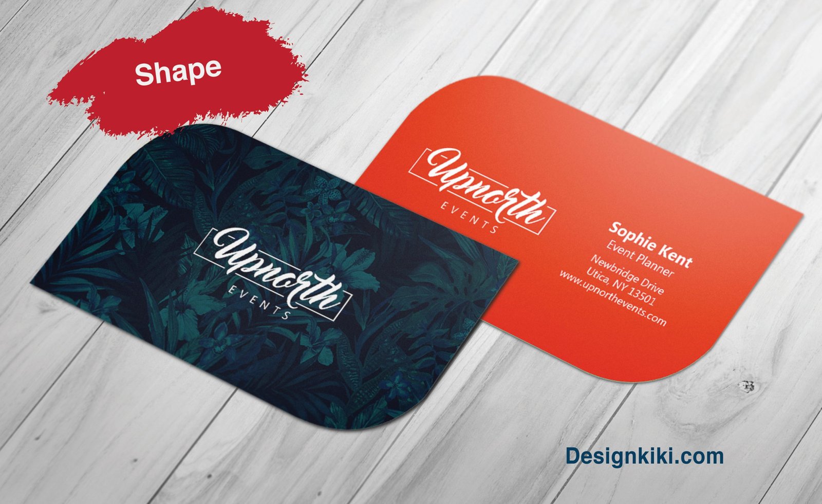
Most business cards are rectangular. However, many companies (especially those related to culinary and design fields) choose to experiment with the shape of the card to make it more exciting to look at. This makes the card more memorable. The only thing here is to remember to keep the size small enough for it to fit in pockets and inside purses and wallets.
Colors
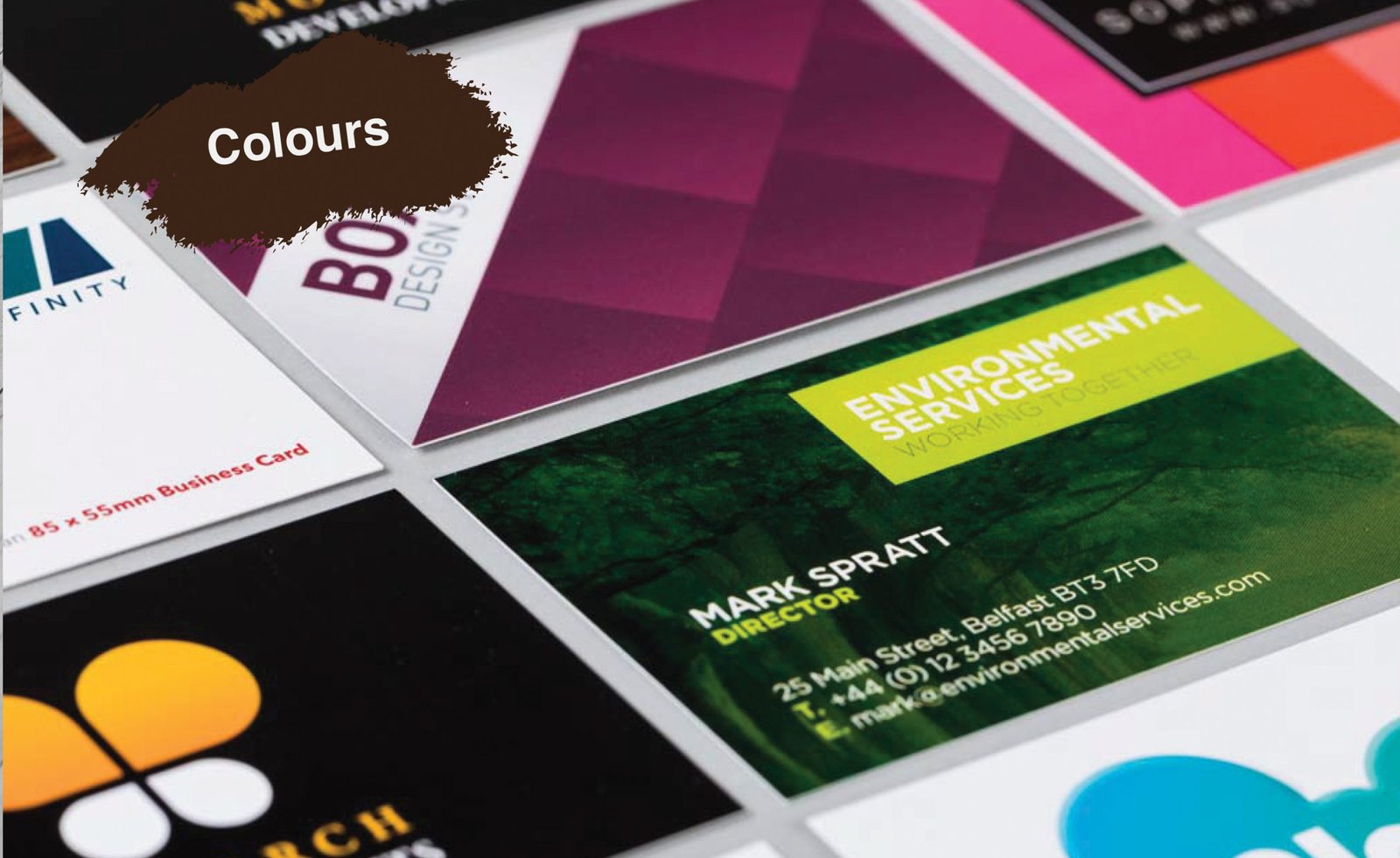
Colors are a critical element of any design. For a business card, you should always go with either black or white for the text, if possible. You can add a few color blocks to the layouts. Never use more than two colors in the template and make sure that the colors complement the colors used in the logo design. It is essential for the colors used in the design to stir well with the color of the paper.
Typeface
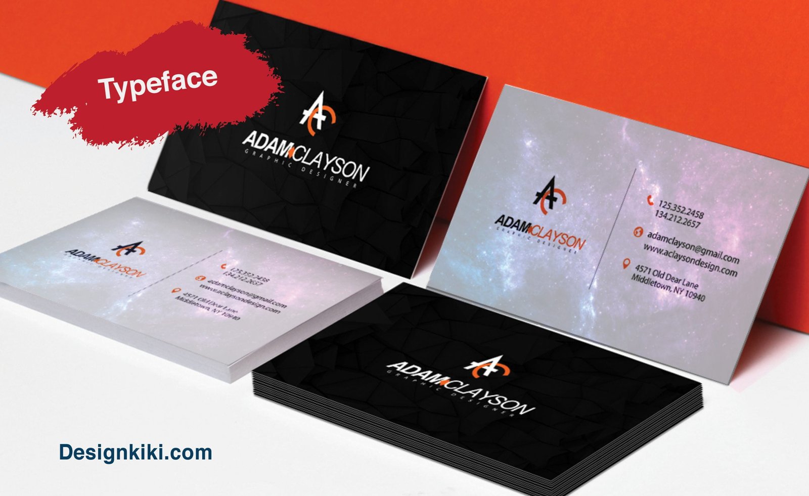
The choice of typeface is significant in the design of a business card. Always choose a clean typeface, preferably a sans serif font, because they look neater. They also go with the minimalistic approach of a business card. Also, keep the number of fonts to only two to make the template look sophisticated and professional.





Leave a Reply