
Some corporate logos are self-explanatory. Others are less so, their meaning more symbolic than literal. Others still are the product of generations of tweaking, redesigning, and rebranding, until a once-clear design becomes something else entirely. The work of “hidden persuaders” in the psychology of marketing has been going on since the 1920s. Nowadays, some companies even hypnotize focus groups of consumers to reach their intimate associations. Market research has found that children can recognize a brand logo before they can realize their name. So today you will read about 6 famous logos with hidden meanings.
Let’s get started.
1. Mc. Donald’s
The logo for McDonald’s is the golden arches of the letter M on a red background. The M stands for McDonald’s, but the rounded m represents mummy’s mummeries, according to the design consultant and psychologist Louis Cheskin. In the 1960s, McDonald’s was prepared to abandon this logo, but Cheskin successfully urged the company to maintain this branding with its Freudian symbolism of a pair of nourishing breasts. This may seem funny, but it is no laughing matter to the industrial psychologists and marketing consultants who are paid millions to find new ways to seduce us into buying by manipulating our unconscious desires.
One way McDonald’s ensured the visibility of its brand, and in the process, revolutionized fast food was by making its restaurants easily accessible on the US highway system. Over half the population of the USA live within a 3-minute drive of a McDonald’s, and Ray Kroc, the founder of the restaurant chain, made sure they did so. He used the company plane in the 1960s to spot from the air the best locations and road junctions for new restaurant branches. Church steeples were often his guide because Kroc wanted to attract church-going families to his temples of efficiency and nourishment, which always had clean toilets. In fact, in the USA, more people now eat at McDonald’s than go to church or synagogue. Surveys have shown that the golden arches are better known than the Christian cross. Psychologists confirm a theory that Ray Kroc and Walt Disney traded upon, that “brand loyalty” can be established by the age of two.
2. Toyota
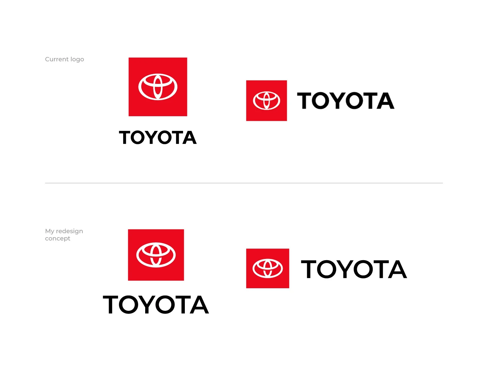
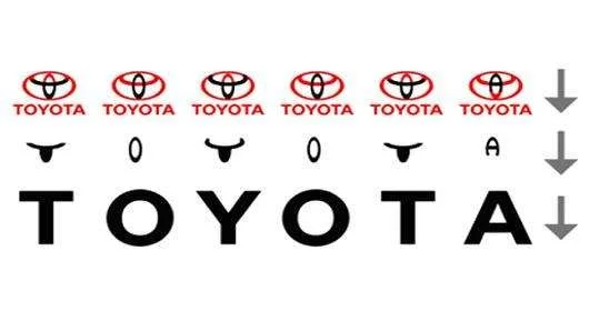
The Toyota symbol is one of the most different symbols in history. It’s been seen on the front of millions and millions of vehicles for decades, as well as in ads on TV, in newspapers, and on websites. It’s safe to say that nearly everyone in the world can recognize that symbol and say where it comes from, but what, exactly, does the Toyota symbol mean? Toyota hasn’t always used the distinctive oval symbol that today embellishes all its vehicles. As ubiquitous as it may be today, the current logo was only introduced in 1989, nearly 50 years after the company’s founding.
Once Toyota executives decided to rebrand the company with a new, international-friendly image, they had to decide on a new logo that would speak to consumers around the world. What they came up with just in time for the company’s 50th anniversary was something unique and distinct, but well in line with the company’s existing image and Japanese cultural traditions. The graphic symbol in the Toyota logo is made up of 3 ellipses, which are meant to signify 3 hearts: the heart of the product, the heart of the customer, and the heart of progress in technology. On looking closer at the symbol, however, one would realize that the letters of the word T O Y O T A can be derived from it.
3. Coca-Cola

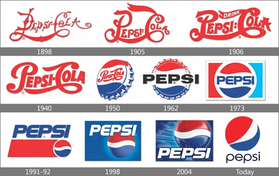
When we are on the subject of famous logos, Coca-Cola has to be on the list. Their logo is not iconic, because their logo doesn’t have a relation to what they sell. But because almost everybody knows them, everyone knows that they sell cola. Coca-Cola possesses one of the most recognized brand designs in history. It’s not only the trademark design of that white typeface on that particular shade of red that makes it iconic but also the equally famous bottle. Sometimes they also write a slogan in their commercials.
They have changed their logo many times. Since 1969 they have used the red and white logo as we know it. They have only changed it a couple of times in connection with a campaign.
An example is when they changed “Coca-Cola” to a different name. It also has a Danish flag between the o and l. However, the company has never used this in any of its marketing campaigns in the Scandinavian country, and not everyone knows it’s there. And guess what? Denmark was declared the happiest country in the world. Coca-cola was the one that inspired Santa Claus to be red and white, in their commercial in 1931. They made a Christmas campaign, where Santa Claus should drink a cola. The cartoonist of this commercial made the drink a full-year drink, and he also strengthened the idea of how the modern Santa would look.
4. Pepsi
Pepsi had paid over a million dollars to create a new distinctive logo with secret occult meanings. PepsiCo employed the help of the eccentric designer, whom some call crazy, Peter Arnell of the Arnell Group for the job. The Pepsi logo contains a circle with the top half red, the bottom half blue, and a wavy white line that runs through the center. The red, white, and blue colors have always represented the American flag. But there are more secrets in this logo than just the shapes and colors of the flag. The new unique design represents magical secrets such as the earth’s magnetic field, feng shui, Pythagoras geodynamics, the theory of relativity, and the golden ratio. The old and the new. Pepsi changed its logo sometime in 2008.
The meaning of the new logo, wherein the central white band has been shaped differently, is not apparent. However, a document leak from the design house that executed the new logo stated that the new logo was inspired by Feng Shui, the Relativity theory, etc., implying that the Pepsi logo is perhaps the key to the universe.
5. Baskin Robbins
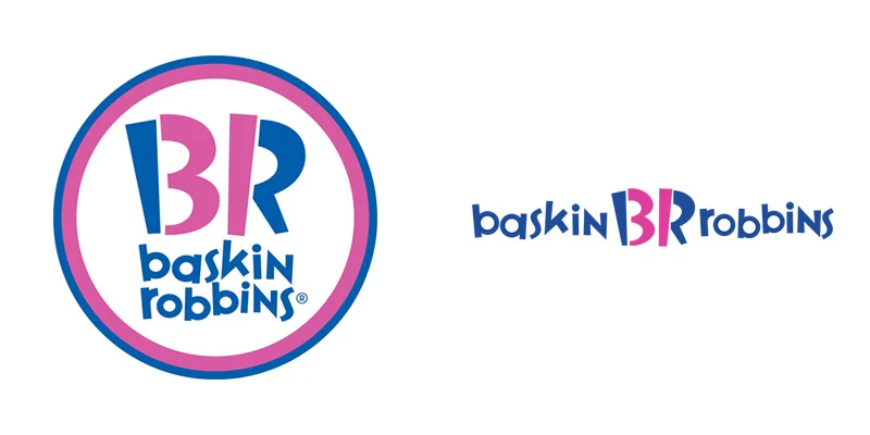
Burt Baskin and Irv Robbins got together and merged their ice cream parlors to create Baskin Robbins in 1953. At the time, it was rare to offer as many flavors as they did and they wanted to brag about it in their logo and on their storefronts. The number 31 proudly stood out from the name. Since then, the logo has been modernized, but it still includes the number 31. It’s just hidden. The pink parts of the B and R make up the number 31. All of the hard work Burt and Irv put in is still shown in their logo today.
6. Amazon
Founded in 1994, Amazon was once nothing but a tiny online bookstore. Today, however, it is a multi-billion-dollar company that sells thousands of products all over the world. From sports equipment to DVDs and even streaming movies, Amazon has become a company to be reckoned with. Amazon has grown incredibly powerful and is sure to be a player on the national stage for many years to come. One factor that has helped Amazon in its climb to the top is the uniqueness of its logo.
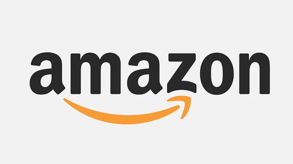
People from across the globe can recognize the Amazon logo on sight and, should they need to buy a present or the latest piece of technology, the image is sure to stick in their minds. In 2000 Amazon introduced the logo that most people can probably recognize. The logo was shortened to include the web address against a white background with a yellow arrow underneath. The indicator, which points from A to Z in the Amazon logo, symbolizes how a customer can find everything they need at Amazon. This logo was meant to be simple and easy to understand, catering to the customers who were interested in 1-stop shopping.
In 2002 Amazon created its current logo. This logo borrows heavily from the previous logo but adds the words, “and you’re done” to the bottom left-hand corner. This served to better illustrate to people that Amazon had a massive selection of merchandise and, no matter what they were looking for, Amazon was most likely to have it. There can be no doubt that the logo is instrumental. People from around the world can recognize that it’s an Amazon logo, and the company can and does spend billions of dollars for that kind of brand recognition. The reason that it probably works so well is that it’s simple but offers consumers precisely what they want. To put it plainly, what they wish is a place where they can find everything from A to Z.


Leave a Reply