Logos are the identity of a business. It speaks volumes to the customers and interested parties, especially as we continue to advance digitally. All brands and companies need a little shaking up with time. However, not all change is good.
Sometimes brands go too far or not far enough, and sometimes their logo redesigns even go back in time. So, we are counting down the five best and worst logo redesigns of all time. This will give you a picture of what to do and what not to do if you’re thinking of business rebranding.
Five best logo redesigns
Here are the logos and businesses to look up to if you are thinking of rebranding:
Starbucks
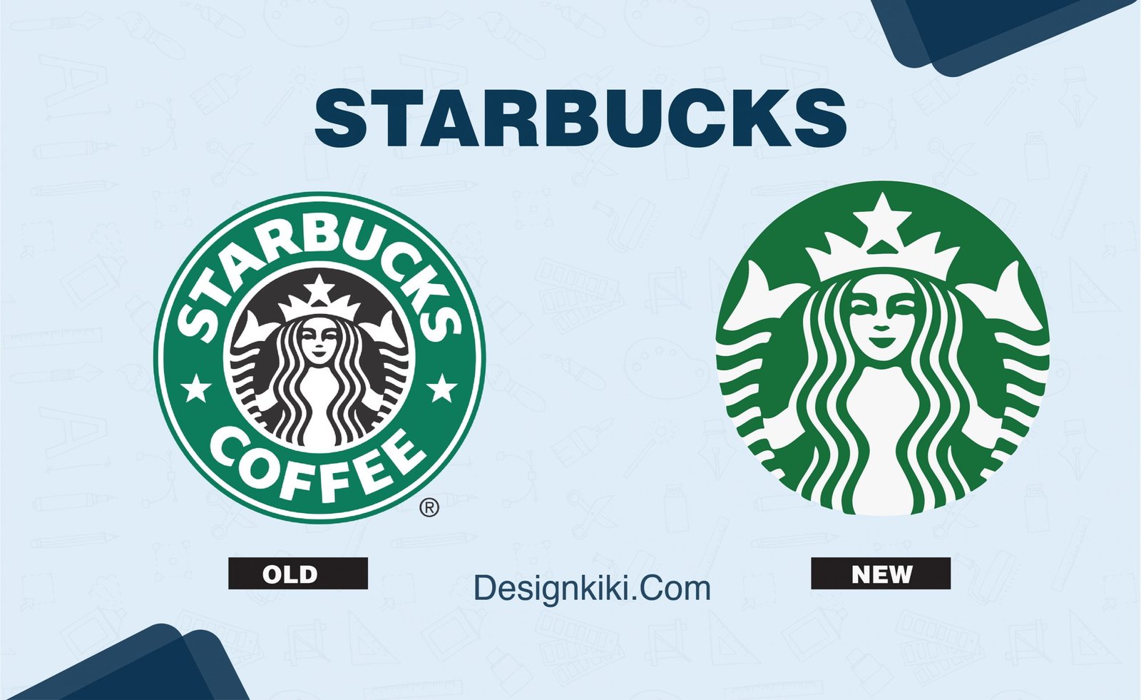
When it comes to the most wholesome logo redesigns, Starbucks takes the cake for me. The brand started with a brown earthy-looking emblem-style logo with the iconic mermaid in the center. It then evolved into a green and black logo with bolder text at the circumference.
Finally, in 2012, the brand was big enough to be recognized even without its name, and they decided to drop the text and dual color scheme. What we now have is the iconic monochrome logo with just the image of the green mermaid.
Audi
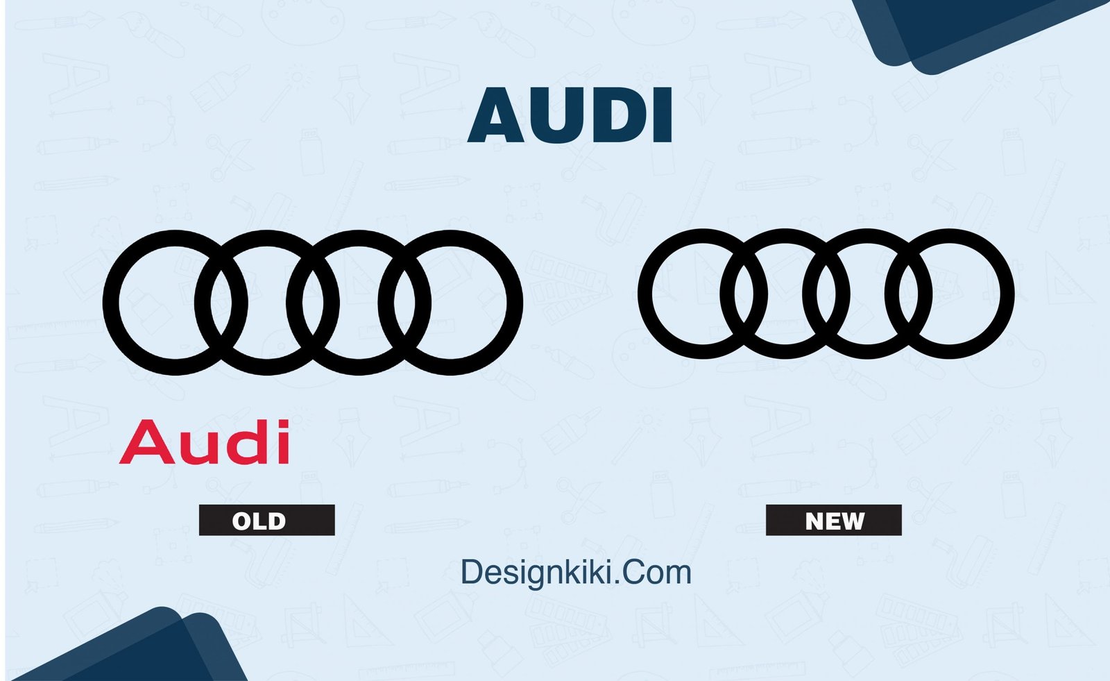
This automobile giant took a long time to figure out its niche for its logo since it first started in 1910. The four interlocked rings came into existence only in 1932 but with symbols inside each circle. The company even pulled back the ring concept in 1969.
In 1985 it brought back the four-ring logo. The final sleek monogram we see today came in 2009.
Nike
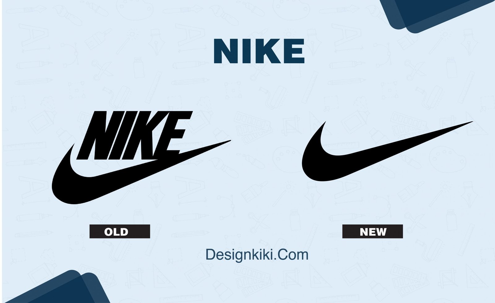
There is no denying that the ‘swoosh’ symbol is the most iconic logo ever to exist, considering all brands, businesses, and industries. At first, the brand started with its name in lowercase superimposed on the swoosh outline in 1971.
The fashion-athleisure mogul has since rebranded to a filled swoosh with the brand name in bold above it to just the mighty ‘swoosh’- a perfect testimony that if you are thinking of redesigning your logo, ‘just do it.’
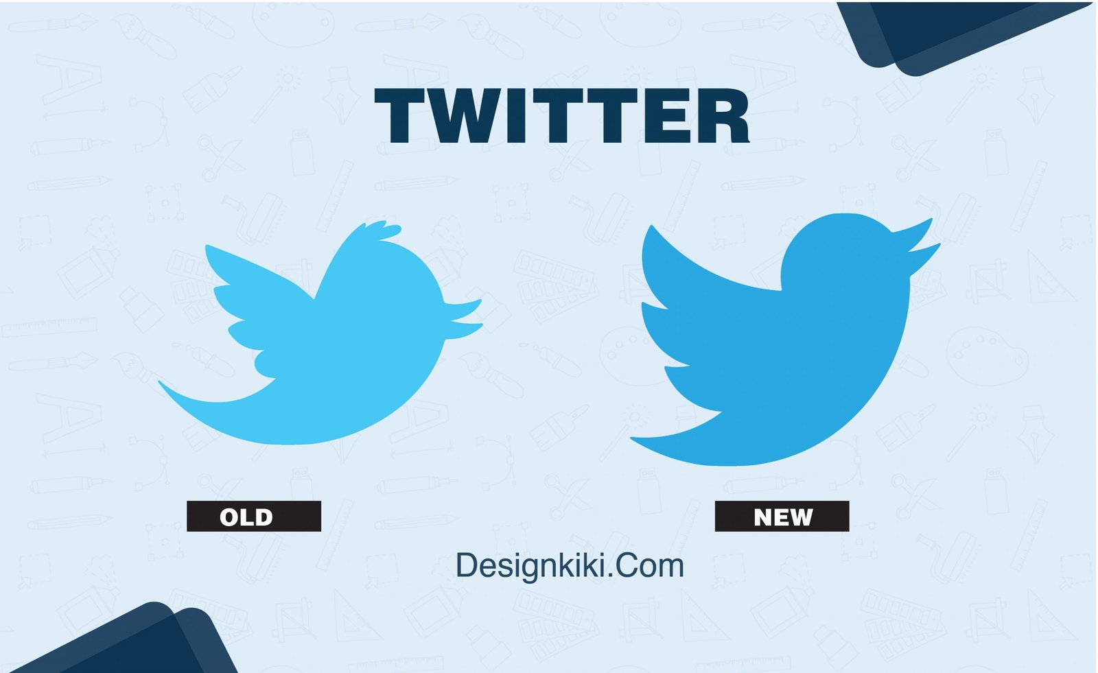
This app’s evolution is the exact equivalent of watching a baby bird hatch out of an egg and learning how to fly. It started with a bubble-like font in green in 2005. Today, ‘Larry’ the Bird is one of the most recognizable brand symbols, and Twitter is the most popularly used social media platform.
Netflix
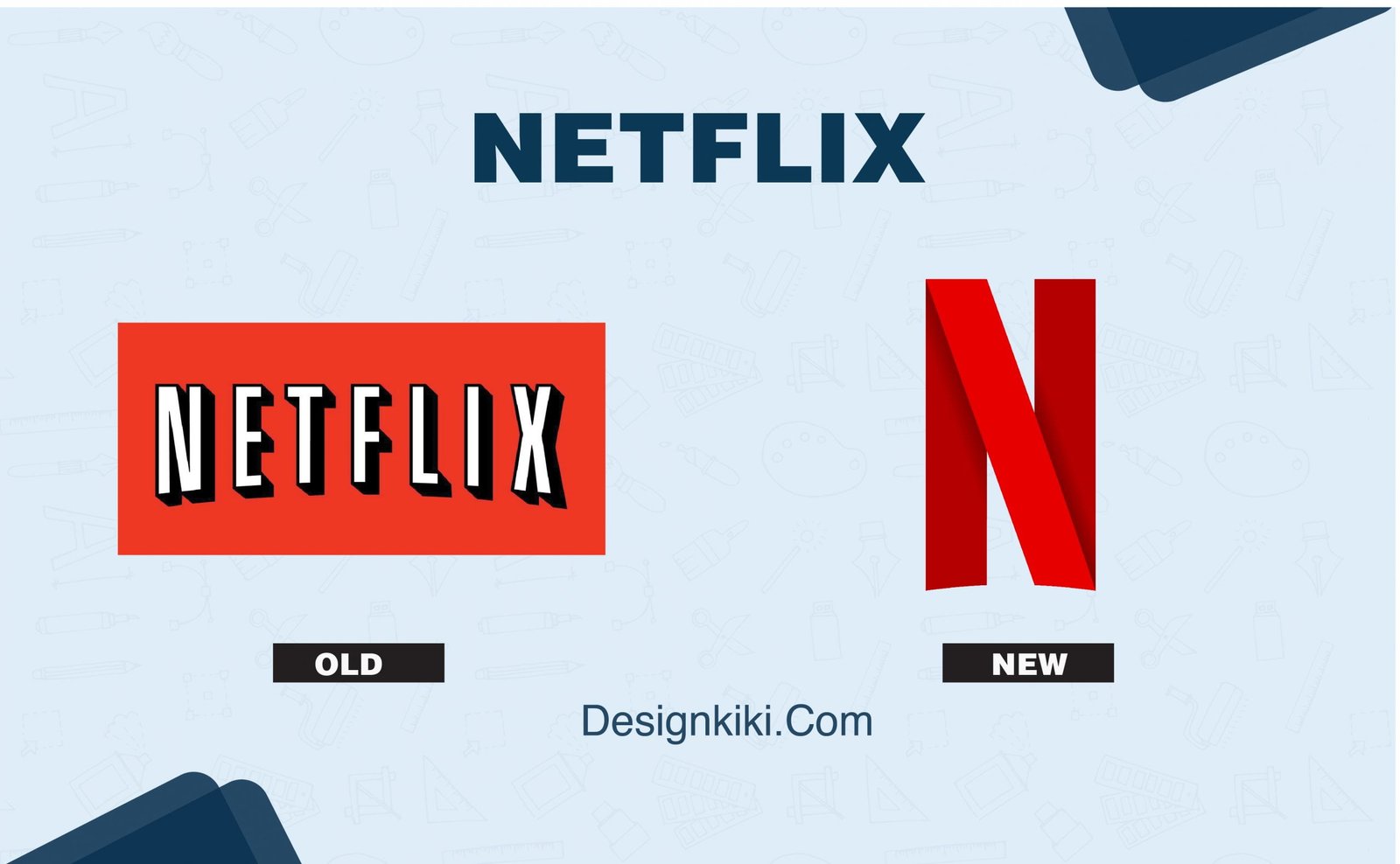
This streaming king started as a mail subscription service with a classic bold font, and a black shadow against a red background. It induced the old movie theater feeling. But when Netflix went digital and began producing original content, it was only fair that they gave a more hi-tech, modern edge to their logo.
The red one-dimensional font against the black background is so apt to the brand and its culture.
Five worst logo redesigns
If you’re looking to rebrand, here are some cautionary tales on what not to do:
Reebok
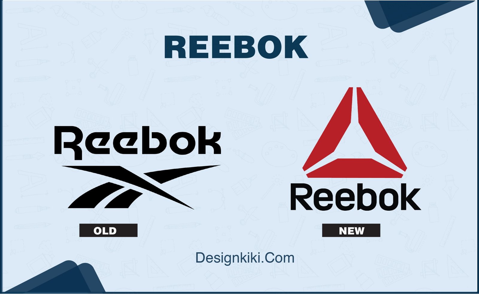
Reebok has to be the most underwhelming redesign. In comparison, other sports-athleisure brands were thriving in the market because of their iconic brandings and trademarks such as Nike with its ‘swoosh,’ Adidas with its three stripes, and Puma’s panther silhouette. Reebok decided to replace its already unstimulating logo with another lazy, generic logo.
Most people find the triangle symbol unrelated to the brand’s image. It’s just not the best logo to put on a pair of sneakers or training shoes.
Saint Laurent
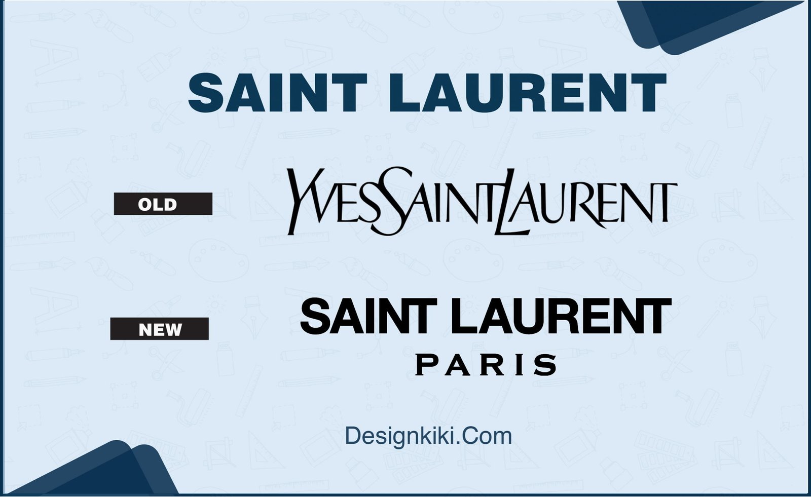
Formerly known as Yves Saint Laurent, the brand had one of the most impressionable logos among the many Parisian and Sicilian couture brands. But sadly, in 2012, it decided to drop the founder’s name and the iconic logo.
Now, the logo merely looks like a street sign with the most basic font. One might even call it a ‘fashion disaster.’
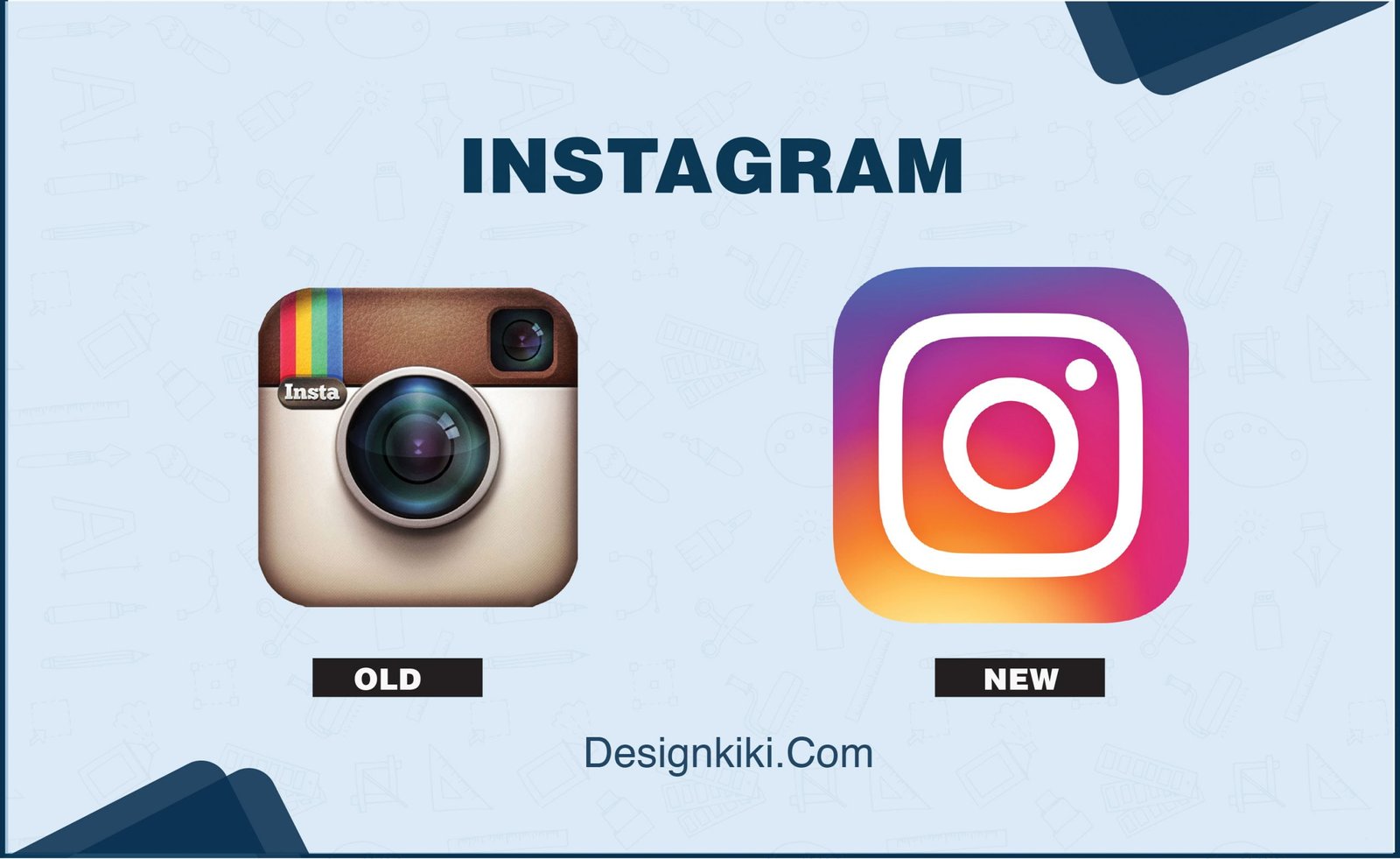
The journey of the Instagram logo is sad to see. It was once the most beloved app icon of its time. Now, it just looks like a washing machine door instead of a camera. Many brands simplify and decongest their logos over time, but this is an excellent example of going too simple. The present logo would be very forgettable if only half the world weren’t on it sharing their pictures.
GAP

The Gap started with a fun and playful logo in 1969. The fashion brand’s logo, I believe, peaked in 1986 with the white font against a blue rectangular background. When the company redesigned its logo in 2010, the public was not pleased. So much so that it had to go back to its old logo in a week.
Mountain Dew
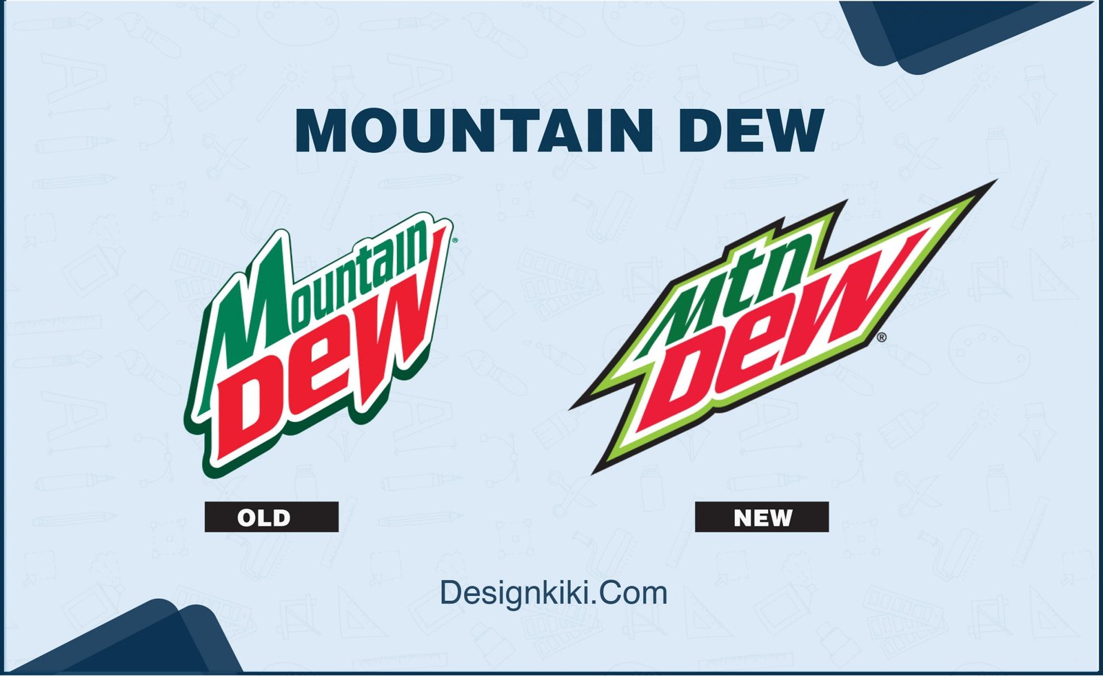
This soda beverage brand experimented quite a bit with its logo to arrive at the present logo’s foundation in 1999. Even after that, it underwent many small changes over the years. But for some strange reason, the company decided to ditch the word ‘Mountain’ to an abbreviated form ‘Mtn.’ Why? No one knows.




Leave a Reply