
A business logo has so many roles to play. It has to be memorable, and attractive, and convey the brand’s message simultaneously, from the tiny icons over the internet to branding on products to big signs. Logos have a lot of checkboxes to fill. With an increasing number of uses, businesses need to opt for logos that easily meet all the criteria. Minimalistic logos are selling like hotcakes these days. Why?
With the recent wave of minimalism across industries such as fashion, interior, art, architecture, etc., most people have been attracted not to intricate dense logos but to simple, sleek logo designs. The best logo redesigns of big successful brands are evidence that less is, in fact, more.
What is a minimalistic logo?
Minimalistic logos are sophisticated yet straightforward. They use undemanding fonts, shapes, and colors. Often, minimalistic logos are two-dimensional and avoid any extra details. Easy on the eyes, minimalistic logos are very often easy to comprehend.
If you’re still debating on the logo style to use for your business or logo redesign, worry not, for we are counting down ten successful brands with the best minimalistic logo designs of all time.
1. Apple
This tech giant is just the perfect example that you don’t need an elaborate logo to build a successful business. The symbol of Apple Computers is based on Newton’s discovery of gravity as an apple fell on his head. It was a historic moment in the field of science. The bitten apple is nothing too complicated but has a warm story behind it that brings the otherwise two-dimensional plain-looking fruit logo to life.
2. FedEx
The FedEx logo is, without a doubt, a design masterpiece. The minimal, bold font and the modest color scheme represent prestige and prosperity. There is a hidden arrow in the negative space between the letters’ E’ and ‘x,’ which stands for speed and accuracy. It’s nothing too elaborate but is recognized from far away.
3. Nike

The conversation on minimalism is incomplete without Nike. The ‘swoosh’ is one of the best examples of minimal logos that can go a long way. It symbolizes speed and movement. I hardly think it’s a coincidence that one of the best brandings of all time across all industries happened to be a minimalistic one. We highly doubt that.
4. Airbnb
Airbnb’s logo shapes the alphabet ‘A.’ But the loop-like design represents community and togetherness. This design shows us that a minimalistic logo doesn’t have to be bland and underwhelming.
5. Target
As the company’s name suggests, Target’s logo is a red bullseye. A red dot and one ring. It is easy to spot, and the circular symmetric layout makes it look very cohesive. The name and logo give out a positive message to its audience. It is one of the most detectable logos today.
6. Fendi
Karl Lagerfeld sketched this luxury brand’s ‘double F’ logo in just five seconds! The two Fs stand for ‘Fun Fur.’ It is one of the most remarkable logos in the luxury fashion industry. Often seen in black, brown, and tobacco colors, many say the logo adds luxury to the historic Fendi bags.
7. Mastercard
The company’s logo is two overlapping circles in the standard red-orange-yellow color scheme. It can be used pretty much everywhere, in any size, and still be recognized easily. The latest logo without its name and the lines in the overlapping part is the ultimate minimal logo.
8. McDonald’s
McDonald’s is the most successful fast-food chain in the world. Its logo is flawlessly minimal. A simple and neat icon, made of two symmetrical arches in yellow. No letters, no words, no images. Just the singular alphabet. To say that the logo is working out well for the company would be an understatement.
9. Uber
Who said that Wordmark could not make an excellent minimalistic logo? Uber is here to prove you wrong. Unlike most apps that go for monograms or symbols, this cab service decided to find the best minimal font in the grey-black color scheme and owned it like nobody’s business.
10. Mercedes
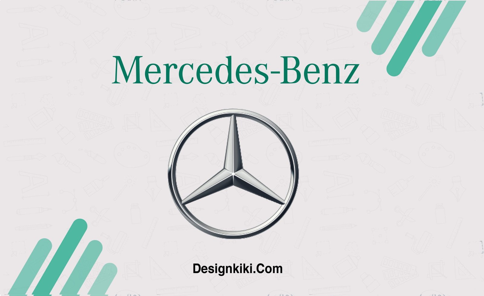
Most Automobile companies indeed go for simple, regal logos, but Mercedes stands out the most. The Mercedes logo is a three-pointed star enclosed within a circle, symbolizing the brand’s domination on land, sea, and air. the logo is silver and reeks of class and elegance.

Leave a Reply