As humans, we have a deep connection with animals, be it as pets or as characters in folk tales. In the world of logos as well, our furry friends are very popular. From clothing to the film industry and jewelry to cars, animals can fit any industry or brand style. Hence animal logos are a favorable choice.
Certain animals are also associated with particular emotions and feelings. Owls symbolize wisdom and intuition, dogs symbolize loyalty and true friendship, while bulls represent valor and magnanimity. You must have understood what I am trying to say through this. Animals can be used to tell your brand story without using words, by triggering certain feelings in the subconscious of your audience.
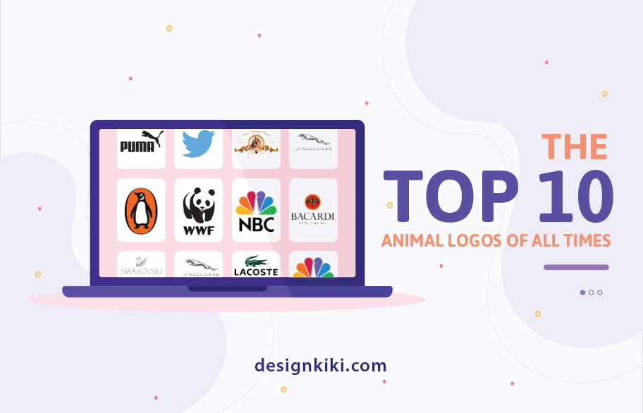
Today’s blog lists the top 10 examples of animal logos that have won many hearts over the years. You can read about them and get inspired to create one such animal logo for yourself or your clients. Here we go!
1. Puma

When we say animal logos, Puma is one of our favorites. The global sportswear brand Puma shows off its namesake animal’s ceaseless momentum and energy to propose that its products can instill parallel qualities in the wearer. The logo has the image of a vaulting puma, which is also called a panther, or a cougar full of life both day and night and can leap up to a height of 20 feet. By using this symbol, Puma summarized the capabilities of its product.
2. Twitter

The company’s Creative Director Doug Bowman in 2012 said, “Twitter is not the bird. The bird is Twitter.” The bird mascot of Twitter symbolizes freedom and endless possibilities. They tell us through their logo that they deliver messages as fast as a bird can fly. The blue color of the logo shows us the carefree and airy nature of the brand, much like the tweets that it is full of.
3. MGM

– Did you just imagine a roaring lion? I know you did! Since its inception in 1916, the logo of Metro Goldwyn Mayer (MGM) is a symbol of sheer pride, strength, and power. The most remarkable thing about this logo is that it was one of the first moving or as we call it today, animated logos that were previewed before films and cartoons. Talk about having the right logo, at the right time and for the right place! Leo the Lion has been roaring for a very long time, hasn’t he?
4. WWF

– Over the years since it was first designed, the World Wildlife Fund logo has undergone several changes, but the thing that has remained the same is the beloved panda that it features. An animal would best fit and represent the WWF, but why a panda? Well, the inspiration can be traced back to a giant female panda named Chi-Chi at the London Zoo. The panda itself has come to denote the menace of animal extinction, which the WWF contests passionately. The smartest thing about the updated logo, however, is the clever use of negative space.
5. Jaguar

– Jaguar’s logo is a textbook example of how an animal’s traits and qualities can be used to represent brand values. The pouncing jaguar in the logo conveys grace, swiftness, and power that their cars imbibe. The company quotes- “Designed to meet the automaker’s core values, the Jaguar logo was meant to symbolize “grace, elegance, performance, power, and the ambition to leap forward.”
6. Swarovski

– The swan, has long been associated with royalty, elegance, and beauty. The Austrian crystal maker’s logo makes excellent use of the bird to carry a sense of sophistication, taste, and class. What better to portray premium jewelry?
7. Penguin Publications

– Penguin Publications, for decades, has brought high-quality books with classic designs to the market at a reasonable price. The jolly and welcoming bird representing them has been treasured by generations of readers, both young and old. The black and white penguin and the elliptical accent of orange in the background hold special meaning because orange prompts feelings of pleasantness, liveliness, and fun. Those sentiments get associated with the brand.
8. Lacoste
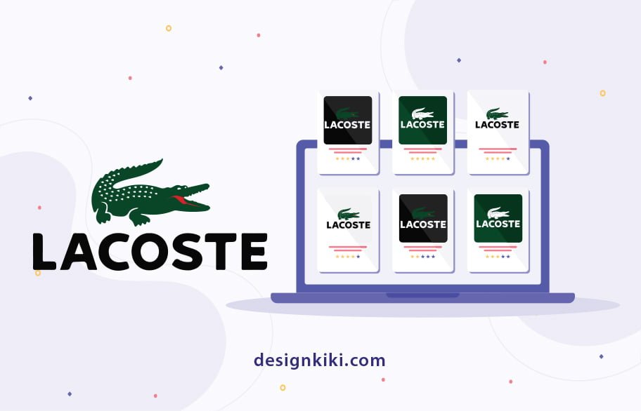
– Lacoste is one of the most vastly familiar apparel brands in the world. As history suggests, its logo was inspired by an occasion when founder Rene Lacoste saw and was taken by an alligator’s lifeless skin on somebody’s briefcase. The fearsome alligator continues to brand the celebrated tennis shirts that are worn around the world.
9. NBC

– In its logo, the National Broadcasting Company showcases quite a few progressive design techniques. The peacock is just a graphical stratagem to flaunt the rainbow of colors. Though, the focus is the peacock’s neck and head, impressed into the background using negative space. Because the rainbow is the dominant part, a maximum number of people only spot the peacock head on a second look.
10. Bacardi

– A bat isn’t significantly associated with rum or alcohol at large, but the Bacardi logo’s intricate design is right up the ally of its brand identity. The predominant black color shows class and power, both customary premises in liquor branding, so in that view, it fits like a glove. Still, bats are also synonymous with nighttime, when people drink Bacardi most. Clever? You bet!
Which one of the above logos is your favorite? Tell us in the comment section below.
Are you ready to design animal logos? Try DesignKiki now and get the best and the most creative results!

Leave a Reply