Hey there, young design enthusiasts! Welcome to the fascinating world of Logo Design Trends in 2023. Imagine this year as a playground of creativity, where designers from around the world are like superheroes, crafting logos that capture attention and tell stories. If you’re wondering what logos have to do with all this, well, they’re like the cool costumes that superheroes wear, but for companies and brands.
In 2023, these logos are undergoing some exciting changes, just like your favorite game gets updates with new features. It’s like a fresh coat of paint for brands, and it’s super important because it’s the first thing you see when you check out a product or a website. So, join us on this journey to discover the coolest Logo Design Trends of 2023. We’re going to unravel the secrets behind these designs, explain how they work, and even inspire you to create your logo someday. Ready? Let’s dive in!
1. ANIMATED CARTOON LOGOS
by Adam Insam
by Daniel Bodea
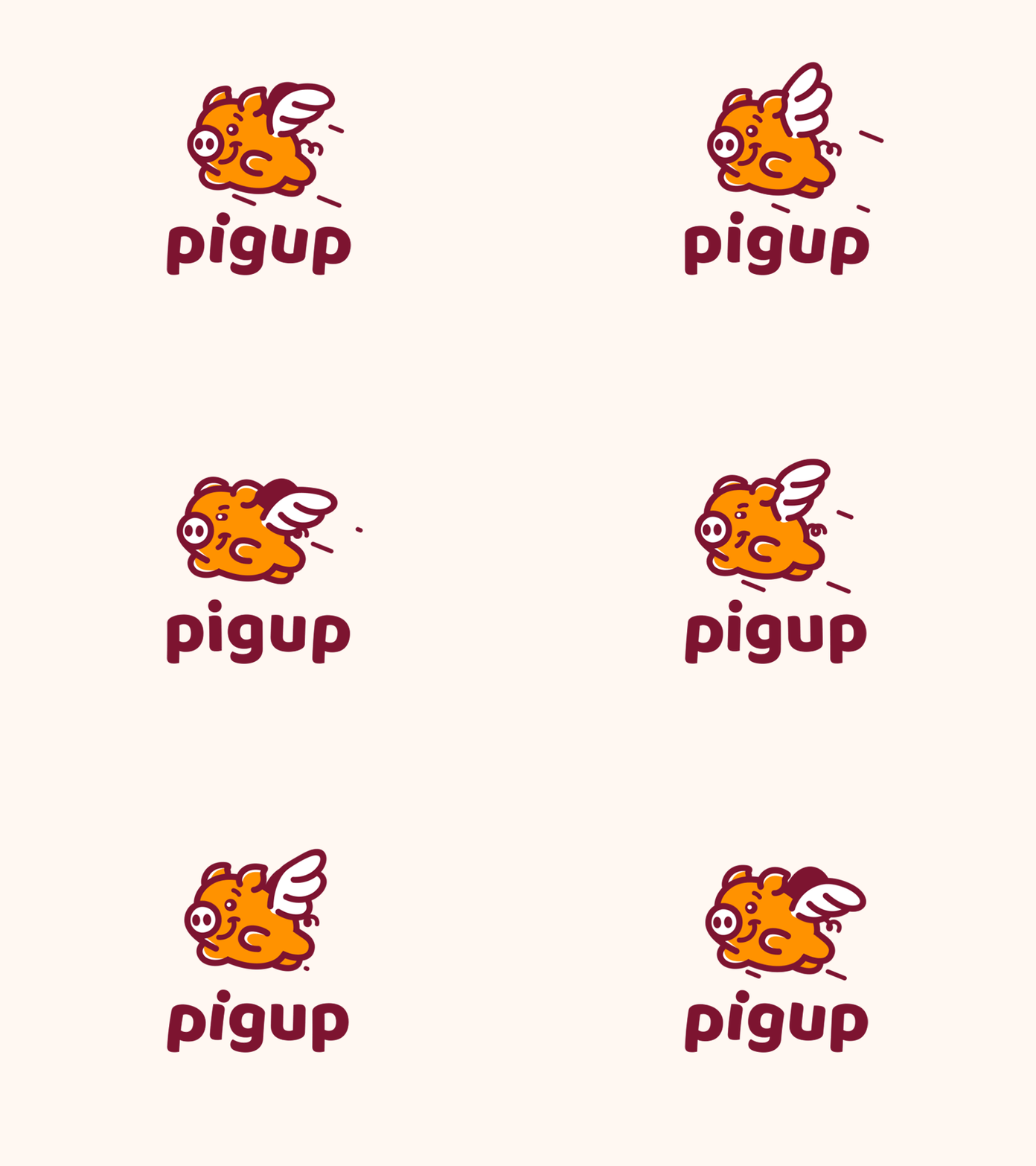
Talk of vim and sport, and whoopee! A cartoon pops right up. Animations are fun straightforward and friendly, which makes them idyllic for companies that want to be seen as so. 2023 however, will not just be a year of cartoon logos. The animation is making a big entry in the logo market early this year to top up the fun.
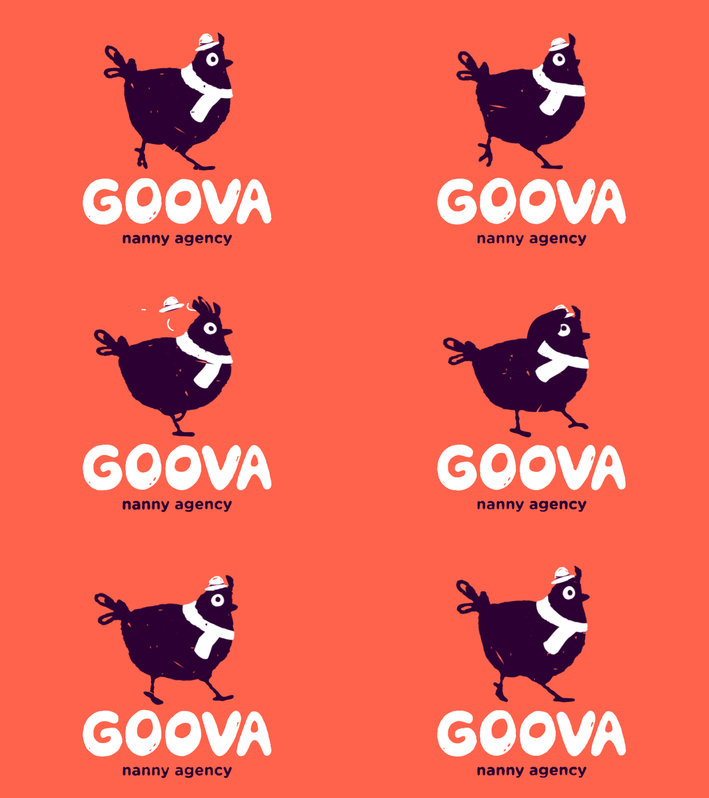
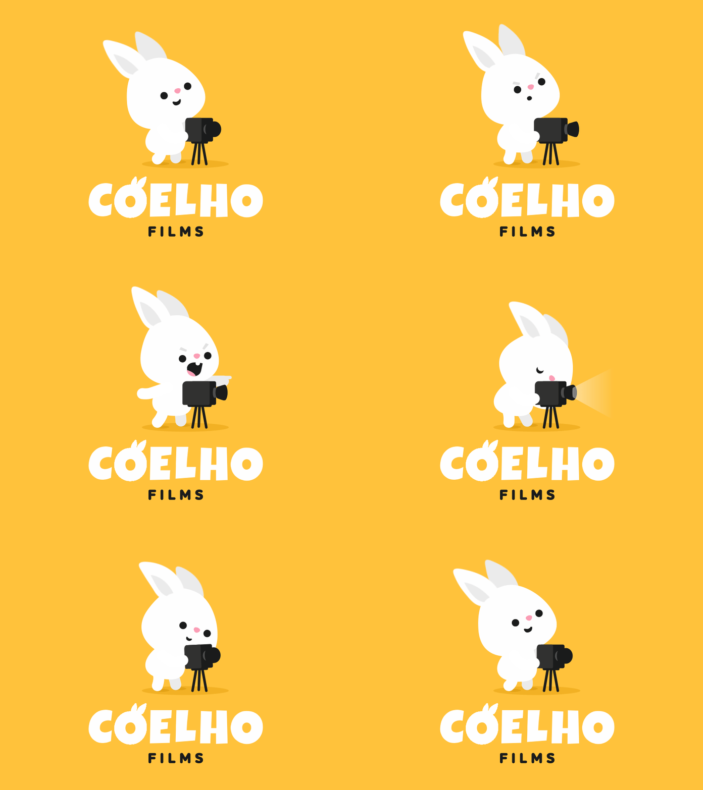
Cartoon logos are already a big hit for kindergarten and other early education programs, cartoon channels and networks, toy stores, the infant care industry, pet stores, and food joints and cafes. They have been timeless, and some big names in the market with cartoon logos include Wendy’s, Pringles, Twitter, MetLife, and Warner Brothers. But animated cartoon logos are the next big thing for almost all industries to jazz up their business.
So first in our list are animated cartoon logos. If you do decide to get one, you don’t have to worry about going out of style.
2. ANIMATED BLACK-AND-WHITE LOGOS
by Abraham Mast
by Kat Cassidy
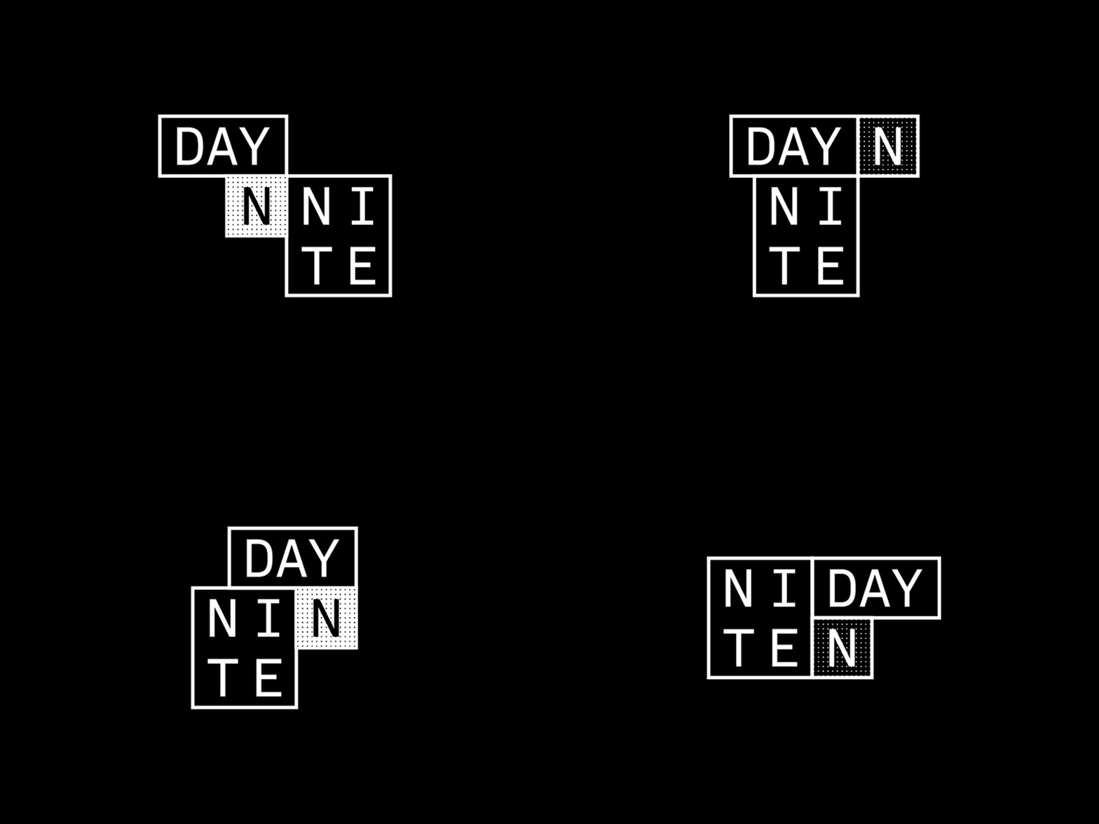
No.2 in our list is the classic combo of animated black and white logos. Color is a delight for the eye, but black and white is a delight for the soul. The pallet of black and white brings with it a sense of calm, subtlety, and simplicity, and we know simplicity is the key to brilliance. Another essential thing to note here is that black-and-white logos don’t distract and never go out of style, and that is why designers often create a black-and-white version of the same logo they make in color. Now it may be just a coincidence, but major multimillion-dollar luxury brands fashion black and white logos generally. Apple, Disney, Louis Vuitton, Nike, Prada, Chanel, Adidas, and Ralph Lauren are just a few names. No wonder we associate black and white with class and elegance.
3. CREATIVE LETTER LOGOS
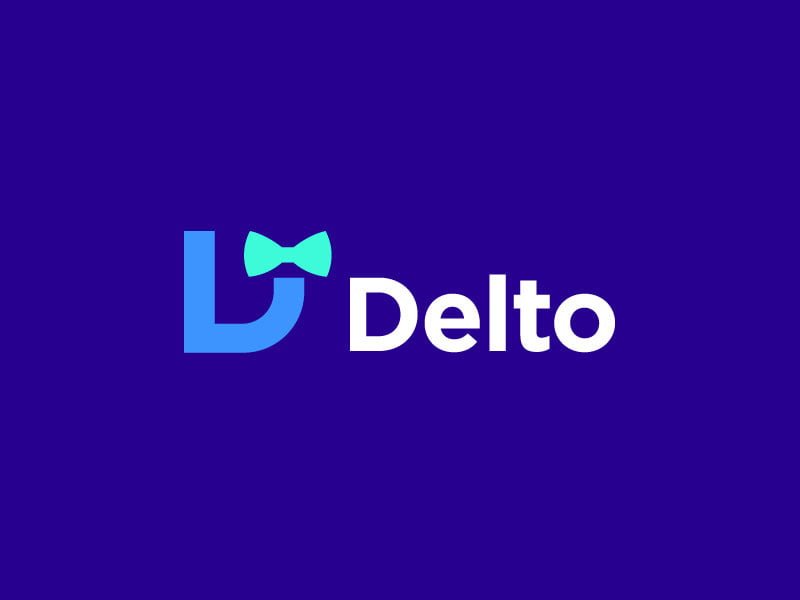
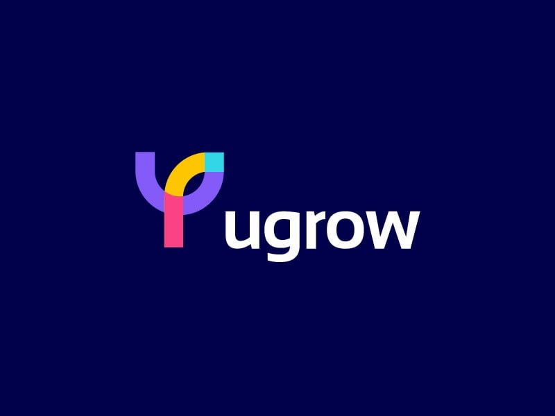
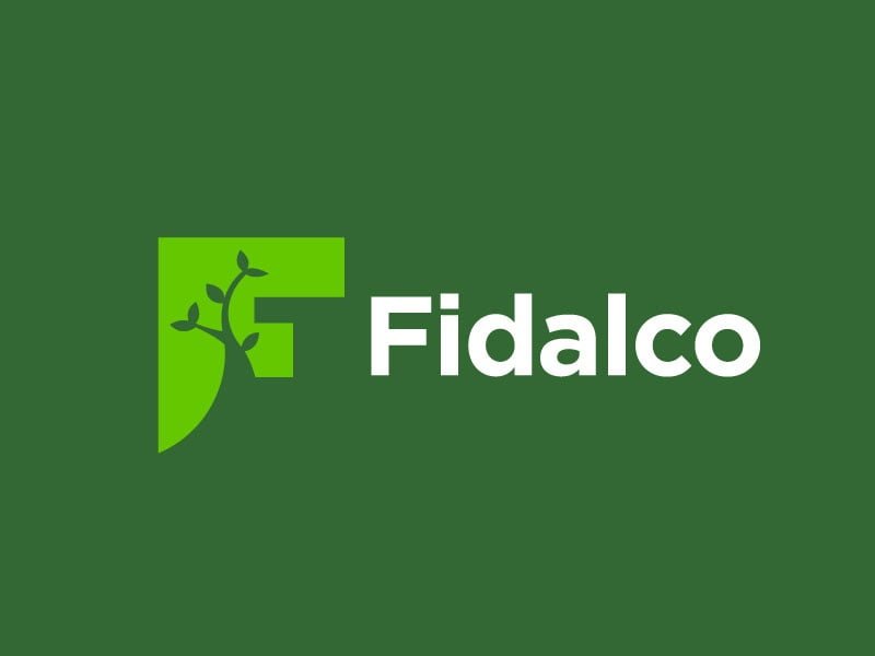
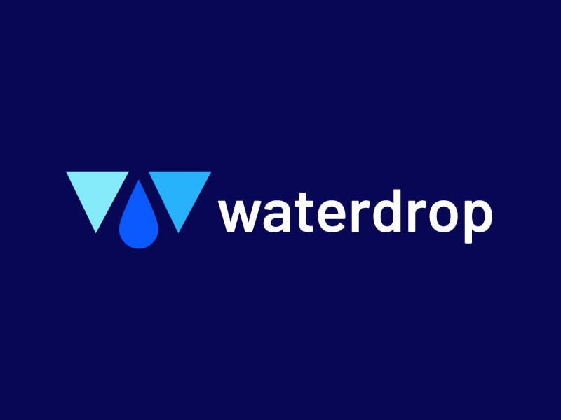
They say your logo speaks for your brand. Well, this was just a metaphor…until now! Designers are making it happen. Yes! You heard it right! By strategically hiding symbols, objects, and characters relevant to the business in the text, they give meaning to your logo like never before. An interesting technique that they employ is using the negative space of the text to depict what the company stands for. They also replace letters in the logo with similar symbols, imagery, or special characters to make it personalized for the brand.
4. MINIMALISM- LESS IS MORE
by Lucas Fields
by Aditya
Minimalism uses only the most essential elements, basic shapes, and a limited range of colors. These logos do away with unnecessary details that may be distracting and affect readability. Minimalistic logos are visually harmonic and devoid of imbalance, and there is an intelligent use of colors. Designers work with the understanding that color is a potent tool and use shades that offer the viewers the feeling they want to convey. The heart of minimalistic logos, however, is a font that is clean, simple, easy to read, and aesthetically pleasing. Minimalistic logos are going to sell like hotcakes in 2023.
5. GRADIENT LOGOS
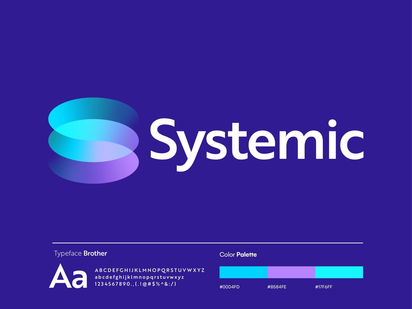
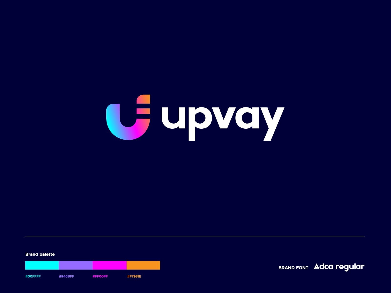
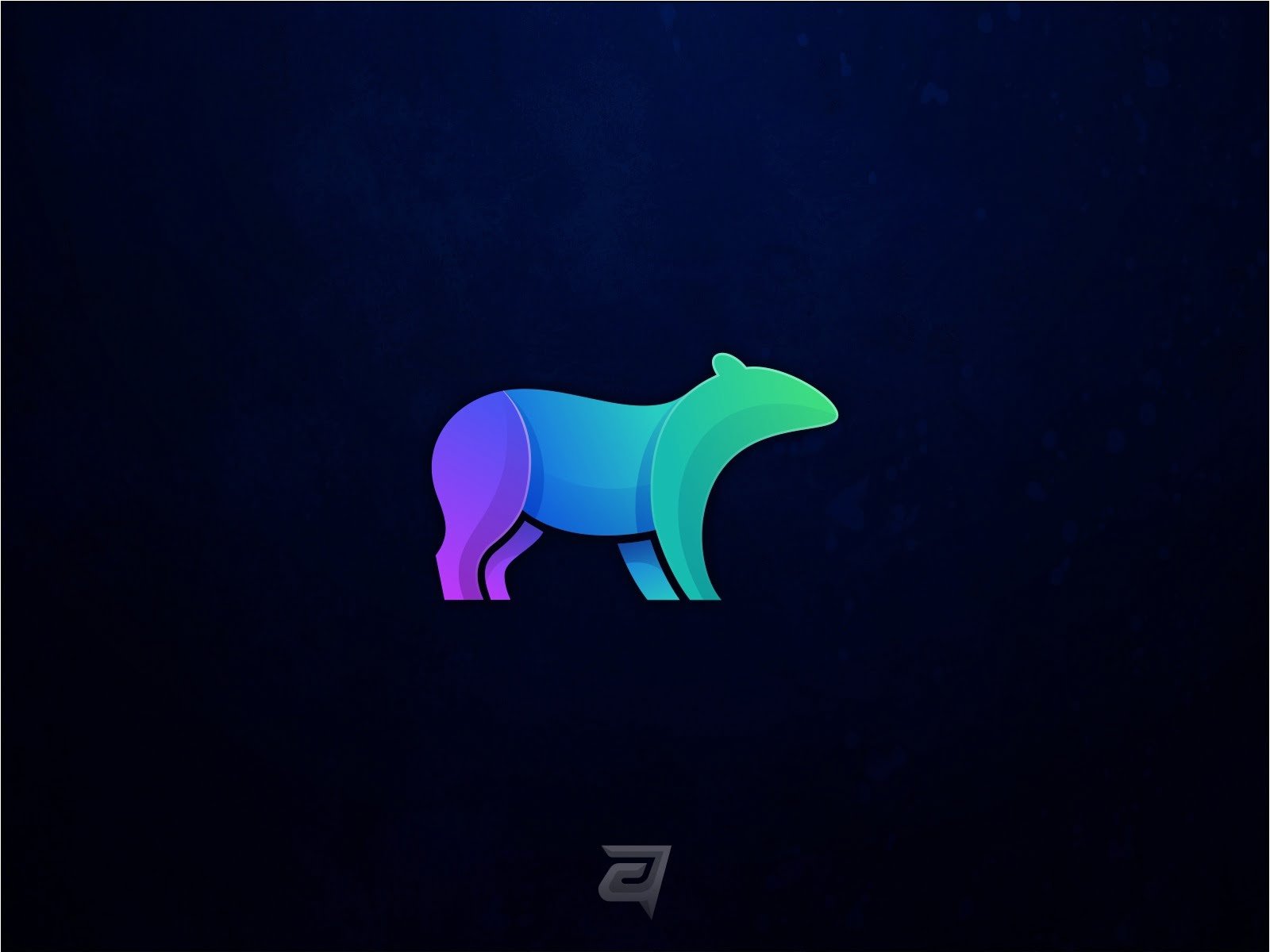
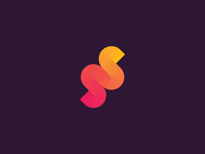
by Yuser Kabani
Gradient, also known as a color transition is a gradual blending of one color to another; it could be a blend of similar colors or completely different or contrasting colors. And because it mixes and blends different shades of color, the gradient can create new color combinations that feel fresh and give your logo stunning vibrant transitions that make it stand out. Gradient logos are having such a moment right now because they are so eye-catching. Another possible reason is that it is a fantastic way to incorporate your brand color pallet innovatively and visibly in your logo and make it more meaningful on its own.
6. RETRO
Everything new is a well-forgotten old. Retro is the logo design theme and a nostalgic trend that works well in creating a connection with your clientele. It is a ‘throwback’ style that derives from the lifestyle and patterns, including music, fashion, and attitudes from decades past, especially the 60s, 70s, and 80s. Businesses these days take full advantage of retro style not only to target the oldies but it appeal to the young too. Characterized by earthy tones, blocky shapes, textures, and outlining a retro touch makes your logo look premium and unconventionally attractive.
7. CUSTOM LOGO TYPES
by Viet Huynh
by Chaz Russo
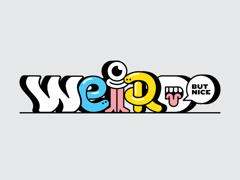
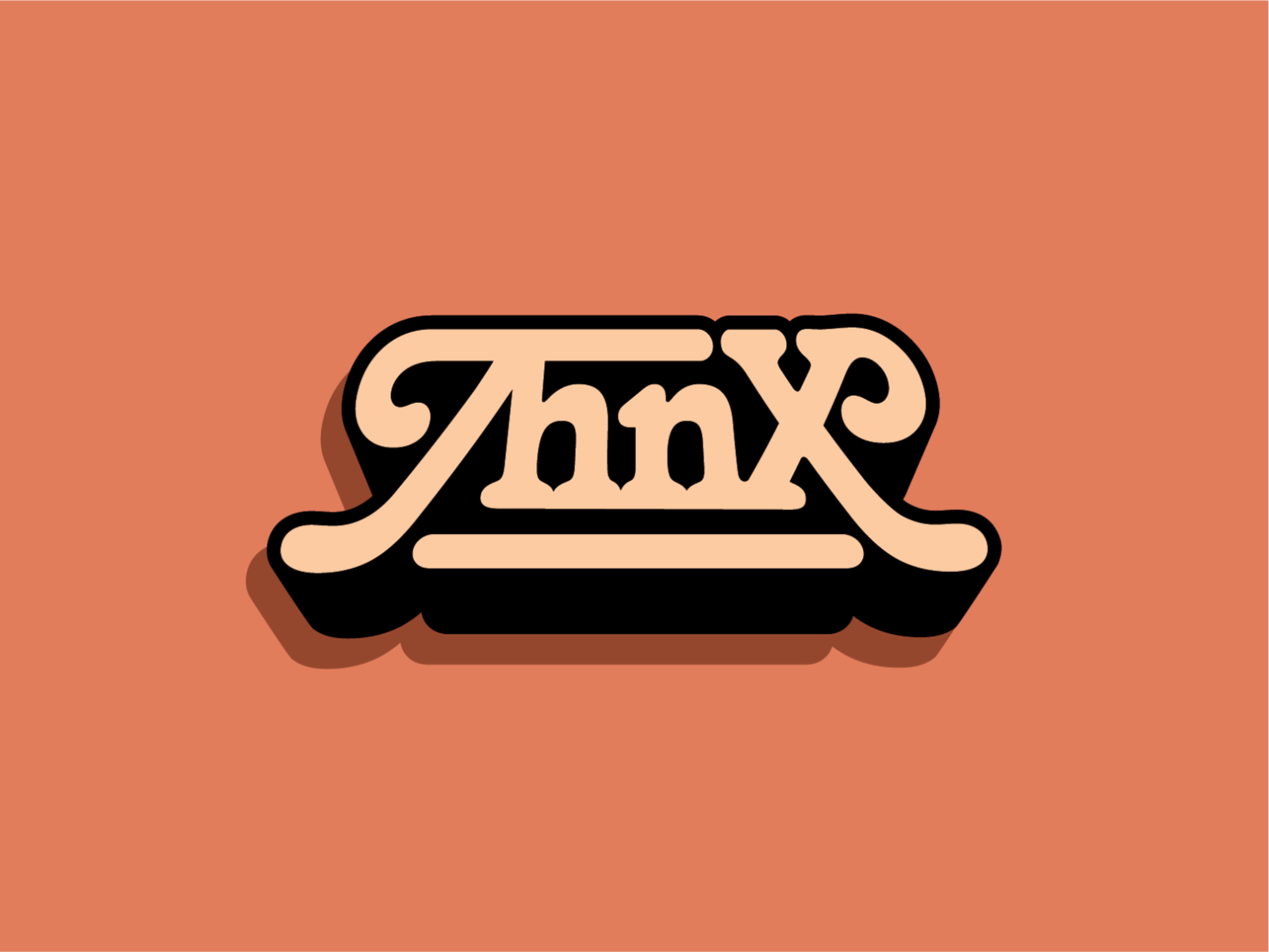
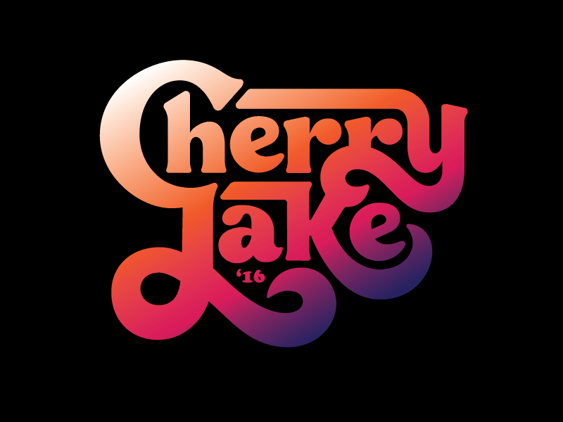
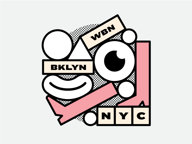
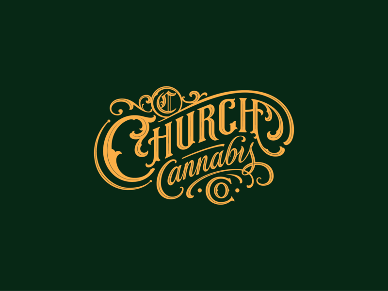
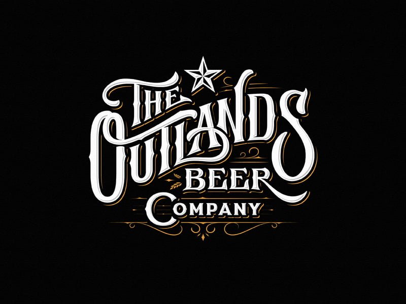
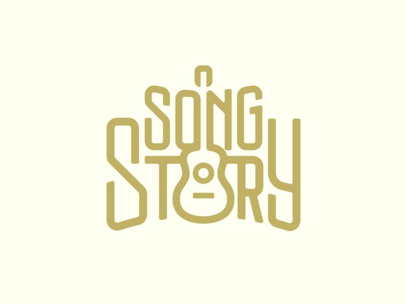
In 2023, you will see a lot of new texts, fonts, and logotypes becoming the focal point of logos. Instead of going for generic and plain old fonts, designers use types that are very impactful in their appeal and thus, not by surprise, a top choice for business logos. Typography is one thing designers love to play with. Here, the font is used uniquely and creatively to depict the word, and it could be special effects, textures, shadows, overlapping, distressing, inverting, or mirroring. You will see fonts that are extraordinarily different from those out there.
8. 3D AND ISOMETRIC LOGOS
by Alex Sailer
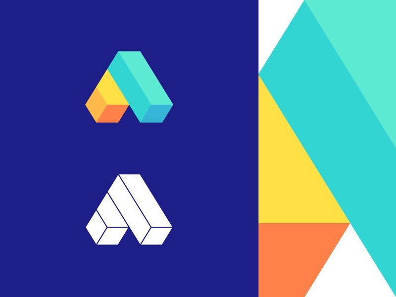
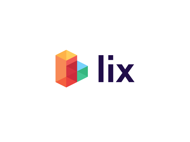
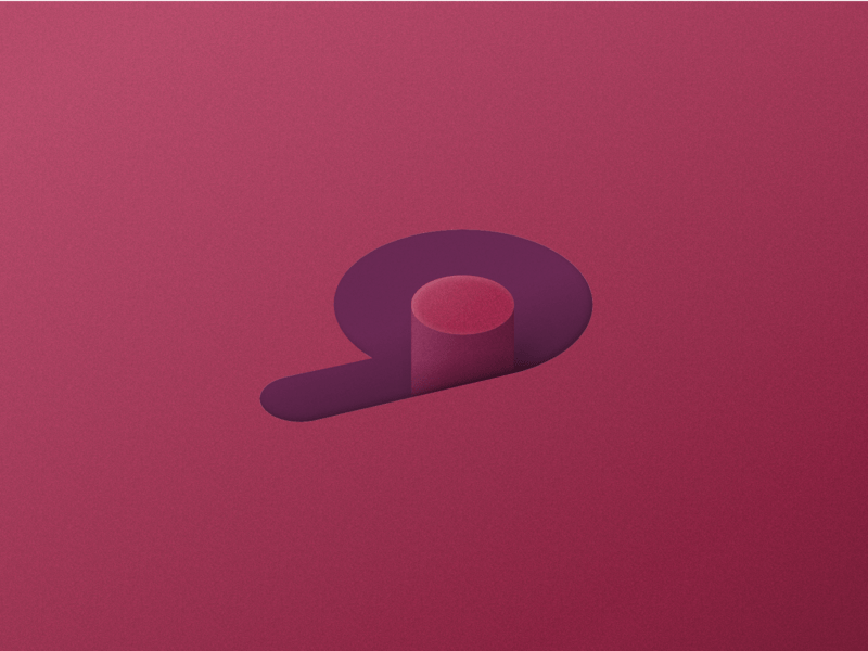
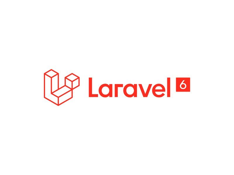
We are living in a 3D world, so why choose a flat logo? Well, isometric logos give you the best of both, and no! you won’t need any 3D glasses. Isometry is the evolved version of flat design that retained its simplicity. In simple words, it is what would if the flat and 3D model had a baby. It gives you more perspective and depth, both literally and figuratively! These logos are perfect visual metaphors. It is the best way to make your logo detailed yet clutter-free, even in a tiny space. It is just like being too much but not TOO MUCH.
9. SEMI-TRANSPARENT LOGOS
by Alex Spenser
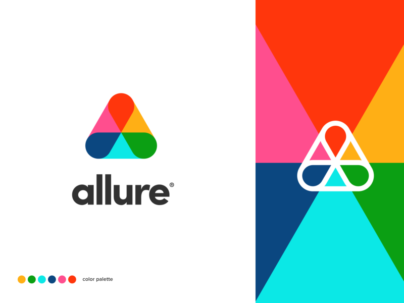
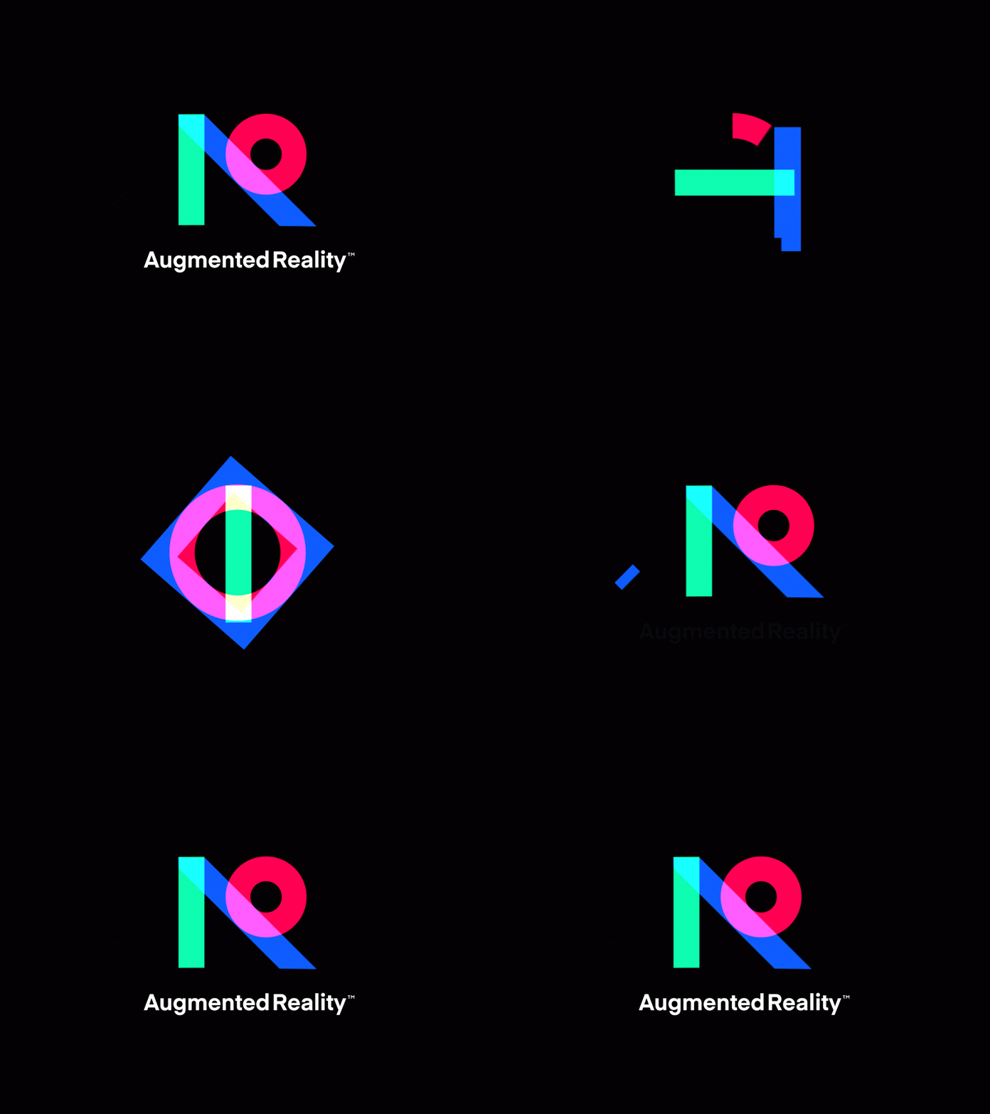
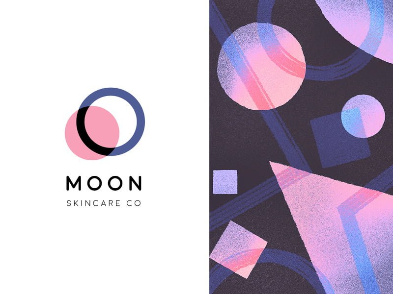
Semitransparent elements are in right now, and we believe they will be hot throughout 2023. It makes your logo see-through and adds depth to it. This becomes even more appealing with layering and overlapping. Semitransparent logos are visually exciting and stimulate attraction on your client’s end. This modern and chic style is not just attractive and pleasing to look at. They hold a deep-seated symbolic meaning as well. It is used by companies to symbolize transparency and accountability. It is also a symbol of trust and reliability.
10. RAW & IMPERFECT LOGOS
by Marcelo Hoff
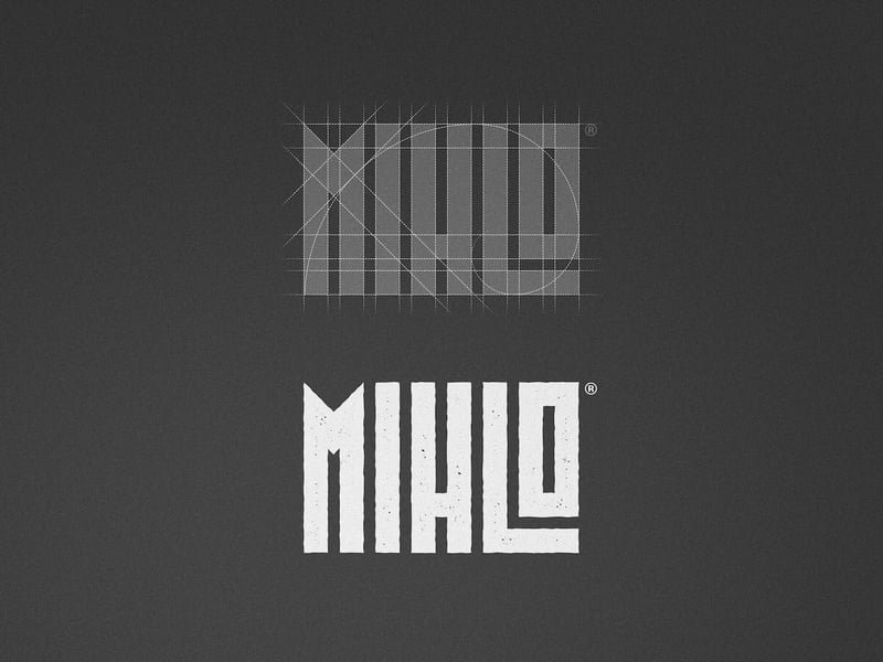
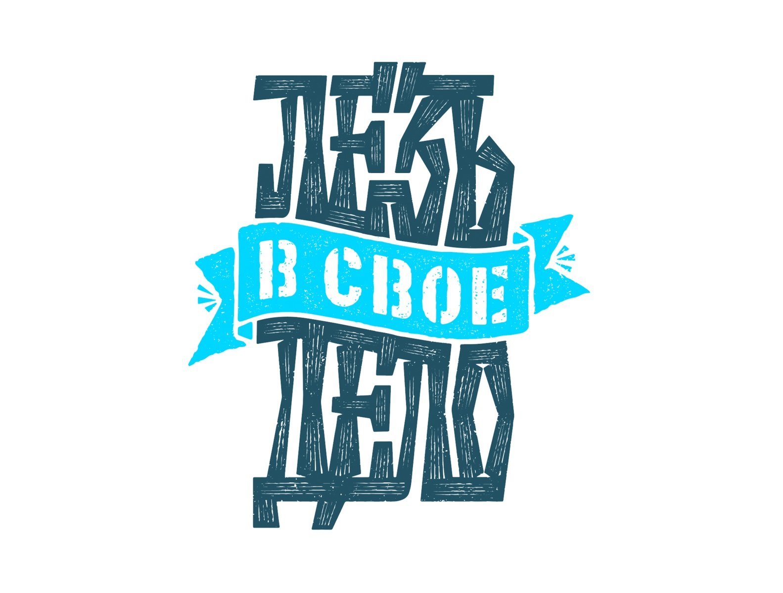
The next big thing on our list is handmade raw and imperfect and untried logos. This style propagates the idea of finding beauty in imperfections and blots. It celebrates disfigurements, irregularities, and roughness. They reject the sleek, perfect look made possible with design programs and take us back into sketchbooks where there are asymmetry, uneven lines, and shading techniques like cross-hatching and contour shading. This style is derived from doodling and freehand drawing and is creative enough to be fashioned in your logo.




Your sryle is unique compared to other folks Ihave rad stuff from.Thanks for posting when you’ve got the opportunity, Guess I’lljust book mark this web site.