Hey, folks! Have you ever wondered why some company logos are so memorable? Well, it’s not just about pretty pictures or colors. Logos are like superhero symbols for businesses, and they come in all sorts of shapes and sizes.
In this cool article, we’re going to talk about “Types of Logos.” Yep, you heard it right! Just like there are different flavors of ice cream, there are different types of logos. Each one has its superpower, and today, we’re going to unlock their secrets.
Whether you want to start your own business or just love checking out logos, this article is for you. We’ll break down five awesome types of logos that businesses use, from simple and sleek to colorful and fun. Plus, we’ll show you how to pick the perfect one for your own business someday.
So, if you’re ready to explore the logo universe, hop on board. We’ll make it super easy to understand, just like chatting with your friends.
Let’s get started!
Did you know that people like things that look cool? Yep, we’re talking about being visual creatures. We often make decisions based on what we see first, rather than anything else. That’s why having a super-duper awesome picture that represents a company, brand, or service is super important. It helps people quickly recognize and remember them. If you look at all the famous and successful businesses out there, you’ll find they all have something in common – a special picture called a ‘logo.’ This logo thing is like the heart of their whole look!
Now, remember, branding is like putting on a superhero costume for your business, and the logo is like the superhero’s symbol. It’s got to be easy to remember and look good in lots of different places. But before you start creating your logo, with fancy fonts, colors, pictures, and stuff like that, you’ve got to figure out what type of logo you want as your main one
Designing a logo is one of those tasks that are seemingly simple at first glance. But if you’ve attempted to design a logo, you know firsthand that the seemingly simple task is much more complicated; there’s more to it than meets the eye. There are several different components to think about when you’re designing a logo- fonts, colors, shapes, arrangements, illustrations, associations, etc. Logo design usually becomes the basis for the whole brand strategy. A resourcefully designed logo can undoubtedly increase the recognizability of the brand or company. This enables the business to achieve its goals, be it selling more goods, involving more customers, getting more subscribers, or obtaining wider recognizability. Besides, a logo is a sign that makes the product or service different from its competitors, which is also a critical pre-condition of the company’s fast and fruitful development.
Though logos all a combination of typography and images, each type of logo gives your brand a different feel. And since your logo is the first thing new customers will see, you want to make sure you get it right. Here are the five different types of logos-
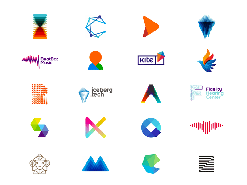
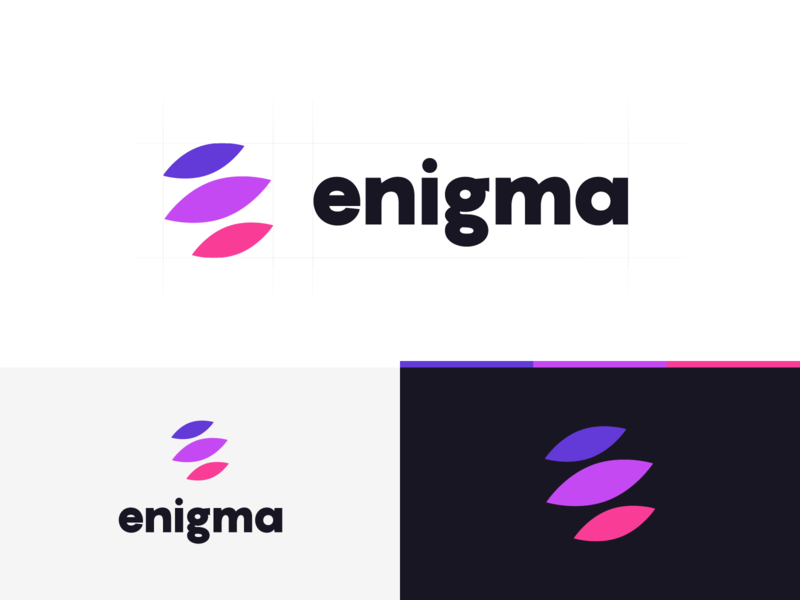
SYMBOL OR ICON
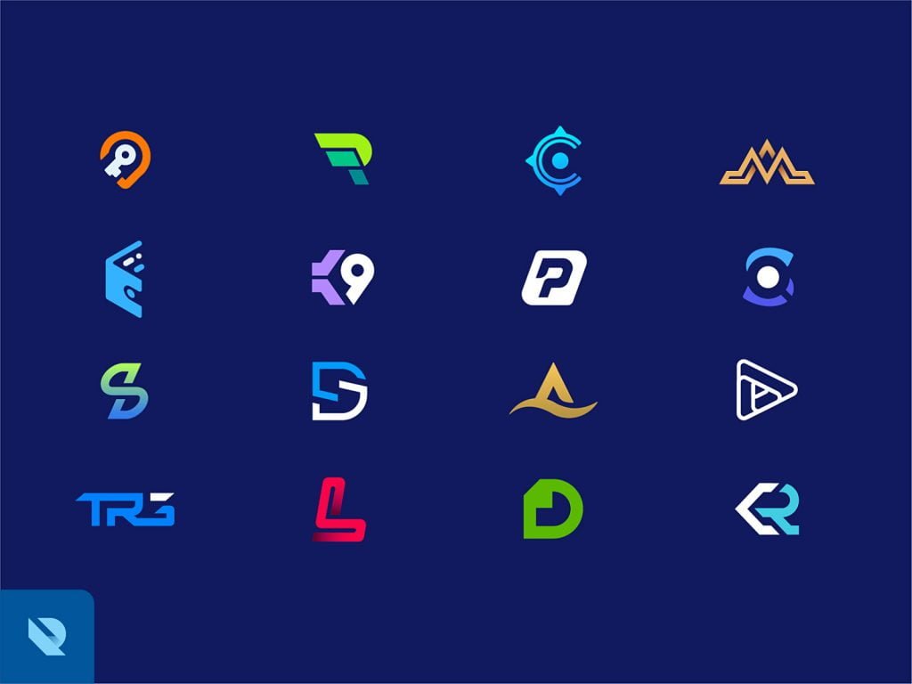
by Alex Tass
Symbols are bold, straightforward depictions of a business. They often take the form of a recognizable object, but it’s usually transformed or used in an abstract way to make it discrete. Symbols are typically used as a secondary or substitute logo, but because they’re compact and straightforward, they economize well and are great for quick recognition. Businesses often utilize symbols within their brand because they take a lot less time to process and, in most occurrences, they express ideas more efficiently than text-like traffic signs. Symbols are also universal; they don’t have a language barrier, so they’re great for global companies. They’re also straightforward to remember. Mercedes, Nike, Target – their simple symbols quickly come to mind and are easy to remember. However, logos and icons take some time to develop recognition. So, if your business is relatively new, it might not be very easy for people to identify an image with your business name if it’s used on its own.
All in all, symbols and icons are a great addition to any brand. When designed correctly, they provide versatility, easier recognition, and express ideas well. The biggest thing to consider when deciding to go with a pictorial mark is what image to choose. This is something that will stick with your company its entire existence.
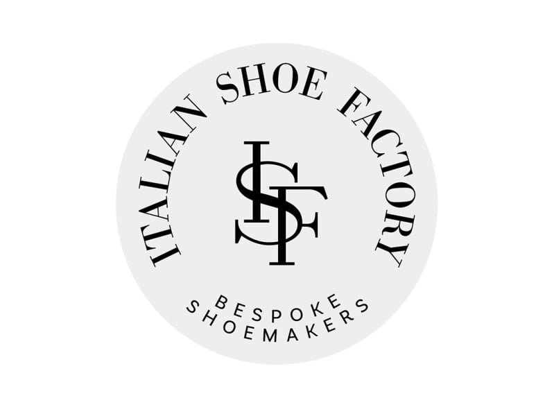
LETTER MARK

Letter marks are comparable to symbols, but they’re wholly typographic. They represent a company through a simple mark that uses the initials of a company’s name. This type of logo is excellent for businesses whose name is too long, hard to pronounce, or not very distinct, and it also assigns an equal position to every word in a company’s name. Designers usually alter a font, add a distinctive element to the letterforms, or creatively arrange them to make them unique to the brand and more recognizable. And like symbols and icons, it takes some time to develop recognition to the point where people identify a letter mark or sign with a business name. Overall, letter marks are helpful secondary or alternative logos and are used by some of the most recognizable brands in the world.
WORDMARK

Wordmarks spell out the name of a company. And while they might seem simple, there’s more involved than simply choosing a font and typing out the name. Wordmarks are frequently fashioned or altered in a way that differentiates it from a plain font, or sometimes a new font might be created explicitly for the logo. They make up 37% of the top 100 brands in the world because including a business’s name is tremendously essential for recognition. Wordmarks work best as a chief logo if the name of your business is characteristic or comparatively short. Otherwise, you might choose a combination mark or an emblem to help differentiate your primary logo a little bit more. Also, like with a letter mark logo, typography will be a crucial decision. Since the focus will be on your name, you’ll want to pick a font—or create a font—that captures the essence of what your business does. A wordmark is the right choice if you’re a new business and need to get your name out there, make sure that name is short enough to take advantage of the design. Anything too long can look too cluttered. Wordmark logos are easy to replicate across marketing material and branding, thus making them highly flexible options for new and emerging businesses.
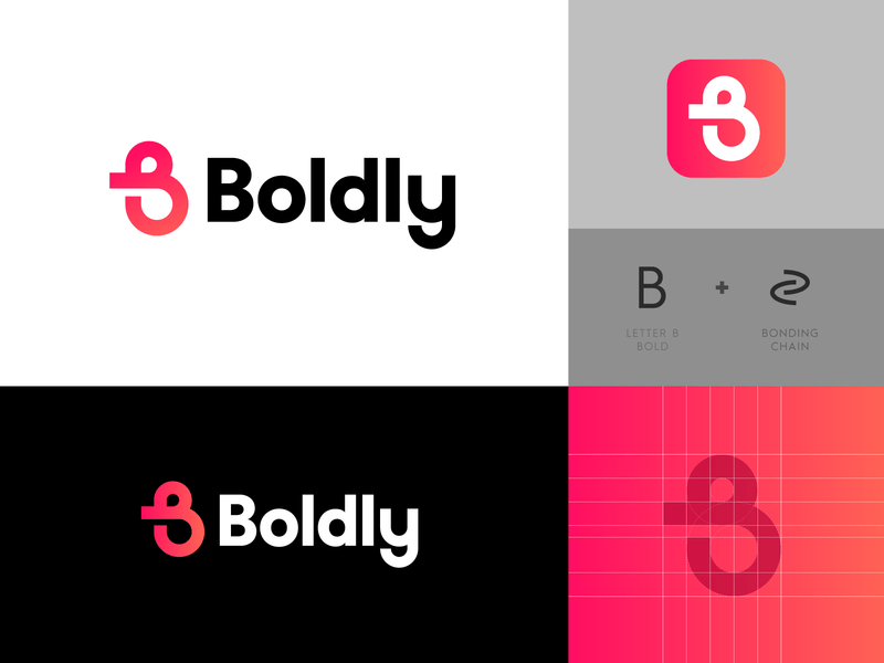
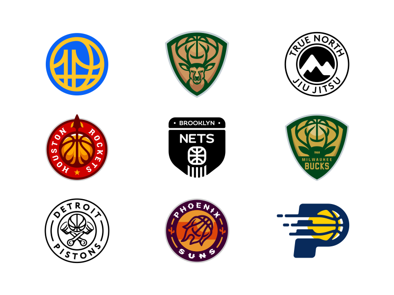
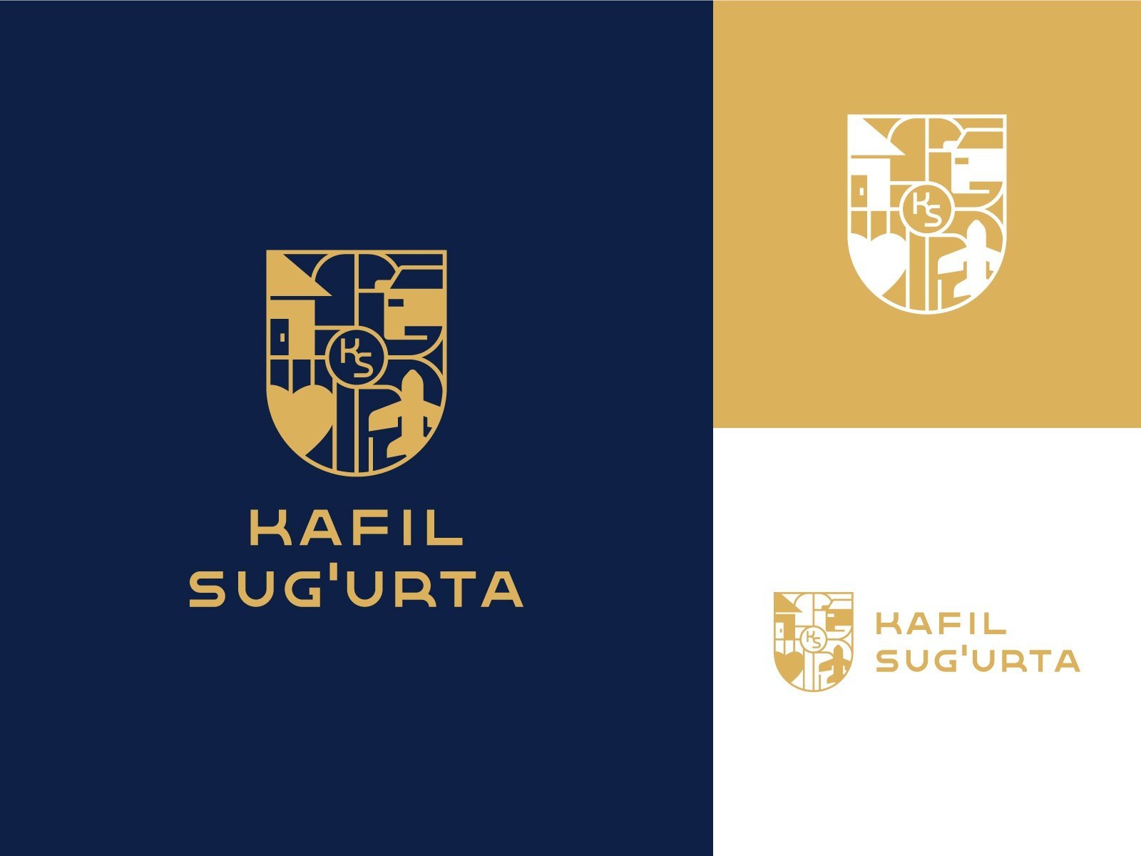
COMBINATION MARK
Combination marks combine a wordmark with a symbol, icon, or letter mark. This type of logo is the best of both worlds; it spells out a company’s name while connecting it with a visual icon. And that’s why they’re the most common, making up 56% of the top 100 brands in the world. It also delivers a lot of versatility because while the components of a well-designed combination mark look great all together, they can also be broken apart and used separately on their own. Because combination marks include quite a few different components, they’re more challenging to design and necessitate more time and intention. However, the versatility and distinction you can attain through a combination mark make the extra work worth it. This type of logo is also easier to trademark because the grouping of all the different components helps set it apart from other logos and brands. With a combination mark, people will even begin to associate your name with your pictorial mark or mascot right away. In the future, you may be able to rely exclusively on a logo symbol, and not always have to include your name.
EMBLEM
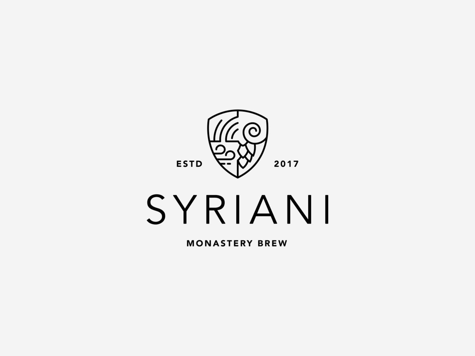
An emblem is also made up of quite a lot of different components. But as a substitute for the text beside or below a symbol or icon, emblems embrace a company name within the design. This type of logo often looks like a badge or a seal; it’s very compact. And it’s often seen and used in government and sports logos. Unlike combination marks, they’re more difficult to split apart, and they’re difficult to downscale because the words are encompassed inside of the logo. An intricate emblem design won’t be easy to imitate across all branding. For business cards, a busy emblem may shrink so small that it becomes too difficult to read.

Hello, i think that i saw you visited my web site so i came to “return the favor”.I am trying to find things to enhance my site!I suppose its ok to use a few of your ideas!!
You’ve made some really good points there. I checked on the internet to learn more about the issue and found most individuals will go along with yourviews on this web site.