Now and then, you will have to bring your logo up to speed. Sometimes, sweeping changes in your brand’s story and direction demand new slants to the logo, and at other times it could just be for a modern, fresh touch. Any way redesigning a logo can be a big decision that you might need help with. So, we’ve rounded up some of our favorite logo redesigns.
First off, logos everywhere are getting brushed off, cleaned up, and their color palettes refreshed, whatever the reason. Secondly, a load of global brands is looking back to their roots to invigorate retro logos in the new world.
Let’s jump in and see how they do it!
Durex
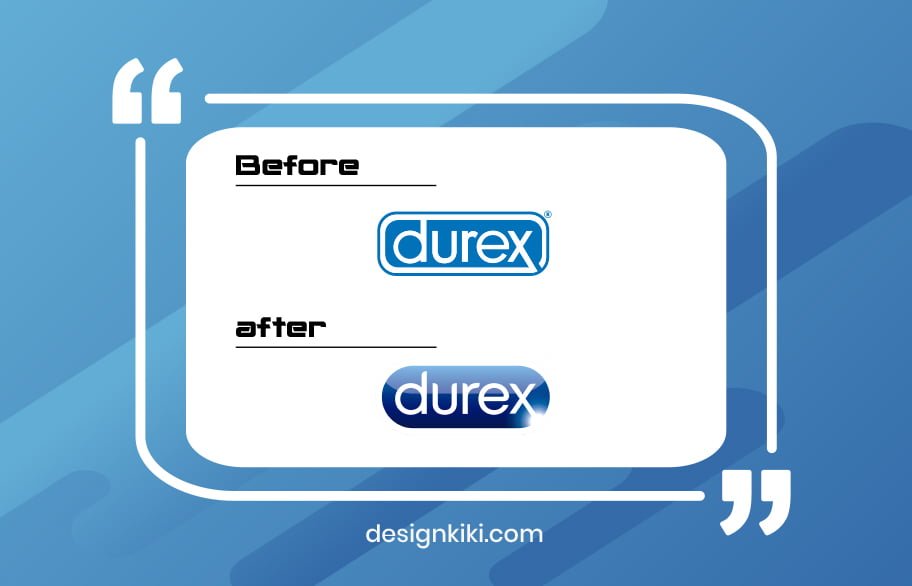
The timing for this logo redesign couldn’t have been better. As Durex evolved its brand to become more and more inclusive, the logo got a much-needed update. They’ve replaced the former clinical-looking capsule logo with a fresh and casual logo—the new look acts as a neat, simple stamp on the reforming brand. Last but not least, they added a new font system called ‘One Night Sans,’ I bet the pun was intended!
Cadbury

A lot of brands are reconstructing historic logo elements with new digital implementations. The UK-based Cadbury’s wanted to refine its existing logo by drawing on the exemplar signature of William Cadbury, the grandson of its founder. The company allegedly paid a price of £1 million for the simple refresh. However, the price tag starts making sense considering that it’s part of a global brand refresh for a multi-billion-dollar legacy.
GoDaddy
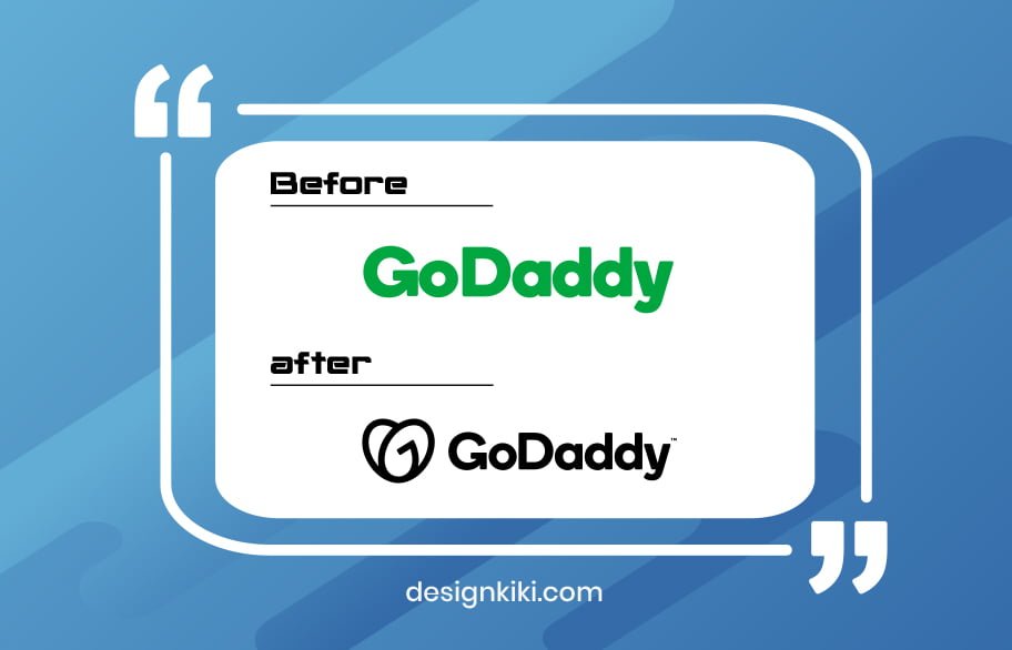
This logo redesign brings life back into the elderly GoDaddy brand. The altered wordmark cartels the letters G and O to form a heart. This creates the effect of a friendly brand with a heart. Plus, the updated color palette suits it, giving it a more modern touch.
Think about artistically merging prominent letters or even initials in your brand name or merely picking a symbol that reflects you for you.
Popeyes
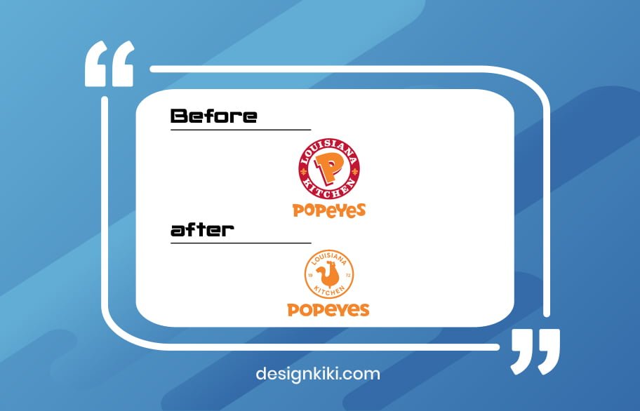
A cheerful, up-to-the-minute revamp of a classic, which tactfully keeps the essence of the old logo intact. The color palette was simplified to bold, lively orange, and the fun, contemporary wordmark made Popeyes’ logo redesigned on the beat.
Badoo
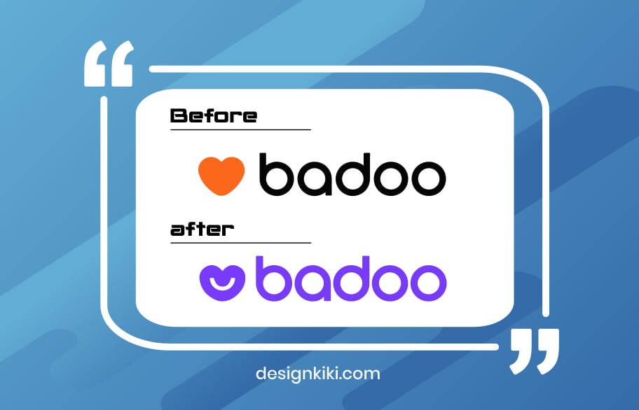
Badoo cooled down its color palette from black and orange to a beautiful shade of blue. This softened up their logo and made it friendlier and more attractive. The extra smile on their heart-shaped icon breaks the mold in the dating space. More importantly, this upgrade shows how much a logo redesign can change your messaging.
TGI Fridays
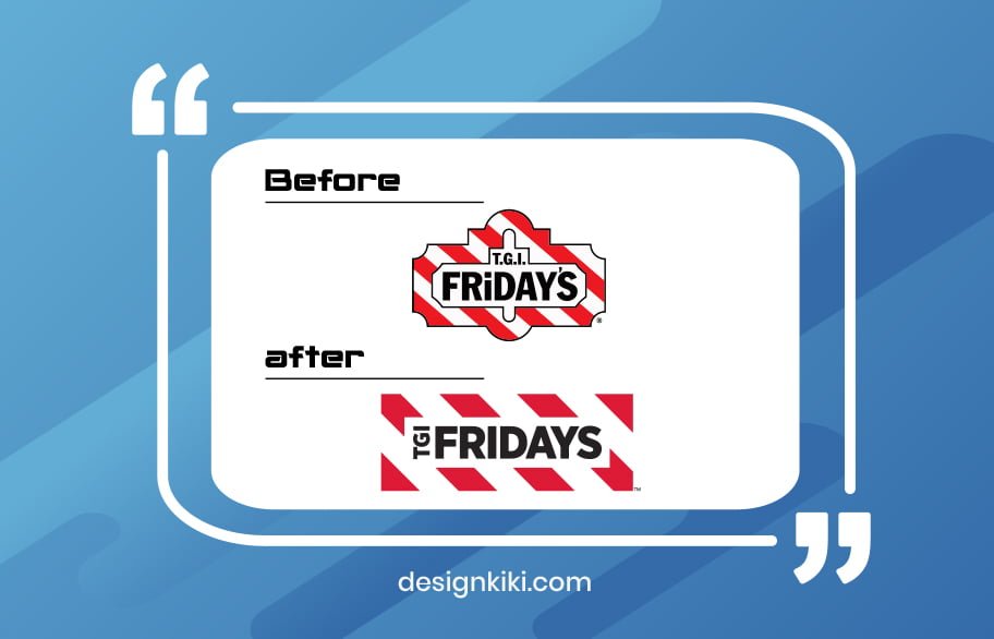
From ‘Thank God it’s Fridays’ to only ‘Fridays,’ the American restaurant icon released gives the brand postmodern energy with a hint of its old quirky Americana vibe. They revamped the font to a neater and simpler one and went for a cooler shade of red compared to the loud one earlier. Aren’t we all in love with the new logo?
Oneplus
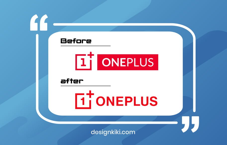
The Oneplus logo redesign features a humanized number 1 and a new font to enhance legibility. They moved on from the prior logo’s negative space, which looks pretty good from where we are sitting. While it’s perhaps a minor revision, it sets the tone for a more elastic brand identity.
BMW
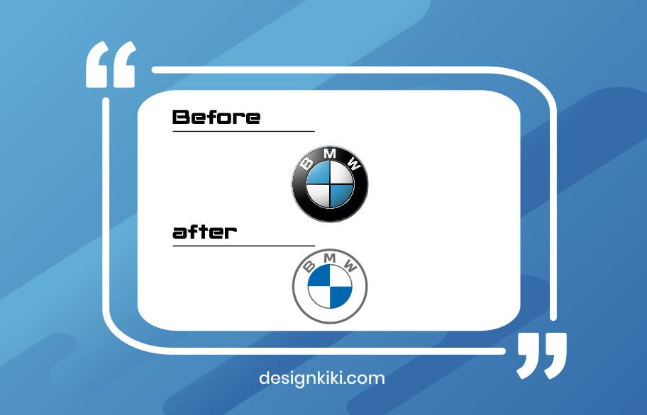
Our list of the best logo redesigns wouldn’t end without this one. The car giant BMW released their updated logo earlier this year, aiming to make it more suitable for digital formats and prints. While the logo has been tried and teased on physical applications, its chief role is to embody the brand in 2D communications (like print and online). The shadows and highlights have been stripped down, and the black ring around the logomark has been replaced with a transparent one.
Eventually, redesigning a logo is a meaningful process. The further you see how others in your space are going about it, the better your instincts will get. An exceptional logo design is about creating something symbolizing both your brand and your clients in a simple yet powerful way.
Continue exploring other unique logo redesigns as inspiration for your own, and let us know if you need any more help in that respect.




Leave a Reply