Design as a process is a peculiar one. The same goes for design logos too. It involves so many elements- color palettes, fonts, logo shapes, etc. figuring out the perfect balance of these can be a time-consuming process.
However, artists have designed some trendy logos in minutes, even seconds! You never know how and when inspiration hits. We have a list of logos that were scribbled out on napkins in moments.
Citibank
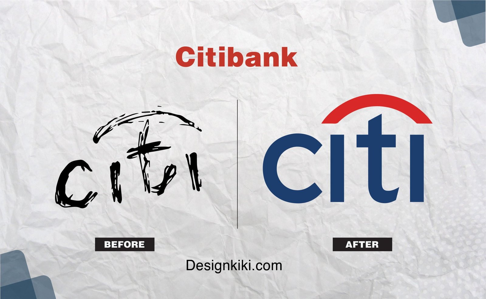
In 1998, Pentagram, Paula Scher’s design agency, was hired by Citi Group to design the Citibank logo. Paula’s design team met with the officials of Citi Group to find out what they wanted from their logo.
She started scribbling on a napkin while they were talking, and five minutes later, she said, “This is your logo.” The napkin was worth $1.5 million. She incorporated an arch representing the red umbrella from the old logo.
Canadian National Rail
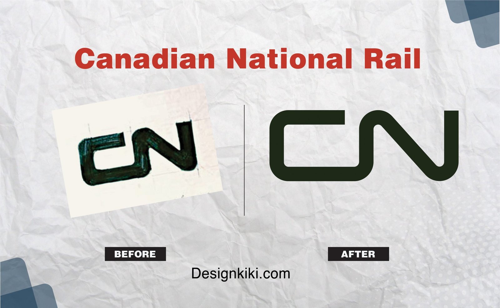
Alan Fleming redesigned the Canadian National Rail logo. He decided to leave out drawings of maple leaves, animals, or any other objects for that matter. Fleming said, “A literal drawing in 1944 of an object — even a plant leaf — looks in 1954 as if it was drawn in 1944. After five, 10, or 15 years, that symbol would have to be revised. CN itself has had that history up to now — of constantly revising its trademark bit by bit — and every time it has been revised the one before it is out of date, and it costs a lot of money and a lot of hard work to keep ahead of the game.”
I Love NY
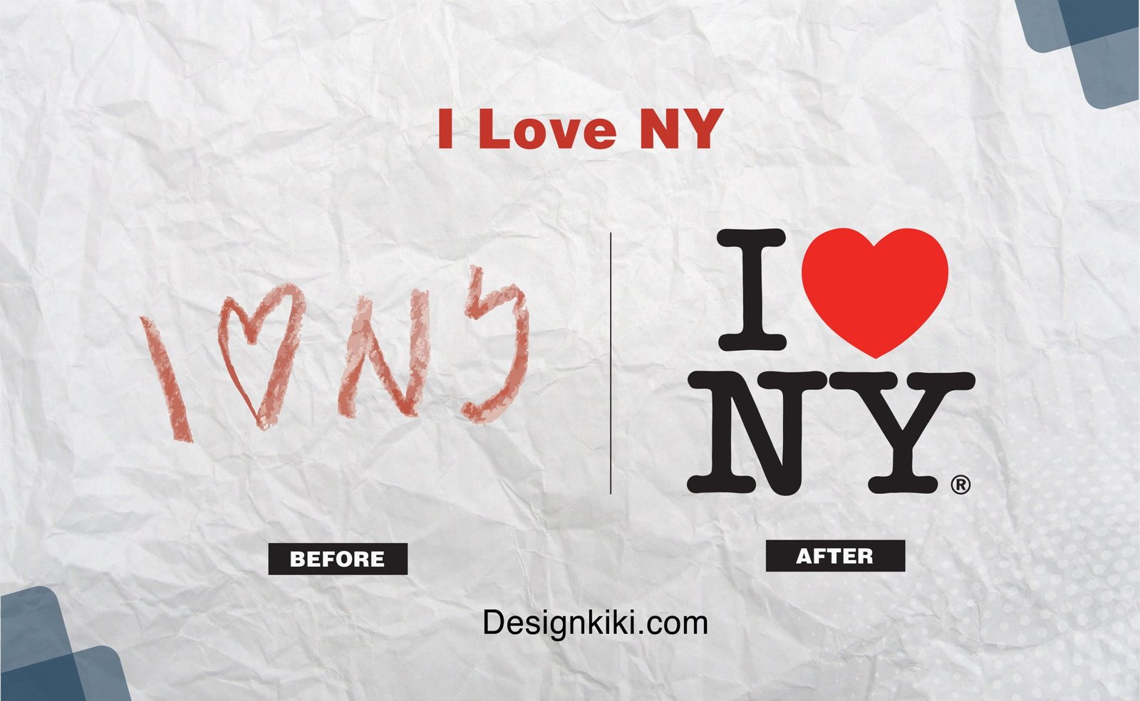
During the ’70s, New York City was not doing well. The crime was at its peak, the tourism industry was nearly dead, and the city was on the brink of bankruptcy. They needed a boost in tourism and a cheerful face to the city for which they needed a logo to reach people’s hearts.
Milton Glaser was hired for the job. He was in a meeting with the ad agency in charge, during which he scribbled the logo with a red crayon on an envelope.
Chupa Chups
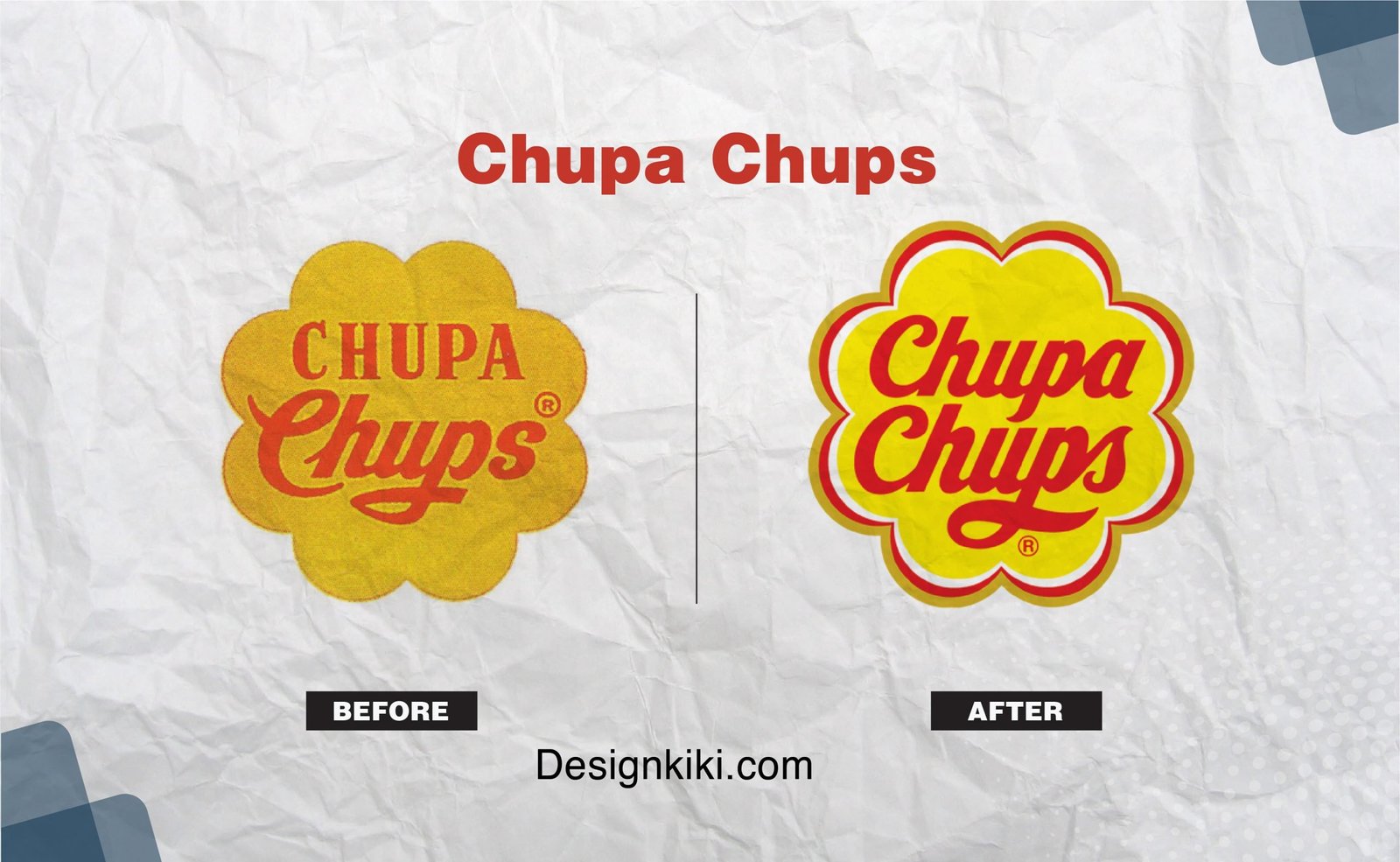
The Chupa Chups logo was by the famous artist Salvador Dali. According to the brand’s website, Dali scribbled out what would become the brand’s basis in a newspaper. He suggested that the logo be on the top of the lollipop instead of the side, which proved to be a great branding tactic. In 1969, Dali played a massive role in rebranding.
Virgin
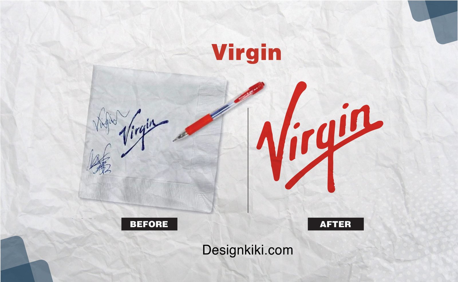
The initial logo of this venture capital group was two naked ladies around a tree. It did not reflect well on the brand’s future. In 1977 Richard Branson hired an anonymous young designer. During the conversation, the designer hurriedly drew up the present logo. It looked like a signature, but Branson liked energy and attitude.




Leave a Reply