Do you think you have mastered the basics of logo design, and you want to know more? If you are looking to level up your logo game, then you have reached the right place! Logo design is like an addictive science. Once you are hooked onto it, it is difficult to find an escape. There are always new tricks and tools you can learn and follow to do more. The list can never be fulfilled!
In the contemporary world, there are thousands of companies doing the same thing. To make yourself noticeable and differentiate yourself from the crowd, you have to do something out of the ordinary. The first that can be used to catch the attention of the public is your company’s logo. Therefore, we are here with advanced tips and tricks to help your logo stand out in the rat race.
The monochrome edge

Do you snore every time you hear the word monochrome? What comes to your mind when you think of monochrome? If your answer is black and white, then we have some great news for you! Black and White is just one example of monochrome. In reality, monochrome is called varying tones of the same color.
The tones of colors can be changed by adding the grey color to come with different variations. Bet you didn’t know that! Monochrome shades of color make a great, eye-catching color combination and are a great decision to make when deciding on the color scheme of the logo. Experimenting with this is only recommended once you’re clear with the basics of logo designs.
If you’re further interested in color scheming, these articles can help you
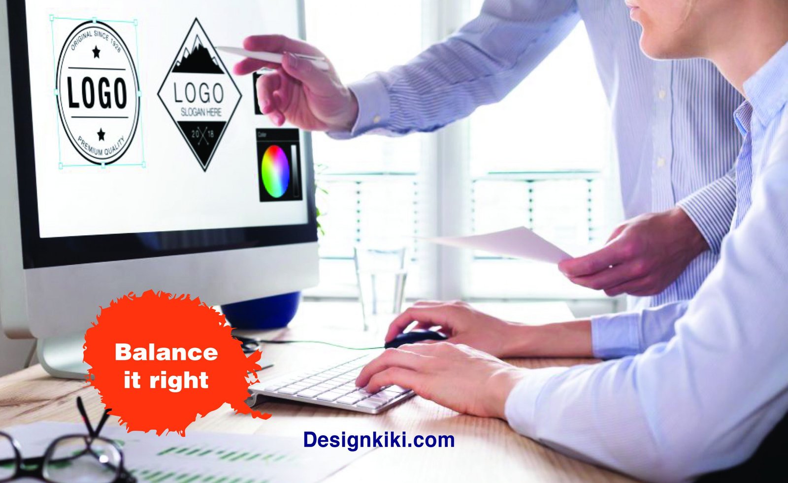
Balance it right

Visual balance is crucial in a logo and is one of the main principles of design that advanced graphic designers swear by. Visual balance has two elements – weight and direction.
Visual weight is influenced by the location, depth, and size of an object. It can be used to draw or divert attention from certain elements in a design. Visual weight can further depend on the color, space, and negative space around an object too. Negative space is the biggest player in making a logo stand out and make the audience fixated. To learn more on the topic, click here.
The balance of a design also depends on the direction of an element. Usually, the objects at the top catch more attention than the objects at the bottom. This is the secret that marketing houses swear by when they advertise a sale. They always write the word ’50 % off’ in big alphabets and the phrase ‘on selected items’ in tiny letters at the bottom. We have managed to get innocently trapped in this trick for decades!
Another important theory in balance is that pictorial elements on the right are more prominent than those on the left of a design. Therefore, important elements in a logo should be aligned to the right of the design to achieve attention to the right parts of the design.
Use the name literally!

I know you might have heard otherwise a million times. Although the idea sounds silly at first, designing a logo according to the literal meaning of the name of the company makes the logo look witty. If designed intelligently, the logo may turn out to be legendary. It will help your company in attracting an audience.
Also, having said that, remember to use the name appropriately and make it look relevant to the kind of business in your company’s field of business. You have to keep in mind to master the foundation of creating a logo before plunging into this adventure. Penguin publications, C Elephants, and Black Mamba films are some examples of great logos designed literally.
Pop it up

Have you encountered a logo with 3D effects or a color pop? If you have, you’ll agree with us that the extra detail to an element makes a logo stand out and is much more noticeable. You can always use color and shape to make elements pop up in the logo. It will make your logo much more interesting and memorable to look at.
Recently, designers also used animated motions in logos. This makes a logo thrilling and gives it an edge over other ordinary logos. It is always said the human eye notices movement faster than it does stillness. Now you know why the buzzing fly always catches your attention so quickly when the assignment left on the desk always manages to slip off the mind!


Leave a Reply