All of us have gone to H&M, Zara, or a thrift store searching for vintage-looking clothes and footwear. That old stuff gives out a very decadent vibe. Thus, we can collectively establish the fact that vintage is an immortal trend in all things design. If you walked past a vintage cafe and a modern and futuristic restaurant, I’m about 110% sure that the vintage cafe would attract you more. So, one can only imagine the advantage of vintage logos and branding for a business.
WHAT IS A VINTAGE LOGO?
A vintage logo embodies design elements from the 1900s-1960s. This time frame is, of course, completely flexible and subjective. It is a logo style that puts out heritage, adventure, tradition, rustic, homegrown, or nostalgia.
This description might seem like that of an Emblem logo. That is because emblem logos are a subtype of the vintage logo. It is one of the oldest logo styles. However, they aren’t always synonymous.
Common vintage logo design elements
If you want a vintage logo for your business, here are some design elements you should consider incorporating
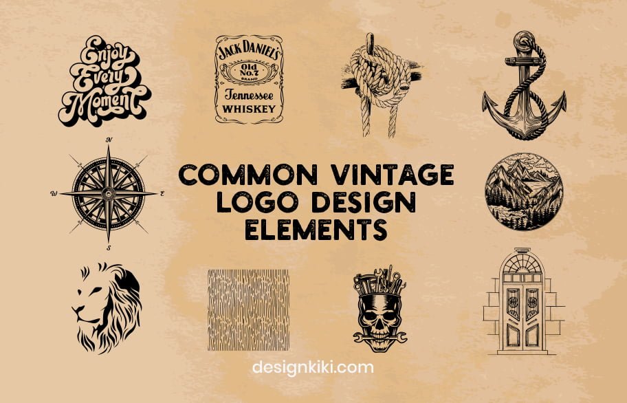
- Cursive text and typography
- Uppercase trademark text (think Jack Daniels Old No.7 Brand. Tennessee Whiskey)
- Ropes
- Anchors
- Compasses
- Wilderness
- Line art
- Hand-drew texture lines
- Industrial manual labor
- Year of establishment
These rules aren’t rigid, just a general guideline.
Thumb rules for designing a vintage logo
1. Shapes
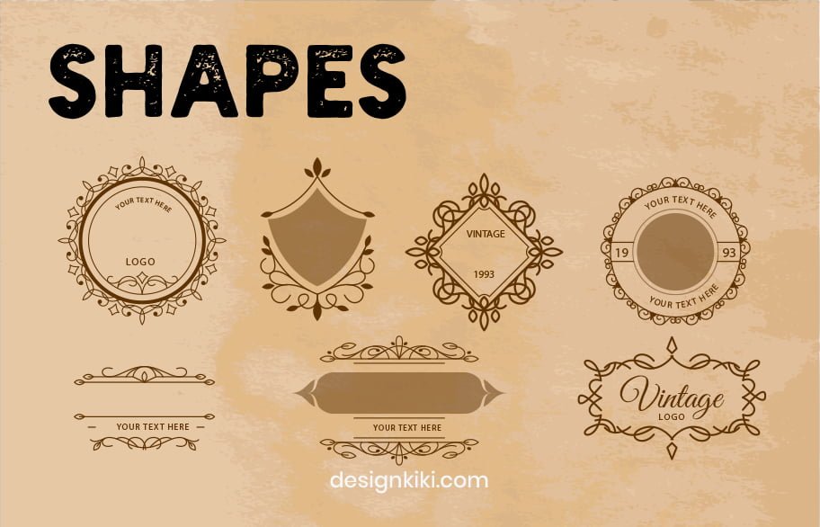
Stick to conventional logo shapes such as circles, squares, octagons, or any symmetrical polygons for that matter
2. Colors
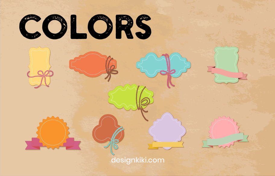
Select rustic color palettes. Charcoal, grey, beige, light brown, olive green, etc. would be good choices. Use colors like red, blue, green, and orange to add a minimum pop of color wherever needed.
3. Font
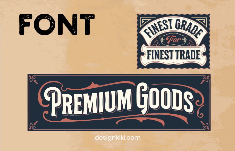
Typography is your choice for the brand name. for the rest of the textual part, bold classic fonts in all caps would be appropriate
4. Noise
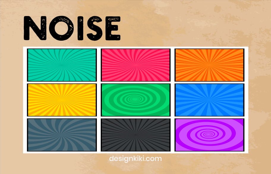
Noisy gradients are a great way of adding a retro element to your logo. If used appropriately, it gives a rough edge to your brand.
5. Texture
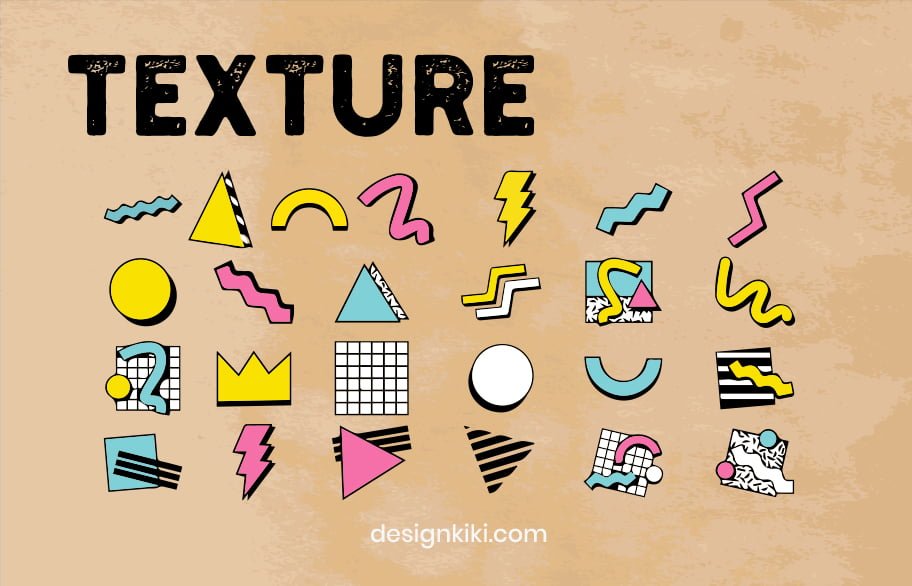
Texture, layers, and gradients are great tools to make your logo more approachable and friendly. They give away a rugged feeling and make the audience feel more comfortable.
Famous Vintage brand logos
Here are a couple of case studies of very successful businesses to take notes from if you’re looking for a logo for your business:
Jack Daniels
This logo is like a black and white movie nominated for an Oscar. It would easily win if there were one for vintage logos. Notice the bold classic font, the swirly line art around the oval, and the trademark text. The overall symmetry of the logo is just beautiful
Levi Strauss
If the words ‘vintage logo’ do not immediately remind you of this masterpiece, you will most certainly live under a rock. However, their present logo looks very different from the vintage one after the logo evolution. The brand still uses this logo as a part of its branding.
Should you get a vintage logo for your business?
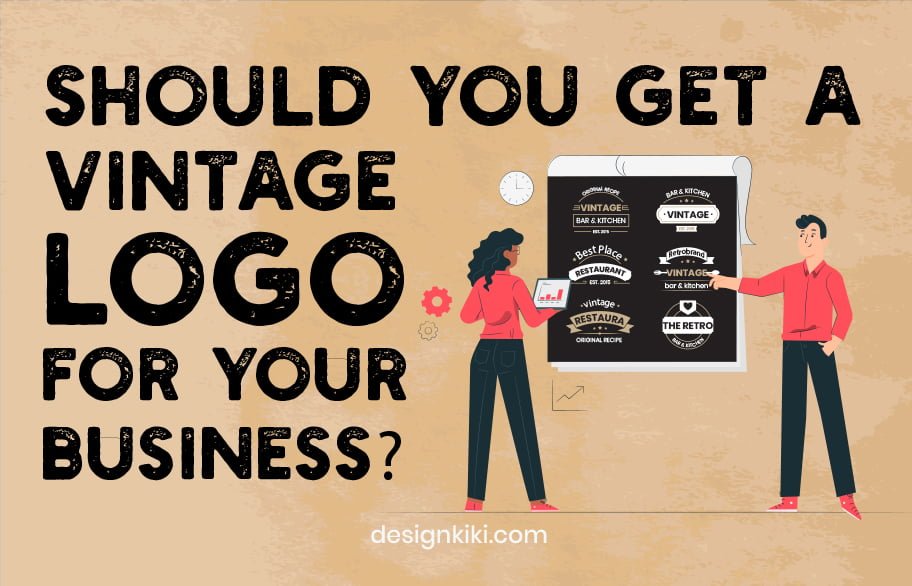
Businesses such as earthy cafes, breweries, liquor, adventure goods, tobacco, cigars, garages, bakeries, country clubs, etc. can go for a vintage design for a logo. However, it is not industry-specific. Any business involving tradition, heritage, and nostalgia can go for a vintage logo.




Hi my loved one! I wish to say that this article is awesome, nice written and come with approximately all vital infos. I would like to peer extra posts like this.
Heya i?m for the first time here. I found this board and I find It really useful & it helped me out a lot. I am hoping to offer something back and help others like you aided me.
With every little thing which appears to be developing inside this particular subject matter, a significant percentage of opinions are generally relatively refreshing. Having said that, I beg your pardon, because I do not give credence to your whole idea, all be it stimulating none the less. It looks to me that your opinions are actually not totally validated and in fact you are yourself not entirely certain of the point. In any event I did enjoy reading through it.
Wow! This blog looks exactly like my old one! It’s on a entirely different topic but it has pretty much the same page layout and design. Wonderful choice of colors!