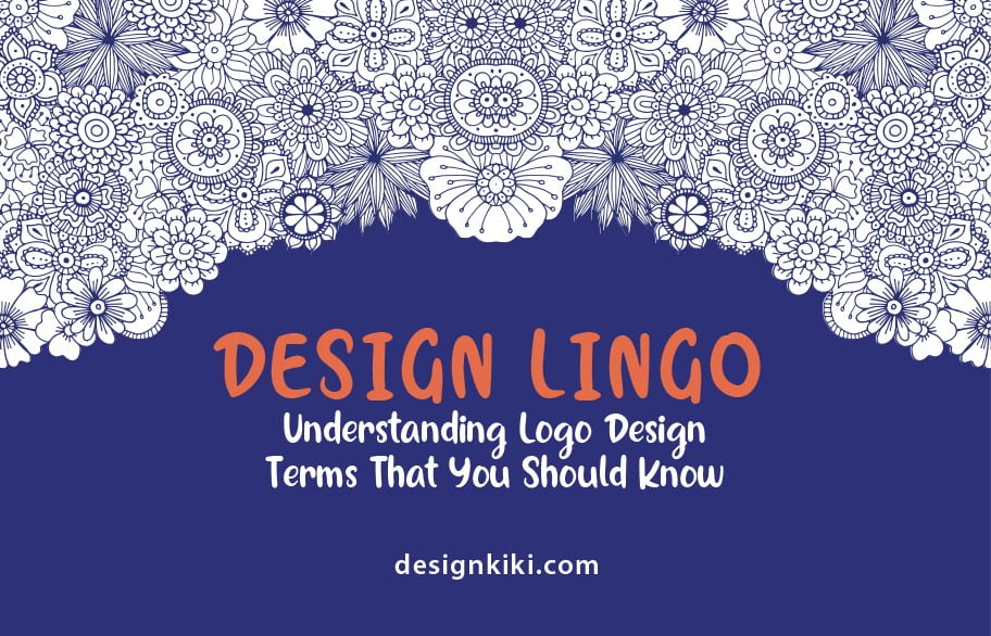
Do terms like RBG, PNG, and CMYK make you go, OMG? These are some of the most commonly used logo design terms, but they might seem frustrating to a layman. It is not all that hard as it may seem after you understand their meaning, these words will come naturally to you.
Knowing the design lingo is vital for effective communication with your designers to get the results you want without any hassle. So, read along with the following list patiently. I have divided all the information using headings and subheadings, yet, if you find it too heavy to go about it at once, save it for a read later.
DESIGN
Composition and layout
Many describe layout and composition as the building blocks of logo design. They refer to the placement and arrangement of the design elements about one another. In simple words, when the design elements are put together, they make up a composition.
An excellent composition is further made up of several different visual design elements, including balance, alignment, proximity, contrast, repetition, and negative and positive space.
Balance
The dictionary meaning of balance is stability, but it refers to the precise placement and distribution of elements on the page in the design industry. This does not, however, mean symmetry. Symmetry is only a type of balance.
Here are the three types of balance-
- Symmetrical– This type of credit is achieved when the design objects or graphics on either side of an imaginary central line are precisely identical.
- Asymmetrical– This is the exact opposite of symmetrical balance. When the pictures on either side of the central line are unequal, it is referred to as asymmetrical balance.
- Radial– A radial design is one in which elements spread out from or diverge into a central point, creating balance.
Alignment
Alignment refers to the orientation of the text or graphics on a plane involved in a logo. Alignment could be of four types, namely left, right, center, or justified.
Proximity
This is the physical space between different elements of the logo. Catchy logos generally have elements nearby, meaning that they are tightly grouped.
Contrast
Contrast is measured using the difference in the appearance of the various elements. A designer may use color, texture, shape, size, or typeface to create contrast.
Repetition
Repetition can be described as the number of times a single or a group of elements is repeated within one design.
Negative Space
Negative space, also known as white space, is the part of the unmarked logo or is left empty. It does not contain any object, but it does not necessarily have to be white. To read more about the use of negative space in logos, click here.
Rule of Thirds
Used in photography and design alike, the Rule of Thirds states that if a design plane is divided into nine equal parts with the help of a pair of horizontal and vertical lines, elements of interest must be placed at the focal points or the intersections of the lines.
Grid
A grid is a series of intersecting vertical, horizontal, and diagonal lines used to organize graphic elements on a page and relativity to one another.
Scale
It refers to the size of the objects in a design concerning one another. Scale, if used appropriately, can create visual interest and enhance your logo.
Thumbnail sketches
While designers conceptualize, they tend to hand rough sketch drawings to explore the logo’s possibilities with the given guidelines. These sketches are called thumbnail sketches.
Mock-up
Logo mock-ups are a real or digital model of your logo used for test runs to see how they could look in practical settings.
TYPOGRAPHY
Font Type
There are hundreds and thousands of fonts. Most fonts fall into one of four different font types.
- Serif– This type of font has embellished lines and hooks at the ends of each letter.
- Sans Serif- The word sans means “without”; thus, Sans Serif fonts do not have lines and hooks.
- Script- When the letters are cursive and form, it is called script.
- Slab Serif- They are the louder cousins of the classic, quiet serifs. They are bolder and more dramatic.
Font Case
You might know the upper and lower case as capital and small letters. Here are the different types of font cases-
- UPPER CASE- Capital letters (A, B, C, D, E…)
- lower case- small letter (a, b, c, d, e…)
- Small caps- these are uppercase letters that have the same height as their lowercase equivalent.
Font Spacing
This can be described as the horizontal and vertical space between characters, words, or lines. There are three spacing techniques-
- Kerning– When the space between two letters of the same word is altered, it is called kerning
- Leading– When the space between two or more text lines is altered, it is called leading. It is also known as line-height.
- Tracking– Often confused with kerning, when that space between the entire block of text.
Font Style
- Point size- Point size is the size of the text. There are approximately 72 (72.272) points in one inch.
- Font weight- Font weight postulates the boldness of a font.
- Italics- When characters tilt to the right, they’re in italics.
COLOR
I have written expansively about color theory in the past, so instead of giving you detailed descriptions, I will explain the terms briefly and link my previous blogs, so you can read them in-depth.
Color Psychology
Each color is known to evoke a certain feeling in the spectator, the study of which is known as color psychology. All logos are designed following the principles of color psychology so that the customers feel what they are supposed to when they look at the logo. It is crucial to choose the right color while creating the visual identity of your company.
Hues, Tones, Tints, and Shades
Hue is the color at its purest.
Hue + Grey = Tone
Hue + White = Tint
Hue + Black = Shade
Saturation
The intensity of the color is known as saturation. A high saturation resembles high intensity, while low saturation resembles low intensity.
Gradient
The gradual transition of two or more colors is called a gradient.
Opacity
Opacity is the same as non-transparency. The more transparent a logo, the lower its opacity.
Temperature
It refers to the warmth or the coolness of a color. You will read about cool and warm colors below.
Palette
The specific range of colors used in a logo makes up a color palette. These colors, when used together, enhance the aesthetic appeal of the design.
Warm, Cool, and Neutral Colors
Warm colors are striking and energetic and tend to advance in space.
(Yellows, Reds, Oranges, etc.)
Cool colors give an
impression of calm and create a soothing feeling. (Blues, Greens,
Purples, etc.)
Neutral colors are visually restful and do not distract. (black, white, grey,
etc.)
RGB, CMYK, and Pantone
RGB stands for red, green, and blue – the three primary colors. This scheme is used to represent colors on a digital platform by rendering each color a mix of all three.
CMYK – cyan, magenta, yellow, black is a color scheme used by printers to print colored material.
Pantone is an exclusive color blending scheme by Pantone Corporation that enhances prints using CMYK colors that cannot be mixed.
Color Harmonies
Monochromatic- The use of shades, tones, and tints of a single hue in a design.
Analogous– The selection of colors placed adjacent to one another in a color wheel.
Complimentary– Use of colors on a color wheel that is placed opposite to one another.
Triadic– The use of three colors spaced evenly on a color wheel, where one dominates, another supports, and the third adds an accent.
LOGO TYPES
The different types of logos are as follows-
1. Symbol or Icon- When a logo is all about its pictorial representation and has nothing but an abstract form used straightforwardly. Its examples include the logos of Nike, Twitter, Mercedes, etc.
2. Lettermark- Logos that feature creative use of the initials of a company as a focal point. Some examples of lettermark logos are HBO, ITC, IBM, etc.
3. Wordmark- These are simple logos that spell out the name of the company. VISA and Google are two examples of wordmarks.
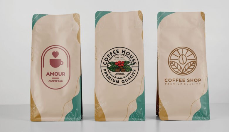
4. Emblem- These are identical to seals, crests, and badges. Emblems are popularly used by schools, clubs, etc. So, examples include Starbucks, Harley Davidson, etc.
5. Combination Mark- These are logos that comprise both symbols and icons and a lettermark or wordmark. The Burger King logo is an example of a combination mark
6. Mascots- These feature cartoonish characters or brand spokespersons. The Wendy’s logo is one of them.
Designkiki Brings Out The Infographic On Design Lingo- Understanding Logo Design Terms That You Should Know

Leave a Reply